Daffodil Season, 2

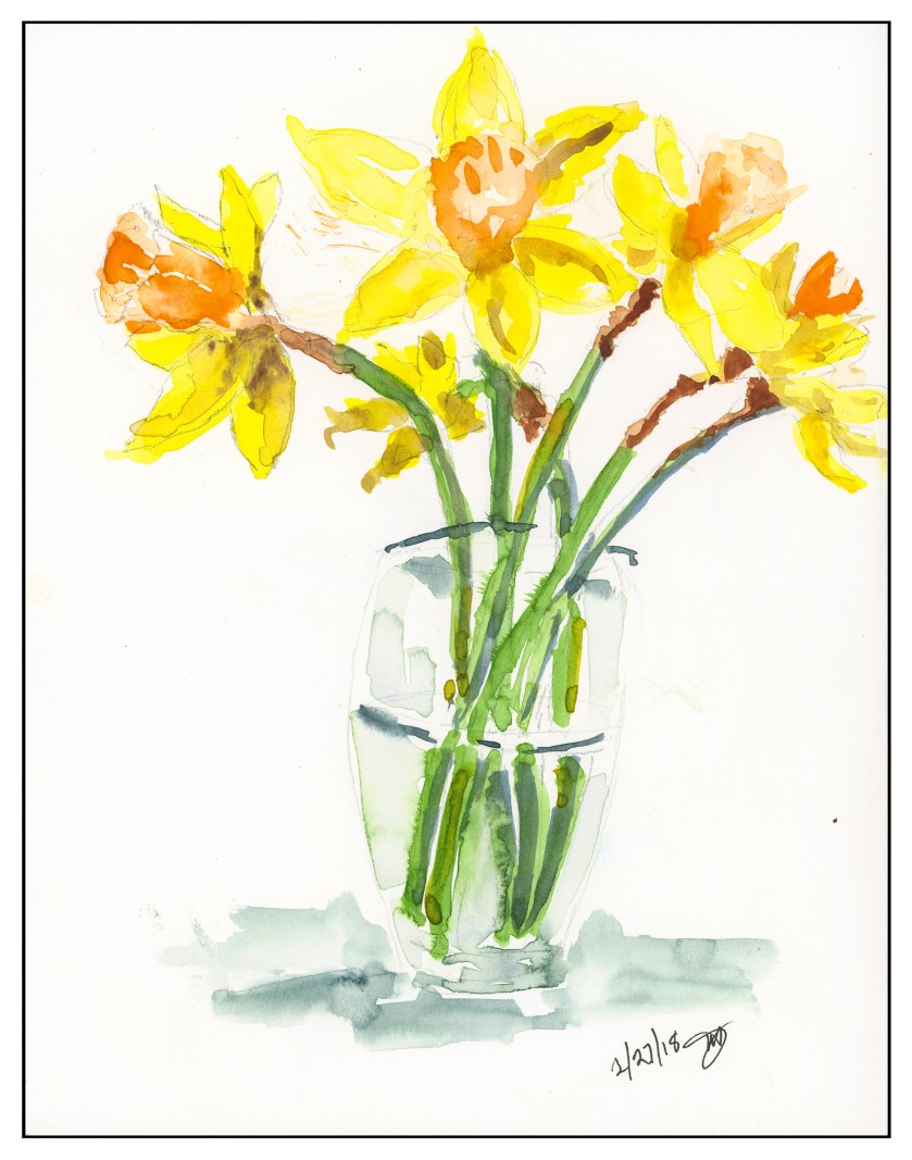
Painting flowers well is a lot more difficult than it seems.  Part of it is just getting the colors correct, and the shadows.  A sense of depth and shape is not quickly achieved for me at present – I am still trying to get that.  Still, doing a quick morning watercolor before work is a good exercise as I think about various things.  This daffodil is from this morning – I spent about 20 minutes on it from beginning to end before getting ready for work.

Tonight, I plan to do another daffodil, preparing for it by making a value study in pencil.  This morning’s painting, and yesterday’s, were done directly onto the paper, preceded by a pencil sketch on the paper.  Let’s see if a value sketch proves to lead to a more successful sense of contrast and depth.

Lines of Bodie

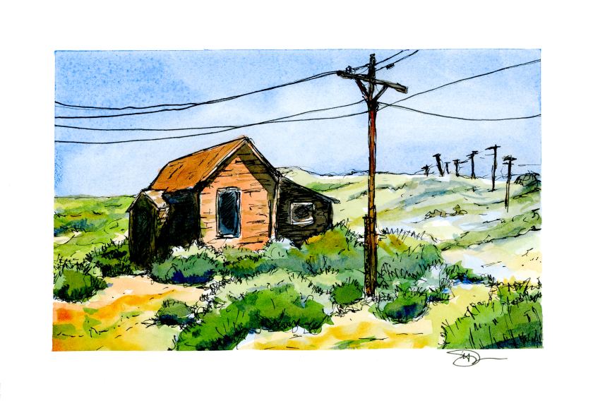
Today I ventured out on my own, influenced by practice sketches by Peter Sheeler and his videos.  This is from a photo I took in 2016 up at Bodie, California, when it was moving toward noon on a hot, hot day in August.

I rather like the composition, particularly the lines of poles marching over the hill in the distance.  If you ever have been to Bodie, you know it’s a long drive down a long and bumpy washboard road.  The telephone poles and lines emphasize the town’s isolation.  As far as painting the subject matter, I started out with a line drawing, painted, and then came in again with the ink pen.  It was so, so, so hard to not try to draw and paint every line and rock.  Simplification was a big challenge for me.

As I painted, I worked hard to recall what I have learned doing the practice studies.  Keeping things simple also meant keeping the palette simple, and the brush choice as well.  I started out with sky in Cobalt Blue after wetting it down with a big round brush.  Then I kept myself isolated to a dagger brush – first time to use one, too.  The remainder of the palette included Quin Gold, Burnt Sienna, Ultramarine Blue, Sap and Hooker’s Green, and by accident, a tad of Indrathene Blue.  The paper is 5×7 Arches Hot Press and taped down with a 3M painter’s tape with specialized edge-sealing qualities, which really worked to keep the tape from pulling up as it got wet.

Overall, I like the lack of mud and the contrasts I developed between light and dark.  Pen and ink come to save the day again!

California Oak Trees

Today, my little Meetup group went to a local place, the trail by the Chumash Museum nearby my house.  (The Chumash are a California tribe.)  We were there for about an hour.  I began with a pencil sketch, and then, color.  We were settled in a small oak grove, with dark and light contrast about as contrasty as you can get.  At the end of the hour, this is what I had painted, knowing full well I would look at it and work it a bit once home.

Once home, I looked at the painting.  Still a need for contrast, and a bit more detail.  More pen, more ink brush, more colors, and some warmth.

Overall, the one above came out okay, but if you look on the mid-right, to the left of the furthest trunk, there is a bit of an odd space, so I went in and worked it a bit with ink to try to mitigate it.  I found it very distracting.  Here is the final image below.

The area has a few more lines in it, a bit busier, but somehow more in keeping with similar areas of the painting.

I used Koi watercolor brushes and the following paints:  Quinacridone Gold, Naples Yellow, Hansa Yellow Medium, Cerulean Blue, Cobalt Teal, Ultramarine Blue, Indanthrene Blue, Phthalo Green, and Burnt Sienna.  I used a Stillman & Birn Beta Series 8×10 inch softcover notebook, and scanned the images using my trusty, not rusty, Epson V600.  Ink is Carbon Ink, and an ink brush.

Working with Contrast, or, A Day Without Mud

Today, my little Meetup group was really little.  Initially there were to be 4 of us, but one cancelled, and then the third unfortunately got very lost using her GPS.  She wrote she was 3/4 of an hour late . . . and we waited 10 minutes, too.  Next time I post a Meetup meeting, I’ll spell out directions, so hopefully that won’t happen again.

So, contrast.  I am dreadful with it.  And with painting things so that they look like things rather than blobs of color.  However, that is probably something that time and experience will cure.  Today, though, I did manage to not turn everything into mud – a major accomplishment, let me tell you!

We went to a local place, the trail by the Chumash Museum nearby my house.  (The Chumash are a California tribe.)  We were there for about an hour.  I began with a pencil sketch, and then, color.  We were settled in a small oak grove, with dark and light contrast about as contrasty as you can get.  At the end of the hour, this is what I had painted, knowing full well I would look at it and work it a bit once home.

As you can see, I did leave areas of white!  Another first . . . As I was painting I made a monumental decision, too:  paint long horizontal stripes to represent the grasses under the trees, and the shadows crossing the foreground.  I sat there and painted stripes.  It was nerve wracking.  The blobby white areas were deliberately left for consideration later.

And once home, I looked at the painting.  Still a need for contrast, and a bit more detail.  More pen, more ink brush, more colors, and some warmth.

Overall, the one above came out okay, but if you look on the mid-right, to the left of the furthest trunk, there is a bit of an odd space, so I went in and worked it a bit with ink to try to mitigate it.  I found it very distracting.  Here is the final image below.

The area has a few more lines in it, a bit busier, but somehow more in keeping with similar areas of the painting.

My palette was somewhat unknown!  That is, I was not really sure the names of the colors as I was using them, but I do have a list of how they are laid out on the palette, which is why I can tell you now!  I used Koi watercolor brushes and the following paints:  Quinacridone Gold, Naples Yellow, Hansa Yellow Medium, Cerulean Blue, Cobalt Teal, Ultramarine Blue, Indanthrene Blue, Phthalo Green, and Burnt Sienna.  I used a Stillman & Birn Beta Series 8×10 inch softcover notebook, and scanned the images using my trusty, not rusty, Epson V600.

Texture iii, BW

Texture, iii BW

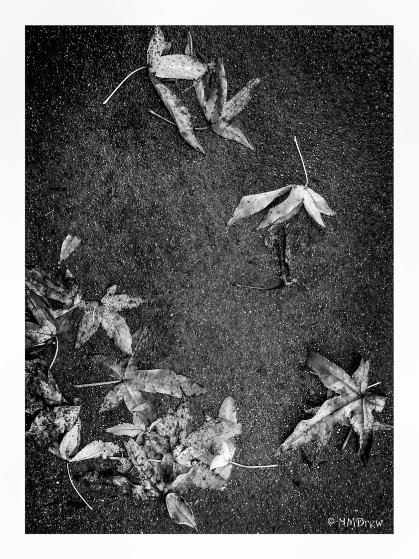
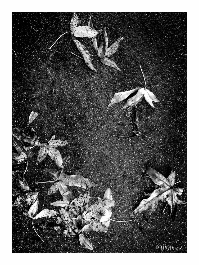
Black and white can be very difficult if not done properly – contrast has to be there, whether long scale (lots of grey between the blackest black and whitest white) or short scale (little grey between black and white).  Long scale images may never reach black or white, and may not work at all.  Certain colors work better in b&w with a filter.  So much more stuff, it seems to me, needs to be learned when shooting in b&w!  I struggle with it.  Above is longer scale; below is shorter scale.  The red leaves were really difficult to render.

Texture, iii BW v. 1