Siena Blue did a series of 30 gouache studies – and she/he did a beautiful job! Inspired, I have decided to do a series of gouache paintings over the next several days, but I am not setting myself a goal as to how many. Gouache can be returned to easily enough as the paint re-wets quite well. As I have not worked in gouache lately and my life is going to be rather crazy over the next few weeks, it seems like the perfect medium for playtime.
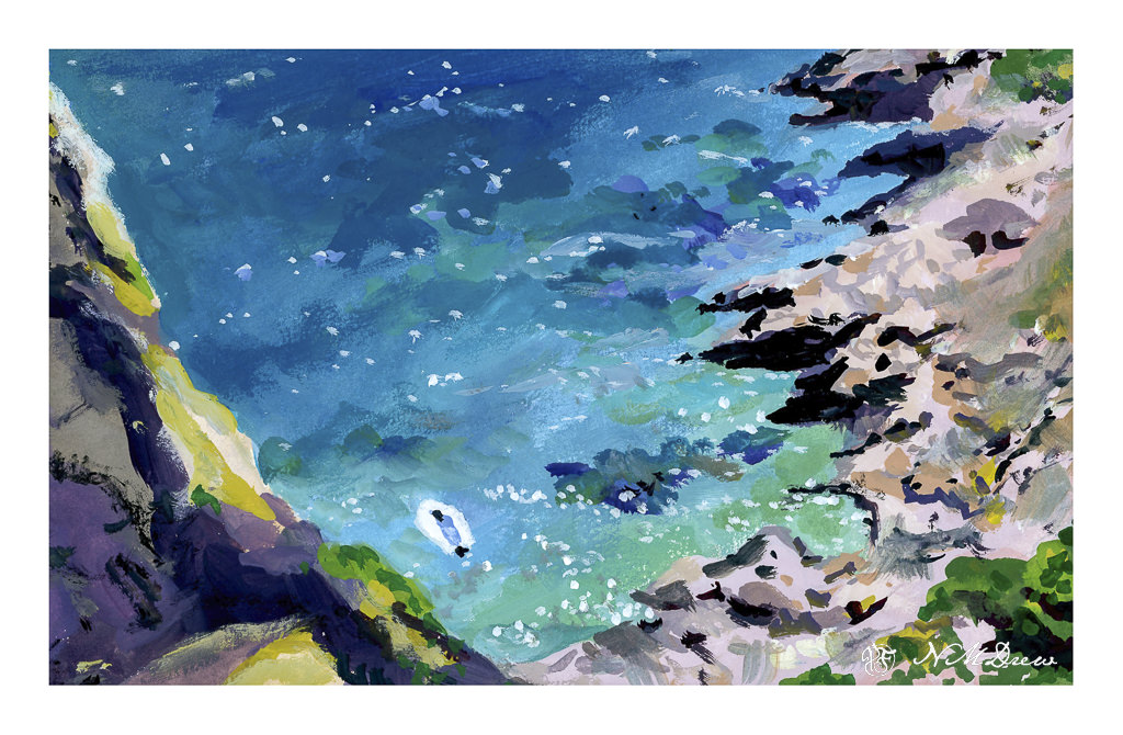
So, a view looking over the edge of a cliff (I assume) taken somewhere on Capri – thus states the Pixabay description. As it is now summer, a rocky coastline, and a moored sailboat on a turquoise sea is quite a pleasant thought!
When I first began exploring gouache I found the work of Lena Rivo, observed her YouTube videos and took her short course. Both really helped me get a sense of how gouache works – it’s not watercolor nor oil or acrylic – and has an odd opacity that takes some getting used to – the colors are unique in many ways as there is a lot of white filler in the colors. Good quality gouache paints are opaque and cover well. All of my colors here are the same Lena Rivo uses, made by Holbein.
Gouache, about 8×10.