Toward Yaquina Head

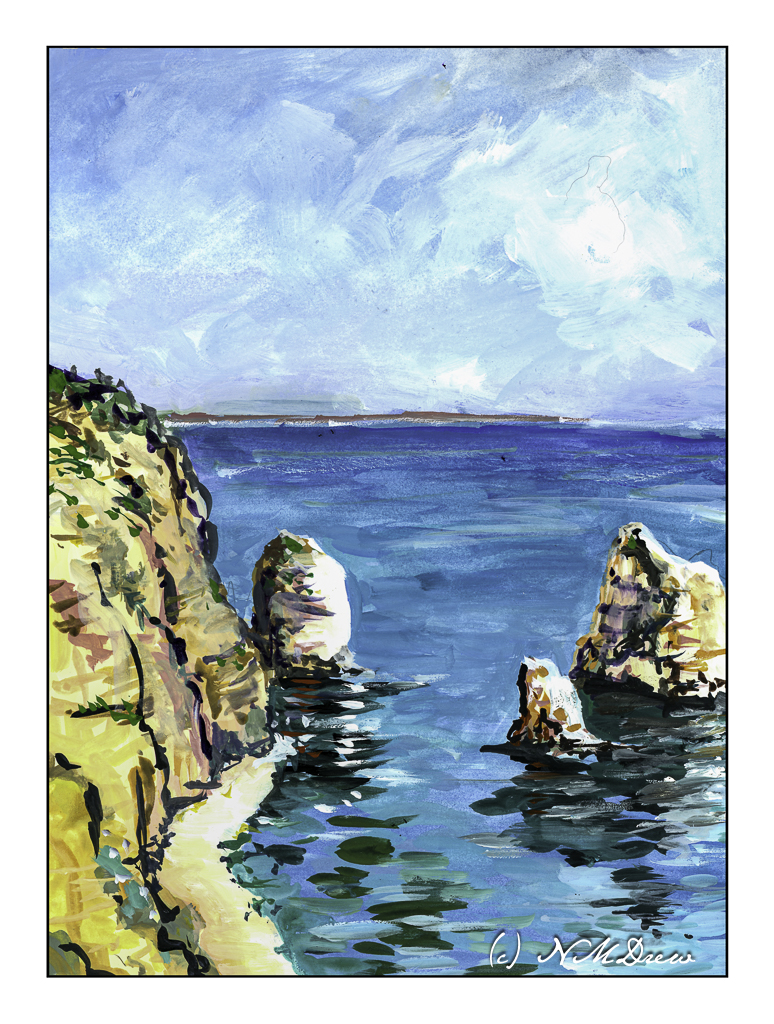
Awhile ago I went to Newport, Oregon, with a friend. We spent a few days there and went to the various touristy areas around town as well as visited the Yaquina Head Lighthouse. It was a rather overcast day, quite chilly for the middle of summer. The hills were green and filled with wildflowers, the sea air fresh. Coming from a dry SoCal, it was a bit of paradise! I took a lot of photos, and this painting is based upon one of them.

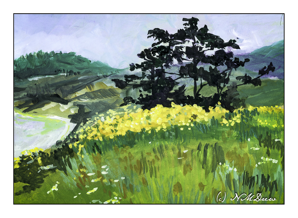
The medium of choice was gouache with a tan heavy-weight paper as the surface. I usually paint on white, but as I have a big tablet of it, I decided to go ahead and try it out. I rather like the results, but truthfully have no idea if the tan paper makes a difference in the final appearance. The whites do seem brighter in this painting than they usually do, so perhaps there is merit in using toned paper. More paintings on the toned paper will be done as I like the surface for the painting.

Gouache, tan toned paper, 7×10.

All on a Saturday Afternoon

There are times when it seems all the piddly little things pile up and I spend my days doing them, like a list of a million bits of this and that. It gets depressing. It is important to do more than just tasks and chores and the to-do list. Today, after spending too much time on oil painting and working on getting myself organized, I just pulled out the gouache and some paper and played.

First around, trying a paper that I haven’t tried before. This is an inexpensive cotton paper with a decent texture for watercolors, but too much texture for gouache. I had forgotten that gouache is much better on smooth paper. I chose flowers as it is summer time.

I have yellow cosmos – a bit past their prime – in the front yard. A tall, jolly mess!

Here, echinacea. I often grow it, but this year did not. I like the way the petals fall back and the center is bright orange and black with bits of yellow. Not a good painting – too dark and messy.

Mullein is a wild plant but it has been hybridized to grow in colors such as pale yellow, lavender-pink, and whitish. It is normally a yellow flowering plant with dark centers. I have thought of growing them but so far haven’t. Maybe next summer.

And then, I moved on to a smoother paper. Here, a coastal scene with rocks and sea and clouds and a distant shoreline. Here in California the coastal fog comes and goes, making for some chilly summer days!

I like this one the best, in part because it was easier to paint on smooth paper. Gouache is such a fun medium as it is easy to use, never looks real but does, and so on and so forth.

Altogether, a nice way to spend an afternoon outdoors ignoring the list of petty crap that seems to be dominating my life these days . . . .

Above the Bay

Back to California, Edward Seago as a mindset.

Up north along the Pacific are many beaches with dramatic cliffs, sandy beaches, fog, and it is always exciting to drive along the coastal route – usually Highway 1 – to enjoy the scenery. Sometimes you need to wander a bit off the beaten path to find a bit of paradise, but exploration is always fun!

I don’t remember what colors I used specifically, but I do recall ultramarine and cobalt blues, burnt sienna, yellow ochre, cadmium yellow, Hooker’s green, and possibly a bit of alizarin. The scene is a bit soft because the coastal fog, prevalent along the California coast, is in the distance. The air is moist. And, it is chilly! Mark Twain supposedly said the coldest winter he ever spent was a summer in San Francisco. You know what I mean if you have experienced it!

We all have our own styles and methods of painting, and in some ways I like the way I paint, in other ways I dislike it a lot. Here, I focused on simplification but in some areas did a bit more working of a subject than I should have, such as on the right distant cliffs, ocean, and sky. The estuary below the headland is simple enough – at least I realized that and didn’t do anything more to it. My bush is also okay, but perhaps it could have been simpler – or the foreground, too – but when something is close to the viewer, details do become important. Each leaf and blade of grass, though, would be excessive.

Hahnemuhle 9×12 140# CP paper, watercolors, Northern California.

Coastal Fog, Morning

I am trying to lighten up my handling of watercolor. Very often my colors are far more intense than I really want. I think part of this is the result of impatience and perhaps pre-cataract surgery days. Watercolor itself lends itself to a delicacy other media lack, I think, and to not play into the wetness and what it can do perhaps defeats watercolor’s beauty.

There is something about fog and early morning that always fascinates me. The idea that a cloud is on the ground (my father’s description of fog when I was about 5) still intrigues me. After all, clouds are UP!

So, a morning along the coast. Wet, soft, blurry, and giving way to a sunny, summer day.

Arches CP 140#, 9×12, watercolor.

Coastal Hills in Late Summer

Since I had all the pastels out from Tuesday’s class, before I straightened up the mess in the studio, I decided on another study. This time, the oak-covered hills of California. In spring, the hills are brilliantly green, often covered with wildflowers, such as poppies and lupines. As spring gives way to summer, the heat comes, and the grasses dry out. Perfect conditions for all these dreadful wildfires of late . . . Anyway, the coast can be socked in with the summer fog, but inland, the hills are under the brilliant sun. As you look toward the Pacific, you can see the “fog monster” lurking on the other side of the range.