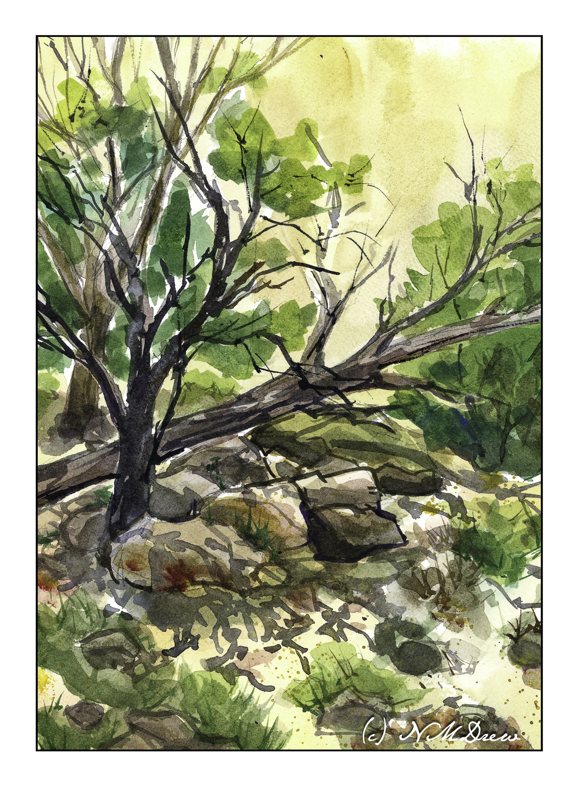
In the corners of southwestern canyons, near seeps, there is always something growing. These places are subject to harsh conditions, but somehow nature has evolved and beautiful trees and plants provide food and shade and protection for wildlife. And me.
I was really drawn to the contrast of the dark trees and shades of green against an ochre canyon wall. The shadows and the trees and brush create complex patterns in what is often a very barren landscape.
Pixabay is home to a lot of great pictures! I used one of them – as you can see below – to create this watercolor. Unfortunately, the scan doesn’t show the real warmth of the rocks as painted very accurately as it could, but c’est la vie.
I chose this subject because the warm rocks on the left and right of the photo move into cooler ones as atmospheric conditions work their magic. The foreground of the photo is very dark and trying to catch the details and put them all in shadows was also a challenge. I also tried to create a focal point for the watercolor, namely the point at which the Virgin River, in the lower middle center of the painting and photo, turns. At this apex I also tried to create some visible interest to lead the eye into the canyon beyond. Of course, the big rock structures also add to this sense of depth.
Painted in watercolor on Kilimanjaro 140# CP paper.
Another rendering of another artist’s work! This is from a (what else?) YouTube video by Roland Lee, an American watercolorist who paints the national parks of Bryce and Zion with a beautiful and delicate touch.
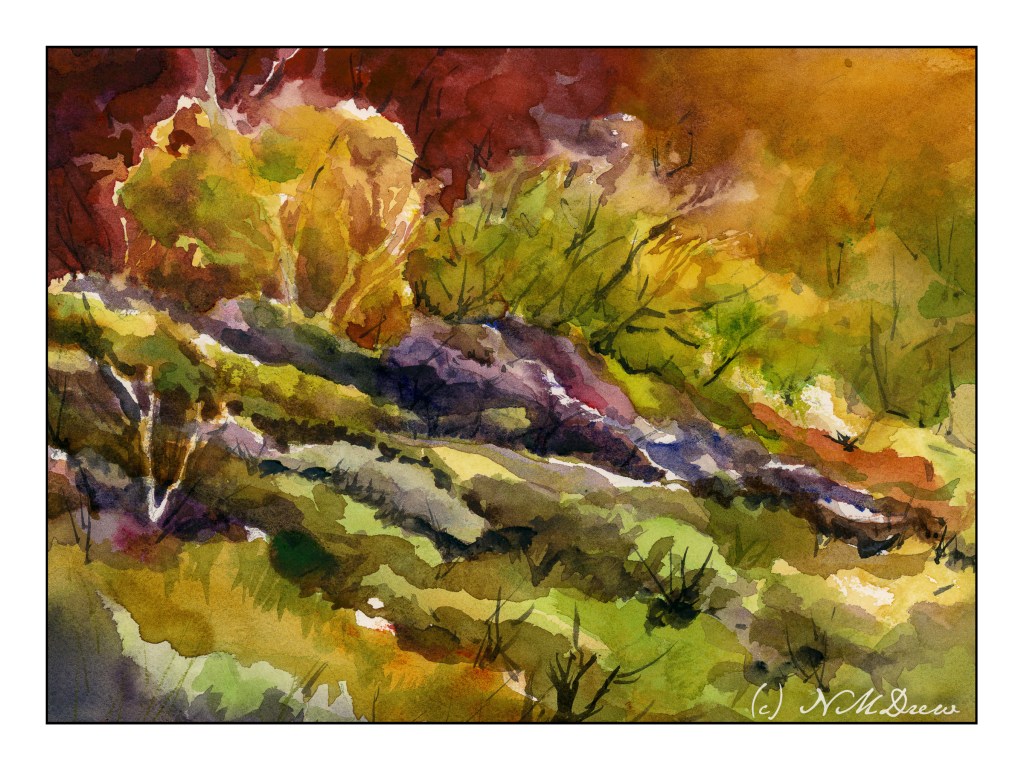
The subject here, of course, is landscape, but here are more subtle renderings of nature – here, more trees – using negative painting. I added a few of my own touches, of course, but the point of the lesson was observed and learned to a degree. Not easy to do, not easy to follow, but I rather like the results. More practice to come, too.
Learning from a paint-along is rather fun, at times daunting. I used to think of my paintings all as “failures” because I never replicated the teacher’s work. Of course, that is silly, but until I could let it go, as well as become more adept at watercolors and skilled in their handling, my own paintings would be disappointments. Now I am getting comfortable with my own style, if there is one, as well as how I handle everything. Skills are building.
Done on Arches CP 140#, 9×12.
And here is the video to enjoy – Roland Lee is a good presenter – clear instructions and a deft hand. I know I will be looking at more of his over time.
Another timed painting. This time the requirement was 37 minutes. I set my phone alarm and was shocked to hear it go off! I was checking it off and on, but suddenly it just rang, and here is the result.
This time I used Uart 600 grit paper, which is like a fine sand paper. It pulls the color of the pastels really easily so a lighter touch is required when painting than with the unsanded Mi-Teintes paper. I used a combination of photos for this one as I needed a creek, but I wanted some oaks and hills from around here. Not especially successful as far as I am concerned; the exercise was the point. I did get into the zone of painting even through I knew that timer would go off at some point.
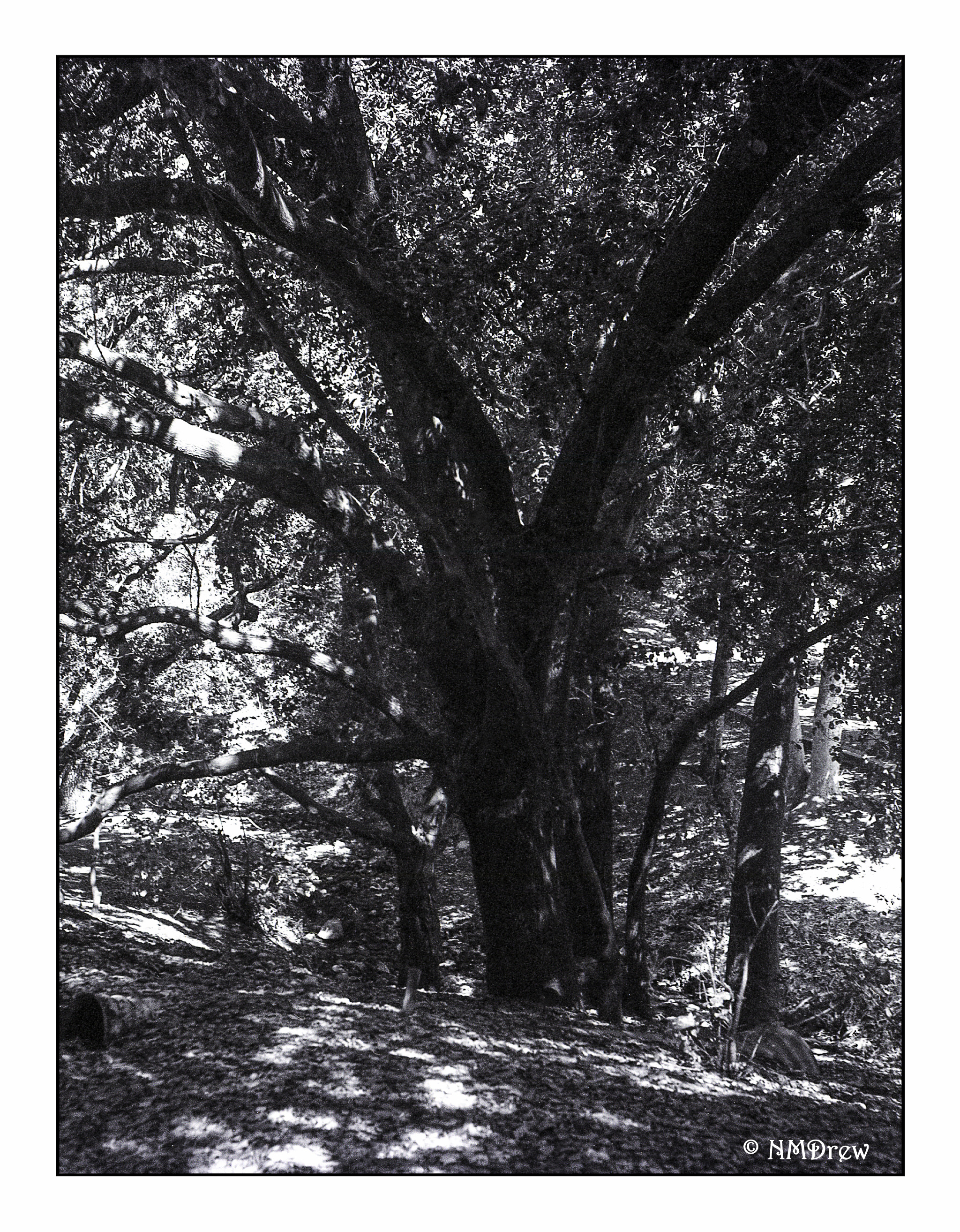
A tree, a sunny day, a canyon, a 1937 folding Welta Weltur camera, a colored filter, 120 film shot in6x4.5 film, Ilford film, a Schneider Kreuznach Xenar 2.8 80mm lens. Such a delight to get back from the lab (even if I have to do a bit of cleaning up in LR)!
If you look closely, you will see there is blur in the image. I finally figured out that the way I was pressing the exposure button was the fault. I did it too quickly, and the result was a sort of little jerk. Motion and blur. That is why some pictures from this roll are sharper and others softer. Interesting how you have to really think about things differently depending on the camera you are using.