Malibu Creek State Park, IV

Note: to see this painting a bit larger, you will need to right click on it (PC) and open in a new tab to see it bigger. WordPress has a new editor and I am not quite sure how to get it to make an image larger when you click on it. Sorry!

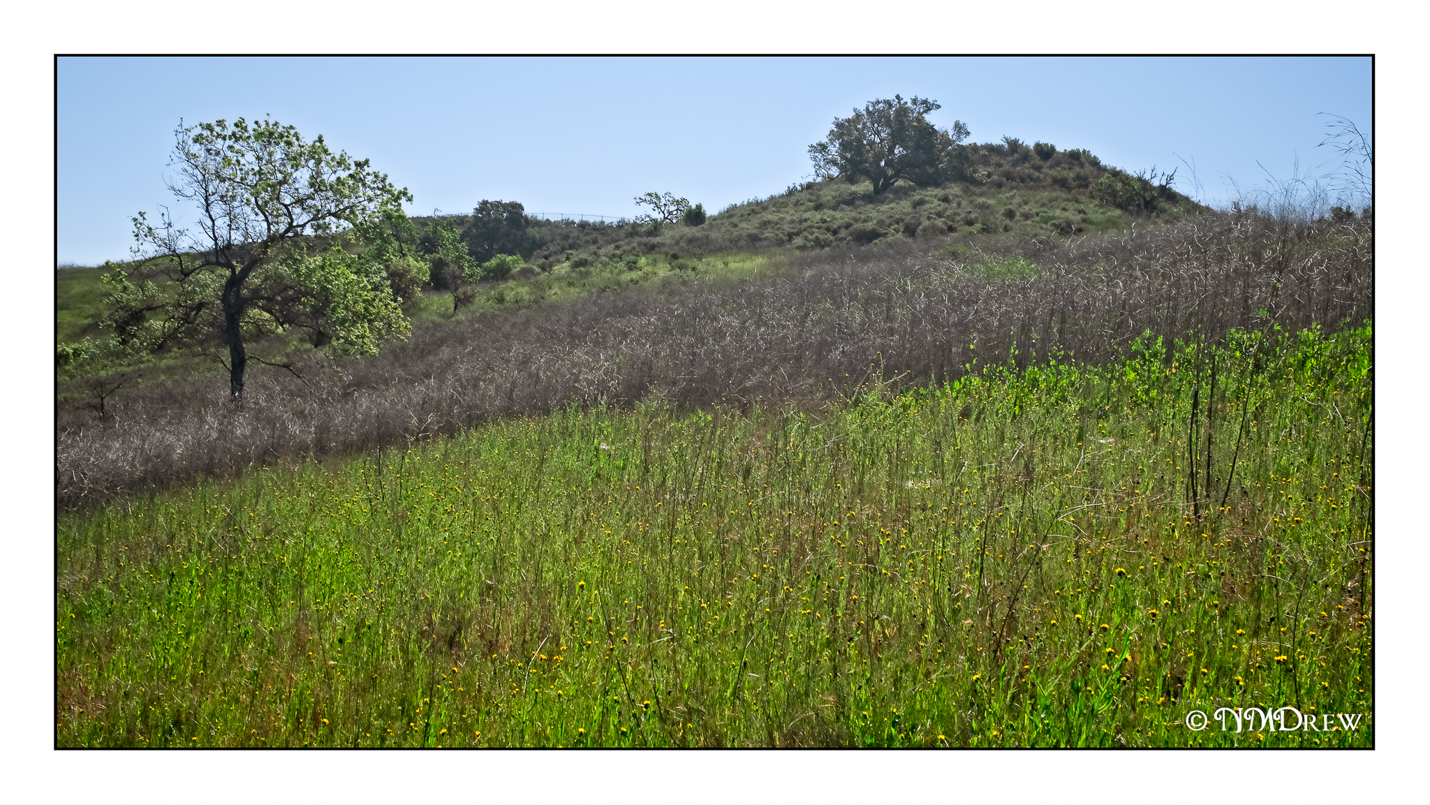
More Malibu Creek State Park, but this time with a different twist. The water is there – in the form of misty air. In spring and summer the coastal fog rolls in, and the landscape softens as it recedes. It doesn’t bring rain, but the environment is adapted to live on the moisture. As well, the land is often green from the rains earlier in the year.

I tried to capture this with washes and glazes, working wet-in-wet as well as rewetting the paper and adding color. This type of painting takes a patient approach (at least for me) as you have to load the paper with a bit of water and/or color, and then test it for dampness if you want things to soften and blur. It is also a fun way to express very faint geological shapes in the mountains.

Finally, oak trees. I just love these trees! Here in California they are really twisty and spooky, unlike the more upright specimens in the midwest. This one in the middle of the plain is unusual, but it is there, alone and grand.

A Study from Vernon Nye

I decided to use a study by the watercolorist Vernon Nye.  He caught the back country of California perfectly – the hills and trees in particular.  It was a fun study and I liked it because it pointed out to me how deceptively simple the hills can seem, but they really are not.  The road, too, was another eye-catcher.  I have driven along a number of back-road highways throughout the state, and you feel like you are the only person in the world.  The perspective was a great challenge, too.  Altogether, a good study of something in my own back yard, and I can take what I learned into future paintings.

Last Year, This Year

Fire season has begun! Up the coast, along Highway 101, the first fire has broken out near Gaviota. The land is hilly and grassy, and rugged in areas. This makes stopping the fire more challenging, and when the winds pick up, it can travel so fast. We have been having a heat wave in the 90s F for the past few days – today is supposedly the last one like that in our area. Then, down into the 70s F, which is much nicer. I used to love the hot winds, but they have become more fierce and destructive over the last few years that they are more frightening than ever.

This photo shows what we can be up against. The new spring growth, becoming lush in our seasonal rains, changes to dry, dead tinder for a wildfire. The swath of grey is last season’s new growth.

Tanglewood (Watercolor)

Here is the third painting in the series of three different media, this in watercolor.

For this painting, I used a piece of 16×20 Arches cold-pressed paper.  I laid down some frisket to keep the paper white for sunspots of leaves and the edges of the trees.  From there, multiple initial light washes to establish areas of color (ie sky, leaves, leaf mould, trunks) and from there just sort of let it happen until I was ready to remove the fisket.  Once that was done, greens and darks, and finally the rigger brush for tree branches.

Each painting has it good points and bad points.  Watercolor is the least forgiving of the three, but here I think I did a pretty good job as I do get a sense of the flickering light through the new leaves, and that really was the main point.  This painting and the gouache are my favorites of the three.

It will be interesting to perhaps try the pastel again as I ordered a set of 25 greens and just took possession of a Terry Ludwig Darks 2 set the other day.  The greens are Mount Vision and will arrive Friday.  The pastel was the first in the series, and now that I am comfortable with the values of the painting(s) more, a 4th try and a 2nd pastel may prove to be a good exercise!