Buildings & Boats

If you follow along here at all, you know two things about me.  One is a lack of real depth perception.  The next is my ongoing struggle with perspective.  I have learned that my poor drawing – sloppy drawing, really – due to impatience – ruins a lot of my attempts at perspective in paintings.

I have decided to work on perspective, particularly architectural perspective.  That means buildings!  As a country girl at heart (no cowboy hats, though), I like the idea of buildings in a non-city setting.  No skyscrapers for me.  Instead, a boat house, a farm house, a barn perhaps.  A building along the waterfront, even suburbia.  Why?  I want a few trees and some water.

This is the first in a bunch I intend to do to really work on perspective.  Looking at things dead on is easy, but looking at something with angles is different.  Also, looking down on something from above, or upward from a low vantage point.

Here, gouache.  This took hours.  About an hour drawing and probably three hours painting it.  It works to a degree.  All this for a 5×7 painting!!

The thing is more than anything is to just get out there and do it, no matter how icky it turns out!!

WWM 2019: Days 20-26

#WorldWatercolorMonth2019 is flying by!  It has been a lot of fun, in the doing, pondering interpreting the prompts, and in the progress made from just daily painting.  I have some really awful paintings, and some of which I am rather proud.  So, with no further ado, the prompts and the paintings!
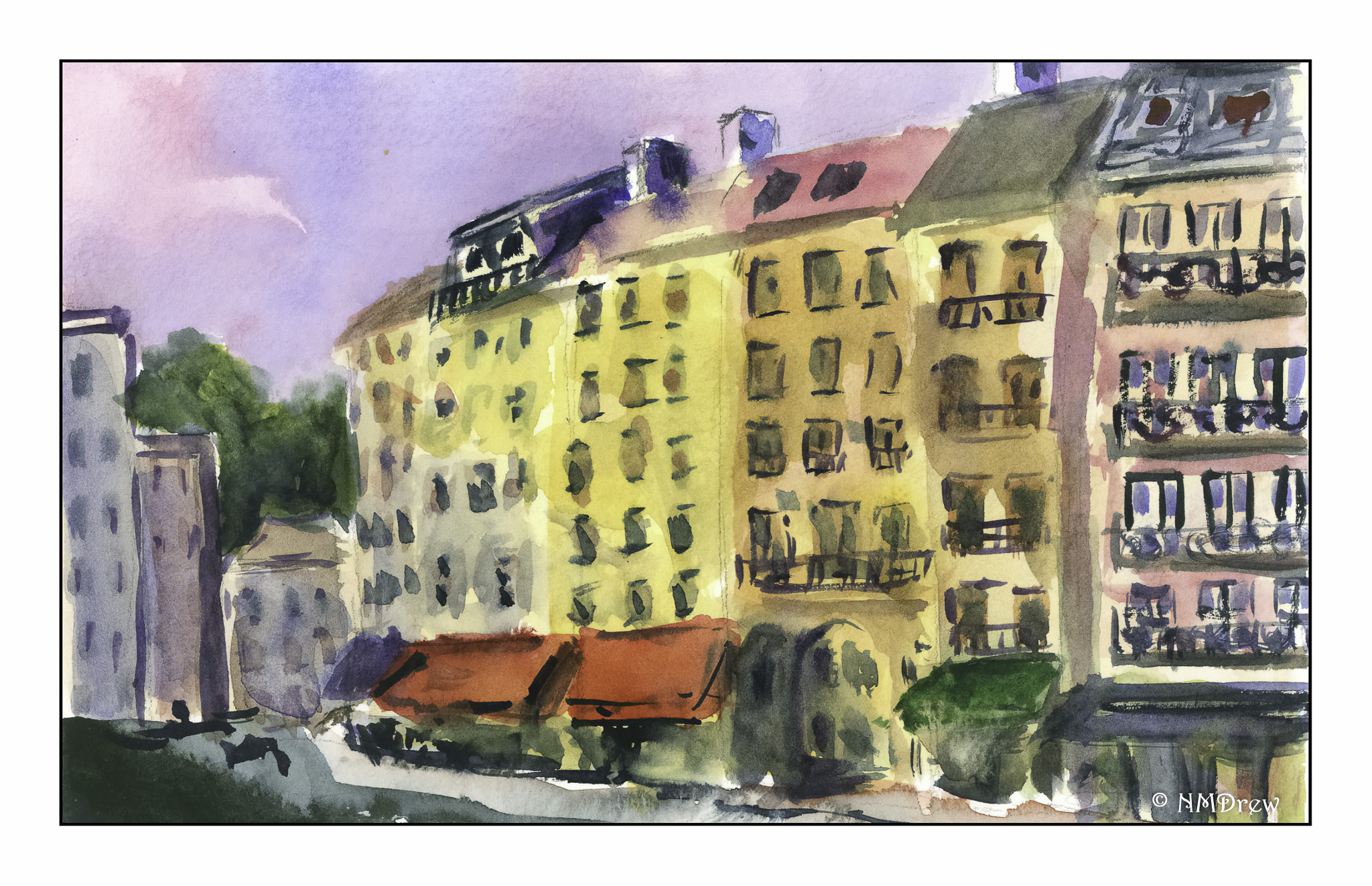
WWM #20:  Buildings

Here, some old buildings in Paris at sunset.  I am rather pleased about this watercolor for a few reasons.  Perspective works, with decreasing detail, lines, and atmosphere.  The sky is pretty killer, too!
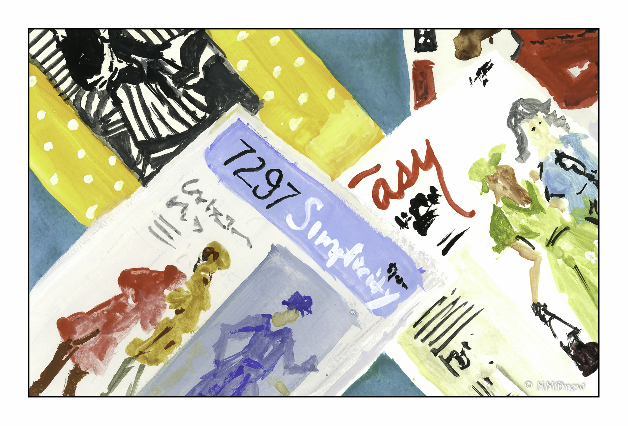
WWM #21:  Patterns

I was pondering this one – I thought of all sorts of patterny things, but in reality, nothing grabbed me.  As my studio – particularly the sewing area – is in total disarray, sewing patterns suddenly seemed perfectly obvious.

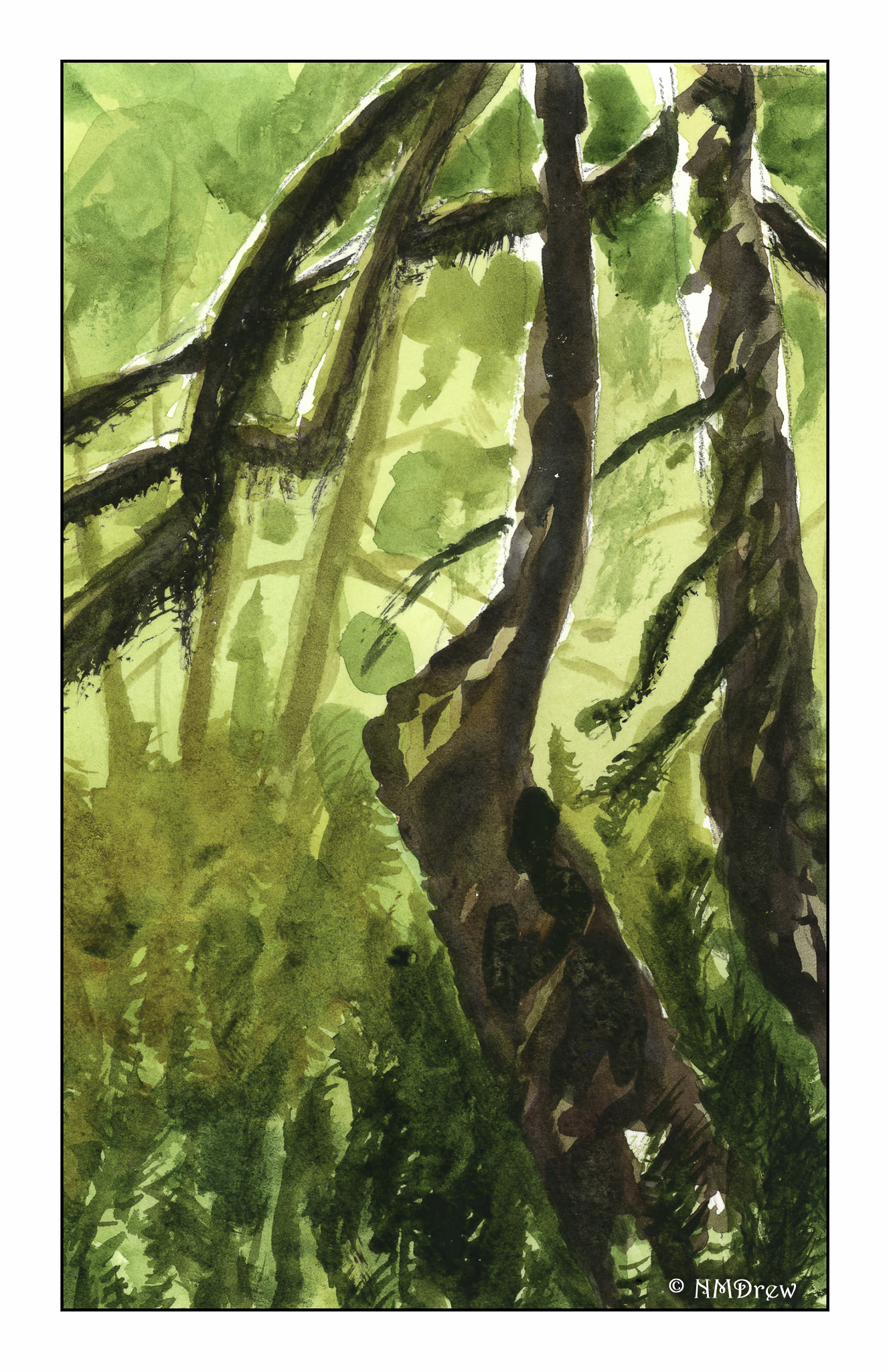
WWM #22:  Rain Forest

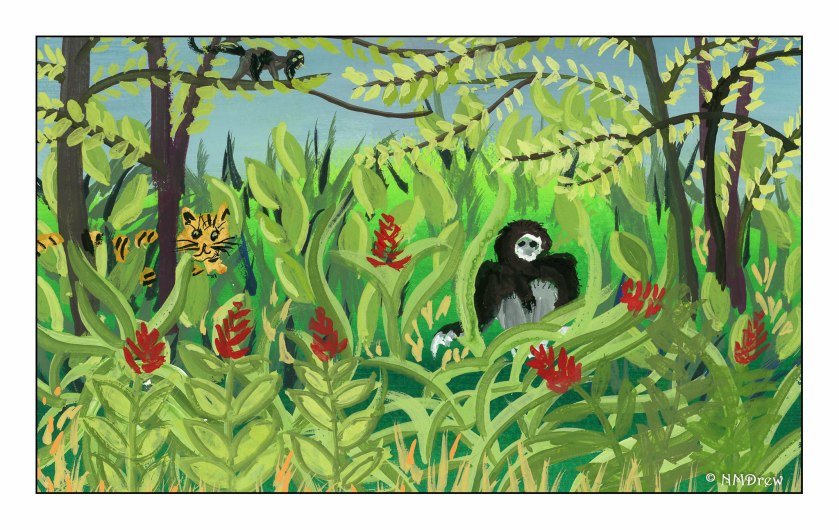
I always imagine a rain forest as the French primitive painter Henri Rousseau showed it. The above is a rather poor homage to his great imaginings.

Here, from some photos and memories of our trip to the Hoh Rain Forest in Washington State. Paths wander beneath ancient cedar trees covered with moss, a green canopy, and little if any sky visible.
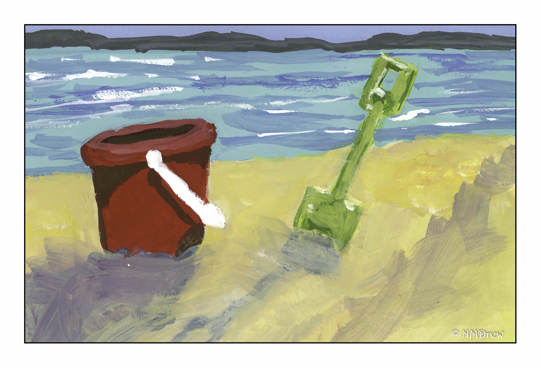
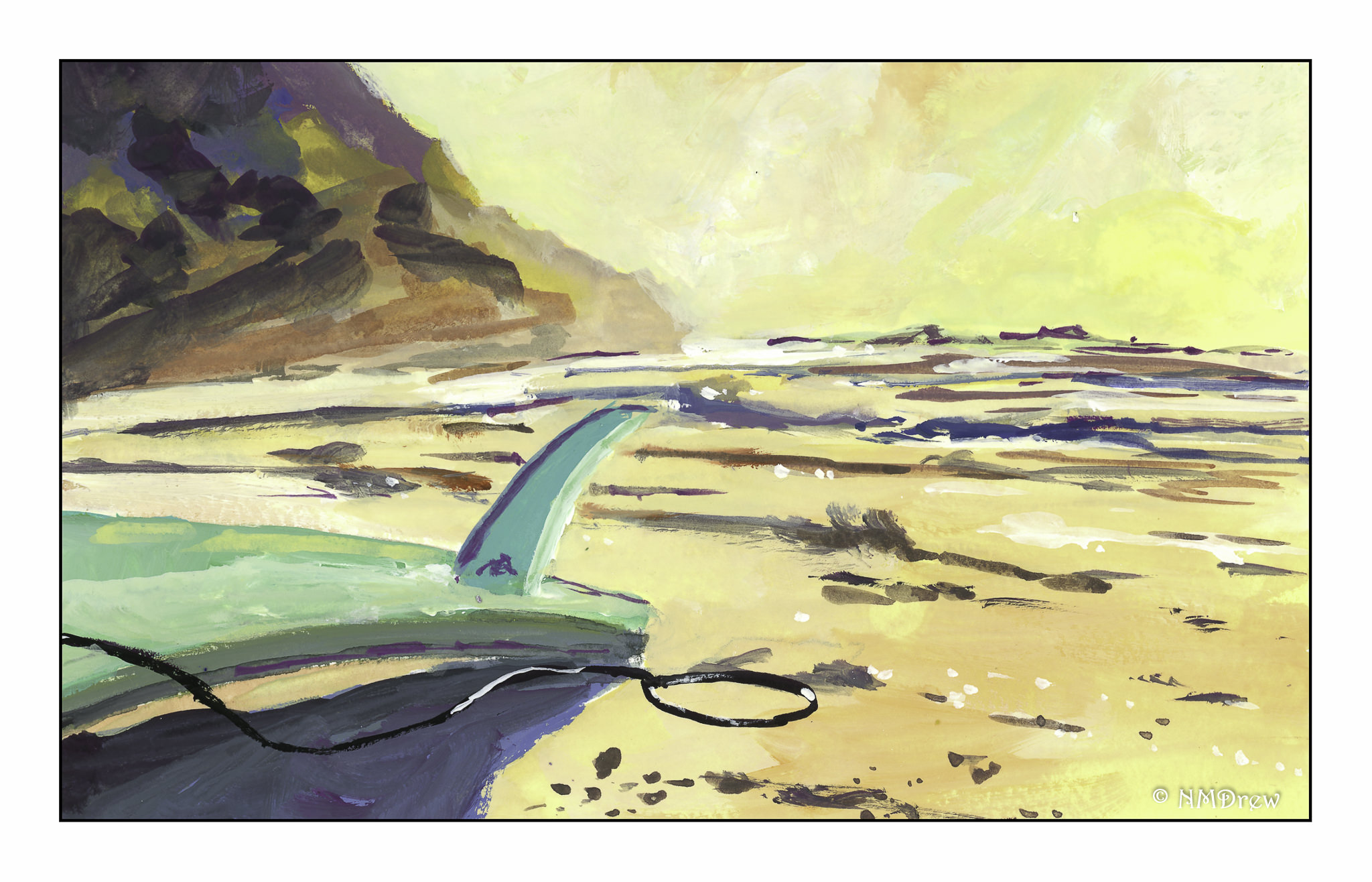
WWM #23:  Beach Fun

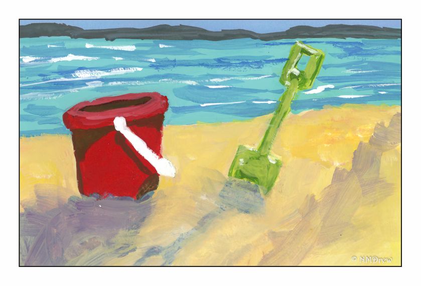
Pales, buckets, and surfing at sunset – all great fun at the beach!
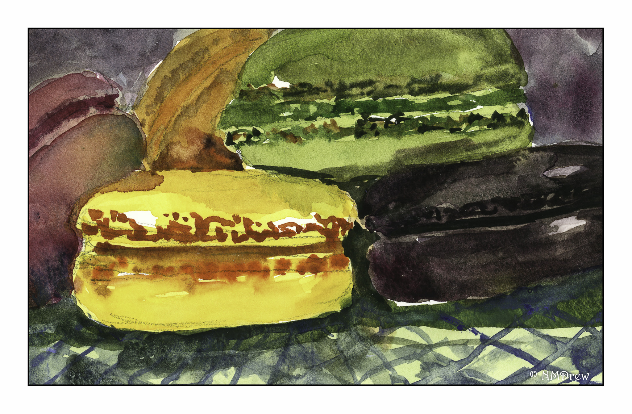
WWM #24:  Treats

Cookies!  I really love cookies (but like pie better, I admit), and for elegance and color and delightful flavor, macarons!  Here, lemon, mocha, pistachio, orange, and raspberry.

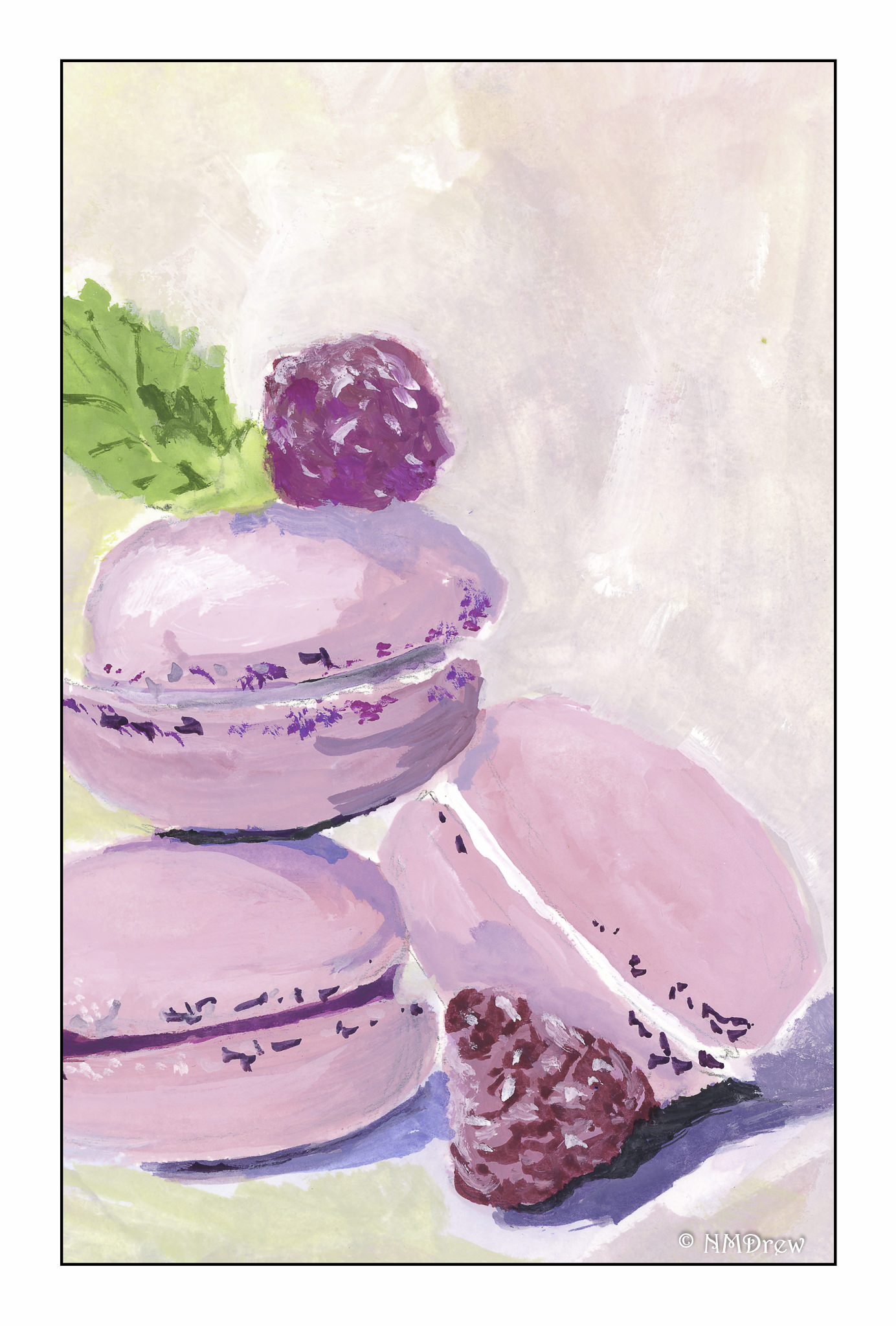
WWM #25:  Shades of Pink

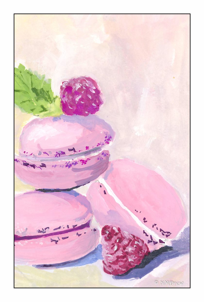
I have to say, I like these raspberry macarons a lot!

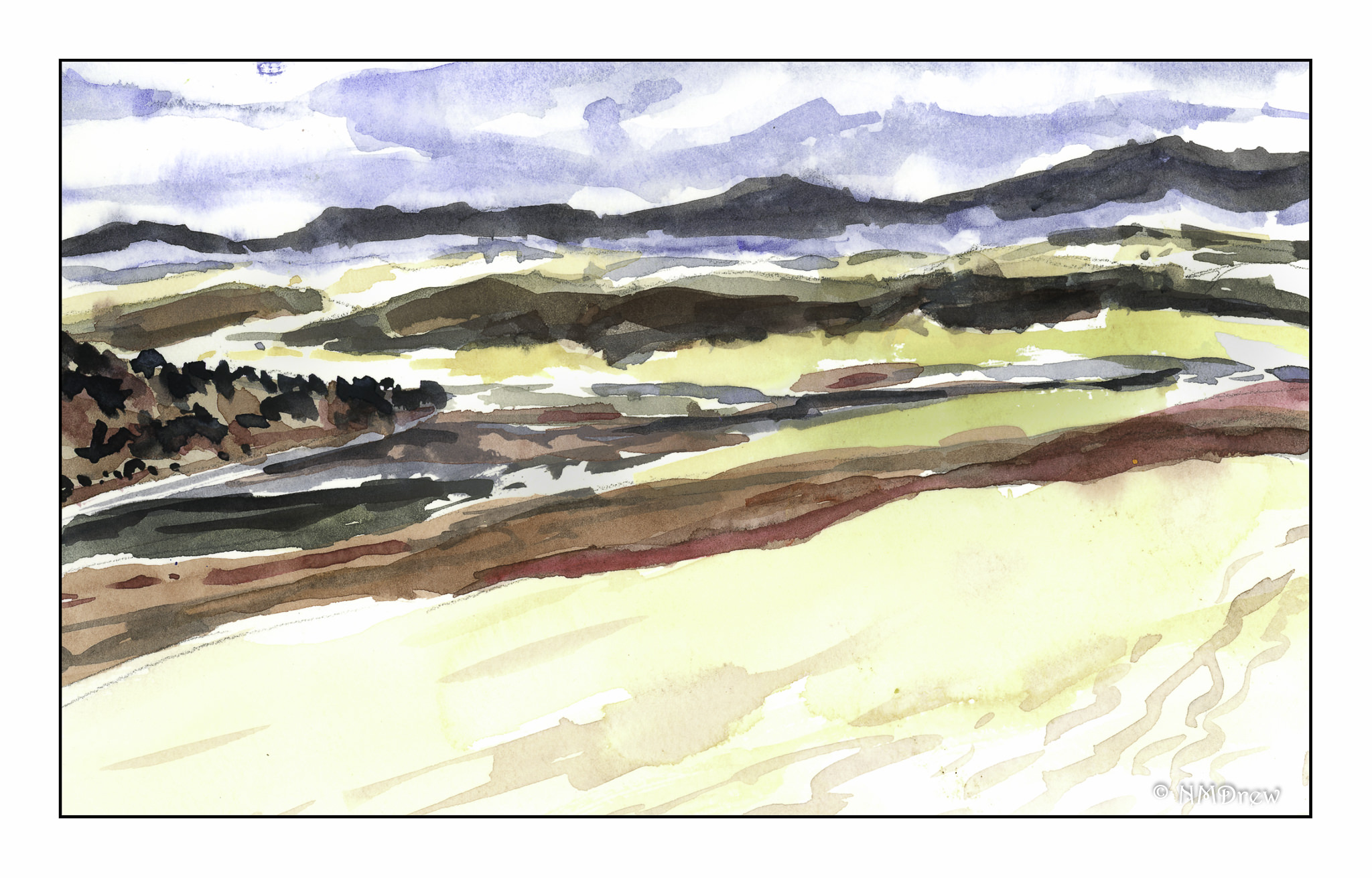
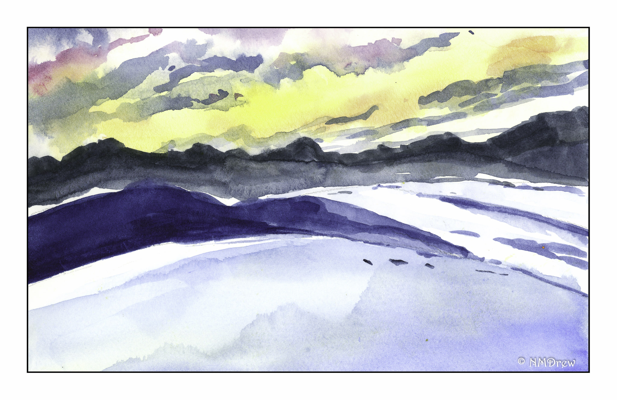
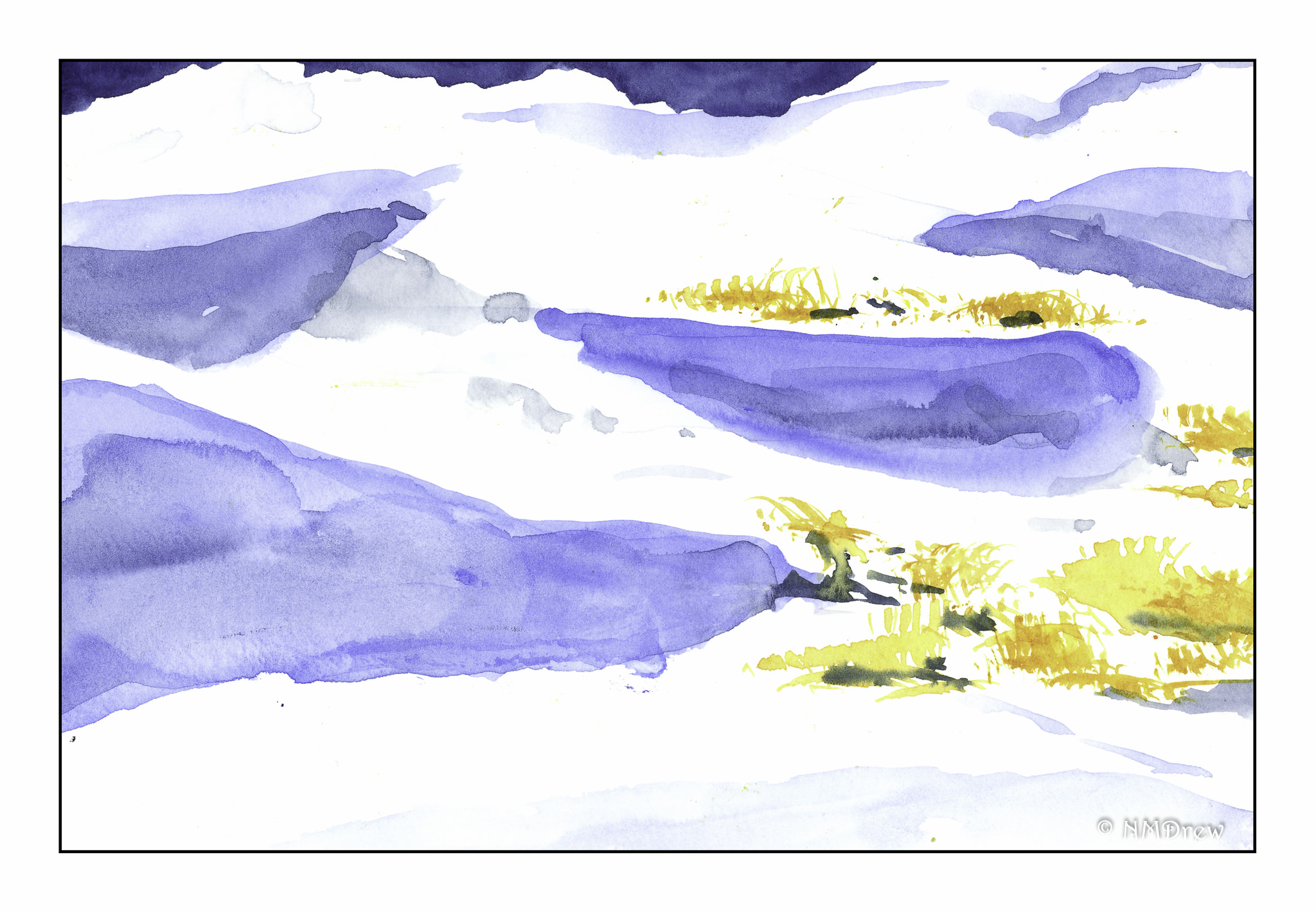
WWM #26:  Natural Wonders

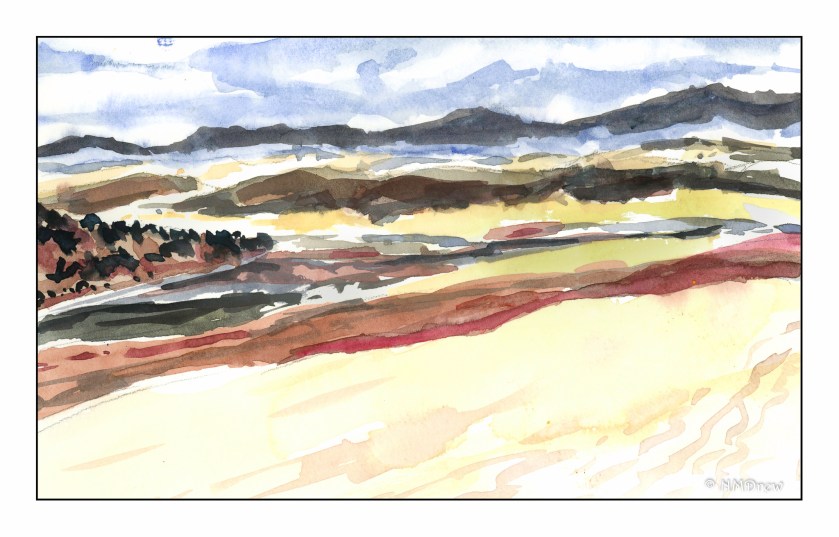
The White Sands National Monument in New Mexico is an amazing place – white sand dunes in the middle of a desert, scant plant life, dramatic skies and mountains all around.  It was also incredibly difficult to paint the whiteness of the sand . . . nothing particular awesome about my paintings.

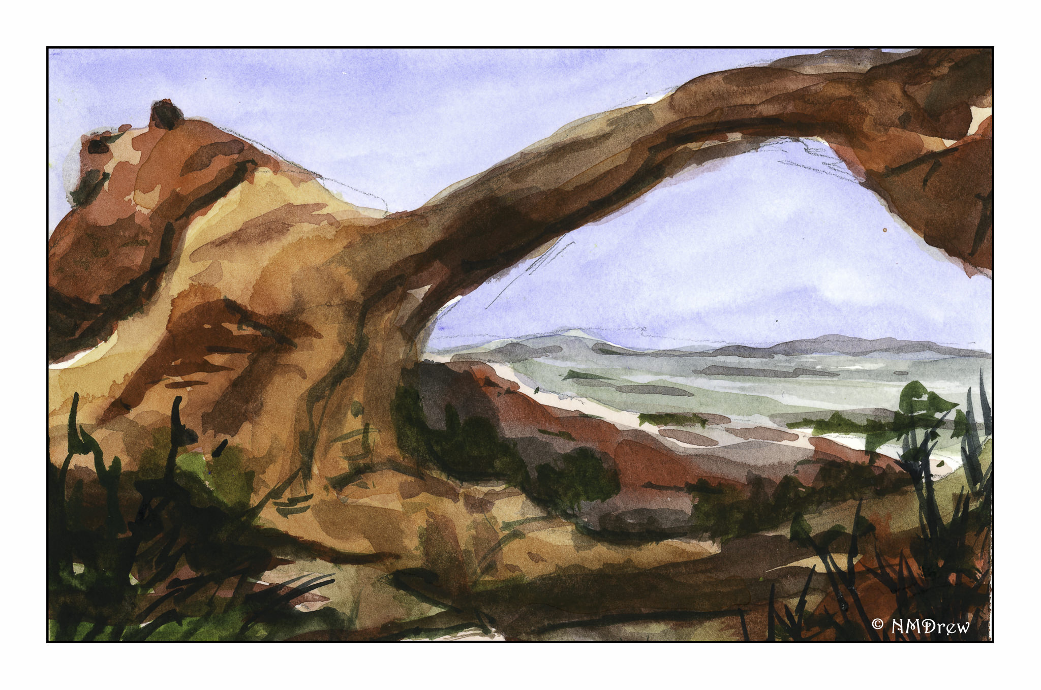
On the other hand, the Arches National Monument has some amazing things to offer – arches being one.  The sandstone, eroded by wind and rain, has left some amazing geological remnants behind.  This watercolor really pleased me . . . again, perspective and distance issues, as well as my usual problems with conveying depth.  To do so, I simplified the background hills with a few lines of color.  I put more detail into the middle ground, which was the arch and the red sandstone behind the arch, and in front of it.  Plants on the lower corners and border became the foreground.  To aid more in the depth, I did a light blue-grey glaze over the mountains, and applied a warmer glaze a couple of times in different areas of the arch and sandstone.

To be continued!

WWM #20: Buildings

Where I live, a building is a house surrounded by the rest of suburbia.  I don’t live in a city.  I don’t live in the country.  Sometimes I wish I could transport myself to someplace so very different than where I live now.  That said, one can travel in one’s imagination, and that is what I have chosen to do here – a street in the early evening somewhere in a gracious part of an old city.

While this is not a perfect painting, I did have some goals in mind while painting “buildings” for the #WorldWatercolorMonth2019 prompt.  One was to really work on perspective.  It’s pretty well nailed here.  Another was negative painting – keep some paper white.  Here, the chimneys up in the sun.  I wanted details to show perspective – the closer to the viewer, the more details, as can be seen the closer to the right the buildings become.  A lack of detail to show there is distance.  Finally, I wanted to use light glazes to designate where the sun is on the upper buildings, and not on the lower part.  Here, light quinacridone gold on top, light cobalt on the bottom.  I rather like the way the street is striped in shades from dark to light, but as to whether it is realistic is not a question I care to answer.  In general, I think the sketchy elements of the watercolor work well with the colors and lines to convey feeling and mood.

For “buildings” I knew I wanted a loose, light painting.  This one is on a small sheet of paper, and I expect the final image is about 6×8 inches (could measure, don’t feel like it!).  I used both small and large brushes, a bit of imagination, a bi of memory of previous reads on perspective.  I found the most interesting thing I did was to do the sky last!  I really think it works well with most o the painting.

Later!

WWM #19: Splashes of Color

I’ve been thinking about how I am developing a sort of painting style in gouache, as well as giving thought to the painters whose work I admire.  It definitely falls in the impressionistic and expressionistic varieties.  Gouache just seems to be made for exuberant color and enthusiastic brushwork.My colors are more subdued that I wanted – I wanted turquoise skies and pink flowers and a brilliant sunset.  Instead, I have a rather northern European type of town scene, with a garden or flowering park in the middle.  Summer’s abundance flourishes under the trees, but in the shade it seems.  In doing this painting, I didn’t do much planning.  I stuck to the prompt of “splashes of color” – and splash I did.  The result was a serious loosening up of my style, and a letting go of “this is what I want it to be.”  That is significant – I can be a real tight ass about painting, and in the end dislike the results.  When I let go – let things splash – I am usually much, much happier with the results.

Regardless, both paintings appear muddy to me.  I wonder if working with pure color – straight from the tube – would help.  Practice certainly will.  The flowers in the vase seem a bit overworked, too.  Again, practice and experience.

So, lots of splashes of color for #WorldWatercolorMonth 2019 is producing some rather pleasing results and, more than anything, a daily involvement with painting.

A Matter of Perspective

Still working on my buildings!  And in the process I realized I am dreadful when it comes to both depth of field and perspective.  If you look at the roof of the building centered in the sketch, the line for it is much, much steeper than the building adjacent to it.  The same with its door.  It was that steep angle of perspective I was trying to follow – and failed.  I have a few books on perspective – time to dig them out and study them quite seriously.  I don’t think it will be that difficult, but I need to learn a few tricks.  On the other hand, I am rather pleased with the sense of shadow and sunshine . . . there is still hope!