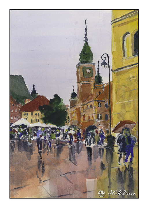
Well . . . I prefer the land, the tree, the ocean, the field. I prefer not people or buildings.
But, I must put aside my prejudices to progress in painting. Andy Evansen’s watercolor course has challenged me to such. I did people, reviewing proportions and where the elbow ends and the knee. People are 7.5 to 8 heads tall, depending.
Buildings and people – crowds – hmm. I usually avoid them, being the reclusive and exclusive and somewhat misanthropic. Nonetheless, they exist. So do buildings. And value studies! This is like trying to fit my tiny foot into a tinier shoe – painful, painful.
I tried this painting in watercolor by starting out on used paper – the reverse of other studies or failed paintings. Cheapness does not do me any good. I was not getting anywhere except PO’d.
I do not like being PO’d.
A new sheet and voila! Life, while not sweet, definitely improved. And I did a crowd of people, and buildings in a plaza, and only one solitary, lonely tree suffocating in the midst of civilization.
This was probably the most challenging painting I have done so far in any class . . . but I lived! Any good? Who knows.
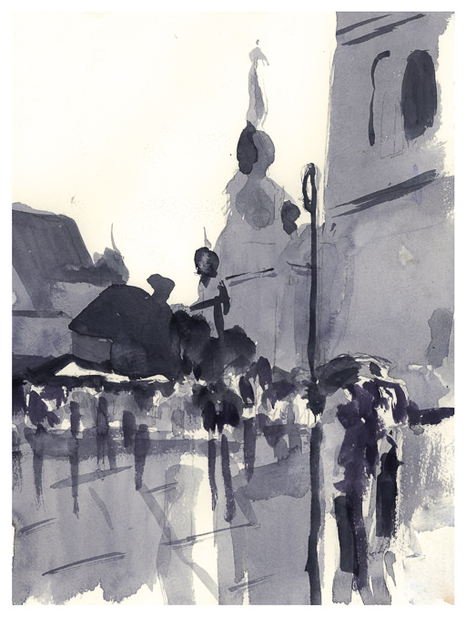
Module 2 – Study 2 – Andy Evansen’s “Watercolor for All Seasons” Class
This is my second foray into the series of photos Andy Evansen has posted for studies in the second module of his watercolor class. Here the focus is on value studies.
One of the things I am attempting to do, from both my classes with Evansen and with Ian Roberts, is to work on value. Evansen is a watercolorist and Roberts is an oil painter. Evansen demonstrates the use of a value study on his YouTube channel by creating the middle value(s) as large shapes. Roberts emphasizes shapes rather than things as well. Unlike Roberts, though, Evansen begins his value study with simply the middle value, leaving lights as white. After he has painted the middle values in his painting, he returns to the value study to put in darks and perhaps details.
I managed to do the middle value study, and then painted in what I considered to be the middle values, working left to right as I am right handed. But, before that, I laid in the sky with paper turned upside down as I wanted to have a darker value at the horizon.
I am not sure if the paper is improperly sized, but the paint and paper did not interact well. This is a 300# CP Kilimanjaro paper, natural white, and the first time I have used it. I also wet both sides of the paper, which is a habit I have for watercoloring with 140# paper. I need to see what happens in the future with other paintings.
I don’t really think this painting has a focal point, but that is not the purpose of this study. This module is to paint left to right, working in midvalues and sky first and leaving areas of white or light colors intact. From there, darks.
Evansen has provided a number of photos as references for the basis of a painting, and for values, I think I will work on that and try to apply what I am learning from Roberts and Evansen to create some things worth the time I spend. The reference photos range from landscaapes to cityscapes – animals and people. I will begin with the landscapes and then try the harder subjects for me. Here, there are cow shapes – blobby things. I have also done geese – more blobby things. All thesse blobs have characteristic shapes for the critters.
So! I am dipping my toe into new territories . . . let’s see where it takes me!
This is really unusual for me – buildings and people intimidate me. However, by painting nearly every day I am gaining confidence in my abilities.
Also, the use of extremes in light and dark are another oddity for me, as well as the limited palette, the colors of which were primarily cad yellow and violet of some variety. White, too, along with some sienna, ocher, and ultramarine.
Painting really means learning a lot of things: how to use color, composition, brushwork. It is here that using a wide, flat brush to paint the buildings rather than my usual preferred rounds that I was able to achieve 90% of the painting. I was rather surprised by myself, and the result.
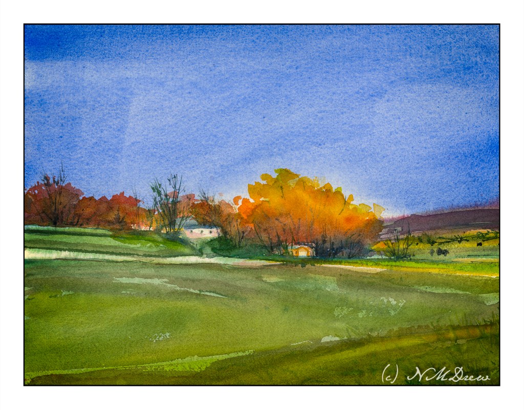
This painting is derived from some take-aways from yesterday’s study based on Charlie Evan’s video. I left white for the tree trunks, painting around them carefully. I also painted more slowly and less splashily than my usual mess. The result is more controlled and perhaps a bit more structured. While the painting itself is not what I would consider a real hit, it does have a decent bit of light and dark, sun and shadow, which is what I was striving for.
If you follow along here at all, you know two things about me. One is a lack of real depth perception. The next is my ongoing struggle with perspective. I have learned that my poor drawing – sloppy drawing, really – due to impatience – ruins a lot of my attempts at perspective in paintings.
I have decided to work on perspective, particularly architectural perspective. That means buildings! As a country girl at heart (no cowboy hats, though), I like the idea of buildings in a non-city setting. No skyscrapers for me. Instead, a boat house, a farm house, a barn perhaps. A building along the waterfront, even suburbia. Why? I want a few trees and some water.
This is the first in a bunch I intend to do to really work on perspective. Looking at things dead on is easy, but looking at something with angles is different. Also, looking down on something from above, or upward from a low vantage point.
Here, gouache. This took hours. About an hour drawing and probably three hours painting it. It works to a degree. All this for a 5×7 painting!!
The thing is more than anything is to just get out there and do it, no matter how icky it turns out!!