Abandoned in Winter

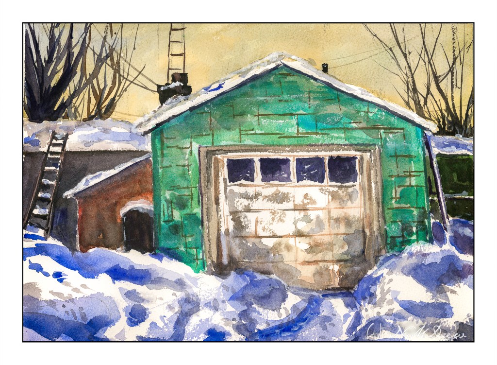
Well, this one sure had me going for a while! The idea was to avoid angles, and look squarely into the building, and so I did . . . and then came along the Esposo who said, “Nay! This does not work!” And, damn, if he wasn’t right! So, I had to pull out some gouache to overlay a roof on the tree in the background, and make the roof look rather beat up and weathered, with beams and such visible. Sort of a success.

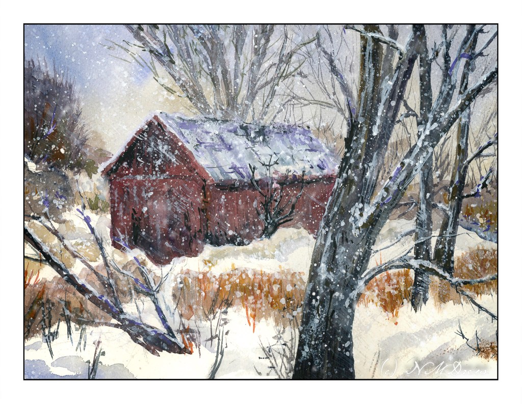
And, I wanted to paint falling snow. Falling snow in a photograph varies from white, sharp dots to elongated shapes. Time to experiment. I used some gouache, diluted, and applied some streaks – I wanted a sense of wind blowing from upper left to lower right, with snow pushed by the wind. It was okay. So, I got a fan brush and made a wet mess of the white paint and splattered and splattered and splattered. I even got it my coffee. Luckily the paint isn’t poisonous, so I shall return.

Overall, this is not a great success as a painting, but it was fun. I rather like the composition with the tree in the very front of the painting. The barn is w-a-a-y off as far as believable perspective, but such is life. But, I have been sticking to my snow themes, and perhaps it is time to do one more and then move to a different season different subject, or put it away for a few days and get back to sewing or doing photography. I can now hobble forth on my partly healed broken toe.

Arches rough, 140#, 10×14. Watercolor with a splash (well, several splashes) of gouache.

Garage in Winter

I feel I somehow turned a bit of a corner when it comes to painting. Shari Blaukopf’s online classes are helping a lot. She applies color directly and doesn’t follow “the rules” – by this I mean applying all the light colors first and ending with darks. Instead, she applies color to areas and moves on, making sure in many cases to let the paint dry. (Gotta love those hair dryers!) The corner also started to turn when I decided it was time to add some of the rest of the world to my painting, meaning buildings and so on. Thus far, buildings, but I am gaining confidence with them, so why not with people and urban scenes?

The fact is, I was getting pretty tired of my limited subjects, so this is a good thing. Now, even my boring suburban neighborhood is taking on a totally different perspective – there are a lot of things to paint, even here.

10×14 Arches rough, 140# paper.

Along the Shore

It is always worthwhile looking at the works of various painters, regardless as the medium in which they are creating. The works of Edward Seago have a charm to them which is old world, peaceful, and hearkens to a quieter and simpler time. This painting is based loosely off one of his oil painting of the eastern English coastline. What attracted me was – and is – his vast skies. The low lying shoreline beneath such a magnificent sky is worth trying out. The same may be said of the watercolors of Edo Hannema – he, too, finds the work of Seago, and Edward Wesson, as sources for inspiration.

In Southern California, the sky, where I live, is almost always blue. No clouds, little haze. Humidity sits at zero. (I won’t discuss the vast amount of lotion I use!) However, the big skies of the midwest with towering clouds, or the piles of clouds over New Mexico, are in my memory, and so the clouds and moist skies of a wetter clime draw me.

Here, I used the 1.5 inch flat brush for 90% of the painting, resorting to a small flat brush – 1/4 inch – for some detail. Large washes, wet into wet, some glazing. Paper is Arches 140# CP, 16×20. The large brush is becoming a favorite for sure!

The large brush helps me keep my colors clean and think about masses rather than details. Big to small. I am also refreshing my water as I move along – this took about 2 or 3 refreshes – and cleaning off my palette, too. With a large brush, large washes, a lot of color is used. Clean palette, clean water, and, of course, a clean brush. The results are beginning to be seen.

Things I Never Paint

After spending 7 hours yesterday sorting through books I hope to sell or donate, I was bushed. Dusty and dirty, too. It’s amazing how much of a mess your life can become when you aren’t paying attention! Painting definitely has its attraction as opposed to drudgery, but lately I feel like pushing myself into areas I don’t ordinarily venture. Cleaning and discarding shakes things up, and it seems to be carrying over into artwork.

Charles Reid, besides being great at landscapes, is also fascinating for me as his watercolor portraits are so loose and wonderful. I read a bit in one of his books about how he does skin tones. Colors for pale skin can be yellow ochre, alizarin, and cerulean – these are the ones I used to paint the figure on the left. For the one on the right I threw in some ultramarine and Hooker’s green at Reid’s suggestion. I worked to make the highlights warm and the shadows cool – more yellow in the light areas, more blue in the shadow areas.

Here are some gardeners laboring away. The color palette was pretty simple – ultramarine, orange, and a bit of ochre and green. I tried to create a sense of dimension in each pose, working with complementary colors to create shadows.

I then thought that after doing people, I should do an animal. I found a wonderful picture on Pixabay of an elephant striding along. I was rather teary when I thought about how we are losing so many wonderful creatures, large and small, because human beings are not the best. Of course, I’m not starving, so my perspective is very different. I was caught by the beauty of this elephant and think I will probably draw and paint creatures more. I have never painted or drawn an elephant before and enjoyed this one a lot.

Finally, a building, specifically Dunguaire Castle. It’s from the 16th century and has been restored. I think it would be a wonderful place to visit as it is right on Galway Bay in western Ireland.

Altogether, this afternoon’s romp in the paint was satisfying and challenging. Figures, animals, buildings – all of these really pulled me out of my comfort zone. I kept my palette simple and worked to create a 3D element with shading as well as contrasts of warm and cool. Initially I used rather cheap paper, but in reality, it sucked, so I pulled out my Arches 140# CP and was much happier with the results.

Under a Summer Sky

More Pointillism!

This painting was done on a larger sheet of paper than my earlier ones as my sketch book was filled and finished with the painting of the other day. I began with a thin wash of gouache, putting in the basic colors of the sky, fields, house and trees. From there, I began the dots. And more dots. And even more dots. Paint went from thin to thick, and thin again. Dots were bigger and smaller. The closer I came to the completion of the painting, the more I began to use the paint to shape the different areas of the subject. I tried to use some complementary colors in shadows, such as red in the shadows of the trees, and bright yellow to enliven the lavender. Altogether, this painting took about 3-4 hours to complete (I lost track of time), but in the end, the dots were worth the effort.

I think I could live here.