I normally tend to use pointed round brushes for watercolors, but every now and then I pick up a flat brush and use it throughout a painting. The other day I noticed some inexpensive flats on sale in a variety of sizes, so I picked up a couple to add to my collection. Now I have .25, .5, .75, and 1.0 inch flats, some firm, some soft. And tested them out.
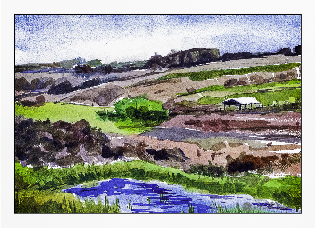
Epson Scan used here – too lazy to putz around. The blue in the sky is granulated and light in color, but the blue in the water is too blue. The rest of the colors seem to be okay.
A flat brush is rather versatile. The longer edge makes for wider strokes, obviously. You can also load your brush with one color on one side and another color on the other side, and when you paint on wet paper, the results can be interesting. I didn’t do that here, but am writing this to remind myself I need to do it a bit more! The narrow side of the brush can give very nice straight lines, as you can see in the hay canopy in the mid-ground. Sharp edges, like in rocks can be easily expressed. Squiggly lines can also be achieved as seen in the too-blue-to-be-true water.
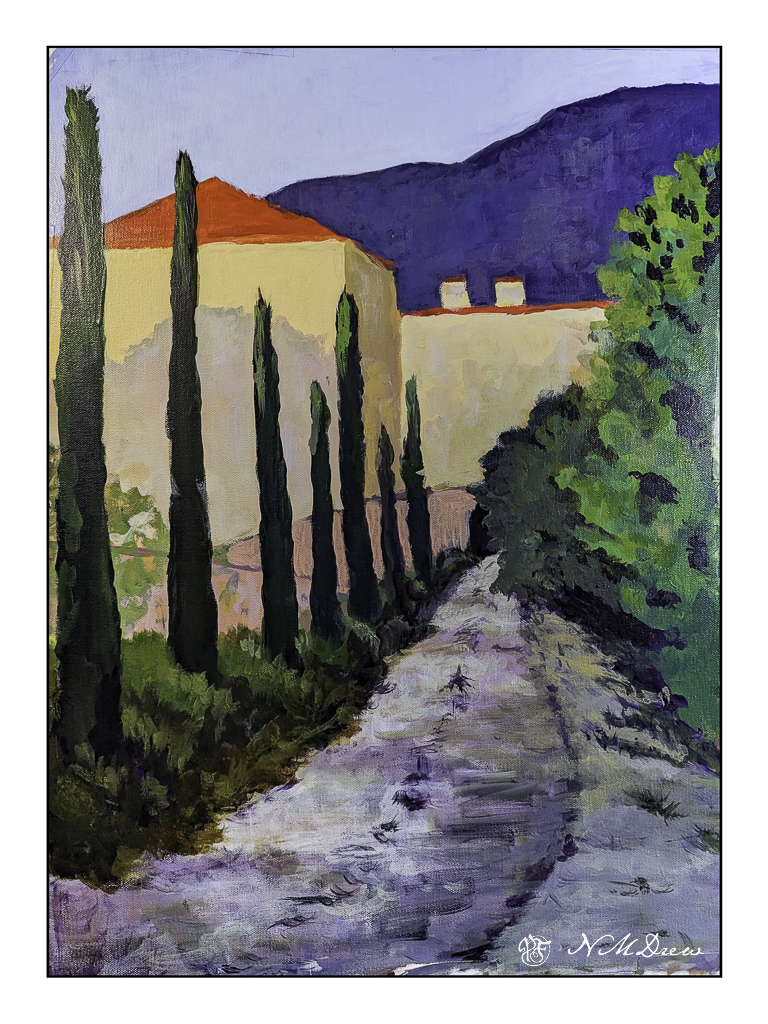
Several weeks ago I started an acrylic painting of a building at the end of a road. It was sort of painted in a traditional manner, meaning I was trying to represent reality. Truthfully, it bored the hell out of me, but I kept it as it was fairly decent in my opinion, but it did put me to sleep.
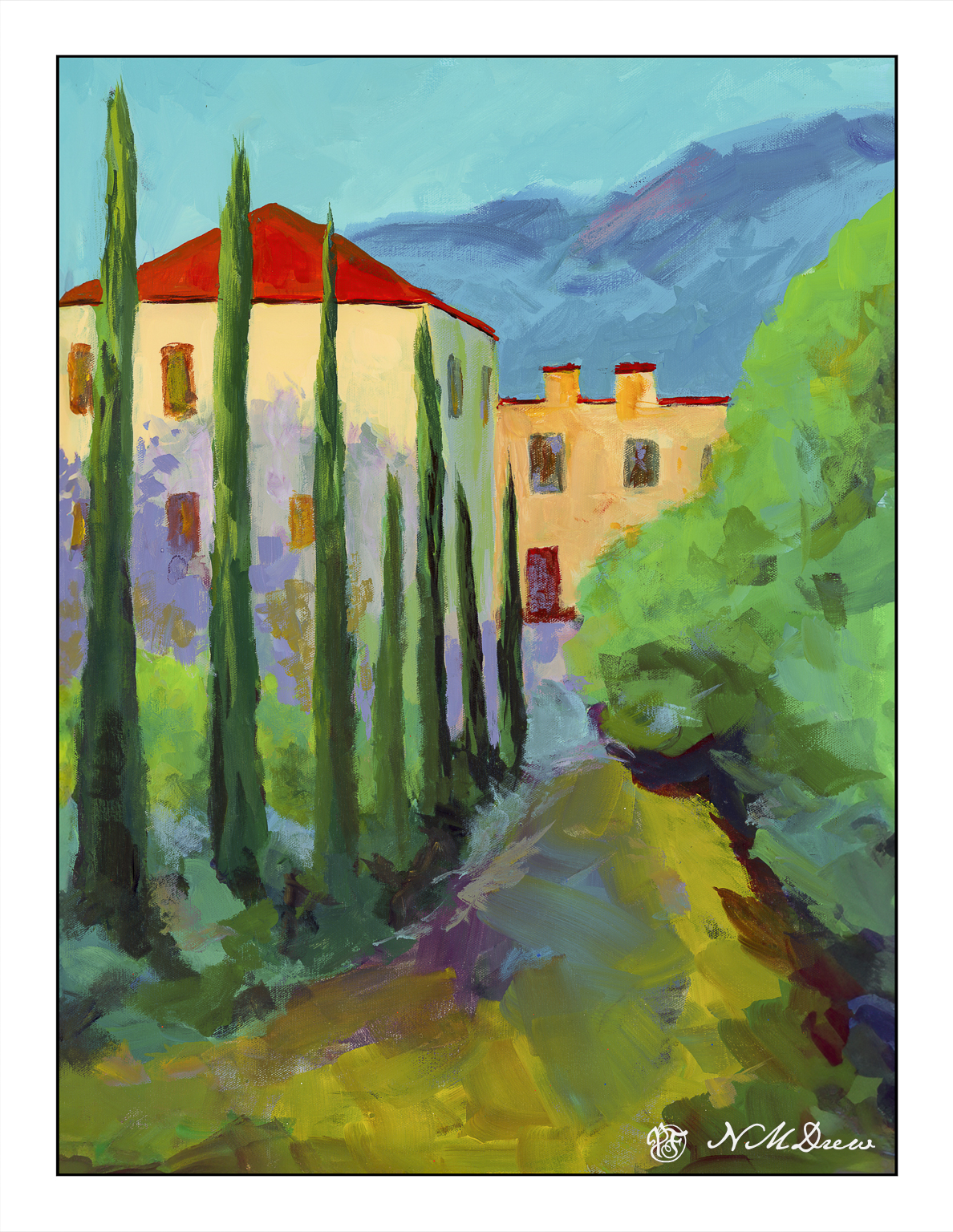
Working with brighter colors of late has really been exciting for me as I feel much more of a connection to the colors I use than I do to subject matter. Subject matter can be anything – but colors express more to me and are more true to who I am (a magpie reincarnated as an old bat) than subject matter in general. So, I took the painting and painted over it. Below is the original.
This is a photograph I took and it is pretty crap (above) as there is a lot of weird stuff going on. I didn’t think it scanning it because of its size. This morning I scanned my current iteration of this painting.
I like this much better, but it is not quite done. I need to work on the road in the foreground as well as details of the building. More windows, fix windows, fewer windows? Create some focus at the end of the road? Fix the road? Cast some shadows – creating light and dark – across the road?
Many things to consider here. I am going to let it sit and ignore it awhile. If you have any ideas, let me know!
More gouache! Such a lovely, forgiving medium. Mistake? Dry, re-wet, blend some more, paint over. Can you really ask for more? The only problem with artist’s gouache is that it stays water soluble when you are done with the painting, but there are ways to seal it and make it waterproof. I think I will try that out on some gouache painting failures – like my snow scene of yesterday.
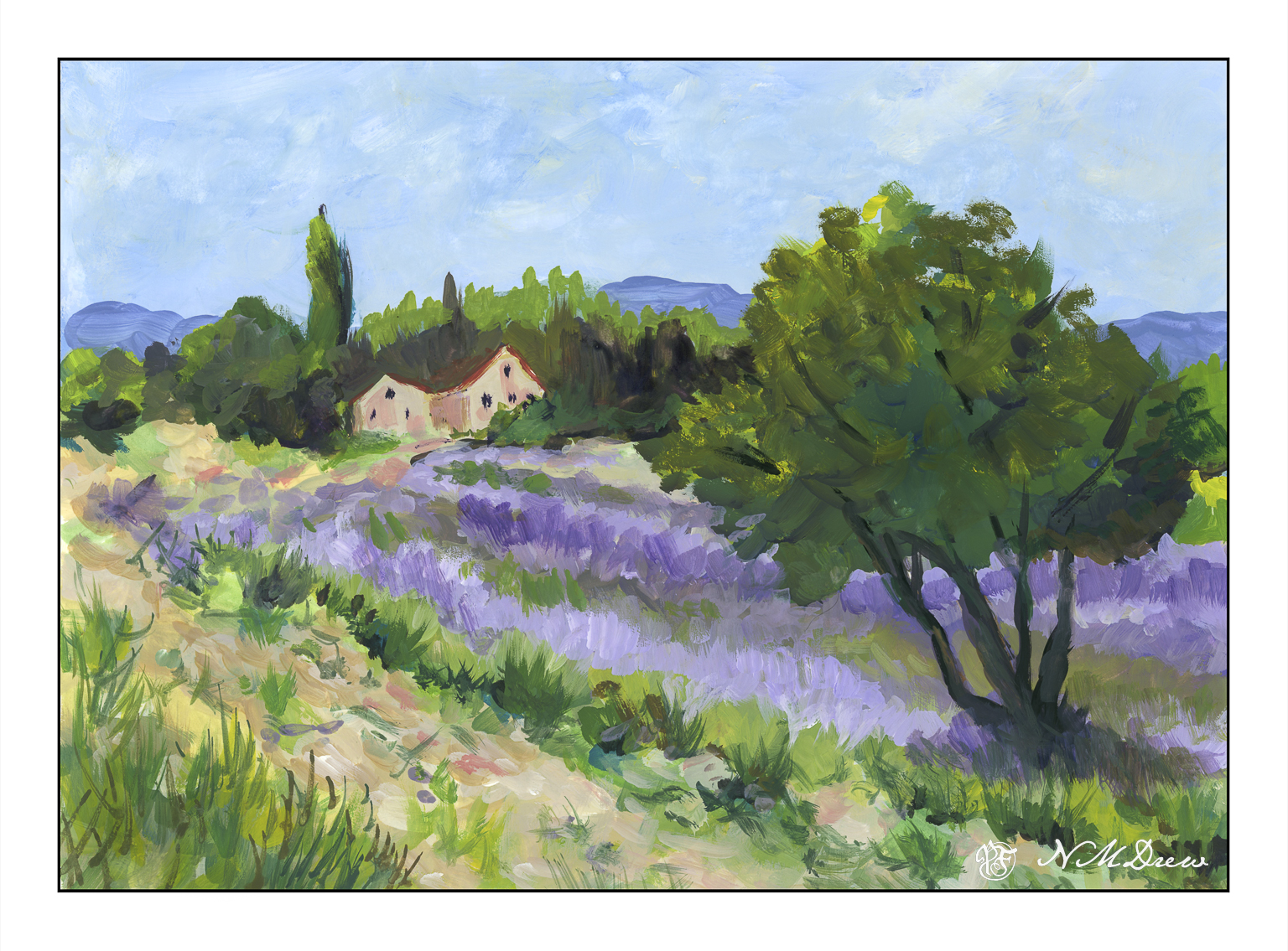
After getting lost in a drift on that snowy road of yesterday, off in my Learjet for warmer climes and roads easier to navigate. May as well time travel a bit, too, and move from winter to late summer.
Back to lavender fields! The ones I have been doing in acrylic are a bit gaudy, but so is lavender. Some lavender is light, some is so dark it rivals the deep blues of lobelia. I tried to strike a bit of a more subdued approach to a large amount of lavender, and I think it works pretty well.
Knowing that we would be visiting the Ness Botanic Gardens while moored in Liverpool (the Land of the Scousers), I decided to go into town in Liverpool in search of another set of pan paints. We went to Cass Art (see above!) and found a lovely set made by Rosa, an artist supply manufacturer in the Ukraine. I chose the “botanical set” that has colors found obviously in nature, and flowers in particular. It includes the reds and pinks and violets that I couldn’t make in my other little set with its 12 colors. While those 12 colors are good for mixing almost anything, there was absolutely nothing that would provide a lovely violet of any shade or any pinks. So, if you’re in a garden, what are you going to do? Well I know what I would do: Go shopping!
As you can see, this botanical set has some really beautiful colors in it as well as multiple greens. A lot of artists like to mix their greens, and while I find mixing greens is fun, having a few pre-made ones from which you can make even more greens is even better. Yes, I am breaking all those artistic rules someone has determined, but so what?!
The first thing I did during this non-taken vacation fantasy was to just look at the different flowers that are available throughout the year at the Ness Gardens. They have lots of flowers, trees, open space, buildings, and just about anything you could think of, as well as walkways and paths and places you can wander in. A good botanical garden is always a pleasure, and one needs color to do it justice in paint.
So, since I was griping about a lack of pinks and lavenders or purples, why not do hydrangeas? White, pink, lavender, and blue. The color depends on the acidic or basic qualities of the soil. I just mixed these vaunted colors together and had a good time.
Sadly, I could not find any map online of the Ness Botanic Gardens, but I can assure you there are buildings to go into as well as pathways to follow. One such building is this one, whose purpose remains a mystery me (shown above), but I thought rather lovely as it had woods behind, and colorful trees and flowers in front of it.
And, relying on photos for my fantasy walk, I took this pathway into the woods beyond. You can see just how beautiful it is with layers of colorful flowers, shrubs, trees, and everything in between.
The Ness Botanic Gardens was going to be one of my high points of our voyage – that and being driven on the left hand side of the roadways! I always enjoy going to botanical gardens because it’s so much fun to learn about plants, see plantings both formal and informal, as well as the variety of trees, flowers, birds and insects. It is all too easy to forget the abundance and beauty of Mother Nature.
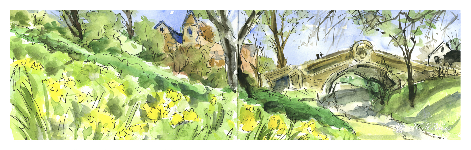
i was so looking forward to visiting Port Sunlight during our brief stay in Liverpool. While I have enjoyed the Beatles since the 60s, I will say I opted for gardens and museums as I prefer the countryside! However, I expect the foul weather which forced the trip we were on to bypass Dublin carried into Liverpool and rather than a bright spring day, we would have needed galoshes and slickers! So, a rough sketch of a rather lovely bridge and buildings, playing a bit with some things gleaned from my building drawing class.
When I do these not-taken-vacation sketches, I confine myself to my limited supplies I would have been using onboard. And limited room. Elements of the colors I brought with me annoy me no end, meaning no good violet at all. The same with pinks or alizarin. I may visit in my imagination to buy some extra colors….or not. Let’s see where all this takes me!