Not any cat.
The Cat.
If you have ever owned A Cat, you know it owns you. You are there for The Cat, period, end.
Pixabay has a lot of free images, and when I decided I wanted to sketch a cat, this one showed up and made me laugh. It is So The Cat.

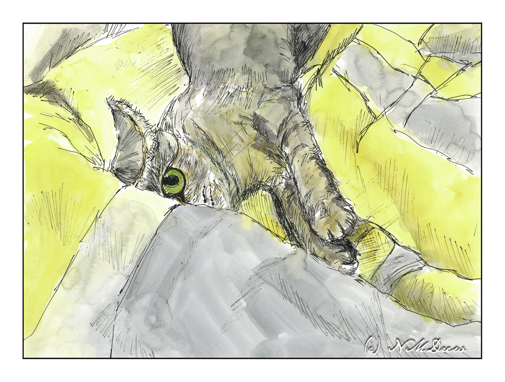
Not any cat.
The Cat.
If you have ever owned A Cat, you know it owns you. You are there for The Cat, period, end.
Pixabay has a lot of free images, and when I decided I wanted to sketch a cat, this one showed up and made me laugh. It is So The Cat.
Rocky coastlines are always fascinating because the first time I ever saw the ocean was along a wide, sandy beach with gentle waves. Not so here! You can see the debris – fallen trees stripped to bare logs, rocks, erosion. You can only imagine what it is like during a storm.
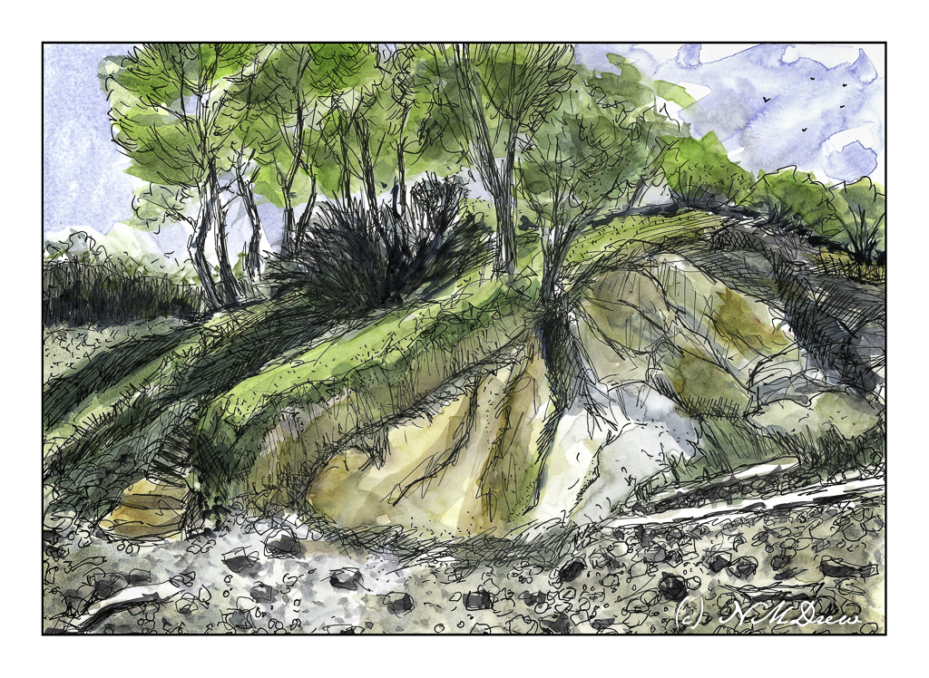
Years ago, we drove up the California coast, heading into Oregon and points north. It seems once you hit the central coast, about 100 miles from where we are, the coastline begins to change. Highway 1 leads into Big Sur, that fabled and beautiful land, and it is here you see rugged cliffs. Then, north of San Francisco, you move into the wide beach sands of Stinson Beach and move further along to the rugged Mendocino coast and then beyond. This picture is based on a photo I took there years ago – no idea where we were, but it was stunning.
Ink, watercolor, bristol paper.
Another pleasant break to be had yesterday afternoon! Tasks and chores shucked and done; dinner to be prepared. In between, back to Shari Blaukopf’s short course on ink and pen and drawing.
I tackled the section on drawing people, and I think I accomplished my task quite well. As always, a few good tips really helped move my sketches into more successful areas – in particular the one about getting the shape of the shoulders correct and then moving up and down the body as needed.

The hands in the above drawing are not at all good, but such is life. The basic drawing was done in pencil, which I did not erase after applying the ink. The line drawing was done using Sailor’s black pigmented ink, and the washes were done with India ink, diluted to make the washes.
From there, we moved on to water soluble ink in color. The color Shari used, and which I bought, is called Ancient Copper. The pen I used is my trusty Spencerian nib in my vintage Edwardian pen hold made of silver (yeah, posh!). The Spencerian nib is great as it provides a very fine line, but with pressure yields a good thick line.
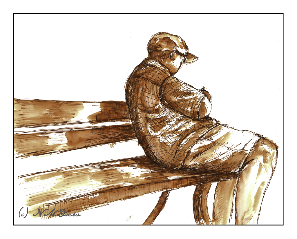
Looking at my signed and scanned image, it looks like there is black ink used here, but there is none. It just shows how scans can mutate color, but also just how variable the ink itself is – from on the nib, to dissolved with a brush dipped in water and applied across the lines.
First a pencil drawing, then outlines and cross-hatching with the pen. Darker areas have more hatching. Then, let the ink dry and erase the lines with a kneaded rubber eraser. From there, a brush dipped in water to create the lights and darks by applying it over the lines. Areas with more lines = darker areas. Then, while the paper was damp or dry, I used my dip pen to apply more ink. In particular, I used it to outline the man, his clothes, and the edges of the bench. This helped emphasize contrast and to help separate different areas of the drawing from other areas.
Bristol paper, 11×14, India ink, Sailor pigmented black ink, Ancient Copper ink, Spencerian dip pen, brush.
It seems as if my life has been in a frenzy with multiple little tasks to be done before the day’s fun can begin! Today is no exception – banking, bills, dishes, housework – and then little petty things that pop up, like buying a bit of something for dinner as we have no leftovers today. Yes, we have no leftovers! And no bananas.
Nonetheless . . . I did complete the second exercise series in Shari Blaukopf’s most recent online class of pen and ink. This time we have a square somewhere in France. I know because she said so! This time it was to be done with a water soluble ink, of which I have none, so I again played with diluted permanent ink. In a few areas I wet the paper and then drew with a permanent pen, but I don’t like that as it seems to mess up a pen’s nib.
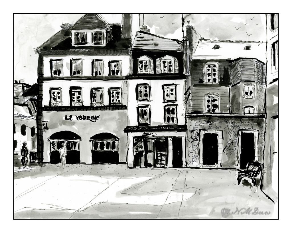
This is done on Bristol paper, very smooth but fairly heavy. The lack of tooth can be very nice when drawing with pen and ink as well as washes. My lines are a bit wonky here and there – earthquake? – and people are not well done, but I struggled most with the park bench on the right!! I will say I don’t like my results as much as I did the first exercise, but this is also a far larger drawing, taking up the entire sheet of 11×14 paper. Still, it was fun and satisfying to do.
Bristol paper, 11×14, ink, pen, ink washes.
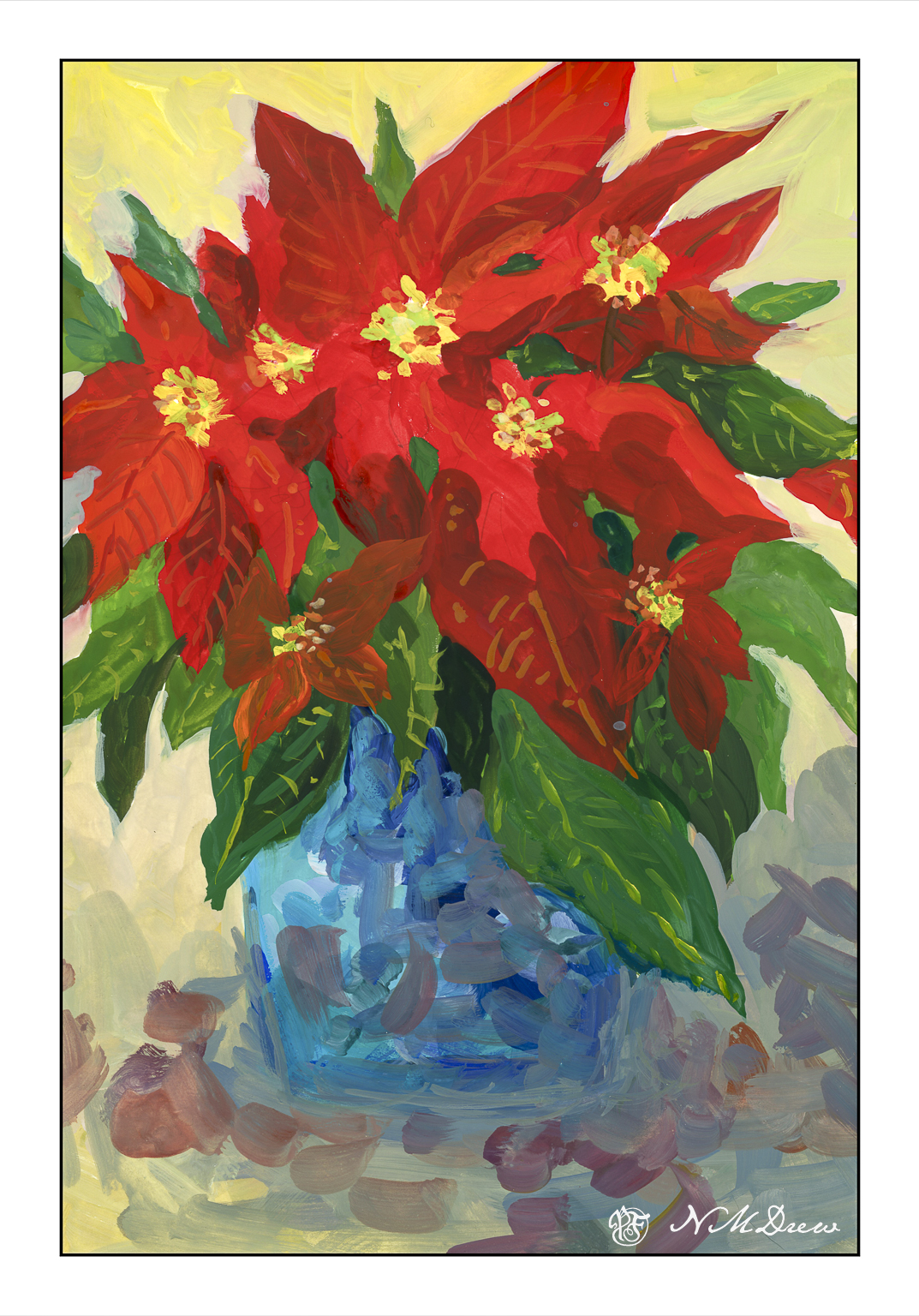
I wanted to paint today, but I didn’t want to deal with acrylics and the bit of a mess they create. Gouache has been on my mind as I haven’t done it for a long time!
Starting this painting was a bit tough, just because I am out of practice. Still, I found all the painting I have been doing made it a bit more easy than I anticipated, but, once more I find myself stuck with problems of light and shadow. But here, it is play; the concept is there, and the plan, while not working out, did kind of get there. Certainly you can see where the light is coming from – but not sure how much it worked out.
Fun time, and that is what an easy afternoon is all about! I used bristol paper for this, and was rather pleased with the way the gouache went on. About 10×14 inches.
