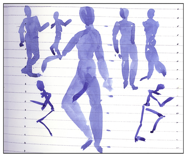
I never paint people in any form. Draw them, yes. Now it is time to add them to paintings so that I can pretend to have a social life!
Watercolor is the first area to which I am adding them. The reason is that watercolor in many ways is very forgiving. As well, there are a lot of photos with people in them in Andy Evansen’s class, so I figured I better stop being intimidated.
And you know what? After watching a lot of videos, and hearing that the general shape of people in a crowd is that of an elongated carrot (supposedly said by Frank Clarke), I had a laugh, and then it began to be fun, not a horror story I had to live.
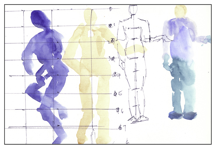
Before beginning though, I felt it was important to get an idea of where things belong. Yes, I do know the general proportions of the human body – 7.5 to 8 heads tall, depending on your source. But where do elbows go? What level is the wrist? And so on. A bit of research and then the fun began.
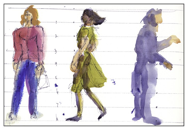
Different ways to portray people, too. Blobs of color with some suggestions added, such as darker color to separate figures. Negative painting to show off highlights, back lighting, or light-colored fabric.
And so, people are showing up in my watercolor life. It was a lot easier than I expected it to be. Proportional formulae help and just playing around, letting go, and practicing.
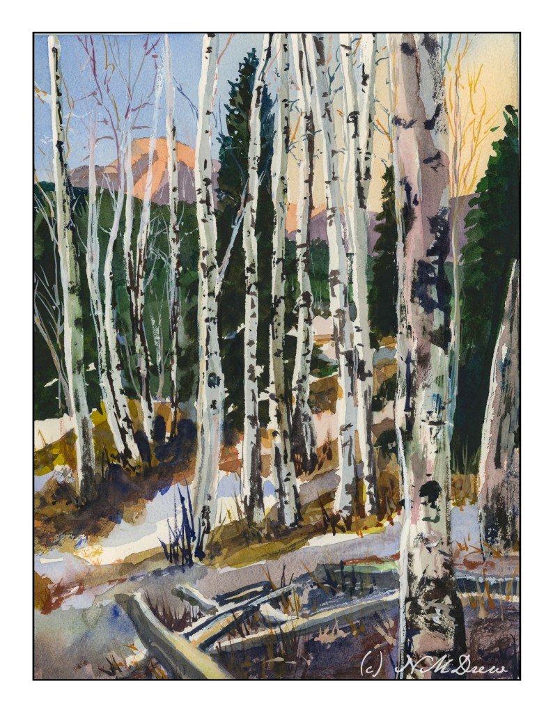
Birch Trees – from a photo in Module 2 of Andy Evansen’s Class
If you have been following me for a bit, you know that I have enrolled in a lot of painting classes. This is a study from my watercolor class, online with Andy Evansen. His work covers a lot of subjects, but I like his ones of the natural world the best. So, lazy me, I stick with his photos of the wilds, but will, at some point, take the dive and do something with buildings and people, and maybe even cars.
I used frisket to create the hard edges of the birch trees and the snowy areas of the logs in the foreground. The other white areas, the snow, is plain paper, no frisket. After the frisket dried, I did the sky, sunlit mountain, and dark background. Then, a bit of the foreground. Finally, the frisket was removed.
When the frisket was gone, I worked left to right, creating the shadows of the birch trees. Upon those shapes I added heavier paint to create the blacks characteristic of birch trunks. Various other details got worked in. White gouache came in handy to clean up some of the birch tree trunks as well as to create the fine branches of the trees toward the top of the painting.
The only thing I have some issues with is the very large birch tree on the right, the one which stretches top to bottom. It is not quite right, but that is something for correcting later on. Despite that, I am pleased with what I am learning, and creating, with all these classes. Painting and drawing and artwork is in the forefront of my mind these days, and it is beginning to show in more “successful” paintings from my viewpoint.
9×12 CP 140# Arches paper; primarily watercolor with a touch or two of gouache. (Maybe 3 or 4 or more….)
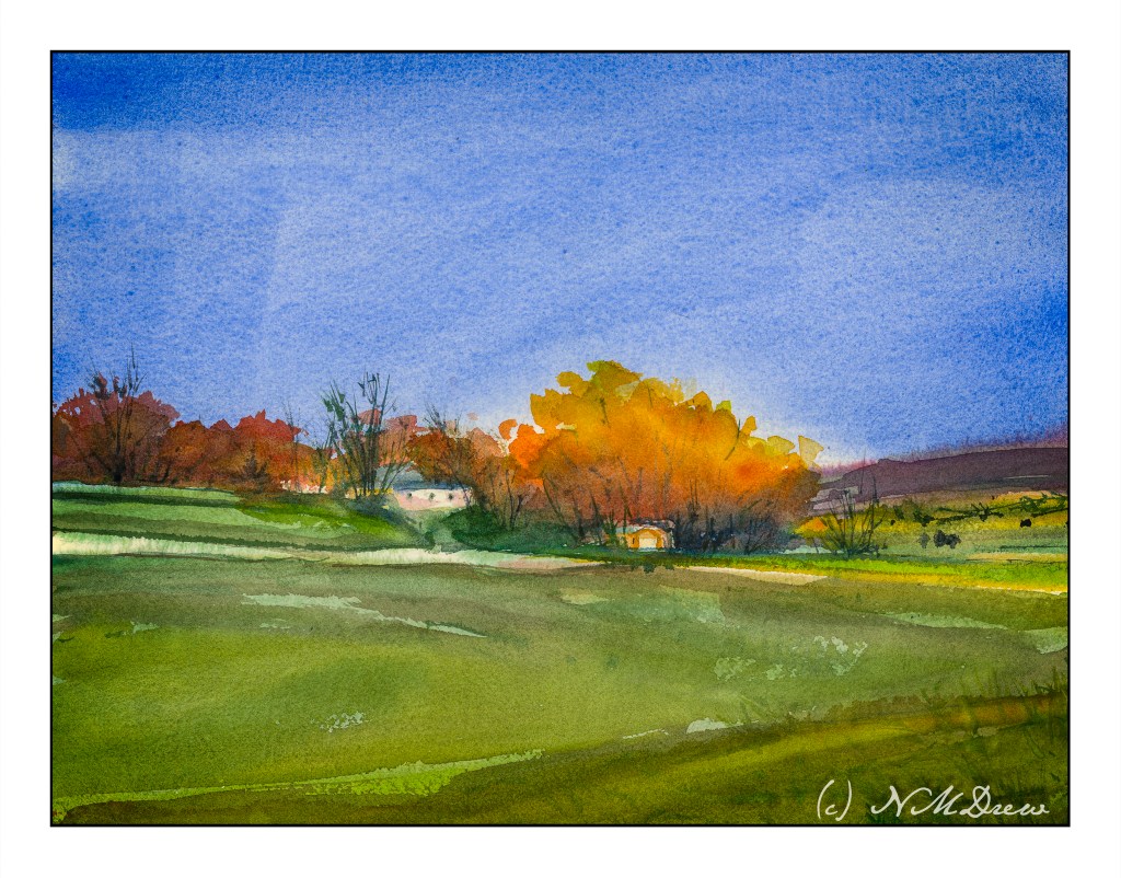
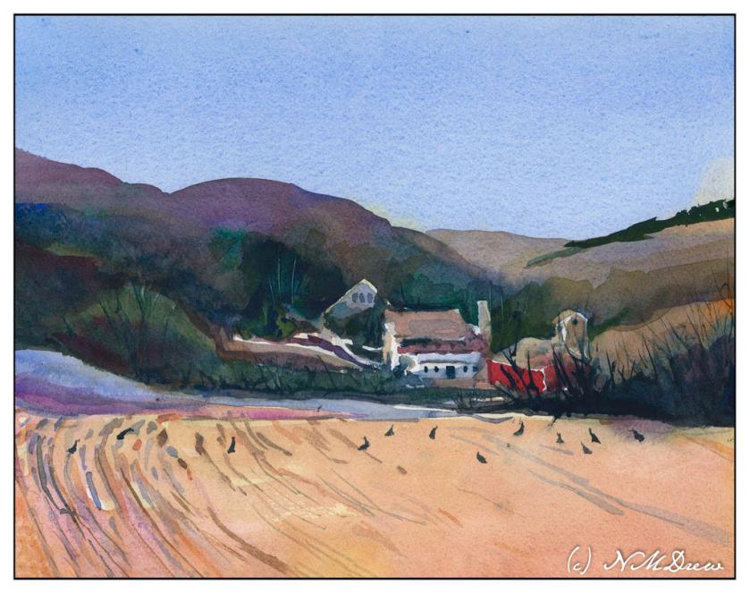
Module 2 – Study 2 – Andy Evansen’s “Watercolor for All Seasons” Class
This is my second foray into the series of photos Andy Evansen has posted for studies in the second module of his watercolor class. Here the focus is on value studies.
One of the things I am attempting to do, from both my classes with Evansen and with Ian Roberts, is to work on value. Evansen is a watercolorist and Roberts is an oil painter. Evansen demonstrates the use of a value study on his YouTube channel by creating the middle value(s) as large shapes. Roberts emphasizes shapes rather than things as well. Unlike Roberts, though, Evansen begins his value study with simply the middle value, leaving lights as white. After he has painted the middle values in his painting, he returns to the value study to put in darks and perhaps details.
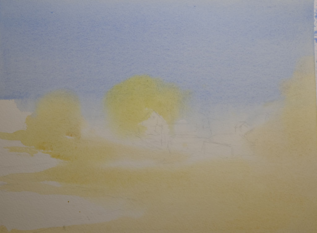
I managed to do the middle value study, and then painted in what I considered to be the middle values, working left to right as I am right handed. But, before that, I laid in the sky with paper turned upside down as I wanted to have a darker value at the horizon.
I am not sure if the paper is improperly sized, but the paint and paper did not interact well. This is a 300# CP Kilimanjaro paper, natural white, and the first time I have used it. I also wet both sides of the paper, which is a habit I have for watercoloring with 140# paper. I need to see what happens in the future with other paintings.
I don’t really think this painting has a focal point, but that is not the purpose of this study. This module is to paint left to right, working in midvalues and sky first and leaving areas of white or light colors intact. From there, darks.
Evansen has provided a number of photos as references for the basis of a painting, and for values, I think I will work on that and try to apply what I am learning from Roberts and Evansen to create some things worth the time I spend. The reference photos range from landscaapes to cityscapes – animals and people. I will begin with the landscapes and then try the harder subjects for me. Here, there are cow shapes – blobby things. I have also done geese – more blobby things. All thesse blobs have characteristic shapes for the critters.
So! I am dipping my toe into new territories . . . let’s see where it takes me!
I feel like a school kid – classes are taking up so much of my life! It is keeping me off the streets, so I am sure a few people are glad to know that! The classes are a series with Ian Roberts (online), Andy Evansen (online), handsewing 18th stays with Burnley & Trowbridge (far behind!), and a local class in oils / acrylics with a good teacher. Housework is falling by the wayside!
The above is a watercolor exercise from Evansen’s class. It’s a year-long course in watercolor, and the content needs me, the student, to work hard at the lessons. We began with skies – I am pretty comfortable with those. This module works with values, and I think I did a pretty good job with it.
What I found especially interesting was the beginning of the value study. Unlike Roberts who puts in all values in a pencil sketch, Evansen puts the middle value only as the first step. The white areas are bright spots and the sky, but the middle values are all created as one big shape. That was quite interesting, and not the usual route one takes with value studies.
Pencil drawing with middle value only added as a shape.
I messed up a bit, but it did lay out a map that was more clear to me than also including the darks. Once I got the idea in my head, the next step was to lay in soft colors on paper that was wetted on both front and back with a natural sponge. I used 9×12 140# CP Kilimanjaro paper here.
After doing the middle value shape, both as a prelim and then on the final painting, you are supposed to go back and add the dark areas to the prelim. I didn’t get there – I was too involved in the final product!
Light areas filled in on dampened paper. Includes the sky, white areas for buildings, and field and trees.
Doing the light areas on dampened paper allows the colors to bleed a bit, and create soft edges.
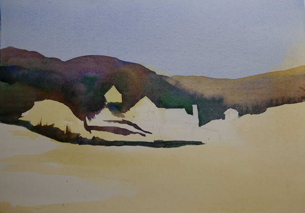
Thicker paint added once the light areas have been worked.
The next step was to work left to right so that the shape created for middle values in the preliminary study could be made on the painting. The idea is to work in one movement – left to right since I am right handed, but right to left if you are left handed. The idea is to create a bead of color that varies as you paint in a continuous design.
To me, this was really a dark based on the reference photo, but that is life! As I did this, I worked around the buildings and structures, as well as roads. The thicker paint and dryer paper allowed this to happen to create hard edges. I was happy with how easy it was to do!
Almost done!
This was perhaps the 3rd stage in my painting. I added furrows to the field and details to the structures. I scraped in tree branches and such with my finger nail only to realize I keep them trimmed too short to be of any use there!
After all the layers were dried, I did the heavier dry brush as well as glazes over the field and hills to create areas of warmth or coolness. I also did it on some of the structures to keep them from dominating .
Some thoughts . . .
It is really a lot of work to do these classes. My whole purpose is to stop my old ways of approaching painting and create some kind of shift so that I can become a better painter in my opinion. Also, I need to stay busy. I have felt like I have been floundering a bit, so an area of focus was important, especially in an arena I wanted to learn. I am still adjusting to all this, but in the big picture, I am happy I made the commitments.