Cove

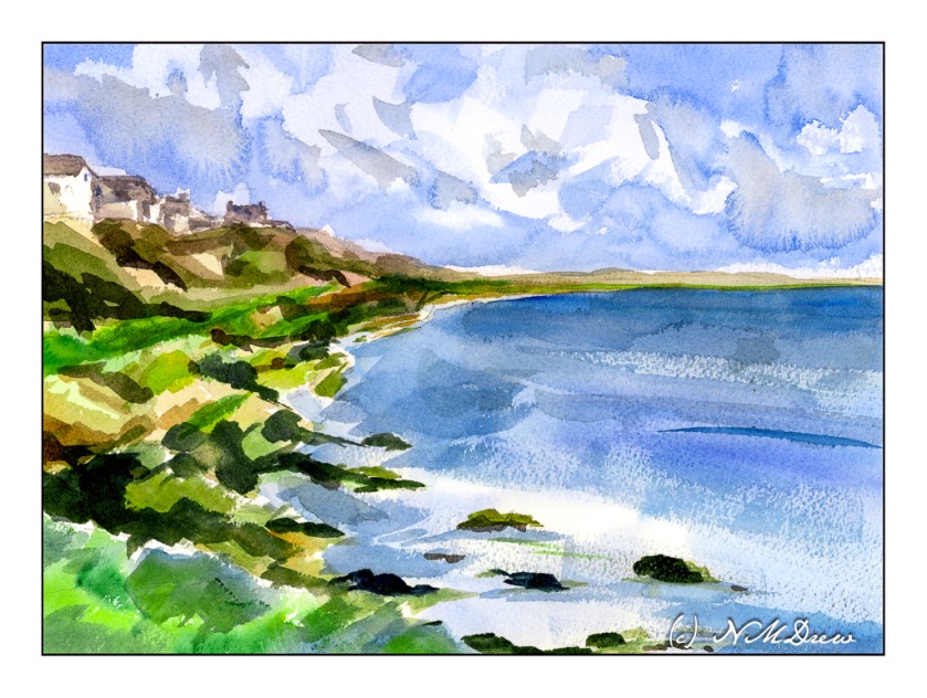
What can I say except this was one hell of a challenge! I wanted simplicity in the form of abstraction combined with atmospheric perspective. Well, the day is crisp and bright, a bit windy, and the light is harsh. Somewhere in there lays a bit of compromise.

The largest areas of the painting -sky, water – were laid in with very wet washes and allowed to dry.

The clouds were lifted out later and more blue, wet paint applied over the initial light wash. Shadows and shapes were created during this step.

The sea was a light wash with simple areas of white left behind in the foreground. Somehow the rest of it sort of happened using a large, flat brush. I find using flats really helps push the abstraction. The same can be said with the shoreline, using color to indicate plants, rocks, cliffs. The most “planned” part of the coastline were the houses and roofs. Dry brush with darker blues were applied with a wide 1″ brush to give the sea some dimension.

I had no idea how this painting would turn out. I like it for the simple fact I did achieve my desires for a simple, abstract painting which still has recognizable subject matter.

Wouldn’t it be great if we all liked everything we did? Maybe not – then we would probably never progress!

Upward to the Beyond

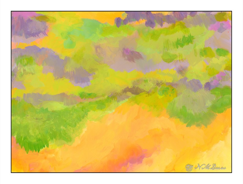
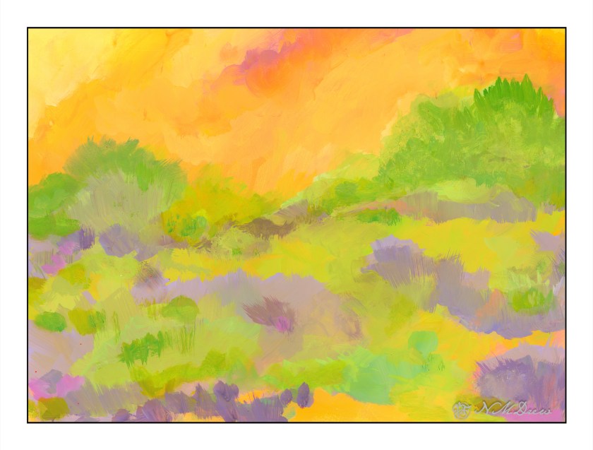
What is the “right” way to hang an abstract? Is it the artist’s choice – the viewer’s choice – the hanger’s choice? The painting “Into the Blazing Hills” is one thing – the title telling you what I see. Inverted, I see “Upward to the Beyond” – moving toward the other side. What is the other side?

Putting my digital signature on this one gives it a different sort of reality – the signature grounds the painting and says “this is the bottom so upward is the top.” What is the top? What is the bottom?

Sideways, the painting does nothing for me, with the yellows on the left or right, but yellows on the top or bottom create a totally different feeling, but somehow the feeling is right. I will say, the yellows on the bottoms are more disconcerting and unsettling to me than when it is on the top. So, upset or comfort?

If I were to critique this at all, I would find this painting bottom-heavy in yellow, and moving upward it seems as if there are trees silhouetted against the sky. However, there is all this stuff in between, and it lacks the harmony, I think, that “Into the Blazing Hills” has. Perhaps it is the ability for me to recognize my surroundings – the hills of California – with either a sky and brilliant, blazing sunset – or a wildfire encroaching a bit of paradise, destruction being moments away.

This is going to take time – maybe both are “right” – and perhaps the middle chaos in this painting is okay but needs a path of some kind to lead the eye upward.

Into the Blazing Hills

One thing I enjoy about a retrospective show of an artist’s work is to have a sequential progression of his / her development. As an erstwhile “artist” I find myself is bopping around. It is my erratic personality – my magpie personality – drawn to this and that. That is probably why I like Hawaiian print shirts – colorful and rather crazy. When I look at my own paintings over time, color is always the primary theme. Sometimes my color usage is quite bad – nay, awful! – and sometimes very much to my liking.

In this vein, I decided to just paint with the Golden fluid acrylics, spreading around colors and creating shapes. I figured it would make itself known to be whatever it is to be. As someone who likes landscapes, I figured it would become one. My thoughts were, as I progressed, a flower meadow, hills of flowers, trees, and then just putz. Using acrylics means putting paint down in a way which works with their quick drying qualities, but I did use matte medium. A lot of times I just dumped color on the palette paper, mixed, added white, and then mooshed it around on the paper. The matte medium creates a bit of transparency, and it makes a sort of glaze over underlying colors.

Painting was done with wide, flat brushes – 3″ and 1″ flats – later a large round – and my fingers encased in nitrile gloves. It took about 3 days and 6 hours to paint this on 15×20 watercolor paper. Golden Fluid acrylics, matte medium.

Colorism is something that truly appeals to me. Not Fauvism, which I find a bit too loud for my taste, but colors to create an emotion or feeling more than reality, with a bit of a suggestion of reality.