The Value of a Local Bookstore

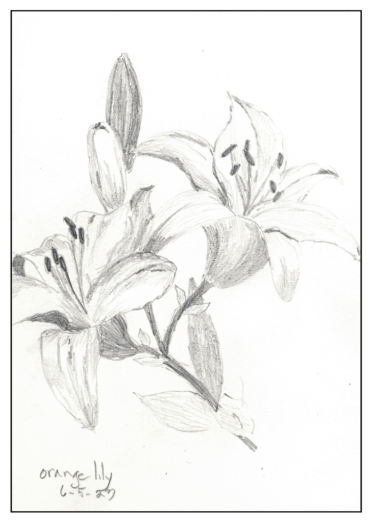
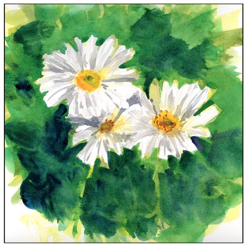
Yesterday I did tasks and then ran away from home. I went exploring down roads I know and then went further. I found some hidden parks in the hills, covered in the remaining bright colors of the season’s rain. I will need to go back to investigate soon.

Before I went exploring I went to the last local remaining bookstore, part of a chain, complete with coffee and magazines and places to sit. There is a children’s section, music section, audio books, crime and SciFi fiction, manga, and novels old and new. Of course, there is history and politics and travel and nature and art and crafts. Lots of stuff.

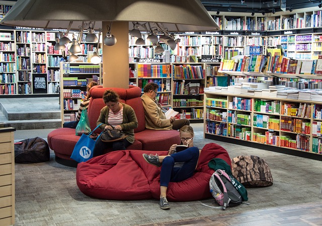
I haven’t been in a bookstore for awhile. I tend to head to the local library, and that in itself is a wonderful resource, and ours is especially nice. However, what does a bookstore have that a library does not? A bunch of new books recently published. It’s a feast for the brain and the eye – wandering around and looking at notes posted on the shelves with thoughts from staff and buyers about them, spying colorful titles or interesting titles.

With the onslaught of online buying, the bookstore is facing extinction, whether national chains or locally owned. Libraries are also being challenged with some US states authorizing the persecution and prosecution of librarians who allow books deemed unfit by a few for the delicate eyes and ears of children to be purchased or checked out. School libraries face the same issue.

Nothing like censorship to ruin good things. Some places have also had to ban the Bible, which is funny and ironic, because most of the censoring is being pursued by the religious right. I am surprised that bookstores aren’t being boycotted and persecuted, too. Or Amazon.

So, back to bookstores. I had forgotten how wonderful it is to just wander and look, and think, and consider what is currently out there. Bookstores are a valuable community resource and should be supported. It’s a blessing to live near one as well as to have libraries – cherish them while you can as they could disappear in your lifetime.

A Baby Cup and a Lily

Today has been one of those days when daily chores fill up life: laundry, housework, and so on. While there is still time to do some creative things, I need to get out of the house before I scream! Playing domestic goddess gets really old really fast, and the best cure for that is a bit of a change of scenery. Even though it is grey and gloomy outside, it is still better than 4 walls and one more load in the dryer.

I have a baby cup – a sippy cup – on my desk, filled with water which I use to dilute my iron gall ink as needed. It is a very important item of stationery intent. Certainly it warrants memorialization.

And then there are lilies. I have gobs of these orange lilies all over the place in pots. They get pretty rangy if they are in semi-sun conditions – like over 3′ tall. The yellow ones I have are shorter. Neither are fragrant like Asiatic lilies, which are a definite favorite, but they do endure and bloom over a long time period. Still, they are a lovely flower, bright and cheerful, and rather fascinating to look at – they are just so orange or so yellow it is hard to believe. In pencil, they are certainly more subdued.

The sippy cup had some subtle shadings which were a challenge. What I was especially intrigued by was how much I learned about the lilies when I started to draw them – the petal shapes, number of stamens and pistils, and colors of the same. Observation is rather surprising at times.

Negative Painting and Ear Kisses

Outside this time, sitting near our picnic table, looking at a pot of pinks on the patio and some backlit orange lilies. On the table, a sudden plop, and who is there but our athletic dog, Smudge. A few licks on the ear, a number of turns on her cushion, and she is sprawled out in her favorite spot. She loves to jump up onto the table, in part to get away from her sister, Inky, and because she likes to get up on stuff. She used to climb a tree in our backyard . . .

But, I digress. This time I decided to work from real life. It’s gloomy and overcast here in California, typical for this time of year along the coast. Even inland, we still enjoy (or not) the May Grey and June Gloom. Perfect for being outdoors – comfortable. And good for plein air.

First up, pinks or dianthus, members of the carnation family. I worked on these with two goals – large washes of color to become defined in shape by negative painting. I did the drawing with a Micron .oo5 pen, a waterproof pen with a delicate tip and good, dark ink.

While that dried, I started the next painting on the opposite page in the sketchbook. Here I used much the same approach – drawing in waterproof black ink (this time using one with a thicker point) and then working on colors and shapes, and giving more shape to leaves and flowers with negative painting.

Both of these are painted on 100% cotton paper and I am much happier with the results. The paintings are a bit fiddly, but it is also the result of trying to capture the flowers and leaves in light and shadow, painting from lighter masses to more detail, trying to indicate stems, leaves, and individual flowers to some degree which is identifiable but not like a photograph.

Today’s adventure was more to my liking than yesterday’s with the not very pretty pale waterproof ink. I feel a bit more successful about the end results. And I certainly am a lot happier with the paper.

Boring Waterproof Ink

I had hoped to have a nice dark ink on this paper, using a fountain pen filled with waterproof ink. The ink is waterproof, but it is so pale I fell asleep. If you are going to do a line drawing and then color it in, you need to have a dark ink. The ink was definitely waterproof, but so what if I don’t like the result?

I also used my cellulose paper sketchbook for this, and once more I am not happy. All these blobs of unabsorbed color and a few more than many times using the hair dryer.

Maybe I am not being realistic about the paper, but I am realistic about the point of this study – is the ink waterproof? And that answer is yes. Goal met.

Brain Training with Negative Painting

No, I don’t mean painting with negative themes or thoughts, but painting around things – but you already knew that!

The normal course of painting, for the major part anyway, is to paint the object you are focused on. Then you paint around it. Most often it works, but for light-colored objects, or flowers, sometimes you just need to paint around the white to keep it white. Paper also can affect negative painting by how well it absorbs water and pigment. 100% cotton watercolor paper is best for this, and its sizing also will affect its absorbency. Cellulose papers, even if heavy, react differently to layers and layers of watercolors and pigments.

Below is one of my first focused attempts on negative painting. Supposedly these are chamomile flowers, but the fact is they look a lot like any generic daisy. Painted on the cellulose paper, absorbency was an issue, as seen clearly on the flowers. Blending of color was rather forced. However, I could paint around the white of the flower and get crisp edges. The outside green was more difficult; I think if I used water between two green values to soften the edges, blending might have been more successeful.

From this paper I went to 100% cotton Kilimanjaro 140# CP paper, natural tone. Already a difference can be seen and, while painting, felt. Color is easily absorbed and blurs nicely. Layers of color, laid in while wet and dry, still creates a lovelier quality than above. It was far easier to paint the petals with shades of grey and with thin glazes than above since the paper’s response was more absorbent and less resistant to both water and color.

Finally, a painting of yellow lilies – lilies? you ask? Yeah, me, too. Anyway, yellow flowers. I painted the basic shapes of the flowers, then painted around them, and then added what was supposed to add character and depth to the flowers, and then back to the back ground, and then back to the flowers, and so on. As a flower painting it is nothing great, but it was good practice for negative painting. I worked at shapes more than anything – the shape the yellows create as well as the greens and darks outside and in between the flowers themselves. This, too, was on the Kilimanjaro paper, and it shows.

The cellulose paper fails when it comes to lots of washes, but for more direct painting it works pretty well. For lots of water and color, as with the two on the Kilimanjaro, the cotton paper is far better. The frustration level with the cellulose paper is certainly there as I had to pick up drops of water and spend a lot of time with the hair dryer so I could move on to the next wash or glaze. With the Kilimanjaro, only when I wanted a totally dry sheet to paint upon, to add glazes or more paint or another layer of clean water, did I need to use the hair dryer.

So, more painting and focus. Not great, but it is in the doing and the play the learning is done.