Negative Painting and Ear Kisses

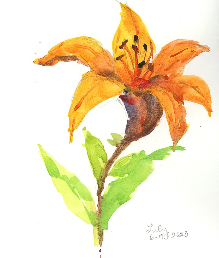
Outside this time, sitting near our picnic table, looking at a pot of pinks on the patio and some backlit orange lilies. On the table, a sudden plop, and who is there but our athletic dog, Smudge. A few licks on the ear, a number of turns on her cushion, and she is sprawled out in her favorite spot. She loves to jump up onto the table, in part to get away from her sister, Inky, and because she likes to get up on stuff. She used to climb a tree in our backyard . . .

But, I digress. This time I decided to work from real life. It’s gloomy and overcast here in California, typical for this time of year along the coast. Even inland, we still enjoy (or not) the May Grey and June Gloom. Perfect for being outdoors – comfortable. And good for plein air.

First up, pinks or dianthus, members of the carnation family. I worked on these with two goals – large washes of color to become defined in shape by negative painting. I did the drawing with a Micron .oo5 pen, a waterproof pen with a delicate tip and good, dark ink.

While that dried, I started the next painting on the opposite page in the sketchbook. Here I used much the same approach – drawing in waterproof black ink (this time using one with a thicker point) and then working on colors and shapes, and giving more shape to leaves and flowers with negative painting.

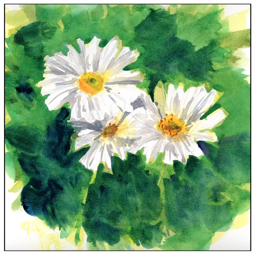
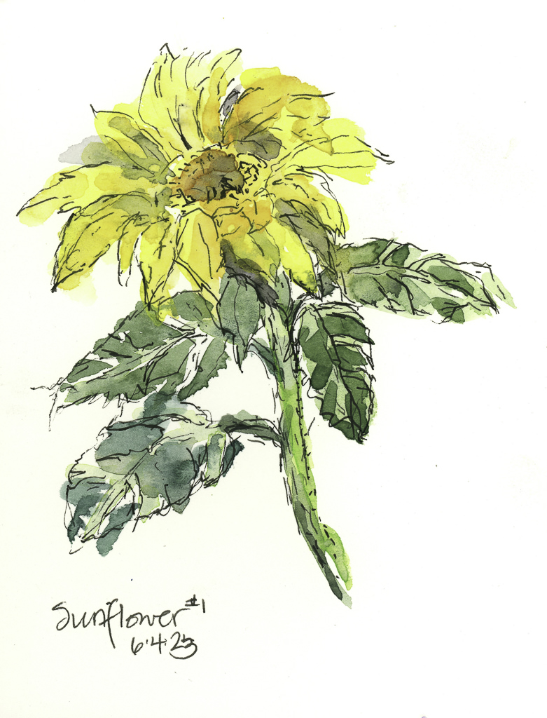
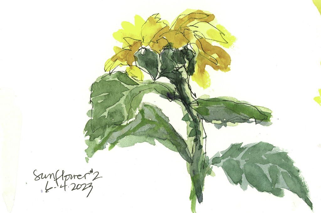
Both of these are painted on 100% cotton paper and I am much happier with the results. The paintings are a bit fiddly, but it is also the result of trying to capture the flowers and leaves in light and shadow, painting from lighter masses to more detail, trying to indicate stems, leaves, and individual flowers to some degree which is identifiable but not like a photograph.

Today’s adventure was more to my liking than yesterday’s with the not very pretty pale waterproof ink. I feel a bit more successful about the end results. And I certainly am a lot happier with the paper.

Boring Waterproof Ink

I had hoped to have a nice dark ink on this paper, using a fountain pen filled with waterproof ink. The ink is waterproof, but it is so pale I fell asleep. If you are going to do a line drawing and then color it in, you need to have a dark ink. The ink was definitely waterproof, but so what if I don’t like the result?

I also used my cellulose paper sketchbook for this, and once more I am not happy. All these blobs of unabsorbed color and a few more than many times using the hair dryer.

Maybe I am not being realistic about the paper, but I am realistic about the point of this study – is the ink waterproof? And that answer is yes. Goal met.

Brain Training with Negative Painting

No, I don’t mean painting with negative themes or thoughts, but painting around things – but you already knew that!

The normal course of painting, for the major part anyway, is to paint the object you are focused on. Then you paint around it. Most often it works, but for light-colored objects, or flowers, sometimes you just need to paint around the white to keep it white. Paper also can affect negative painting by how well it absorbs water and pigment. 100% cotton watercolor paper is best for this, and its sizing also will affect its absorbency. Cellulose papers, even if heavy, react differently to layers and layers of watercolors and pigments.

Below is one of my first focused attempts on negative painting. Supposedly these are chamomile flowers, but the fact is they look a lot like any generic daisy. Painted on the cellulose paper, absorbency was an issue, as seen clearly on the flowers. Blending of color was rather forced. However, I could paint around the white of the flower and get crisp edges. The outside green was more difficult; I think if I used water between two green values to soften the edges, blending might have been more successeful.

From this paper I went to 100% cotton Kilimanjaro 140# CP paper, natural tone. Already a difference can be seen and, while painting, felt. Color is easily absorbed and blurs nicely. Layers of color, laid in while wet and dry, still creates a lovelier quality than above. It was far easier to paint the petals with shades of grey and with thin glazes than above since the paper’s response was more absorbent and less resistant to both water and color.

Finally, a painting of yellow lilies – lilies? you ask? Yeah, me, too. Anyway, yellow flowers. I painted the basic shapes of the flowers, then painted around them, and then added what was supposed to add character and depth to the flowers, and then back to the back ground, and then back to the flowers, and so on. As a flower painting it is nothing great, but it was good practice for negative painting. I worked at shapes more than anything – the shape the yellows create as well as the greens and darks outside and in between the flowers themselves. This, too, was on the Kilimanjaro paper, and it shows.

The cellulose paper fails when it comes to lots of washes, but for more direct painting it works pretty well. For lots of water and color, as with the two on the Kilimanjaro, the cotton paper is far better. The frustration level with the cellulose paper is certainly there as I had to pick up drops of water and spend a lot of time with the hair dryer so I could move on to the next wash or glaze. With the Kilimanjaro, only when I wanted a totally dry sheet to paint upon, to add glazes or more paint or another layer of clean water, did I need to use the hair dryer.

So, more painting and focus. Not great, but it is in the doing and the play the learning is done.

Flower Children, Rocks, Sky, and Mush

I had a bit of running around to do today, but made sure I had time to play. I am seriously trying to paint or draw every day, not just in between chores and appointments!

Today I was interested in playing with flowers. The first was a plein air painting of one of the lilies currently in bloom on my patio. There are a lot of them in bloom, but I decided one would be enough, to get acquainted with them, even though I see them every day, on a more intimate level. Not a great painting, but it was sort of a warm-up exercise to play with some new colors and palette layout.

I am also using, again, some not-so-great paper, but I am getting used to it. I’ve spent some time getting it sopping wet – not really successful, but I am learning how to handle it. This is important as the next painting – the gladiolas below – was to see if I could manipulate washes on this paper. For skies, this is important especially, or large areas of color. Below, sky, rocks, and mushy trees and a color blob.

And finally, the one that I spent time and energy on. The idea was to make a painting of gladiolas (which are in a ridiculously short vase given how tall the flowers are!), making large areas of washes, and working in new and different colors as I moved along the flowers. Patience was needed, and a hair dryer helped things along, but thinking and plotting my painting moves with the air of a strategist was also part of the equation.

So, overall, today was a bit of a success. Nothing great, but I am rather pleased with the gladiolas – not the vase, background, or surface, but the point of the whole endeavor. I also am getting more comfortable with the paper and how it responds to lots of water. It is fairly heavy, and described as “rough” so it has a nice bit of tooth, and now that we are getting used to each other, it will definitely be a playground rather than work.

Sketches Amongst the Potted

Today I finally had time to sit down and enjoy this absolutely gorgeous afternoon! The sun broke through the coastal fog and suddenly the world was aglow with light and shadow, not gloom and grey. That is the standard weather along the California coast, May Grey and June Gloom. It is dull and boring and monotonously monochrome.

I have a lot of potted flowers on a side patio – my yard is worthless for any beauty at this point. First up, the bigger sunflower in ink and paint.

And then the smaller of the two.

Sunflowers are far harder to paint than I think – don’t know why! From there, I decided to look at the tulip tree peeping over the fence a few blocks away. Here I tried to focus on masses of light and dark. It was a bit hard, but the idea was there. I am using my Schmincke pan paints, and they need to be worked a bit to get dense colors, which can be frustrating!

Lastly, my beloved lemon verbena bush. Every year I cut it back, every year it comes back. The leaves were half in the sun, half in the shade. I don’t have any of the delicate white flowers it produces, but the leaves always delight, in shape and scent.

It was fun to sit in the sun a bit. I don’t usually do this, so letting things dry between colors and pictures took a bit of patience. Plein air is not something I ordinarily do, but why not practice it along with patience?

More to come!