More Rocks – A Rocky Shore

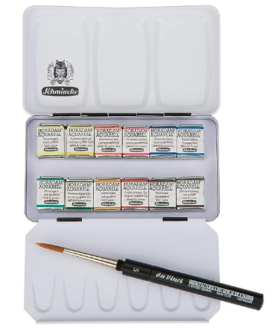
It is always good to break up your routine. I have been sewing a lot over the last few days, and I am now ready for a change. I am also contemplating modifications to what I was making, namely pockets for a kit car. While I contemplate that, other things prevail! Today, I did all those fun things you have to do – specifically, clean house. A friend is coming in from overseas tomorrow, and I have no idea if he will be coming to visit, so I figured I better get it done. Who wants to welcome a guest to a dusty, dirty mess?

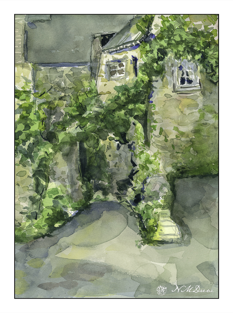
But messes are not really interesting to me. Color is.

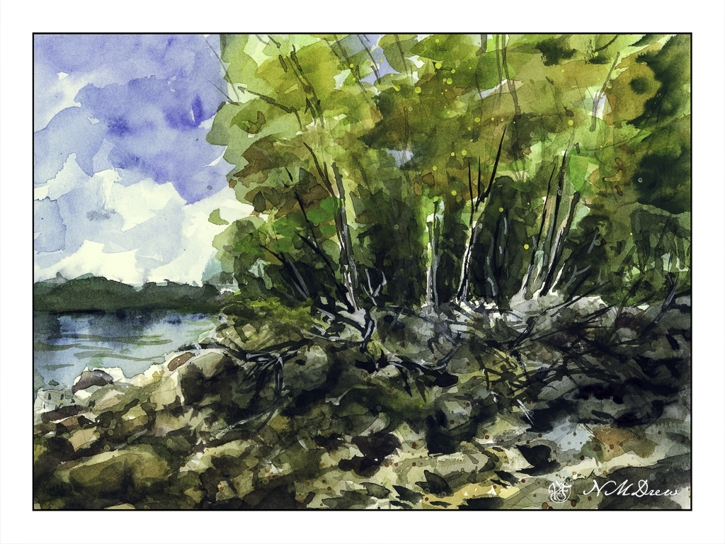
So, back to the rocks in a quick sketchbook painting. In the US and elsewhere, some lake shores are not covered with soft sand, but are home to boulders and rocks at the edge of a forest. Trees fall and die, water freezes and thaws, snow and ice and heat and sun all wreak havoc as storms of all sorts come and go. I love the wildness of these places and their lack of order and tidiness imposed by civilization.

Today I wanted to express rocks in a more abstract manner – suggesting boulders and rocks. Fallen trees, too, and the edge of the summer as it moves into autumn. I splashed on some light washes in the trees and on the shoreline after doing the sky, and from there worked with negative painting to create the rocks and boulders.

I rather like the rocks, but in general, the painting is nothing much – I just like to paint some sort of picture when I am practicing things.

Collecting Little Things

I have been sewing prototype pockets for the kit car being made by Uncle Ed. It is the same one that Josh is making – the 818s. Ed is further along than Josh – retirement has its advantages – and is ready for some storage in the form of a side pocket for the car doors. Details are not necessary, but I plan to make another one today, slightly different, before going down to the Valley to visit him and Auntie Am tomorrow. I’ll maybe post something about the pocketses later.

All this has been a good break from my very unhappy watercolor painting of rocks. Frustration deserves a diversion from the frustrating thingies, so sewing was good. As well, I am really beginning to sort out stuff to take on our voyage, and one thing I am determined to bring is as little as possible, but plenty to keep me from wanting to scream with boredom and nothing to do with my hands. This means setting up a small watercolor kit with pan paints, brush(es), smallish watercolor sketchbook, and ink.

I finally decided on this small half-pan set from Schmincke – it includes a small travel brush, colors I am likely to use, and to which I could add more if I want, I think. I like Schmincke’s pan paints a lot as they are designed specifically for being in a pan, and this way, too, I don’t need to bring tubes with me. I will keep them wrapped up until I begin my voyage – no idea what crazy laws might prevent me from bringing them along.

Awhile ago I ordered these Etchr watercolor sketchbooks, and currently am using the largest for my adventures. I like these a lot, and so I am bringing the middle-sized one along with me. The paper handles both ink and watery colors well, is about 5×8 inches (A5?), and can easily be brought along.

A good mechanical pencil with extra lead is also a requirement, along with a kneaded eraser, some Pitt or Micron pens with permanent ink, a collapsible water cup, and plastic eye dropper or two for wetting the paints. I will most likely stuff them all in a large waterproof zip baggie or something like that, as should anything leak, some things may be spared. I expect I will be doing inked sketches with watercolor, like below, during the trip.

These kinds of sketches are easy enough to do, nothing to get too frustrated about, and bring back memories – as well as give my little hands something to avoid the devil’s attraction.

Packing for a trip is not easy for me – I am always worried about boredom, a lack of clean underwear, sweaty-smelling clothing, uncomfortable shoes. This trip is a real challenge for me as I am trying to be minimalist, yet still have enough for comfort, both mental and physical. Choosing what to bring is not easy – and trying to keep things small and convenient and useful and practical all at once is a huge challenge! I am collecting little things, bit by bit, surrendering to the need for saving space and weight, and rather enjoying the challenge.

Stone Buildings – And What Photos Don’t Show

Anyone who paints from real life and then references a photo of the same knows that photos do not get all the information. This is even more evident when you paint from a photograph of something or someplace totally unfamiliar. Such is the case here – stone buildings from somewhere in Brittany, downloaded from a royalty-free site for the primary purpose of trying to render stone buildings in a painterly fashion, not a nit-pickingly detailed fashion.

First round – colors applied to a pencil sketch in a very wet and general way. As color and paper dried, some details added and attempts at creating contrast done. It took awhile as I didn’t use my trusty hair dryer to speed things up.

I like to desaturate my color scans to see how the picture I am painting works with contrast. IMHO, not too bad, but still in need of stronger contrast. I used my brush in LR to get an idea of where to make things darker, and using that as a reference worked on the arching greenery in the middle and other areas, as well as choosing a source of light – the sun – from the left somewhere.

As I looked at the reference photo, I noticed a window I had not seen in the tunnel below the arching greenery, as well as shapes and areas of light and dark. Was there space without greenery beyond that arch? Was there a turn to the left at the end of the tunnel? How did all these buildings all interconnect? The fact is – I don’t know! So, artistic license as you will, reality is also important as I would like to figure out what I am dealing with, especially when painting the challenging and unfamiliar – old, stone buildings.

Wonky perspective, inappropriate contrast, but I rather like the stone buildings and interplay of shadows, such as in the foreground. The shadows lead the eye (good question where!) and add some interest to an otherwise dull foreground. The light in the reference photo was very flat, so I made up my shadows. As the focus was on the buildings and rendering them in a way I liked (which I do to a degree) I was not especially concerned with the plants.

Looking at the paintings, I am rather pleased with them, but think that perhaps the center upper roof might need some horizontal texture, or do I need to use some ink to define some of the shapes better?

Your thoughts would be appreciated . . . .

Anne said she liked the first one better – it is lighter. In LR I increased the exposure a little bit.

Sashiko #6 – Second Color

Although it doesn’t look especially bright or pink, the second thread I added was a carnation pink. However, I did not have any “real” sashiko thread in pink, so I decided to use a pink DMC embroidery floss.

Initially I sewed the floss as it was – 6 strands of thread – but found it to be really challenging and far more difficult than the sashiko thread in red with which I began. The sashiko thread I have is thinner than the 6-strand floss, so a fatter thread means more work! I picked out what had done. Then I separated a strand of the DMC into two 3-thread strands. These made for thinner thread, and I used it for the top and bottom designs of the swatch above.

However, I felt the 3-strands were just not quite right. So, for the middle design, I used a 4-thread bit of thread, pulling apart the floss into a 2 and 4 strand bit. The 4-strand is thicker and, I think, looks better. However, I never liked separating floss into thinner strands as it tangles up on itself as it is separated. Being lazy I have decided that traditional sashiko thread is more to my liking, and I will leave it at that!

A couple of thoughts . . . the denim is fairly loosely woven, but the floss is heavier than I would like to deal with – I really had to pull to get it through the fabric. For a more loosely woven fabric, I think the floss would be perfect. Sashiko thread seems to come in both thick and thin weights, and I have been using the thin on the denim. Would it be too thick on a more densely woven fabric? If I used thin sashiko thread, would it be too thick and need to be separated, much as the floss needed to be? I guess we shall see on future projects with different fabric.

Sashiko #6 – First Color

This heat is really getting to me – and it is not as hot as in Texas or Florida, and we certainly don’t get the humidity, either. But, I have been staying inside or going to places I know with air conditioning – heat has always not been my best of friends.

Given that there is only so much you can do lounging around a house, it can be good to just watch a movie or show and do something a bit creative. As the sashiko has been ignored, I figured today would be a good time to do some. The same denim as Sashiko #1-5 was ironed and starched, and a grid laid out.

If you look, you will see that the intersections are little + signs, and then there is one stitch in between each plus sign. I am not sure where I am going to go next, but I have a few ideas. The other question is what color thread or threads? I am not quite sure what I have – maybe a pink or bright green against the denim? Not sure.

Anyway, below is the reverse side, just because it is so interesting. Oh, I was going to do the stitching on the reverse, but with the plus signs, my mind was not cooperating, so that will be for a simpler project.