I had a brainstorm the other day: Why not use vacation photos for drawing and watercolor subjects? I certainly do have a bucket load of photos. And, last summer we went to a lot of historical and beautiful places as we wandered through parts of the western U.S. Here, a view from a cliff in Mesa Verde National Park.
Colors include indanthrene blue, quinacridone yellow, organic vermilion, burnt sienna, cobalt blue, phthalo green and Carbon Ink in a Pentalic watercolor book.
Yesterday, here in the U.S., was Thanksgiving. We celebrated it with a few members of our family out of town. Tomorrow, members are coming here for the big family gathering, from east and south and west. So, Wednesday we made pies, and today we set up the tabbouleh, tzatziki, zhuk, and marinating chicken for tomorrow’s feast. Lots of chopping and such, along with a fun grocery trip to a market that sells all sorts of foods not seen in the ordinary middle class market . . . this one caters to Middle Eastern, Indian, Asian, and Mexican tastes, so there is a lot of fun and strange food to be had. On top of it all, it’s so reasonably priced! If you enjoy cooking, nothing like an exciting market and a family which loves good food.
So, did I spend my entire day prepping? No, I didn’t. I did some napping, had some coffee, edited some photos, and then had an epiphany: I can use my photos for subject matter, whether sketching, ink-and-color, or pure watercolor. I went through a few photos from our summer on the road throughout the Southwest and Western U.S., to places like Mesa Verde, Ft. Laramie, Yellowstone, and Teton National Forest. Lots of wonderful things to see. Now, a lot of wonderful things to recall with a drawing . . .
Photo from Fort Laramie in Wyoming:
A quick ink-and-color sketch of the same:
They don’t really look like each other, but what the heck. I liked the roof and chimneys against the blue of the sky.
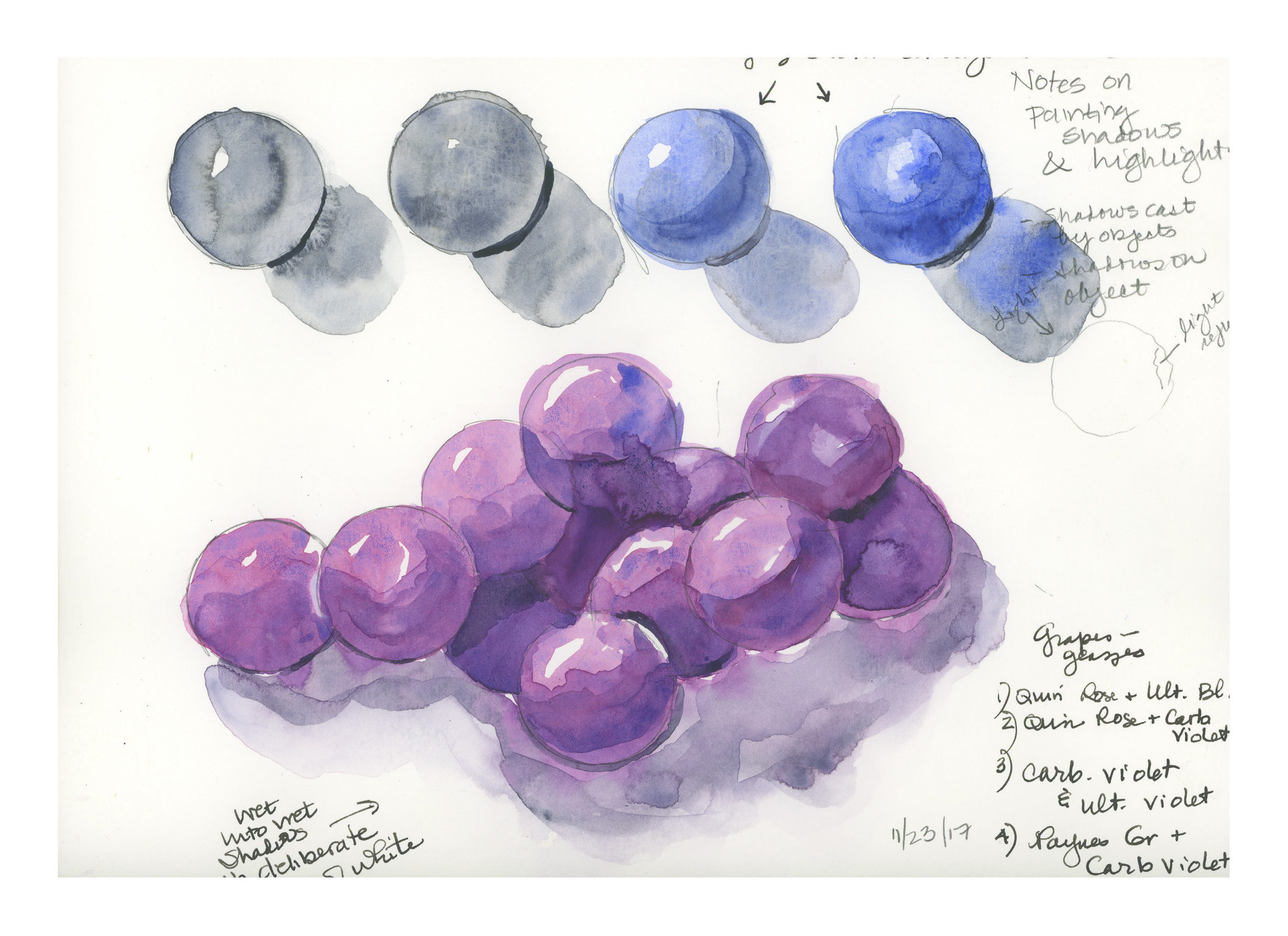
Given my frustration with painting grapes the other day, I decided to look at some YouTube watercolor videos on painting the highlights and shadows of spherical objects. I found two which I really liked, and the result is I did a number of studies, as can be seen below. Techniques include both wet-in-wet, glazing, and a few others.
The purple balls were done with glazing; the shadows were wet-in-wet. Here and there I went in with a damp brush to soften the edges of the shadows in the grapes, or to blur paint over areas which seemed weird. Not too bad, but I do not find glazing appealing; it may be I need to improve my glazing technique.
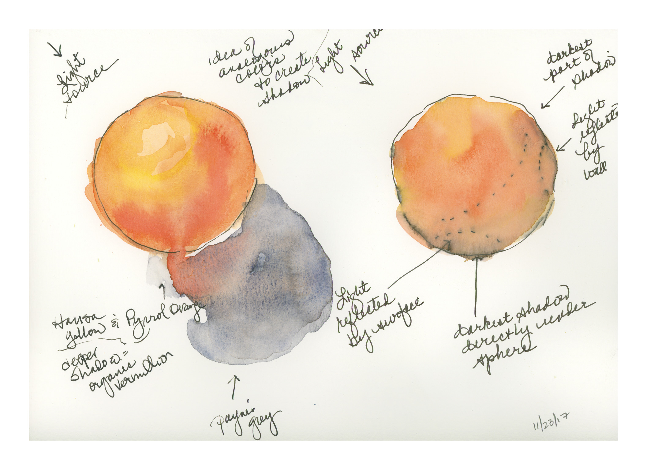
These orange goodies are preludes to a potential painting of oranges. The one on the right was done first, but as the ink was bleeding – it was ordinary fountain pen ink – I moved on to the one on the left, which is drawn with Sailor’s Carbon Ink. I like the on the left quite a bit – the bleed into the shadow, as well as the colors themselves, which are Hansa Yellow, Pyrrol Orange, and Organic Vermilion. The brush I used was a large one, a Cosmotop 14, and the paper was the Canson pad of watercolor paper (not the Montval).
Painting light and dark – contrast – values – is a hard one for me in watercolor. I want to do it wet-in-wet, but maybe layering will work better. I just don’t know. So, when in doubt, look to YouTube!
Here is one video I found that I think does a very good job on both highlights and shadow, discussing reflected light and so on.
Another video which is also good, with a look at only the shadows on a spherical object, discusses the use of analogous colors to create the shadow on the surface opposite the light source. This video can be seen below.
Because I was having problems with making grapes believable (see here), I decided to research highlights, shadows, and round things. These two videos proved very helpful. Rather than describing them in detail, they are definitely worthwhile watching. The top one addresses shape and shadows on the object, as well as the cast shadow. The lower one uses analogous colors to deepen the shadow on the sphere itself, which keeps the color of the sphere rich, rather than neutralized by a complementary color or an added grey, such as Payne’s or Davy’s.
That said, I spent a bit of time on these old spheres today and yesterday. Here are some of the results of my practice.
The image above is based on the exercises in the first video. The ones with the red and blue spheres are the most believable, I think. The spheres and shadows are essentially wet-in-wet, with the final thin lines of darkest shadow done with a finely pointed brush on a dried image.
Here is another round of studies, trying slightly different techniques, such as wetting the paper first, then applying color. The techniques followed were the same as in the first video, with greater success.
Here, the spheres were made as in the first video, but then I went in to darken the shadows using analogous colors. The blue spheres were done in ultramarine blue, and the deeper shadows were a glaze of indanthrene blue. Below the 4 spheres is a bunch of spheres, sort of like grapes. The spheres were done with quinacridone rose and ultramarine blue, with analogous layers in the shadows to include carbazole violet and then Payne’s grey (see note on lower right of image). The shadows were done wet, and linked to the grapes to bleed color in. I deliberately left areas of white, even if they didn’t make sense, just to create areas of white between grape and grape, and grape and shadow.
Finally, the above image. I have a bunch of oranges I want to paint, so I thought it was now time to incorporate all my lessons into one little orange. The one on the left is the example, with, I think, the best orange colors. These were hansa yellow, pyrrol orange, and organic vermillion – all three are colors new to my palette. The ink is carbon ink from Sailor on the left, and just a fountain pen with regular black ink on the right, just if you are curious.
My orange is my favorite of all the exercises as it pleases me the most. The grapes are OK, but they are glazed, which I am not too excited about. It could be that I am just not adept at glazing. Anyway, there we have it: Thanksgiving morning exercises.