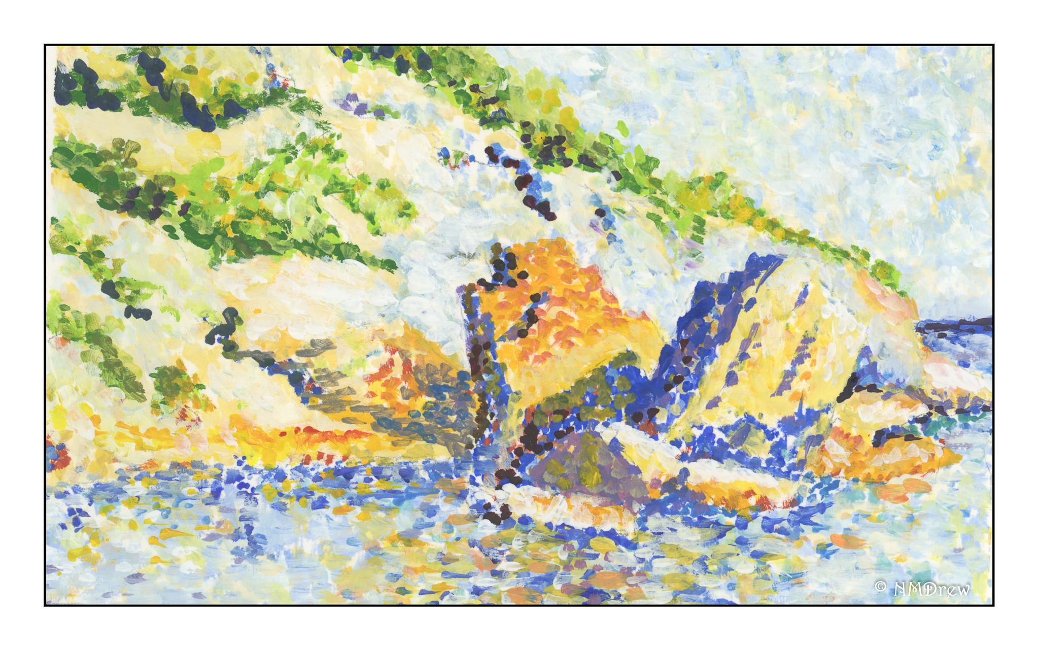
After putzing around with attempts to emulate some of Monet’s Impressionistic paintings of Etretat, I muddled around and found the works of Paul Signac, a Neo-Impressionist and Pointillist. These two schools espoused dabbing, using complimentary colors and such to create a sense of light and movement. They are rather delightful to my eye – I am a magpie at heart – and the vibrant colors and energy of these painters fascinates me.
Here, I decided to see what I could do with a detail of Paul Signac’s painting, which you can see below. His rocks, or whatever they are, and their reflections in the sea caught my attention. My reflections are not very good. As a first attempt to try pointillism, I just started with making dots on the unpainted paper. In reality, the best way to start would have been to laid down solid areas of underlying color, and then build upon that with the dots.
If you look at Signac’s painting, you will see the use of orange and blue in the shadows – reflected light in the shadows. What I also found fascinating is his use of different shades of blue – ultramarine, cobalt, and cerulean in particular. Together with varying shades of orange, yellow, and ochre, he created the stone reflections. I found this very hard to do, but think I get the idea!
More to come. The purpose of copying or interpreting Signac’s work (and Monet’s) is to get a better sense of color. With pointillism, the colors are applied individually. Doing this myself, I begin to appreciate the purity of color when juxtaposed with another.