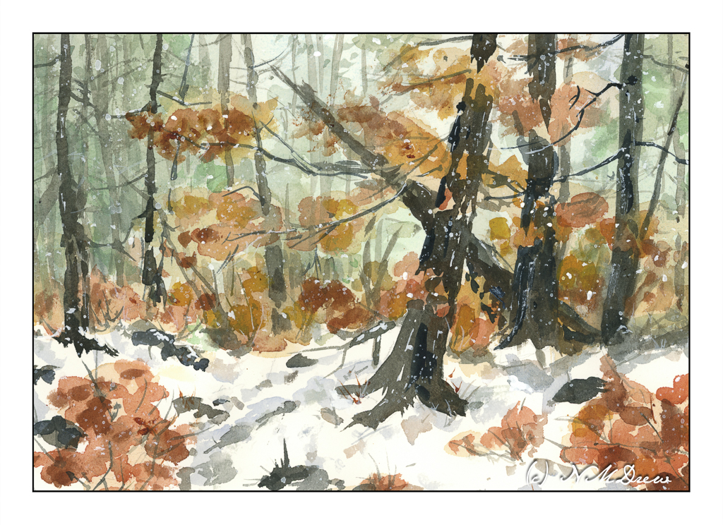
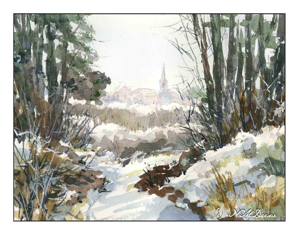
This was an exceedingly hard painting to scan simply because of the very soft usage of blue in the foreground snow. While this scan does not represent the painting very well, the overall image is good enough unless I decided to really play with my scanner’s software. I am not so sure I want to do that.
There are a few “points” to this painting. Using a very limited palette was one point – colors here are ultramarine blue, burnt umber, burnt sienna. There is a touch of a few other colors here but nothing of any significance.
Another point is to keep as much of the paper as white as possible. I managed to do this, but the scan does not do justice to the pale blue of the foreground snow; to compensate for this I used a very light blue graduated filter overlay in my post production software.
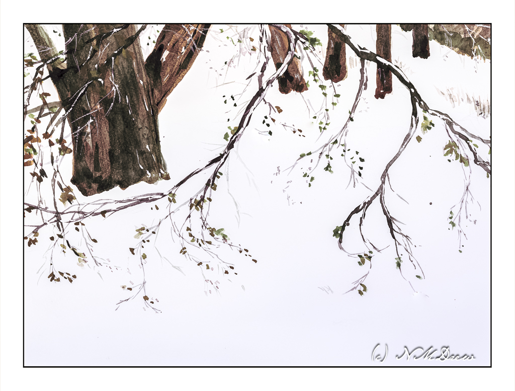
And the final point was to work in layers – light to dark – for the trees. Yes, I used titanium white artist’s gouache for the snow on the branches.
St. Cuthberts Mill, Bockingford archival watercolor paper, 12×16, CP 140#.