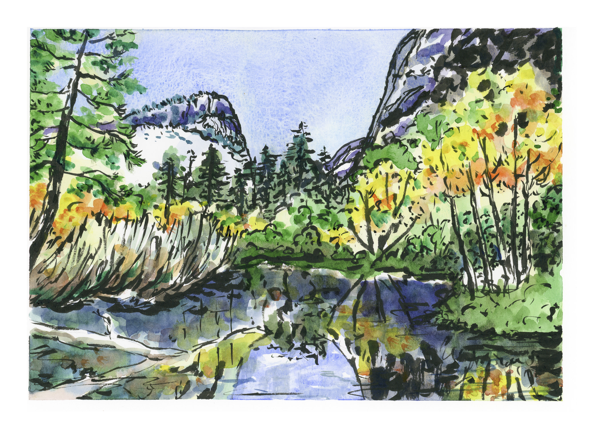
My sister-in-law requested hand-painted cards for a Christmas present. She’s getting them! Out of all of these, 6 were from exercises I did following Peter Sheeler’s YouTube painting tutorials. What made them particularly useful, to me, was that many of them had a lot of white space in them, such as white snow or flowers. The other thing was the simplicity of composition – a few trees, a stream, some flowers. While they look easy, I did need to focus on the videos to follow the sequence of painting, as well as to focus on what I was seeing. Of all of them, I think the stream was the most challenging.
From using Peter’s videos to practice with, and to create cards, I went on to do two based upon photos I have taken. One is a prickly pear which really does sit on a heart-shaped paddle, and the California poppy fields at the State Preserve. The latter made me think of Monet’s painting of a woman in a poppy field – the brilliant colors against a sea of green. Our poppies in California are orange and yellow, so no reds, but mixed in with these colors are blues and whites and so many other colors it is hard to imagine that much of California once looked like that in the springtime!
Below are the different cards I did. Click on one of them to start the slide show.
Yesterday, here in the U.S., was Thanksgiving. We celebrated it with a few members of our family out of town. Tomorrow, members are coming here for the big family gathering, from east and south and west. So, Wednesday we made pies, and today we set up the tabbouleh, tzatziki, zhuk, and marinating chicken for tomorrow’s feast. Lots of chopping and such, along with a fun grocery trip to a market that sells all sorts of foods not seen in the ordinary middle class market . . . this one caters to Middle Eastern, Indian, Asian, and Mexican tastes, so there is a lot of fun and strange food to be had. On top of it all, it’s so reasonably priced! If you enjoy cooking, nothing like an exciting market and a family which loves good food.
So, did I spend my entire day prepping? No, I didn’t. I did some napping, had some coffee, edited some photos, and then had an epiphany: I can use my photos for subject matter, whether sketching, ink-and-color, or pure watercolor. I went through a few photos from our summer on the road throughout the Southwest and Western U.S., to places like Mesa Verde, Ft. Laramie, Yellowstone, and Teton National Forest. Lots of wonderful things to see. Now, a lot of wonderful things to recall with a drawing . . .
Photo from Fort Laramie in Wyoming:
A quick ink-and-color sketch of the same:
They don’t really look like each other, but what the heck. I liked the roof and chimneys against the blue of the sky.
Painting light and dark – contrast – values – is a hard one for me in watercolor. I want to do it wet-in-wet, but maybe layering will work better. I just don’t know. So, when in doubt, look to YouTube!
Here is one video I found that I think does a very good job on both highlights and shadow, discussing reflected light and so on.
Another video which is also good, with a look at only the shadows on a spherical object, discusses the use of analogous colors to create the shadow on the surface opposite the light source. This video can be seen below.
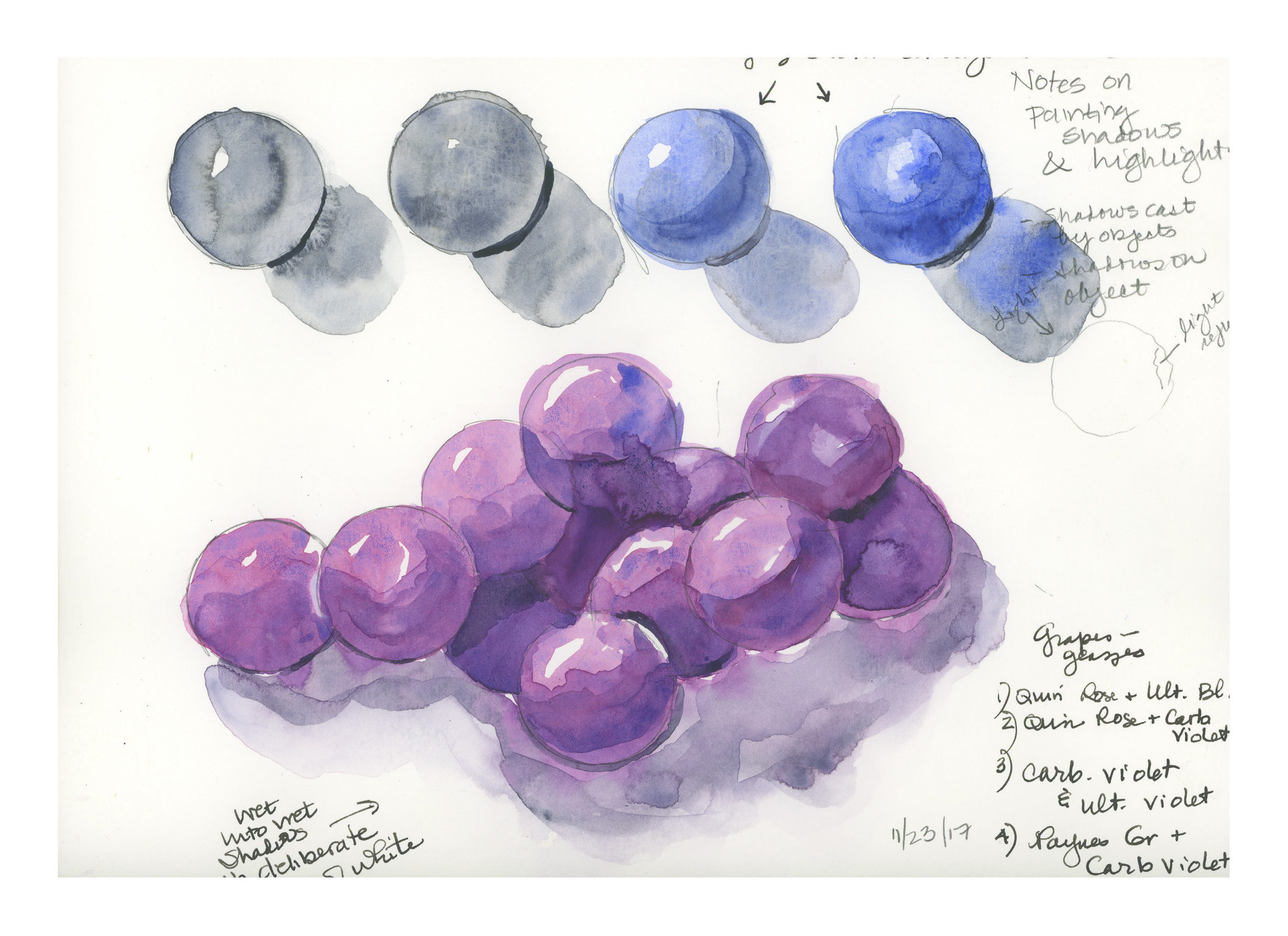
Because I was having problems with making grapes believable (see here), I decided to research highlights, shadows, and round things. These two videos proved very helpful. Rather than describing them in detail, they are definitely worthwhile watching. The top one addresses shape and shadows on the object, as well as the cast shadow. The lower one uses analogous colors to deepen the shadow on the sphere itself, which keeps the color of the sphere rich, rather than neutralized by a complementary color or an added grey, such as Payne’s or Davy’s.
That said, I spent a bit of time on these old spheres today and yesterday. Here are some of the results of my practice.
The image above is based on the exercises in the first video. The ones with the red and blue spheres are the most believable, I think. The spheres and shadows are essentially wet-in-wet, with the final thin lines of darkest shadow done with a finely pointed brush on a dried image.
Here is another round of studies, trying slightly different techniques, such as wetting the paper first, then applying color. The techniques followed were the same as in the first video, with greater success.
Here, the spheres were made as in the first video, but then I went in to darken the shadows using analogous colors. The blue spheres were done in ultramarine blue, and the deeper shadows were a glaze of indanthrene blue. Below the 4 spheres is a bunch of spheres, sort of like grapes. The spheres were done with quinacridone rose and ultramarine blue, with analogous layers in the shadows to include carbazole violet and then Payne’s grey (see note on lower right of image). The shadows were done wet, and linked to the grapes to bleed color in. I deliberately left areas of white, even if they didn’t make sense, just to create areas of white between grape and grape, and grape and shadow.
Finally, the above image. I have a bunch of oranges I want to paint, so I thought it was now time to incorporate all my lessons into one little orange. The one on the left is the example, with, I think, the best orange colors. These were hansa yellow, pyrrol orange, and organic vermillion – all three are colors new to my palette. The ink is carbon ink from Sailor on the left, and just a fountain pen with regular black ink on the right, just if you are curious.
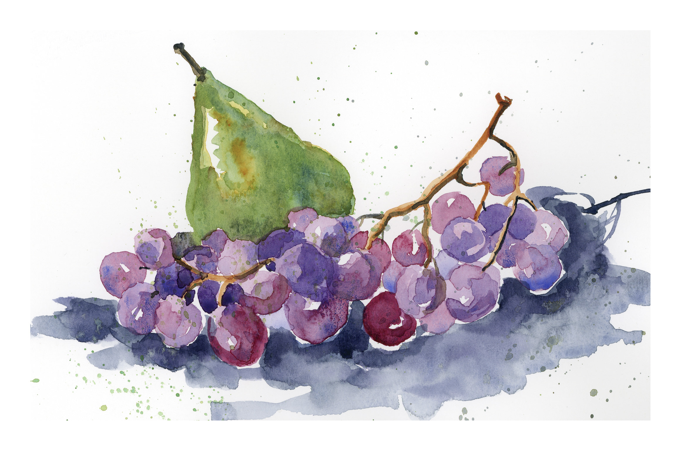
My orange is my favorite of all the exercises as it pleases me the most. The grapes are OK, but they are glazed, which I am not too excited about. It could be that I am just not adept at glazing. Anyway, there we have it: Thanksgiving morning exercises.
If you have been following this blog of late, you will know that I have been putzing around with watercolor on a more serious level than in a long time. (Really, more serious than ever before.) In the process, I have struggled with control of the medium, like all who begin with watercolors. Lines help when a painting fails, and sometimes lines add to a painting if that is part of its intended style.
Having done sumi-e for many years, I love lines and their expressiveness. I also like colors, and that is where self-control needs to show up the most. Think of Hawaiian shirts or 40s palm frond prints and you get the idea about my ideas of color – louder and more is the best!
This painting of Mirror Lake was very satisfying as I felt the use of sumi ink and colors worked well.
Grapes of Wrath (3)
The painting is inspired by a number of paintings I found when I googled “pears grapes watercolor” and chose images. There were a lot out there, and so I painted a number of grapes-and-pear paintings yesterday.
This is the one that pleases me the most. I like its painterly elements and the colors of both the grapes and the pears. It is the most controlled and thought-through of the series. I did not draw any pencil lines prior to painting it, but painted it freehand, recalling brushwork in sumi-e. It’s easy to fall prey to haste in watercolor, to achieve a “painterly” look, but it really requires forethought, just as sumi-e does.
I did four paintings altogether in this series, which you can find under “My Other Lives” above.
This book remains a favorite of mine, in part because of the history behind art apprenticeships, but also because it serves to remind that in all arts, a period of apprenticeship – with or without a teacher – is needed to gain mastery. As I struggle with watercolor, I remember how I struggled when I was working with sumi ink. In sumi-e, the brushes, ink, and paper are enough to make you scream. Watercolor is perhaps worse!
What makes watercolor difficult? For me, it is always a matter of less being more. With colors, I am a magpie – all those colors! I am hard-pressed to use only a few. With sumi-e, you have one color: black. And shades of grey (50 if you want). Another struggle is to not create mud. I seem to be moving away from that. And finally, lines. I like lines. However, I want to paint without lines . . . sort of like giving up training wheels on a bicycle.
At some point, I expect I will be able to master watercolor far more than I am now, but it is a long, hard haul. And, I admit, one I am not very happy doing. I wasn’t happy with the struggles with sumi-e, either.
Finding a master is not something easily done in this day and age. Rather than being apprenticed to learn a skill or craft from a master, many of us go to school. I am way past spending 4 years or more in college – I am an old workhorse – so I learn by observation. This means finding an artist I admire and trying to copy his / her work, as well as subscribing to numerous YouTube videos. I also have to learn by doing, which is the most challenging part. A part of me expects to be perfect, and my temper flares when I feel frustrated. That is when it is time for the proverbial deep breath, retreat, regroup, refocus, retry. Patience is also taught with such apprenticeships!
Thus, in cruising the internet, yes, I do “steal” from the master. In “stealing,” I learn about color and composition, light and dark, contrast. I do not ever intend to pass someone’s work off as my own – that is not right. But, if you go to a museum, you will find people sketching the work of a master. Why? To learn. The best learning is by doing.
Various painters come to mind whose work I enjoy; when I find someone whose work I admire, I like to look at their paintings and try to figure out how they did it, the order it was done, and the colors used. By copying I learn about color mixing and how to create an image that (might) work. Every artist is unique, and each has something to offer. There is a lot to learn from out there, and I am humbled by the talent I see. And I learn when I copy from the masters.


")

")