I’ve been sitting on this picture, doing some research before finishing it. By research, I mean watching videos on painting the red rocks of the American West to figure out colors, practicing with colors and washes, and finally, practicing with blues over the colors. as this mesa has a lot of shadow areas.
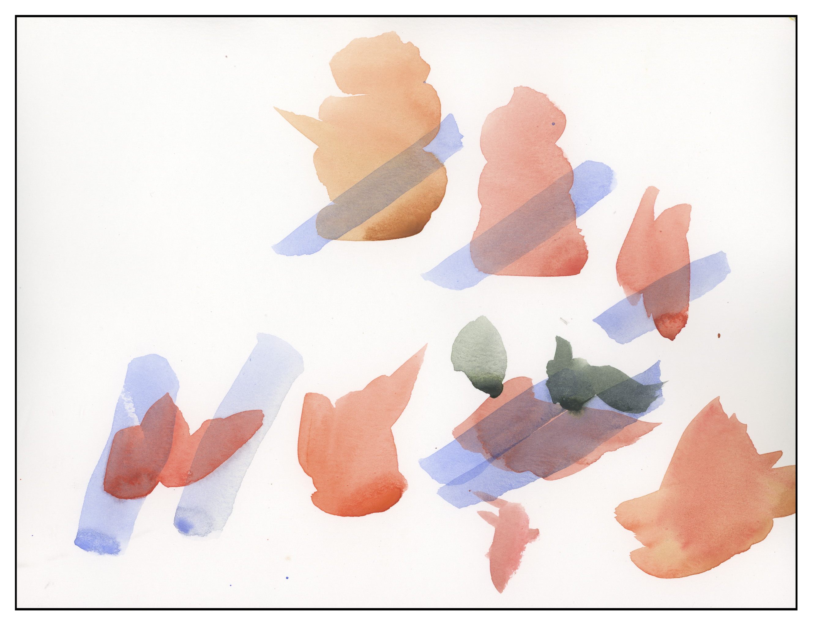
Above, color practice. I used Pyrrol Orange, Organic Vermilion, Burnt Umber and Burnt Sienna for most of the reds and oranges. The grey-green is a combo of Sap Green, Cobalt Green, and Payne’s Grey. The blues are Ultramarine and Cobalt. And below, the final result.
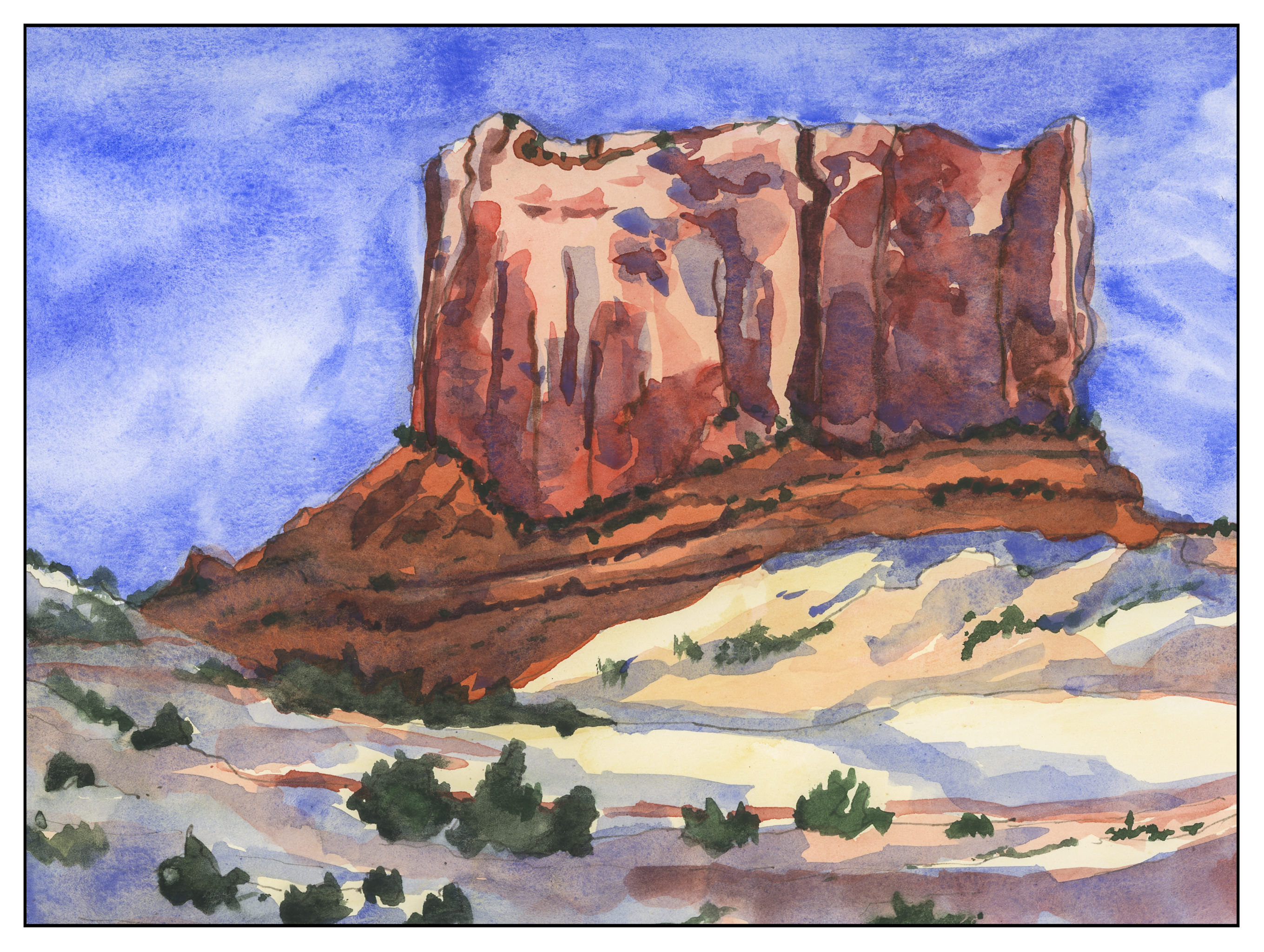
This is perhaps the first “researched” or “practiced” painting I’ve done. I usually just go-with-the-flow. The pay off is pretty good. I’m still not really sure if this sketchbook is good for anything “serious” but it did a good job in the end. It is really curly paper when it dries!