Direct Watercolor

The other day, I came into possession of a copy of Marc Taro Holmes’ newest book, Direct Watercolor.  In spirit, I am much of the same philosophy – little prep, direct painting, thinking ahead, seizing the moment, using colors directly, relying on imagination and happenstance and experience to create a painting.  All this requires is just doing it!  The “doing it” is the training – you do it, you think, you do again.  Like anything, practicing it enhances your skills and brings the mind-muscle memory together in ways that, if you were to consciously thing about, you could never achieve.

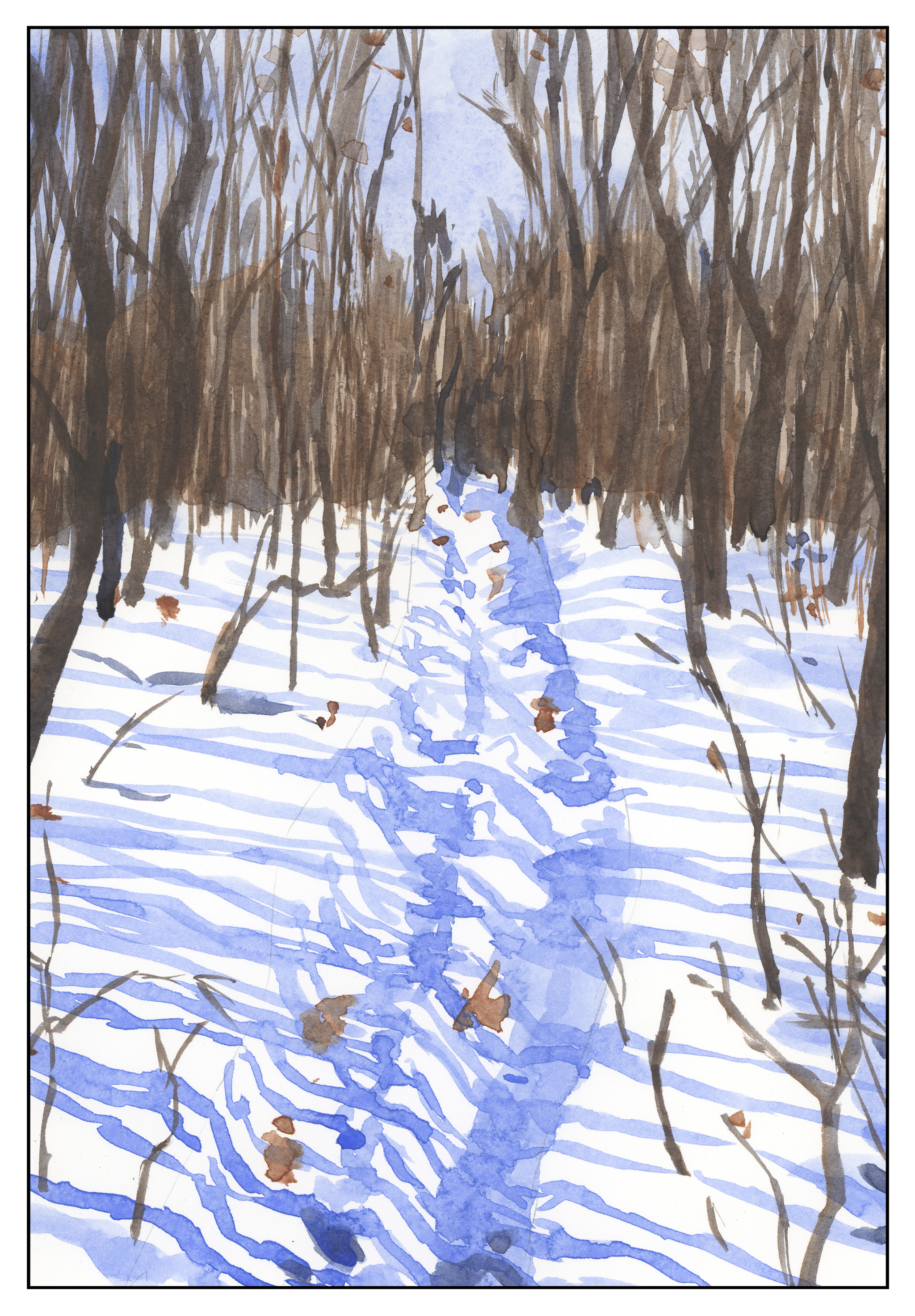
Marc mentioned some things I found particularly useful.  One is to create a silhouette of what you are working on – create the outer edges and then move inward.  Decide if edges are going to meet so that colors can bleed into one another.  Keep your edges dry if you don’t want things to bleed from one thing into another.  Let the painting dry, but don’t go over it extensively.  Other points he made is to work light to dark, large to small, but if you are working on something, do it directly – don’t dance all over the paper.

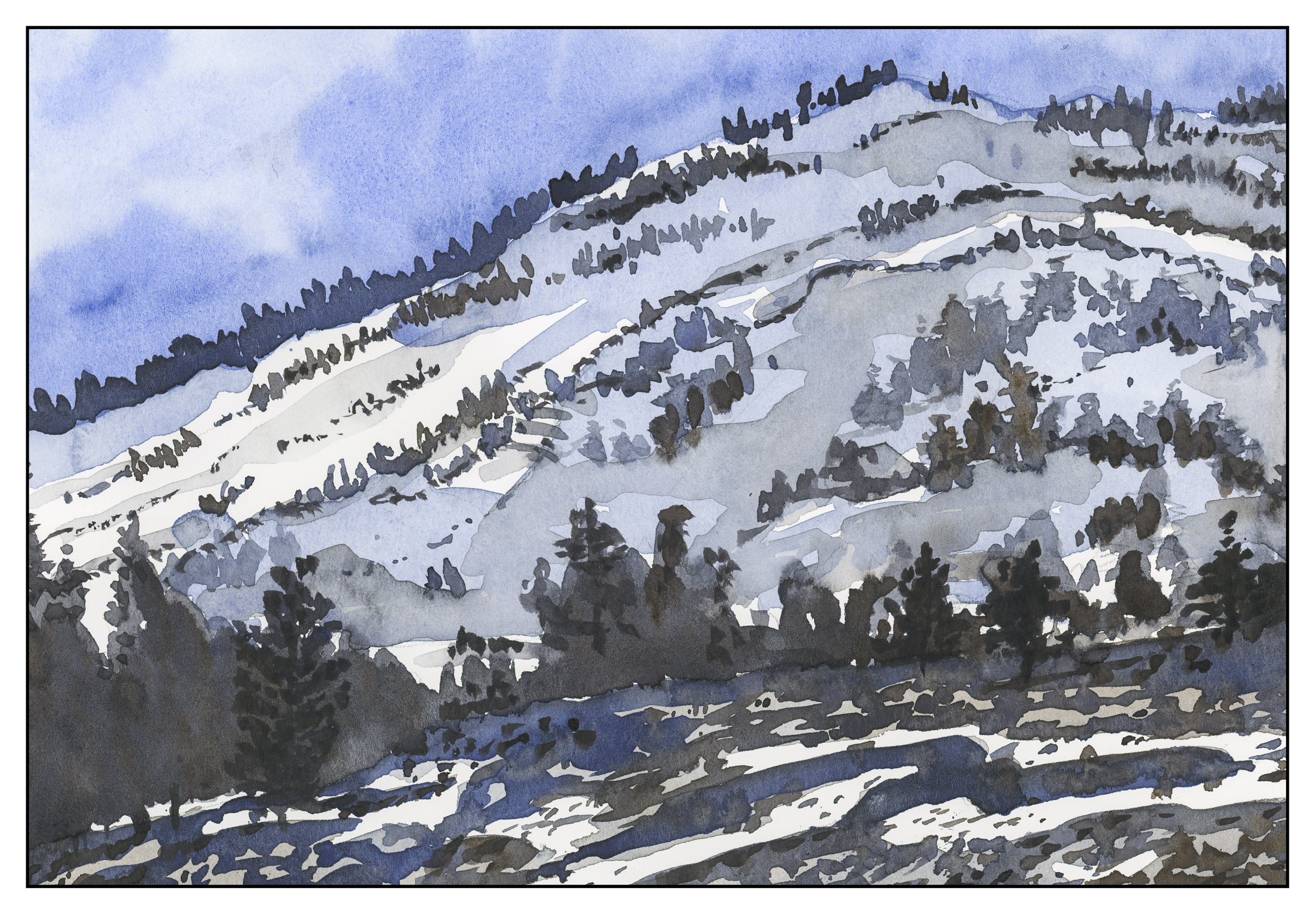
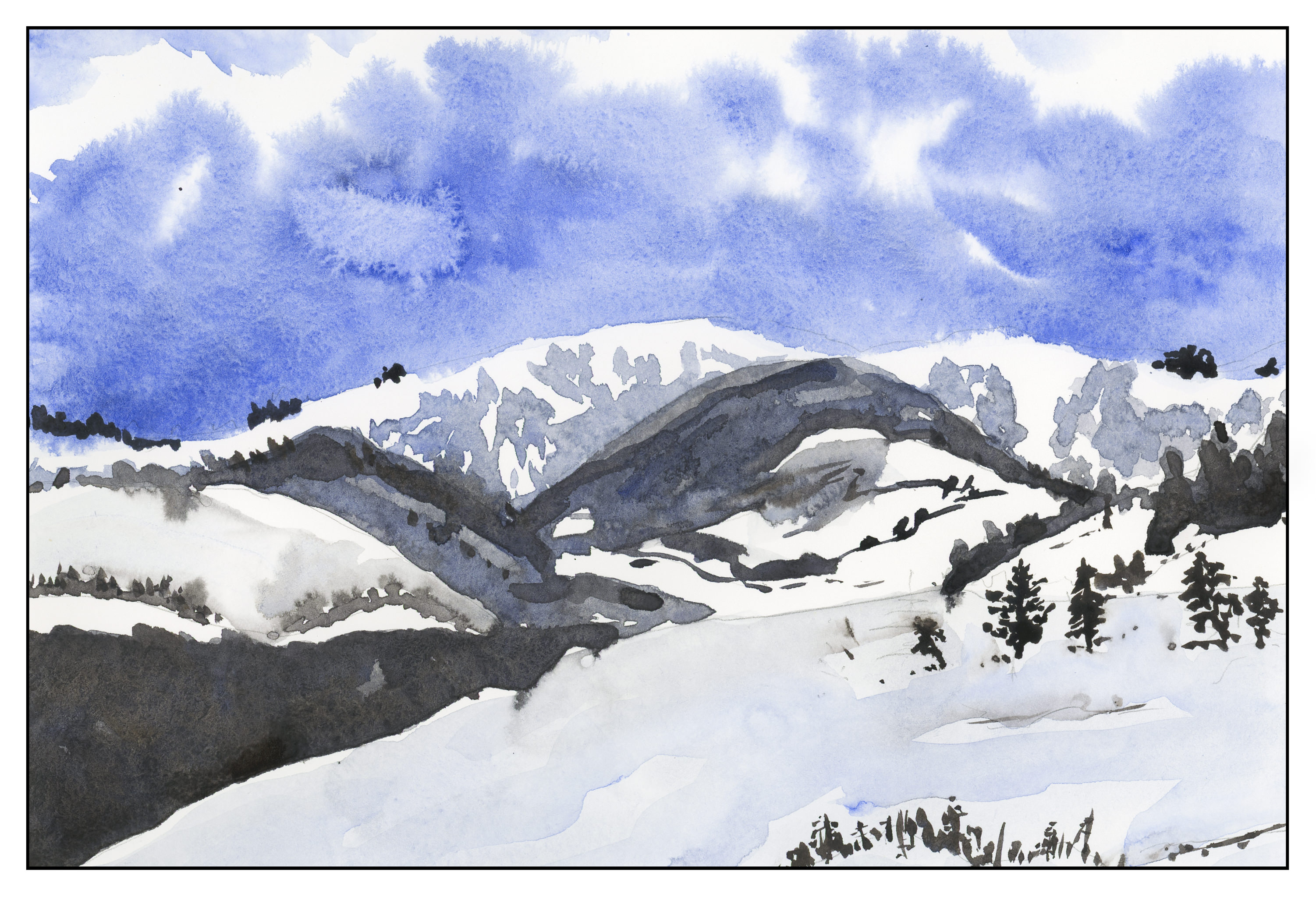
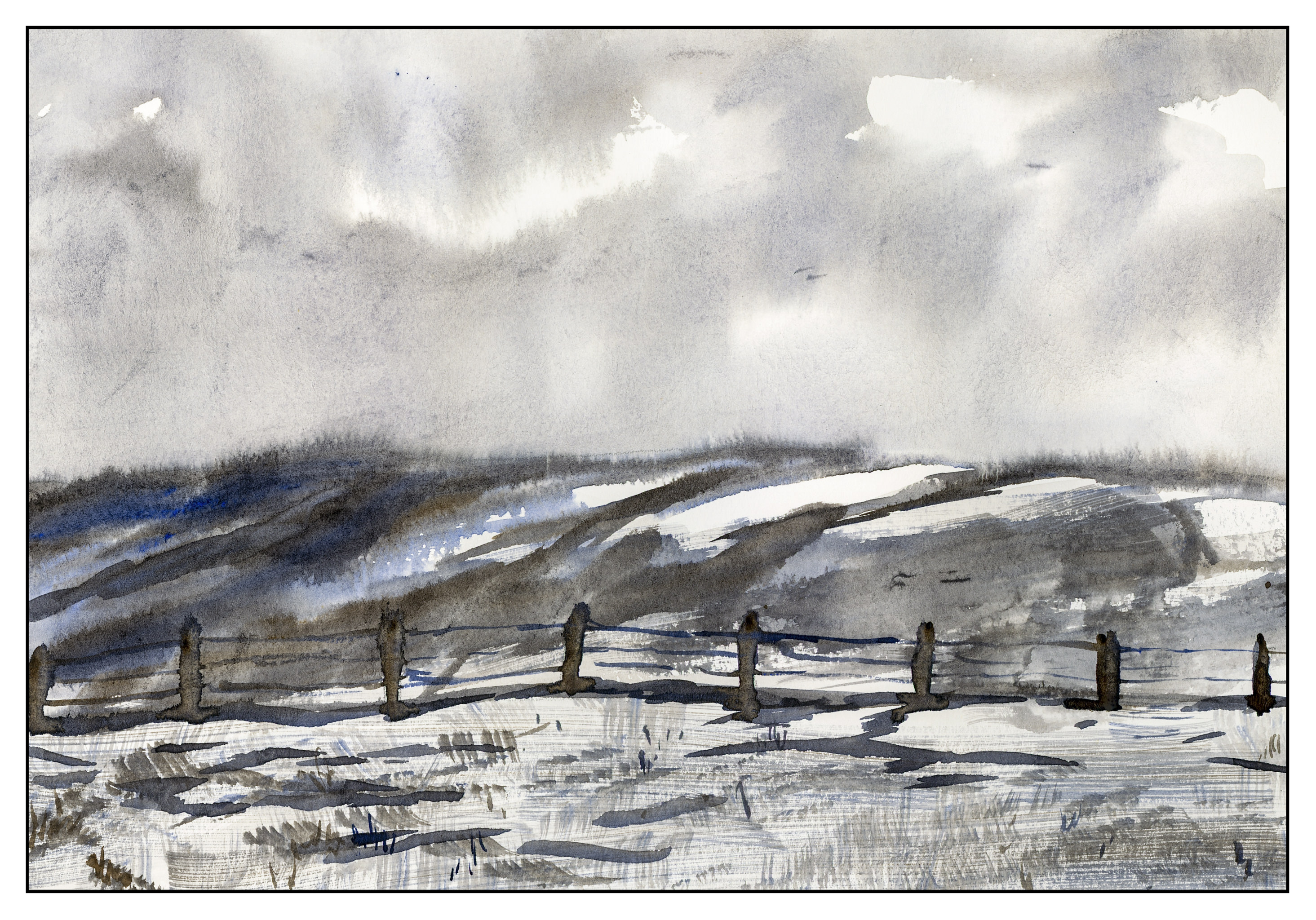
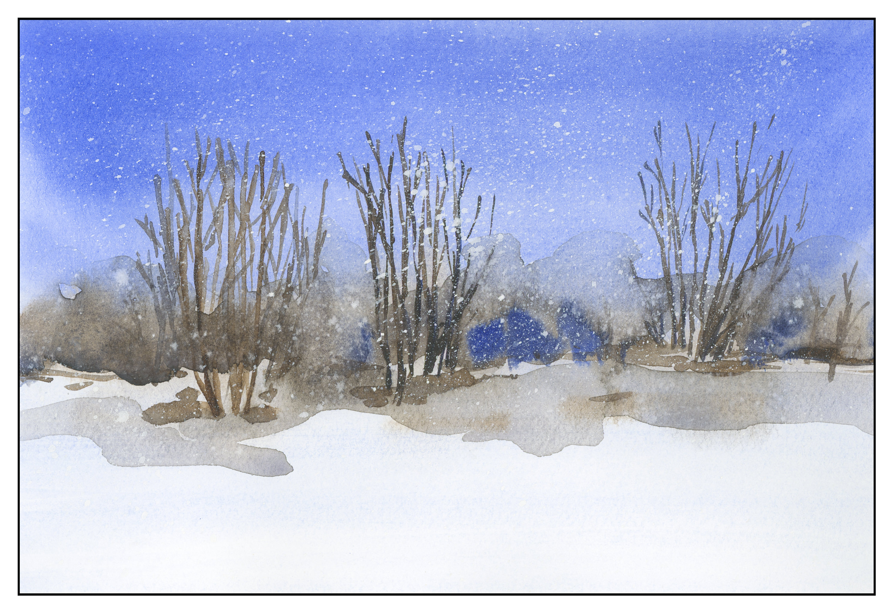
The silhouette appealed to me immensely, as well as the brushwork.  Here are some examples of brushwork and silhouette working together.  Once the edges of whatever I was painting were done, I then came in with varied colors to shade or define.  The colors really please me in many of these little sketches – the blending, the bleeding, the hard edge against the paper’s white.

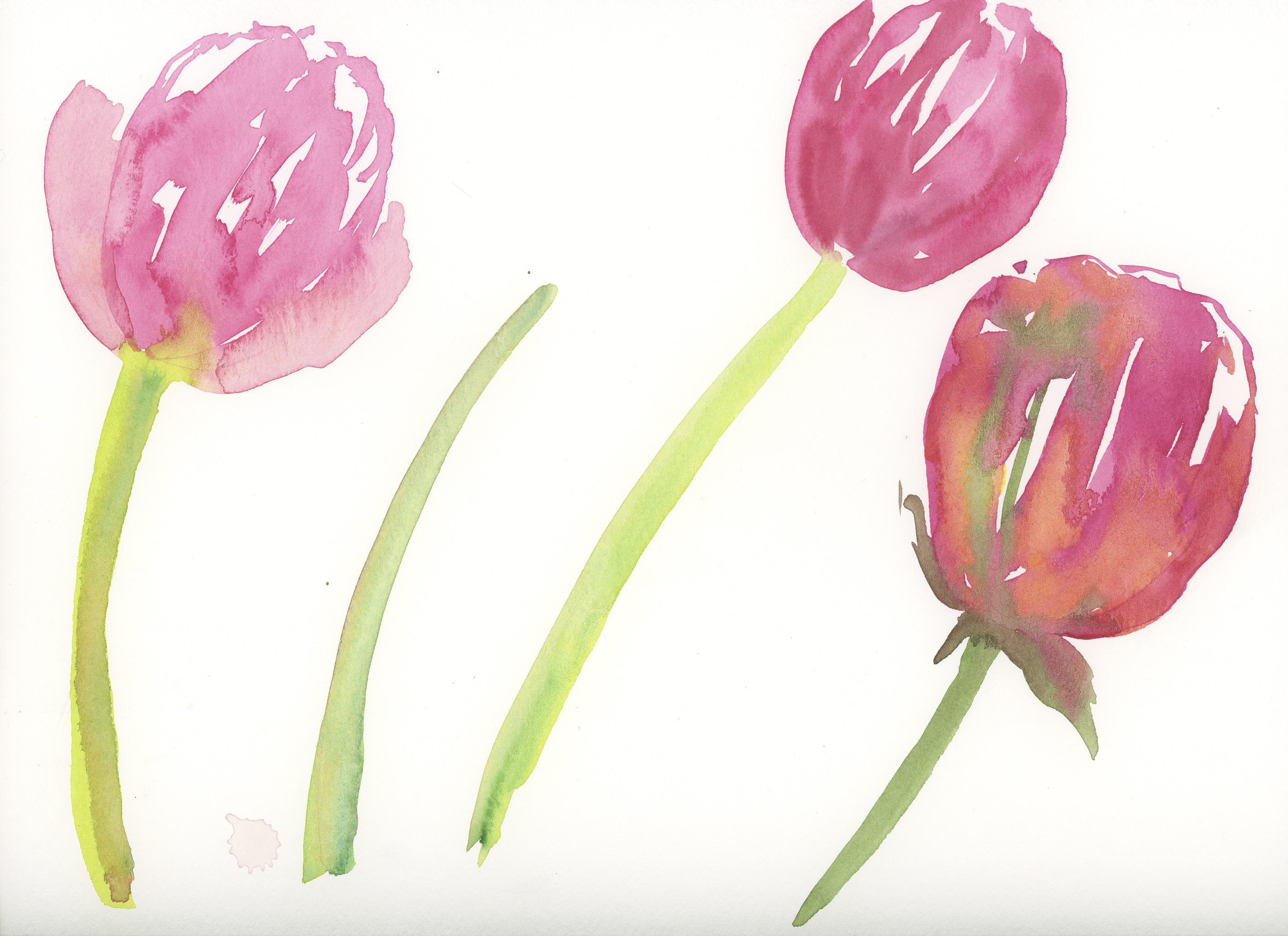
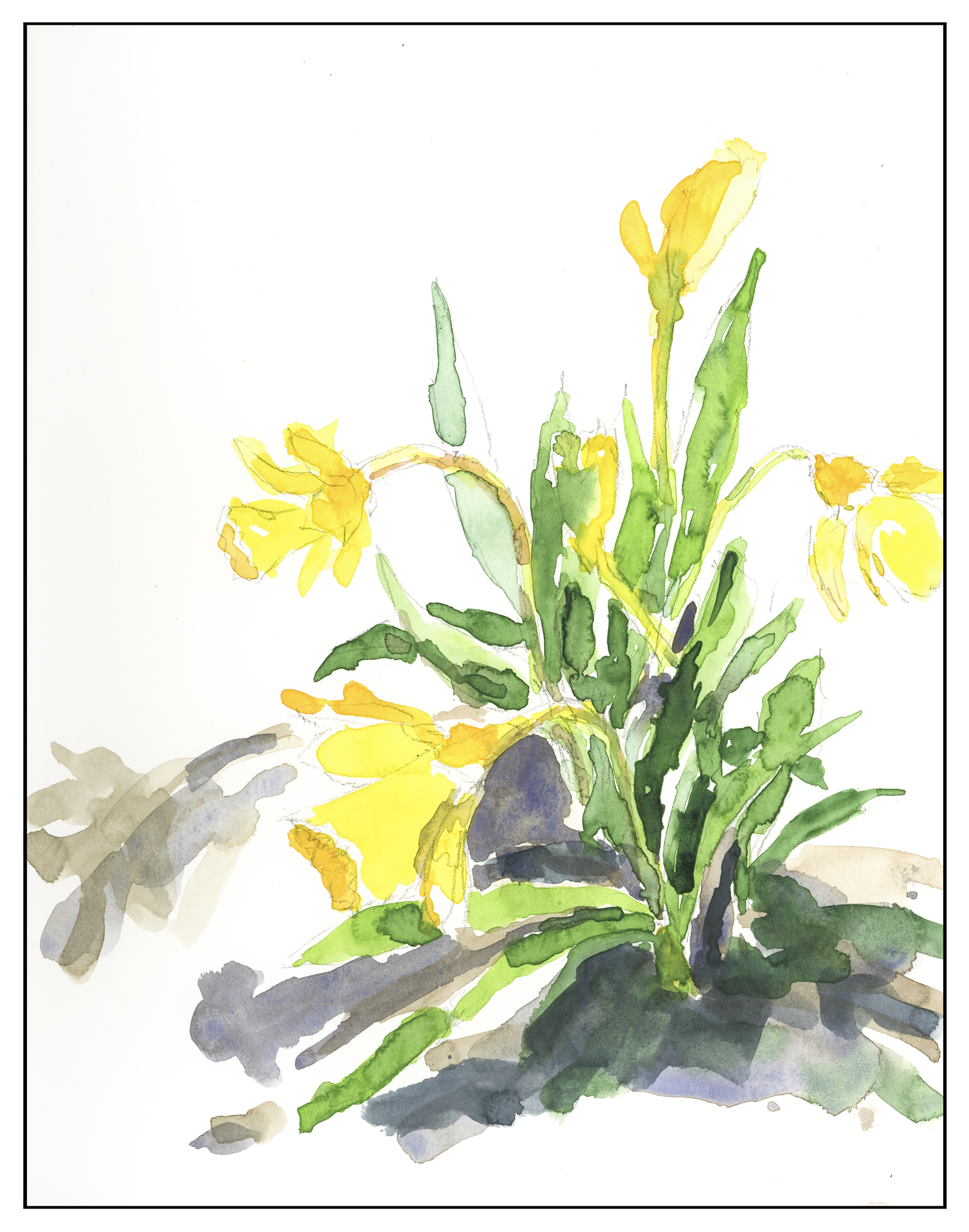
Flowers make sense for the silhouette and then move in to blend colors.  Above, wet-on-dry.  Also, working directly while everything is still wet – as in the tulip on the far right.

Below, some examples of trees to create the illusion of a building (left) and another silhouette then molded to create a shape with shadow (top right).  Marc also mentions brushwork to show direction – and the importance to suggest.  The grassy strokes on the top left.  Finally, a bigger silhouette – here, Morro Rock –  created and worked on first (bottom right) before moving into other areas, specifically the dunes and plants in the foreground.

Quick sketches with valuable lessons.  While Marc’s book is not a “how to” book, it is a valuable resource for specific techniques.  The fact he is such a talented painter makes it look easy, but the truth is, he went from precise lines, to lines and colors, to direct watercolor with a great deal of effort and an entire change of mindset.


Studies in Two Colors

Over the weekend, I worked on numerous simple watercolors, inspired by the 2-color studies found in Ted Kautzky’s classic book Ways With Watercolor.  He suggests beginning with just two colors, Burnt Umber and Ultramarine Blue.  From his book, I did the exercise below.

The umber and ultramarine are considered to be “warm” colors from what I have read, but they work to make wonderfully cold winter scenes!  Here are some I did after the one above, to continue the study.

The beauty of using only two colors is there is little likelihood of making mud.  That’s a good thing!  Instead, I got to focus on value, which is not an easy thing for me.

Values are not just light and dark, but everything in between.  For instance, above, there is bright white, a light grey, a darker grey, and so on, moving into essentially black.

Besides working on value / contrast, the above painting was a work done with a lot of wet-in-wet, particularly at the horizon line, to blur the plant growth into a hazy atmosphere.

From there, another wet-in-wet, accompanied by a gradated wash, in the above painting.  I started with pure Ultramarine Blue, and then worked it lighter and lighter until I reached the bottom of the sheet.  Then, with a dry brush, I worked upward to remove the blues.  You can see some blue streaks left behind.  After the picture was finished, I used white gouache and a toothbrush to spatter snow onto the painting.

After all these umber-and-ultramarine paintings, I have moved onto ultramarine and Burnt Sienna.  The sienna is much warmer, to my mind, as long as it is not mixed with the ultramarine.  With ultramarine, the color can be as deep as you want – nearly black – as you can see in the trees.

The shadows across the snow, and the ruts, were painted with plain ultramarine, as was the sky.  It’s a great color for shadows, on snow or otherwise.  You will see that the dark colors, such as on the trees to either side in the foreground, are blackish, but of a very different hue than the darks in the paintings above.

This study has been worthwhile.  I may do more in just two colors, or add a green.  Varying just one color produces considerably different results.  I also did the same pictures over again, in different browns or blues, or both; this is also a good way to become familiar with colors and how they interact.

Two Color Studies: Trail in the Snow

Another two-color study, this time using Burnt Sienna instead of Burnt Umber, along with the Ultramarine Blue.  As an aside, looking up lists of “warm” and “cool” colors, the umber and ultramarine are considered “warm” by some.  Beats me, as they sure look icy together.  Here, the Burnt Sienna alone or diluted is warm in cast, but moves to dark and cold (in my eye) when combined with the Ultramarine Blue.

Two Color Studies: Snowfall

Another study in Burnt Umber and Ultramarine Blue.  Cold, wintry colors.  Here is a study done to practice laying down a gradated wash.  Using a strong blue wash, I started at the top, then went all the way to the bottom, lighter by adding more water.  Then, starting at the bottom, I used a dry brush to begin removing the wash, bottom up, until I reached the horizon.  From there, a mixture of blue and brown to create the blurred trees in the distance.  Then trees, shadows, and the shading under the trees.  The paper is not the best for heavy washes – there is a bit of puddling – but the exercise of wash and 2 colors worked.  Finally, I took some white gouache on a toothbrush and splattered it to create the effect of snow.  Maybe this is really a 3-color study?