Pictures made with only watercolor pencils seem insipid to me. The contrast is not strong enough to be interesting to my eye.
So, I decided to set out to make this a lie! But, I started out by acknowledging that I would be using whatever means it took – pen, ink, watercolor paint, white pigment – to make the contrast I desire.
What I like about watercolor pencils is the fact you can draw with them, and they create lovely textures. Working in conjunction with other media, I hope to create a picture I like. I am using a 60-pencil set of Faber-Castell Albrecht Durer pencils.
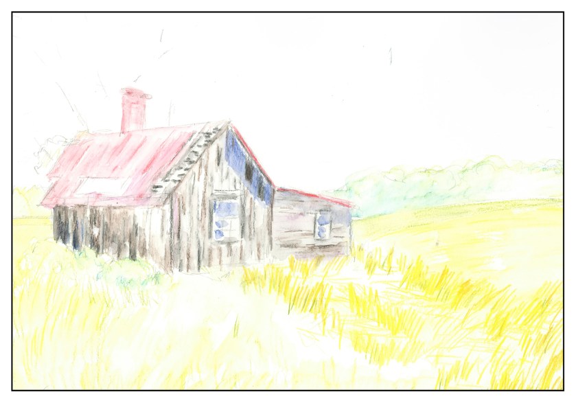
I put down a pencil drawing, and then sketched in basic colors, and then wet them to blend.

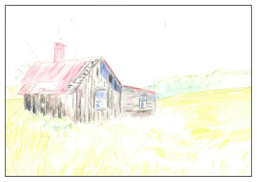
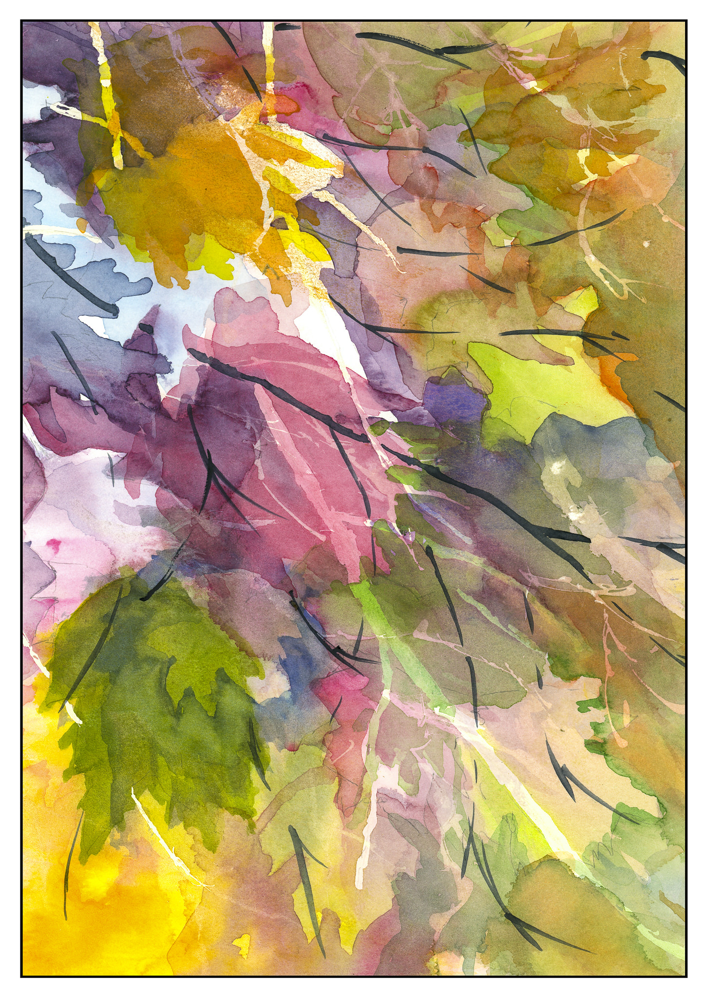
The next step was a bit of a gamble – putting down darker values and colors as texture. Some colors were overlaid with one another, such as the blue shadows on the shack. This is what it looks like before the water is added to blend the colors.
When wetting the picture, I decided to do two things. First, work light to dark – that is, wet the lighter areas and then the darker. The second was to follow the direction of the pencil lines. Between colors I tried to be sure to rinse off my brush, and to blot as necessary to keep the paper from getting too wet. I am also trying my best to preserve my white areas.
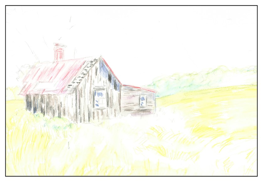
Next, establishing the pattern of the grasses in the foreground. Here, I worked in the light colors to the lower right side, where there are white areas. I drew the lines in the direction of the grasses, including white pencil to lighten the overall colors of the yellows used. The lines are seen below, followed by the application of the water. I laid the lines of the grasses down with some pressure, the idea to make them more distinctive and for the color not to dissolve into a blur.
Here, as before, I used water in the lightest areas and then in the darker areas, following the pencil strokes. The lighter areas I did horizontally, and the darker areas more vertically.
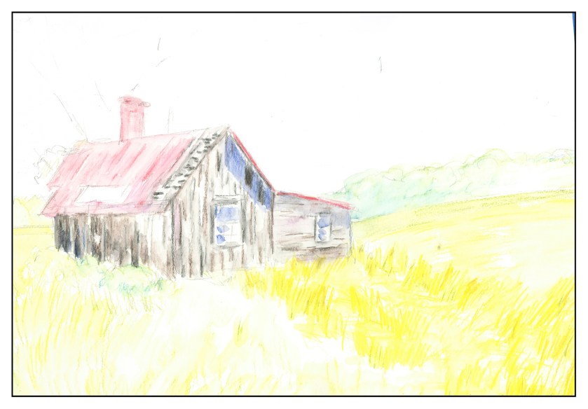
To be continued!


")

")
")
")
")
")
