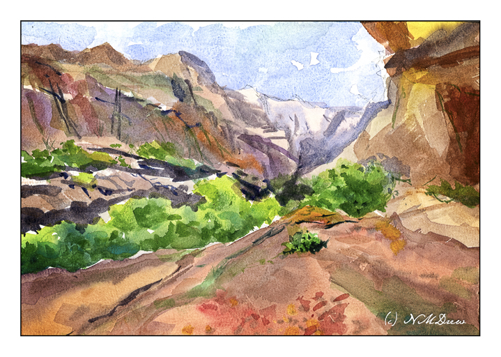
I have been very pleased with the Bockingford paper from St. Cuthberts Mill. It is a good quality, non-cotton paper which gives quite good results and closely mimics the 100% cotton paper most watercolorists prefer. With this in mind, I bought a 9×12 block of their Millford cold press paper. This paper is supposed to closely resemble Whatman’s watercolor paper, long out of production, and highly recommended by painters such as Ted Kautzky.
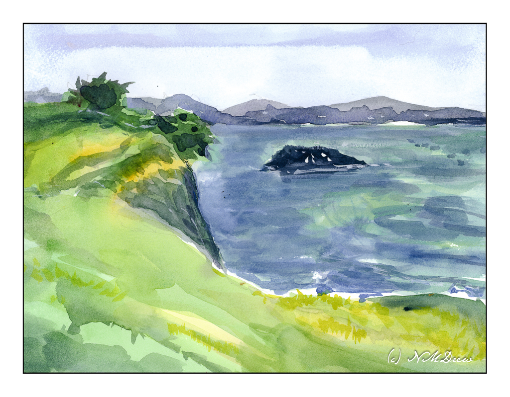
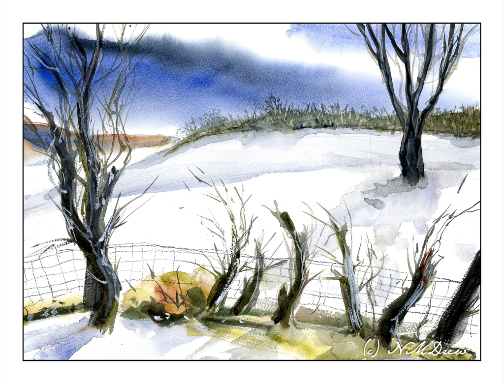
Choosing to reconsider the composition of my previous painting “North Coast” and the island’s placement, I figured a good, wet wash would give me a good idea how the paper handles. I wet the sky first and then added blue.
Immediately I could see there was a serious problem with the paper’s sizing. You can see it as a dark blue streak with a straight edge about an inch into the paper. After that, the wash blends well. We have all seen skies with an odd straightness between sky and cloud, but this is not what I want to have in a painting. Given the price of paper, this is not good.
However, what can I do since this is a fact of this particular block of paper? I know I could take it into Photoshop to fix should I wish to print it out, but that is not the point here.
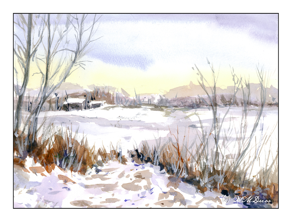
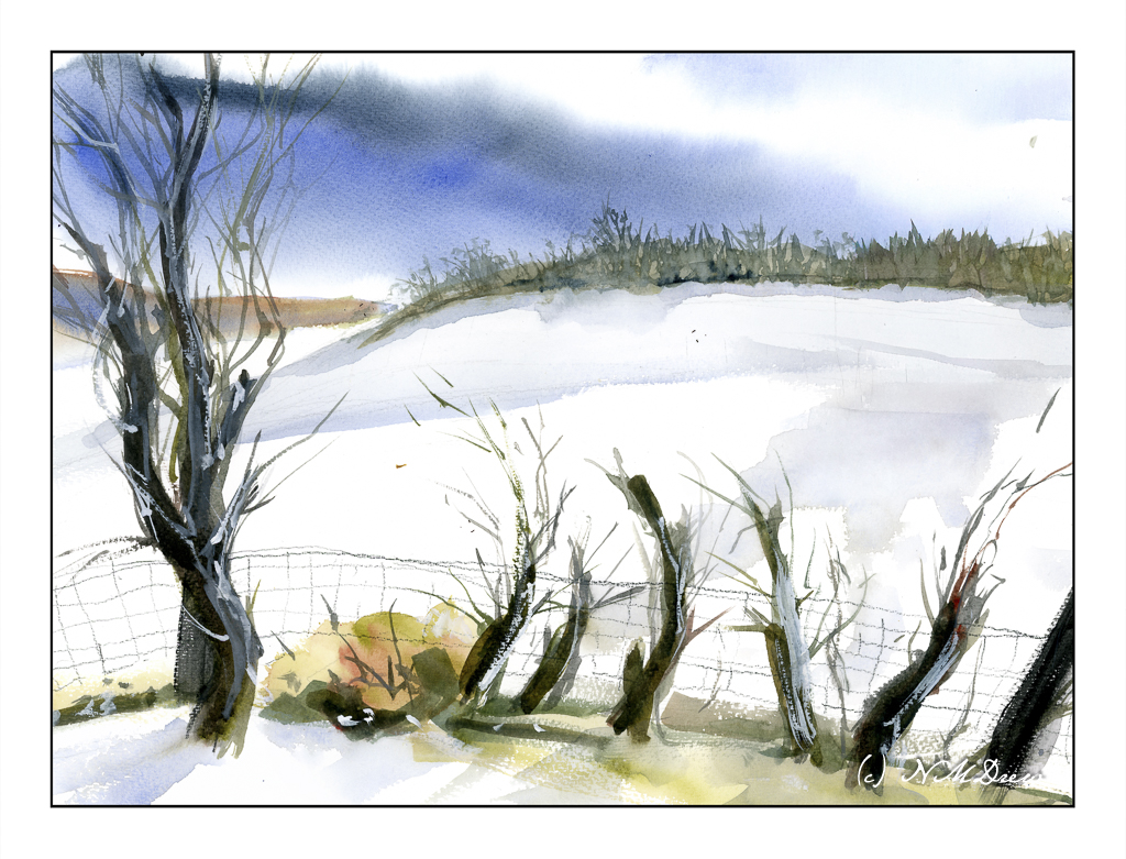
On to another painting, one with a sky that is varied. Again, I wet the sky area first. I laid in the yellowish color at the horizon – hard experience shows this to be a really good way to do such a sky. From there, I applied the bluish mix, dark at the top, drawing a very wet brush across the top of the paper and then into different parts of the sky, letting it blend a bit with the still-wet yellows. Here, I worked with the defect. But then! I saw on the left side of the paper, the same sizing issue appeared.
Sigh.
Well, working with thin washes, I painted on. Trees on the left help to hide the defect.
Despite these issues, I really do like the Millford paper. It has a nice texture. Water rests a bit longer on the surface than other papers, allowing bleeds and such to work well together. In the first painting, I lifted a bit of color out of the island, just to see what happened, and it held up well. Additionally, the glue around the edge of the block was light enough to allow for easy removal of the sheet without tearing the paper – I have had this issue with Arches blocks decades ago, and that has been a big turn off. The glue around the edges of the Arches paper was tough. Perhaps I shall revisit it . . .
Problems exist. Things are not perfect. Working with a problem successfully is satisfying. Knowing the problems with this particular block, I can find ways to make my paintings successful. One thing is to allow the composition of the painting to discard that area if necessary. There are other ways, too, but those can be worked on as a painting proceeds. What will be interesting is to see how far down the pad this problem exists.
And there we are – a Saturday afternoon’s painting, exploration, and play!