Out in the Back Yard: Dinghy, Trees, and Lilies

This past week has been spent sewing, learning software, socializing, keeping appointments, and going to Santa Monica via the canyons. Fun stuff. Today, though, the urge to paint came upon me – it really is part of my identity, for better or worse.

For some reason I am obsessed with boats of late – trying to get their shapes and such. I figured a dinghy on water, reflections and all, would be a good place to begin. Boat shapes are hard in some way, but if you create a series of rectangles, the curves and such are easy to create. I drew this one in my watercolor sketchbook, and there were a lot of pencil marks. In the end I needed a bit of definition, so added blackish paint lines here and there.

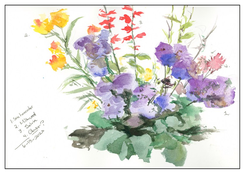
My sister asked me if I ever paint from real life or outdoors. Seldom will I do either, but I have been doing my garden plants, so I decided to do my podocarpus trees along the back wall, and added some imaginary grass to replace the dirt and roots. (I need to cut these all done, have the yard dug out, and then re-landscape. What’s a couple of million bucks?)

After these, drawn ahead with pencil on the paper, I decided to work on what is referred to as “direct watercolor” – a phrase invented by Marc Taro Holmes. This is when you paint directly on the paper – no prelim drawing, no pencil lines. You put pigment on paper and off you go.

The first subject is the large grouping of banana and palm trees across the street from me. I wanted to catch the light, so I began with the beige of the banana plants, and then began creating shapes with negative painting and then adding more colors and so on. The negative painting is easier to do with direct watercolor, I think.

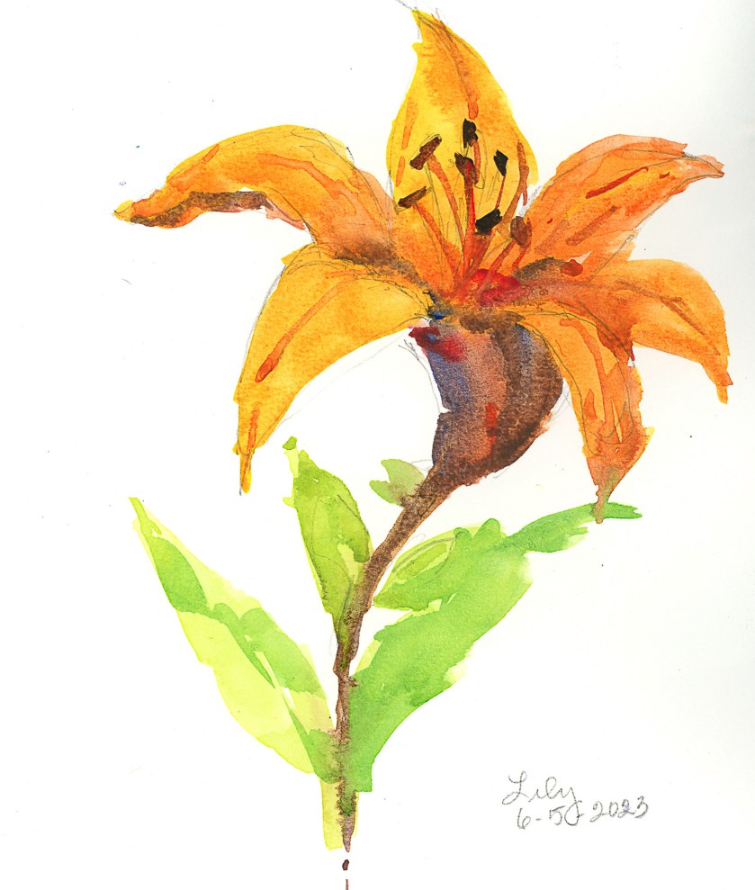
And finally, more of the orange lilies I have. This time I included the pot! I began this painting with the pale beige of the wall, creating leaf shapes by negative painting. I wanted to catch the light and sparkle on these complex plants. They are lighter at the top, and get darker as you move down and to the left. The patio is covered with light and shadow from the sun through the leaves of the overhead trees.

Nothing spectacular, but a good way to spend some time outdoors, seated at the picnic table, and playing around.

Potted Flowers without the Pots

I wasn’t interested in the flower pots these potted flowers are in, so I left them out. Now they are unpotted for your perusal.

Above are what are supposed to be little daisies and some lobelia. More negative painting practice, which didn’t really work out, but I did try it, both around the daisies and then painting green onto green in the greenery.

Venery in the greenery anyone?

I am much happier with this painting than the first one. Some negative painting, such as in the leaves and in the lavenders of the sea lavenders. With both, but particularly the sea lavender, I also tried to merge colors in the wet washes. There was a cauliflower which occurred in the far right sea lavender, but too much working on it made it a bit more messy. My mind was on painting colors, not really on patience of waiting for things to dry a bit – hence the cauliflower.

I worked on these this morning, painting on the patio in a bit of a gloomy day, but it was certainly pleasant enough. Being outdoors while painting certainly is beginning to have its appeal; now I think I might take a handcrank sewing machine outside to enjoy more of this summery now sunny weather whilst I sew!

Boring Waterproof Ink

I had hoped to have a nice dark ink on this paper, using a fountain pen filled with waterproof ink. The ink is waterproof, but it is so pale I fell asleep. If you are going to do a line drawing and then color it in, you need to have a dark ink. The ink was definitely waterproof, but so what if I don’t like the result?

I also used my cellulose paper sketchbook for this, and once more I am not happy. All these blobs of unabsorbed color and a few more than many times using the hair dryer.

Maybe I am not being realistic about the paper, but I am realistic about the point of this study – is the ink waterproof? And that answer is yes. Goal met.

Brain Training with Negative Painting

No, I don’t mean painting with negative themes or thoughts, but painting around things – but you already knew that!

The normal course of painting, for the major part anyway, is to paint the object you are focused on. Then you paint around it. Most often it works, but for light-colored objects, or flowers, sometimes you just need to paint around the white to keep it white. Paper also can affect negative painting by how well it absorbs water and pigment. 100% cotton watercolor paper is best for this, and its sizing also will affect its absorbency. Cellulose papers, even if heavy, react differently to layers and layers of watercolors and pigments.

Below is one of my first focused attempts on negative painting. Supposedly these are chamomile flowers, but the fact is they look a lot like any generic daisy. Painted on the cellulose paper, absorbency was an issue, as seen clearly on the flowers. Blending of color was rather forced. However, I could paint around the white of the flower and get crisp edges. The outside green was more difficult; I think if I used water between two green values to soften the edges, blending might have been more successeful.

From this paper I went to 100% cotton Kilimanjaro 140# CP paper, natural tone. Already a difference can be seen and, while painting, felt. Color is easily absorbed and blurs nicely. Layers of color, laid in while wet and dry, still creates a lovelier quality than above. It was far easier to paint the petals with shades of grey and with thin glazes than above since the paper’s response was more absorbent and less resistant to both water and color.

Finally, a painting of yellow lilies – lilies? you ask? Yeah, me, too. Anyway, yellow flowers. I painted the basic shapes of the flowers, then painted around them, and then added what was supposed to add character and depth to the flowers, and then back to the back ground, and then back to the flowers, and so on. As a flower painting it is nothing great, but it was good practice for negative painting. I worked at shapes more than anything – the shape the yellows create as well as the greens and darks outside and in between the flowers themselves. This, too, was on the Kilimanjaro paper, and it shows.

The cellulose paper fails when it comes to lots of washes, but for more direct painting it works pretty well. For lots of water and color, as with the two on the Kilimanjaro, the cotton paper is far better. The frustration level with the cellulose paper is certainly there as I had to pick up drops of water and spend a lot of time with the hair dryer so I could move on to the next wash or glaze. With the Kilimanjaro, only when I wanted a totally dry sheet to paint upon, to add glazes or more paint or another layer of clean water, did I need to use the hair dryer.

So, more painting and focus. Not great, but it is in the doing and the play the learning is done.

Flower Children, Rocks, Sky, and Mush

I had a bit of running around to do today, but made sure I had time to play. I am seriously trying to paint or draw every day, not just in between chores and appointments!

Today I was interested in playing with flowers. The first was a plein air painting of one of the lilies currently in bloom on my patio. There are a lot of them in bloom, but I decided one would be enough, to get acquainted with them, even though I see them every day, on a more intimate level. Not a great painting, but it was sort of a warm-up exercise to play with some new colors and palette layout.

I am also using, again, some not-so-great paper, but I am getting used to it. I’ve spent some time getting it sopping wet – not really successful, but I am learning how to handle it. This is important as the next painting – the gladiolas below – was to see if I could manipulate washes on this paper. For skies, this is important especially, or large areas of color. Below, sky, rocks, and mushy trees and a color blob.

And finally, the one that I spent time and energy on. The idea was to make a painting of gladiolas (which are in a ridiculously short vase given how tall the flowers are!), making large areas of washes, and working in new and different colors as I moved along the flowers. Patience was needed, and a hair dryer helped things along, but thinking and plotting my painting moves with the air of a strategist was also part of the equation.

So, overall, today was a bit of a success. Nothing great, but I am rather pleased with the gladiolas – not the vase, background, or surface, but the point of the whole endeavor. I also am getting more comfortable with the paper and how it responds to lots of water. It is fairly heavy, and described as “rough” so it has a nice bit of tooth, and now that we are getting used to each other, it will definitely be a playground rather than work.