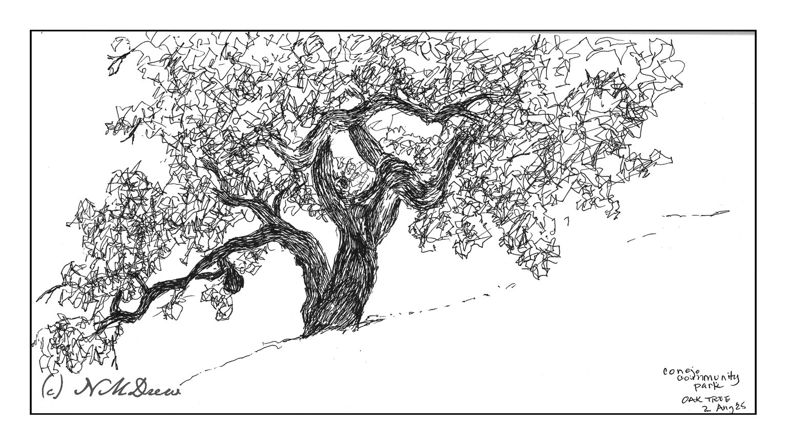
Trees always make me happy, and it makes me sad if I have to remove them for any reason. In particular, I like oak trees, and where I live, it is against the law to cut any oak tree down without permission. California is dotted with beautiful oak trees across the hills; from a distance, I always think that this is what a herd of buffaloes must have looked like in the 1800s as they grazed across the prairies. (Technically, the American buffalo is a bison.)
Mid-morning I headed out to a local park next to the botanical garden. The park is on a gentle slope upon which are several grand oaks. Many are supported by metal tubing as their branches can sprawl far from the trunk, often breaking and falling from the stress.
My goal this morning was to simply get out and sketch plein air. Rummaging through my stash of sketchbooks and paper, I found a 6×12 spiral-bound Pentalic watercolor journal, unused. Perfect for landscapes! And for the broad sprawl of the oak tree.
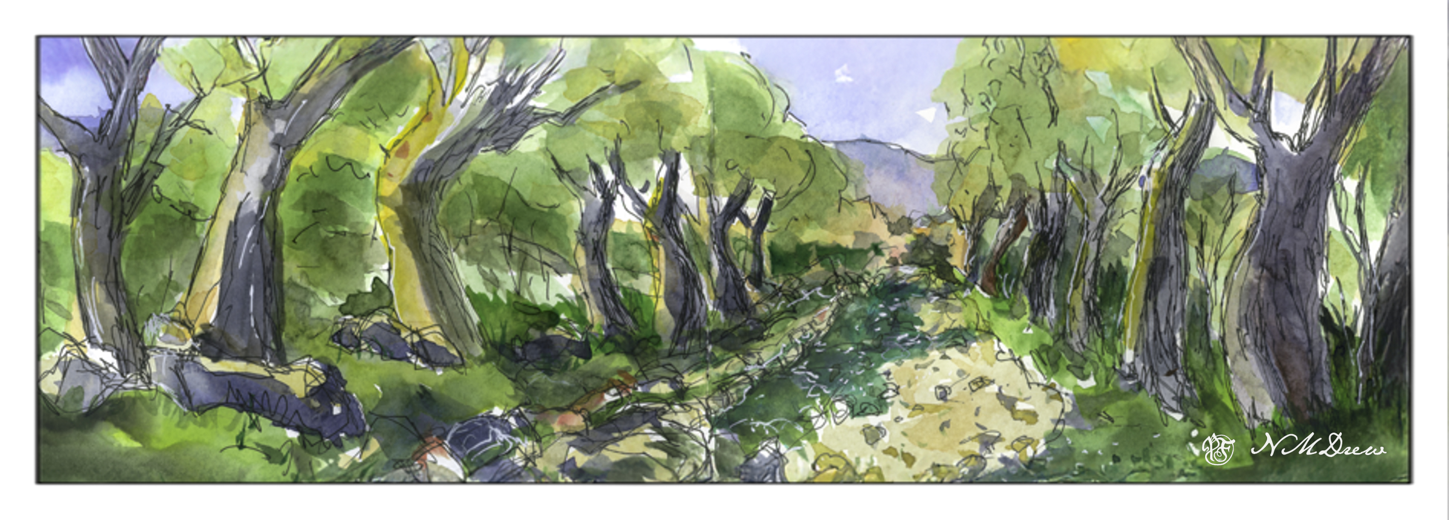
I just realized that if I want to do good – in my eyes, of course – or better ink and watercolor drawings, I need to work a bit more on my colors. For many years my colors were anemic and paintings ended up pale and wan. To compensate, I made my colors more intense – more pigment, less water. However, I think if I really want to do ink and wash, I need to learn to moderate the color intensity a lot. Next painting I do will have color swatches on another piece of paper before applying them to the paper.
This is a very contrasty painting – and it doesn’t really play well with the eye. The shadow along the dirt road, on the left, is too green. The darks between the trees, from shadow and overgrowth, are not well done. I liked the ink drawing but think I could have made better color choices. Unfortunately, when you use a limited palette of only 10 basic colors, color mixing becomes a bit of a challenge. That is not to say these were not good quality paints – they are Schminke pan paints which are very intense – but I need to work more with moderating the colors.
Well, I didn’t paint anything yesterday, but I am beginning to work on cleaning up and getting rid of stuff. Yesterday I worked in the garden, straightening things up, getting rid of debris, and taking apart the drip system. With fewer plants it is unnecessary. This morning, sorting through clothes and mish mash in the in the garage.
However, painting continues!
Sketchbook across 2 pages, about 6×16 inches; ink and watercolor.
After working on pen and ink and watercolor wash from the short course I took, I decided to sit down, pull out some watercolor sketchbooks, and choose one for A Project. And that project will be to try to do a daily – or more than one daily – sketch following certain steps: pencil drawing, ink, erase pencil lines, watercolor, and then more ink. And maybe no ink. The idea, though, is to draw and paint the real world just to see where it goes.
Today it was pushing 80F, and after days of 60F or so, it has gone from cold and damp to warm and hot. Hard transition! So, I sat at the patio table and looked around me. Not excited by much of anything, but here we go!
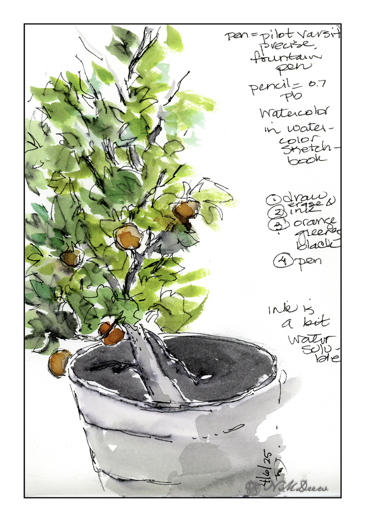
We have a small mandarin tree in a pot. This year, about 10 little delicious mandarins. Here I used a water soluble disposable fountain pen so there is some bleeding of ink and watercolor. This is the first one.
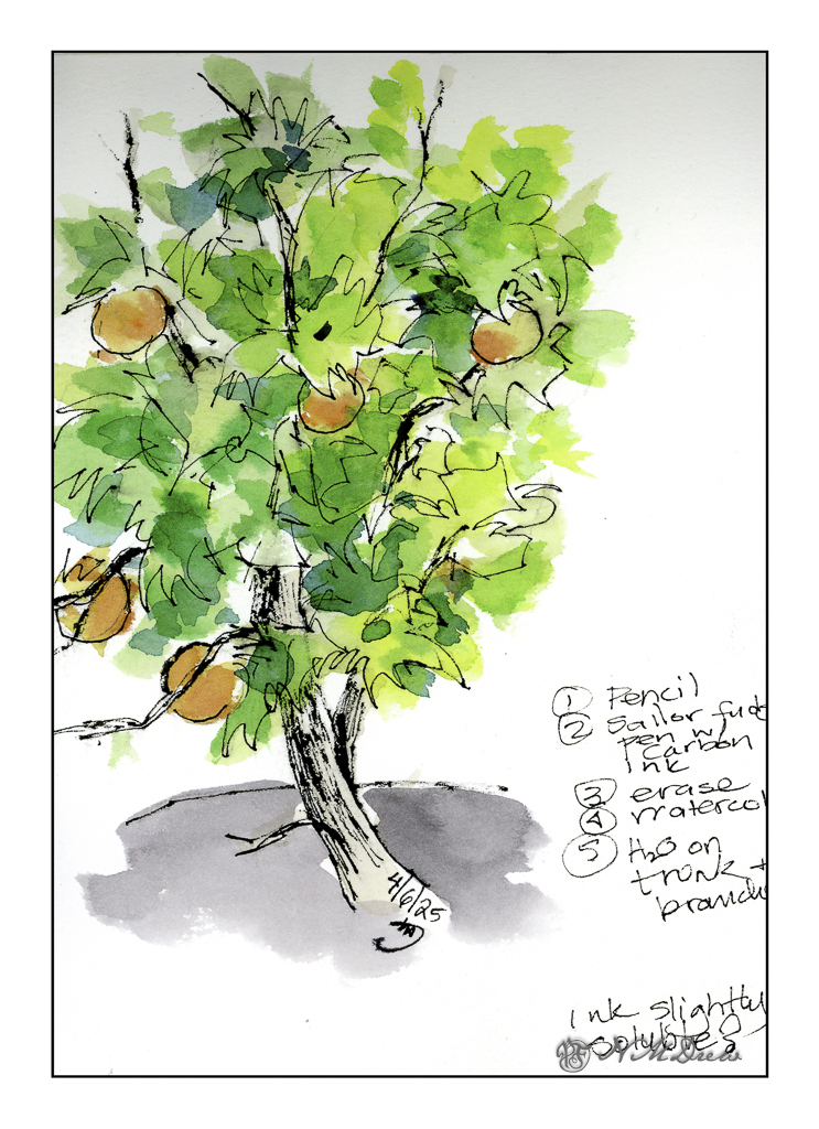
And here is the second rendition of the mandarin. I used Carbon Ink in a fude fountain pen. This ink is a bit more waterproof than the disposable fountain pen. The fude pen is by Sailor, and the pen nib is both wide and angled to about 90 degrees. Depending on how you hold the pen the lines will be fat or thin. The trunk is made up of the fat lines, and I think you can figure which ones are the thin lines!
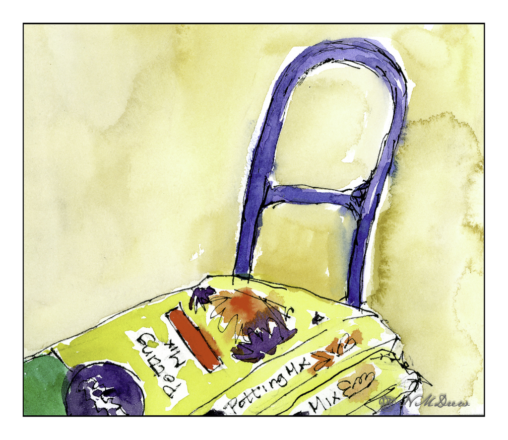
Not quite ready to retreat from my experiments, I used the fude and the disposable pen to create this portrait of Miracle Gro potting soil (my all-time fave). Ink applied, painted around, and more ink afterward. This was sitting just next to me, ready and waiting!
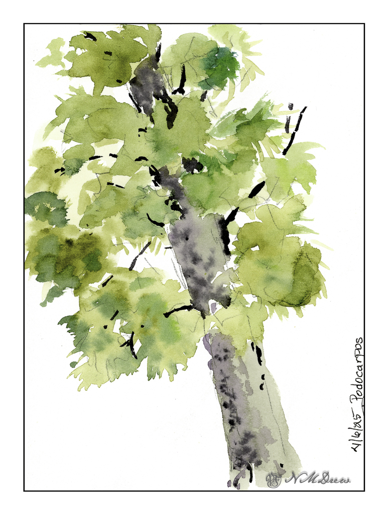
And finally, one of the many podocarpus trees along the back wall. Here, pencil outline, then plain watercolor. No ink. Not great but an exercise focused on areas of color – as in the mandarin tree drawings – to show warmth and depth – as well as simplification of groups of color.
There is a little thing in my brain right now that is sensing a change in how I see things I want to draw. It feels good. You probably know that feeling – something is changing with a more sophisticated or skillful – but new – approach. Let’s see where it leads.
140# CP watercolor sketchbook, about 5-8, Carbon Ink in Sailor Fude pen, Pilot Varsity disposable fountain pen, watercolors.
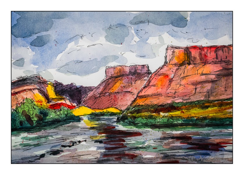
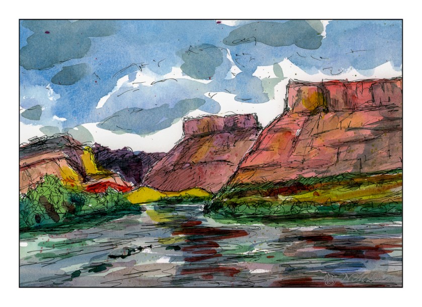
Two different scans, and neither is truly exact. That was planned. I decided to change the mood of the scans – one in Epson Scan and the other in VueScan. Don’t remember which is which. The moods were to be bright and sunny, breaking through rain clouds perhaps, and the other just rather cold and gloomy when the sun has vanished behind heavy clouds.
Above, the warm colors are being pushed – yellow, orange. A bit of glow to try to express that sudden brightness you see when the light changes rapidly because of the weather.
And now the light has changed – potential rain and bad weather. I expect there is a bit of wind, too!
Technically, I drew in the landscape with a waterproof pen, painted, and then drew some more. The mesas’ slopes are a bit steeper than reality as these are about 45 degrees, and in real life, I think they are more shallow, about 30 degrees. Artistic license?
Watercolors, ink, Hahnemuhle 300gsm CP paper, about 9×12.
It’s a nice semi-sunny day this afternoon, and the wind is soft, the temp is about 70F. It’s perfect for spending a bit of time sketching in ink and color some of the remaining plants after the winter clean-out.
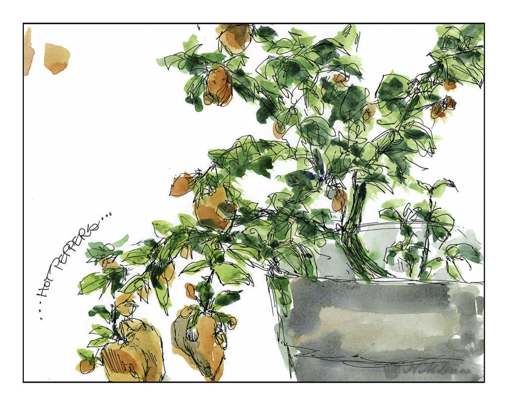
These hot peppers are from last year – and it appears they are getting some new ones! The little tiny blobs of orange are this year’s crop – I guess it is time to harvest some of last year’s fruit. We don’t know how hot these peppers are, but we should give them a shot.
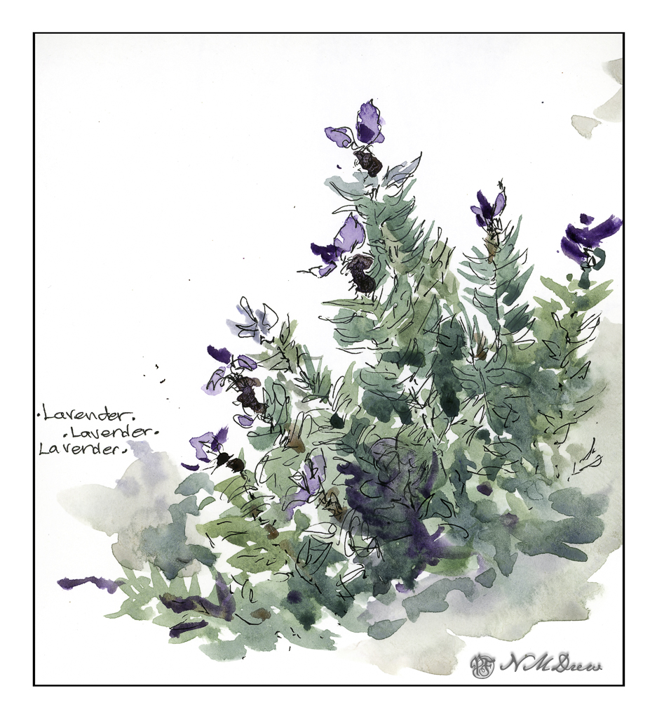
I have three different lavender plants. I am not sure which one this is – I have a tag, but am feeling too lazy to investigate. What appeals to me is the bright purple flowers above the soft grey-green foliage. They look like tiny purple butterflies to me.
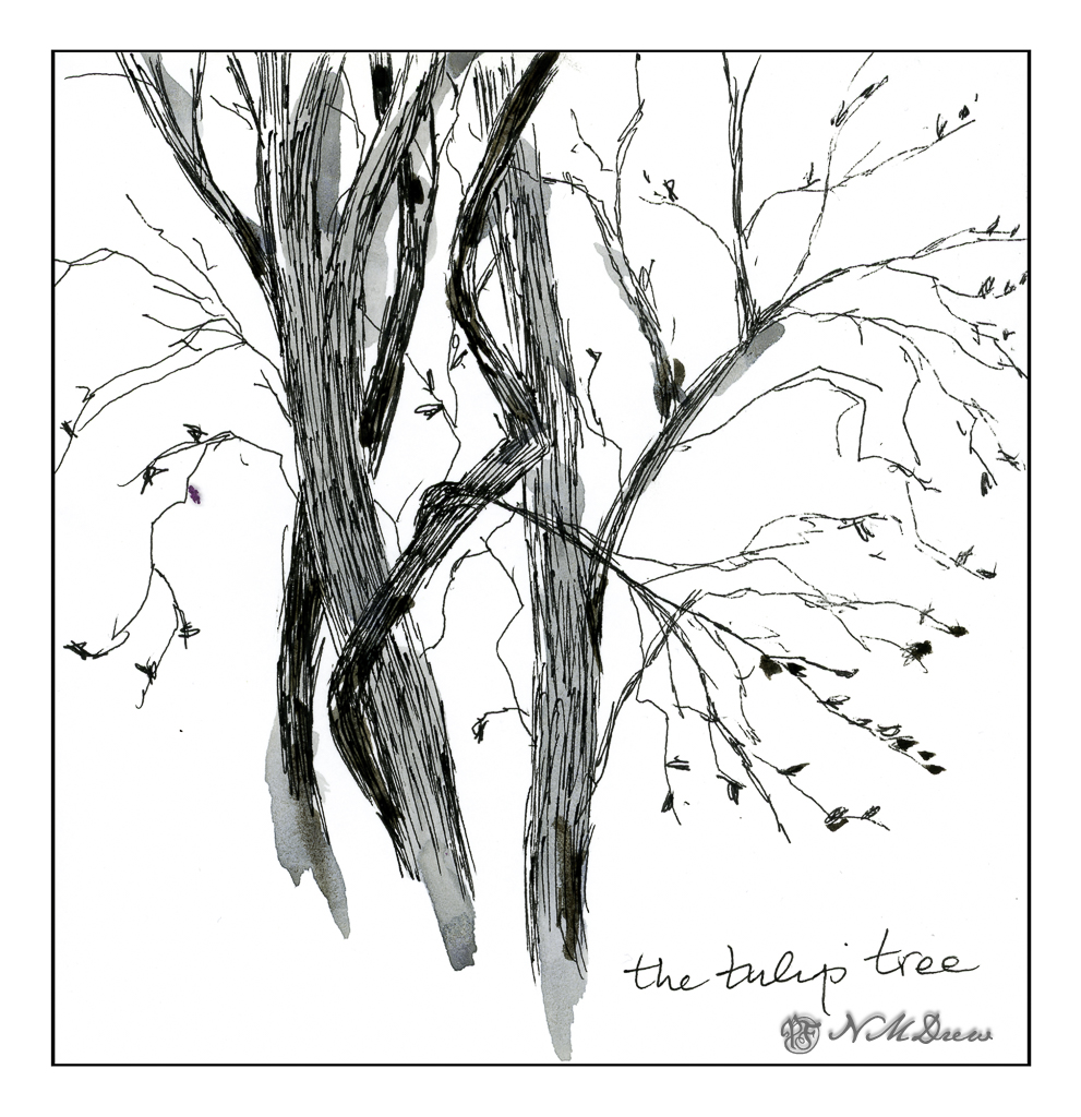
This is the tulip tree which graces my front yard. It’s a strange tree – not really a good one for a neighborhood. It tends to be brittle and branches can break and fall. We have had some 6 footers and then some fall onto the sidewalk below. And then it oozes sap all over the sidewalk. Birds love it – sparrows, crows, doves, and owls have been known to visit. The leaves are an interesting shape, and while it flowers, they are not showy. However, come autumn, the leaves turn an amazing yellow-gold and drop onto the lawn – and this is what makes it so beautiful to me. Add to that, right now the bare branches and twigs are just lovely against the sky.
Colors here are very limited. For the peppers I used organic vermilion, cad and lemon yellow, a bit of Hooker’s green and cobalt teal. The lavender was carbozole violet, and the foliage was a mix of lavender, Hooker’s, and yellows. The tulip tree is primarily the leftovers on the palette, so who know what the colors could be!
And now, time to head out for some fine Thai food provided by Auntie Am and Uncle Ed!