Cottonwood Creek

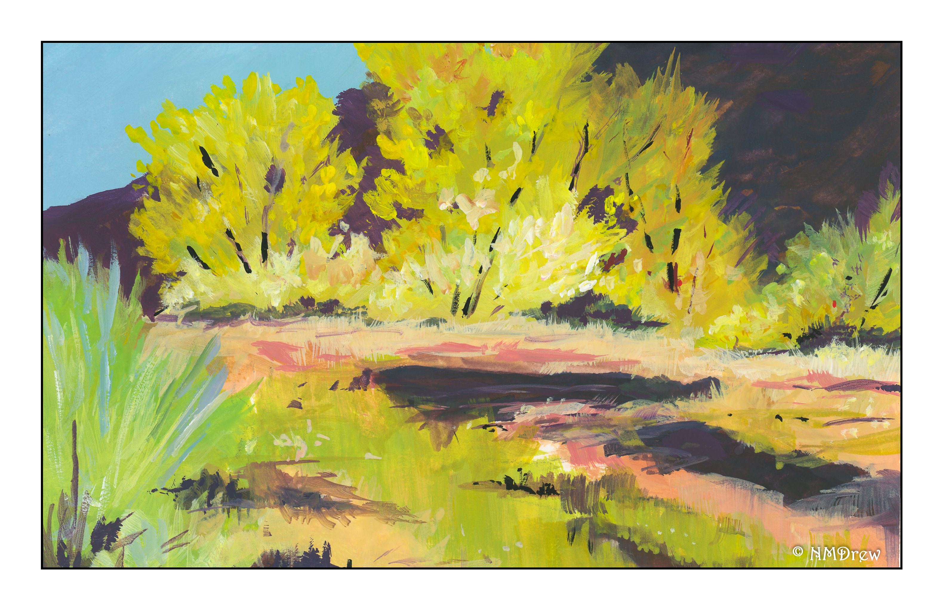
We are pushing 100F today, with east winds adding to the heat and potential fires. Thus, an autumnal desert scene seemed appropriate for today’s painting.  As I haven’t worked in gouache for quite some time, I thought it time to dig them out.  Variety is the spice of life, for sure.

Before painting, I did a value study before I even sat down to paint.

I used pencil, as you can see below. I like pencil a bit more as I have a good range of pencils of varying hardness and softness, and that helped out in the light and dark department.

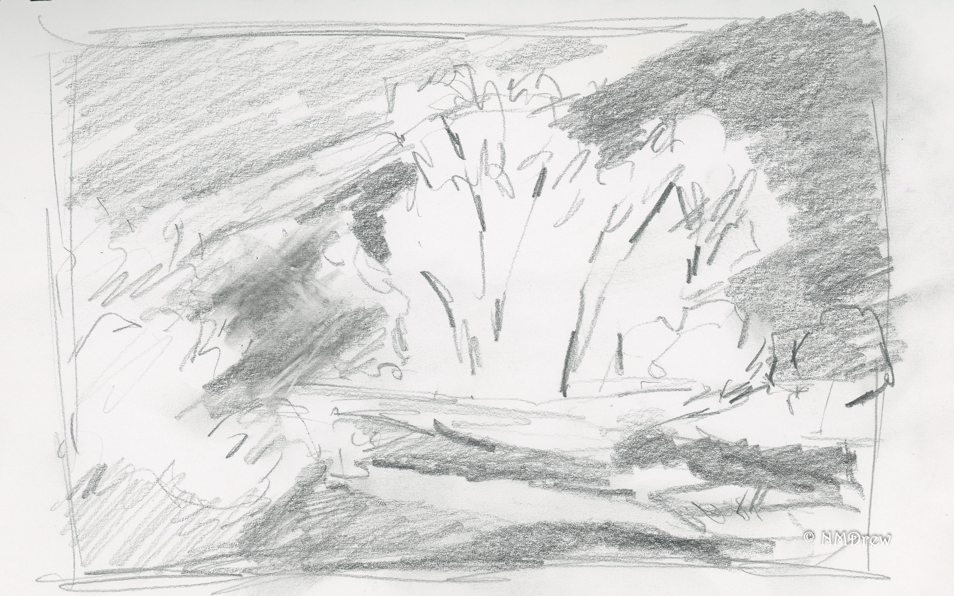
I won’t say that the value study did not help. It really did. What it aided in was setting up light and dark areas, of course, but also helped me see shapes, such as the trees against the dark mountain, as well as shapes in the creek in the mid to foreground areas.

I left the sandy bank of the creek and the reflections deliberately vague – hard for me when I want to put in a lot of detail! The focus of the painting is the cottonwoods, so too much detail in the foreground would compete with the more detailed painting of the trees.

Altogether, this was a pleasant diversion, and the value study was worthwhile (not that they take a lot of time – I am just lazy). The creaminess of gouache is fun and a completely different experience than watercolor or pastels. I used Holbein gouache for the most part, CP 140# paper. The painting is about 6×8 inches – the nature of gouache often means smaller paintings than watercolor or pastels.

Here’s to autumn!

Anacapa Island

The Channel Islands off the coast of California are amazing to visit.  Only recently (don’t remember when) they became a national park, to protect both the islands and their flora and fauna, as well as to protect the waters surrounding them.  Anacapa is a very distinctive island.  It has an arch on one end, and zig-zags, snakelike, as it emerges from the water.  I have visited this island, both on the land, and in a boat sailing around.  It’s a truly lovely place, one worth visiting, painting, exploring, and photographing.

Here, I finished up using the available paints on my muddy palette.  The final painting with that mess!  As with yesterday’s painting, I have added white to the palette for colors, but for the most part, these are colors salvaged from the mess on the palette.

Truth be told, I really did not expect this painting to turn out at all.  My colors were just such a mess.  I simplified everything as much as I could.  I managed to get some sense of depth, which also surprised me!

Beach Study

I like the beach, in case you haven’t noticed.  Grass, sand, cliffs, water, wind.

I broke down and did a value study for this scene.

Of course, I did it on an accessible page in my sketchbook, but since I did the study before the painting, I knew where I wanted lights and darks.  As I worked, I pulled dark areas together to contrast with lighter / brighter areas.  I mixed my colors using zinc white, but this time used titanium white straight out of the tube to highlight the ocean waves.

I’ve been wondering why people say “zinc for mixing, titanium for highlights.”  Zinc is a transparent white, so it blends with gouache and watercolors without distorting the values.  Titanium is a more opaque white, and as a result good for highlights, but not recommended for color mixing.