The Art of the Written Word

This past week or so has found me wandering into another element of water-based media:  Ink.

Ink is used in drawing, but it is also used in writing, whether using the Roman alphabet, Cyrillic, Arabic, Hebrew, Chinese, Japanese, or any other form of an alphabet for any one of the myriad of languages found throughout the world.

Making ink is an art, and that means knowing something of chemistry (no matter how simple) and permanency.  Ink is black and ink is colored – as are paints.  This past week has found me suddenly distracted by the making of iron gall ink, also known as oak gall ink, and cutting quills from feathers.  You can read about my adventures here, here and here for starters.  You can return to Ink, Yarn, and Beer for more updates, too, if you want.

Consequently, I have not had much time to paint or draw as I have been spending a lot of time reading about ink and quills in particular, as well as watching videos on the same.  This morning, I came across one which rather blew me away as it is global in nature, but local in artistry.  Huh – what does that mean?  Take 30 minutes of time to be quiet and to watch . . .

Friday Flower Sketches

I’ve been playing with gouache of late, but really have missed watercolor and its transparency.  Yesterday I thought I would sit down to do some painting, but it never happened.  Today, out on the patio reading a book, I looked around at all the plants, and realized, duh!  There is a lot to play with out here!

I’d moved all my orchids outside to water and air out a bit.  This is the last of the blooming phalenopsis, so I painted it – no pencil or preliminary value studies – just direct watercolor and let it happen.  I can tell by the awkward handling of the paint I am out of practice; as well, the paper is not the best, but that is what sketch books are for.

About 6 weeks ago I took all my old and new flower seeds and planted them helter-skelter.  These are zinnias, plants which are notorious for wilting with not enough water – like in a couple of hours they can look like they will just fall over – but come back miraculously with a bit of help.  Totally crack me up – such simple flowers to be so demanding.  Kind of nervy.  Anyway, what I like about them is that they have beautifully shaped leaves, lovely stems, and smallish bright flowers that burst out of all the green surrounding them.  Here, a bit better handling, with a use of negative painting to create the leaves and perhaps a bit of dimension.

Finally, my favorite of the bunch.  Brush control and forethought.  Here I was perched on a rather tall chair, looking down onto the pot of scaveola, a sort of creeper from what I can observe.  It has a variety of leaf shapes, and the purple flowers sort of send out petals from behind the leaves in a peek-a-boo fashion.  I took a photo of this for Instagram, but you can also see the photo below of plant and sketch, taken with my phone.


A View from Above

More gouache!

Gouache apparently is best used straight out of the tube.  I put a bit of each color I have into a covered palette, and the result is the gouache dried out fairly quickly.  Today, I managed to make a hybrid painting it seems – rather watercolory and transparent, and rather gouachy and opaquish.  To see if I can rehydrate the gouache, I put a couple of drops of glycerin into each well along with a spray of water.  I’ll test them out tomorrow.  I hate to think of wasting a lot of paint – it’s not cheap, even on sale for 40% off.

There are some “rules” for painting with gouache.  One is thin to thick paint, and dark to light paint.  Each layer of gouache is opaque(ish) depending on how diluted it is.  Thus, you can begin with a watercolor-thin wash and end up with a straight-out-of-the-tube thickness.

To begin with, I laid down thin layers of color for all areas – sky, background, middle ground and foreground.  From there it was playing around.  Ultimately the sky and the foreground are more like gouache insofar I used heavier paints, but the middle to background remain less so and more along the lines of watercolor.

Besides using paint in different manners here, I tried to convey depth using atmospheric perspective.  to some degree it worked.  Being able to paint over things was really helpful.  I’m not really sure if things “worked” or “didn’t work” here – but I do know a bit more about how gouache can be used, and, as with everything, practice helps out a lot.

As fascinated as I am with the gouache, I also know I need to continue working on my other artistic goals of drawing and watercolor and perspective . . . so easy to go down a path and ignore everything else I want to do!

First Attempts with Gouache

Goo – osh!  Isn’t that a great word?

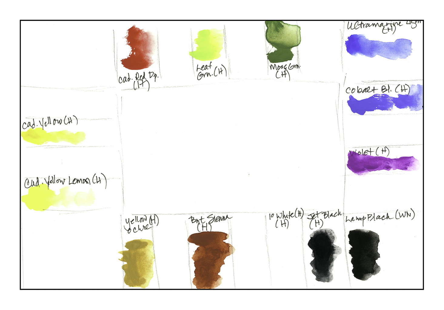
Anyway, when we were in San Diego awhile back, we found a genuine art store in the neighborhood.  Of course, I had to wander in there, and I finally was able to find water-based gouache paints.  All the ones I ever seem to find are acrylic, which is not what I want.  Today I got them out for the first time and put them onto a palette, leaving space for other colors, which I am sure I will want to add.

I think I need to add a red along the lines of alizarin and a couple of greens, such as Hookers and sap.  I use them a lot in watercolors.

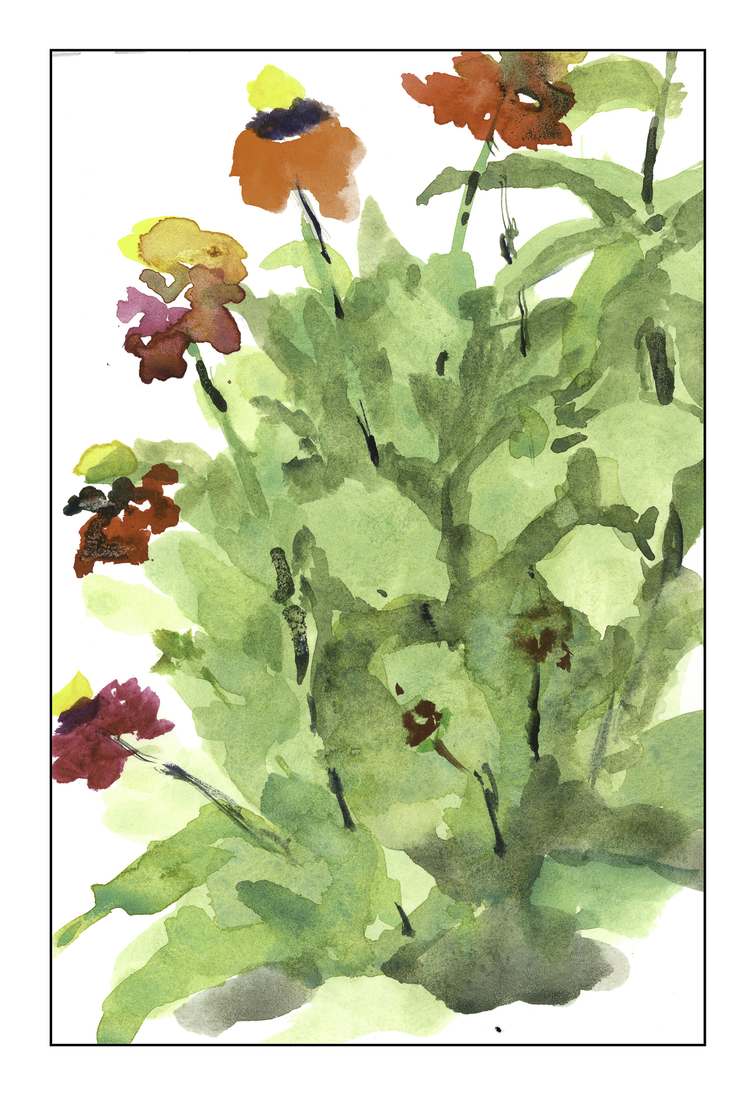
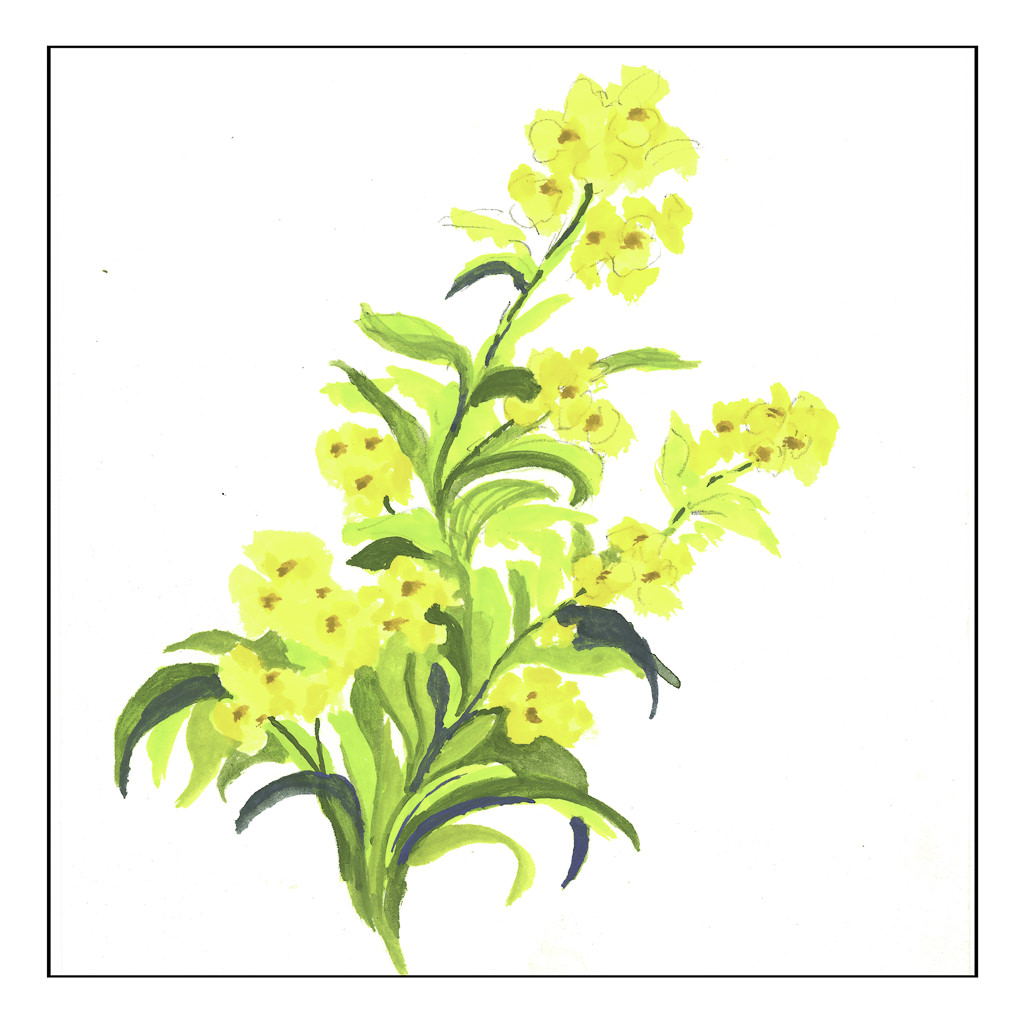
My first picture was quite tentative, but eventually I got a bit more brave.  Sadly, the scanner did not differentiate very well between the yellows in the flowers.  Rather than just one color, I used both to suggest petals.  The greens are straight out of the tube as well as mixed with blue and black.

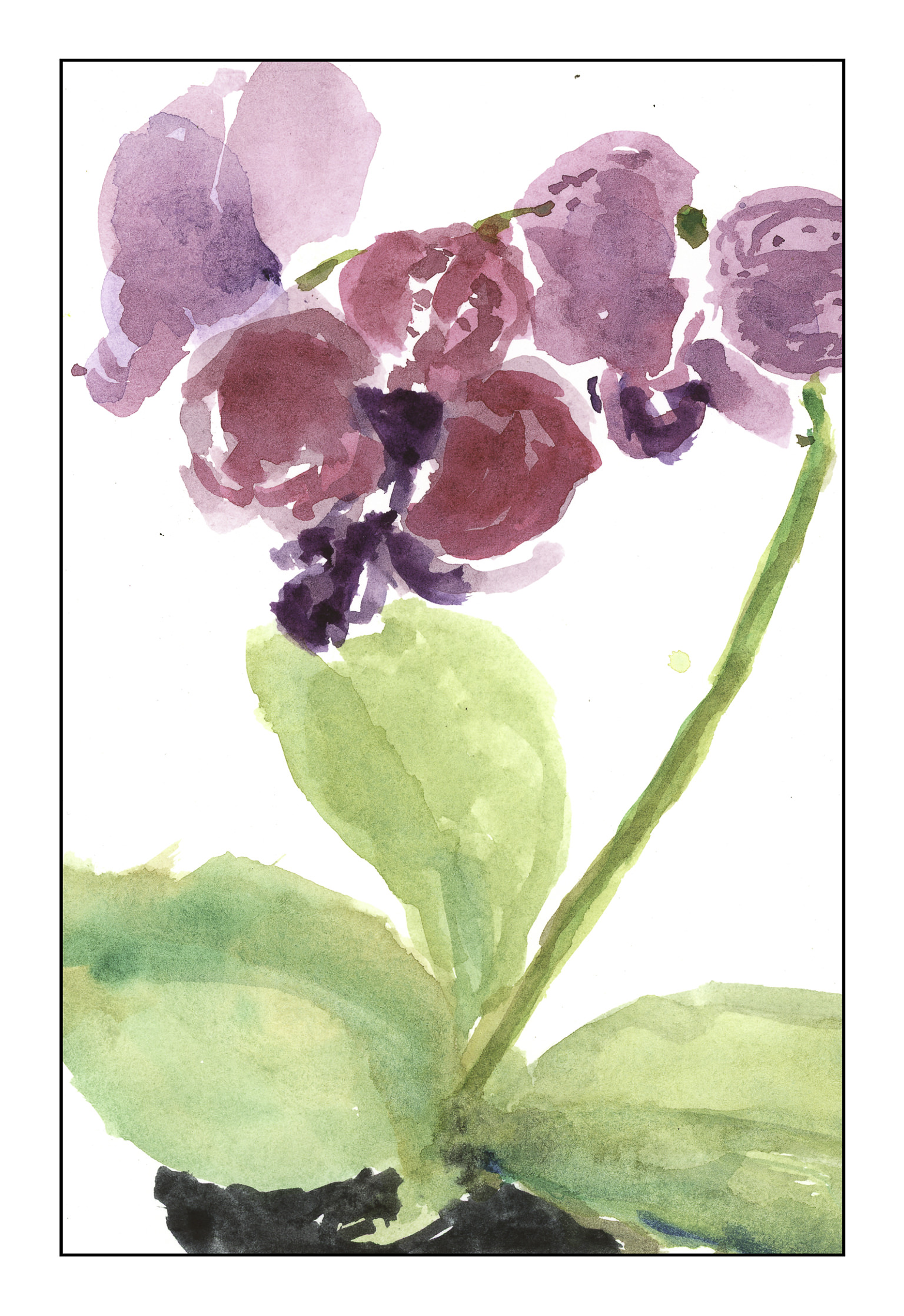
This next painting is what made me realize I needed an alizarin or something close to it.  The actual flowers are more pink; cad red does not turn pink with the addition of white, nor is very pretty with purple mixed in.  So, I settled on the violet with the addition of white.  The leaves were painted light to dark, and I tried to let the paint dry thoroughly so I could paint around things, such as the flowers, or on top of other colors.  This is how watercolor is done – light to dark.  The pot was done while the paint was still wet and I mixed other colors in as I went along.  That was really a lot of fun just to see the result.  Finally, the shadow was painting on fairly transparently and loosely, only to be covered with more opaque paint.  I rather like the result.

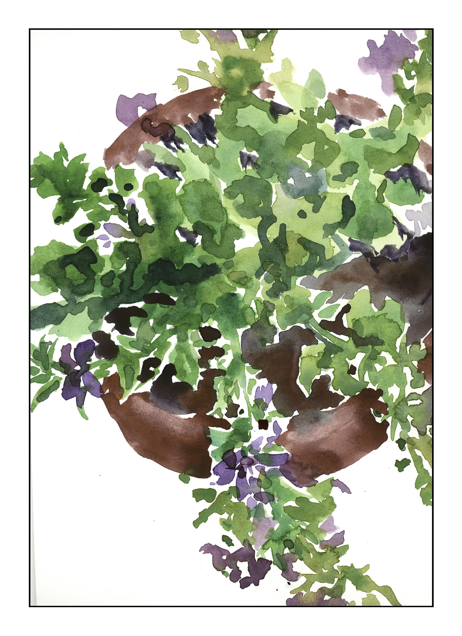
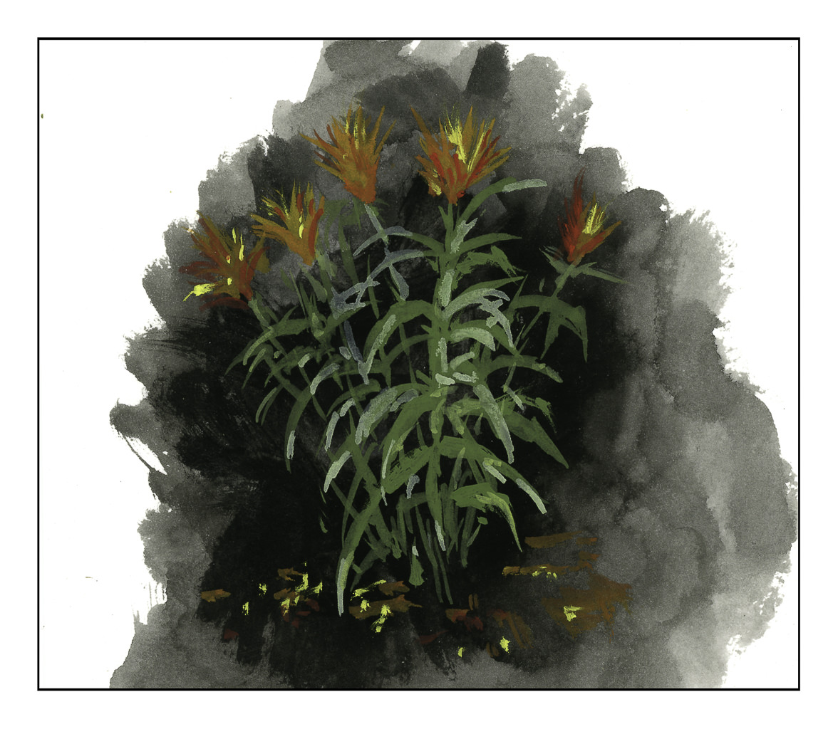
Finally, I remembered that gouache suggests painting dark to light.  Here I placed a black/blue mixture and let it dry.  From there, I applied moss green, but I should have mixed it and the yellows and reds with white so they would dry brighter.  Still, that is a good lesson for the future:.  Darks in gouache dry lighter, and lights dry darker.  Here I applied paint directly and let it dry, as well as mixing it on the paper.

Because paper is so important in painting, I used some 6×8″ 100% cotton paper.  I’m glad I did as there were times when the paper was wet, as when laying down the black background on the painting above.  I really love the fact that I can put lighter colors on dark.  As a kid in elementary school, poster paints were some of my favorite ones for this same reason.

Old dog, new tricks!  Hooked on gouache, indeed!

Dappled Light

It’s been nearly 10 days since my last post.  Nothing traumatic to keep me away from painting – I just have had appointments and social activities accompanied by making sure all my retirement paperwork and insurance is in place for my “official” beginning of being a Medicare recipient on June 1st!  It’s been a slog, but it is in place, and hopefully nothing will make me have to do it all over again.

That said and done, the weather here in California has been really strange.  The new normal!  We have had rain into the month of May, and as a result flowers and plants and butterflies are prodigious, with spring flowers lasting well into what might be considered the summer months.  Even the hills are still colorful, but slowly fading to the usual beige and brown.  The rain, though, fills the bright blue sky with big clouds, sometimes ones which sit around and slowly disperse, sometimes with ones that dance their way across the sky, changing with every glance.  When I was a kid in the middle of nowhere, I loved lying in the hammock and making up stories as the clouds shifted and reformed.  It’s as magical now as it was then.

The local botanical garden is one of my favorite places.  It has so many things to see.  A variety of habitats are represented – desert, Mediterranean, and woodland, to name a few.  Today’s painting is a scene along one of the pathways, from the photo I took below.

I am always attracted to dappled light – the strong contrasts of dark and bright.  Photographically, it is hard to capture, but I was relatively pleased with the way the photo caught it.  I am also fairly pleased as to how I was able to interpret the photo and the light.  It was a struggle, and especially difficult after nearly two weeks of inactivity, but it worked out in the end.