A Bit of Colorado

Great Sand Dunes National Park and Preserve is located in south central Colorado. It is, as the park site states:

The tallest dunes in North America are the centerpiece in a diverse landscape of grasslands, wetlands, forests, alpine lakes, and tundra. Stay on a moonless night to experience this International Dark Sky Park’s starry skies.

I never ceased to be amazed by the beauty of the natural world.

9×12 hot press Arches, 140#, gouache.

Tracks Across the Fields

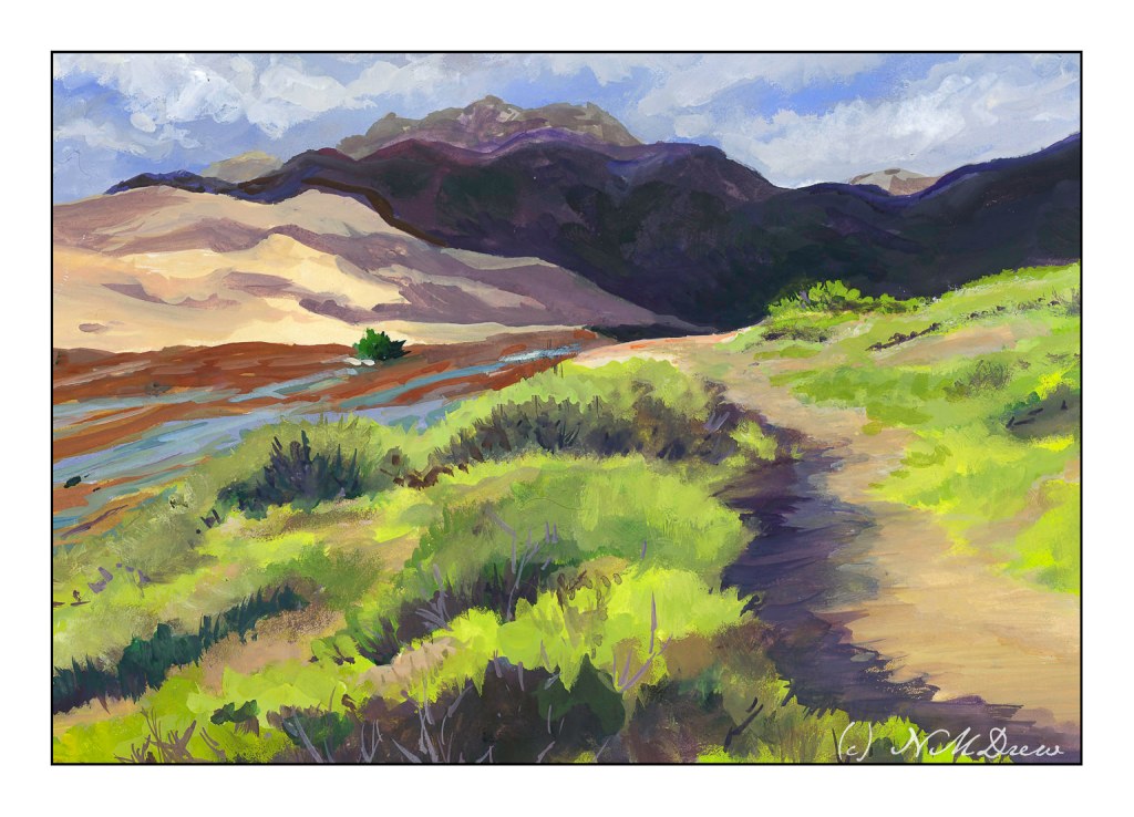
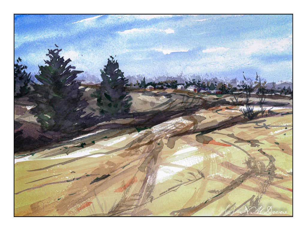
I do love the bleak look of winter. With watercolor, a limited palette of 3 or 4 colors can express so much. Admittedly I used more, but I usually like alizarin, ultramarine, burnt sienna, and Hooker’s green for the colder time of the year.

Following through on points for some of the classes I have been taking, I am working to simplify subject matter, colors, and lead the eye. I think I managed to do this here, leading through the fields to the houses on the hilly horizon. I tried to contrast warm and cool colors, with a bit of warm on the buildings with the hope it will draw the viewer in. I also used wet in wet and dry brush, working from general shapes to more specifics; light to dark in general.

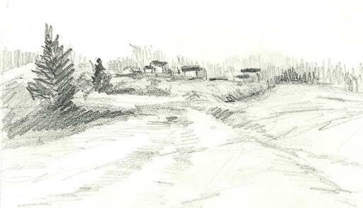
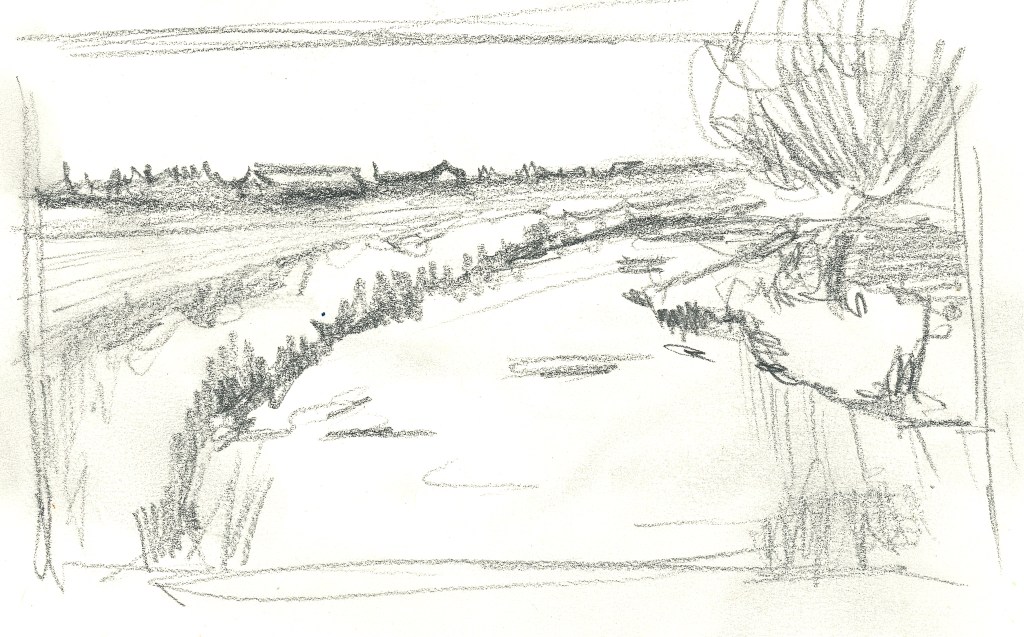
In addition to the painting, I am trying to make myself do a preliminary drawing before I touch brush to paint to paper. I did this one today. Lesson – it is actually worth the time, and I have been a silly bunt not to take on this fine habit sooner!

Watercolor, 9×12 CP Extra White Fabriano Artistico 100% cotton paper.

Changing Seasons

It is really important that if you study art that you make studies! I’ve been following along in my haphazard manner a number of teachers I like, online, and am trying to implement what I am learning. Or what is being taught – and then working conscientiously to absorb some of it. Being a magpie doesn’t help as I am so easily distracted by this and that. Focusing on one thing really helps bring mastery, but I get bored with doing only one thing. I know a lot of single-minded people, and I rather envy them. However, we all have to follow our own drummer.

The focus here is to lead the eye to the orangish, autumny trees in the distance. The water does it primarily, but I hope the curves of the field do, too, as well as the lines along the horizon. I am not too thrilled with the trees on the right, but c’est la vie.

So many artists say a value sketch is important. I like to think I can create the values in my head as I become more sophisticated in my abilities. I have decided to create some kind of preliminary sketch before painting as a habit and that is not an easy task for me – even if it only takes a few minutes. Well, the one below is not really a value study, but it did help me work on some compositional elements. Hmmm.

Kilimanjaro rough 140# paper; watercolor.

Sycamore

Yesterday was a meeting of the Pencil Portraits in the Park group, but drawing people held little appeal for me. So, I decided to try something I had briefly seen somewhere and thought interesting: during their travels in the 19th century, many people sketched in pencil (graphite) and then colored the drawings with watercolor. These days most people sketch with waterproof ink and then color things in, but I rather liked this idea. A sycamore tree in our park, dressed out in autumn finery made a nice portrait, methinks.

9×12, hot press 140# Arches. Graphite and watercolor.