
From the blog Fraggle’s Other Place comes a request to share this video, made by her stepdaughter Emma to inspire the deaf, and others, to know that our lives under Covid-19 won’t be imprisoned forever:
Category: Blitherings
Nowhere Barn
Addendum!

This is the second scan from the final one below. I changed a bit of the elements after doing a preview scan – don’t know why the one on the bottom of this post is so, er, intense!
Now, let us continue . . .
More perspective studies! Today I did a single point study.

This time I created a single vanishing point. This one is below the building, and above the road. The idea for this is that the road ends up going over a hill or slope before the horizon, at eye level, is met. I did a pencil sketch and erased it a billion times. Finally, when I liked what I did, I erased most of the lines after inking it in.

Sort of a value study combined with a color study to see what I might like for color mixes in watercolor. This paper is mixed media paper, so it is not the heavy Arches 140# cold press I like for most work. I think the perspective works pretty well.

Well! Aren’t these colors intense! The scan for some reason just came out like this – the original is a bit more subtle – but I rather like it as I think it expresses the intensity of color that sometimes comes with lowering clouds and a storm. Makes me think of my time as a kid on the plains of the midwest.
So, the final study does have decent architectural perspective, and perhaps even some atmospheric (lots of atmosphere, but more like pressure type!) insofar as I tried to simplify things.
I will continue my focus on perspective, and using it in different media. Watching videos, referring to books, and just doing it is helping.
Another Tale of 3 Paintings: Tanglewood
Yesterday was Painting Disaster Day. I suppose it had to happen after a couple of good rounds. It was also nearly 100F, and even with the air conditioning on, I was hot and cranky, and that doesn’t make for good focus. Anyway!
 I took this photo last month, and rather like its moodiness. The dead leaves and bright new leaves create interesting colors while the trunks create interesting lines. The first attempt to reproduce this painting in some form or another began with pastels, then gouache, and finally watercolor.
 This pastel painting is rather clumsy, but I have found in doing these kinds of series that usually the first one, in whatever medium I am using, is always the starting point. I learn more about the picture as I paint it. 9×12 on Mi Teintes paper.
 This is the second in the series – a small 6×8. What I did differently here than my usual gouache is I used Arches hot pressed paper and worked to keep my gouache paints thin (cream consistency) and moist while I painted. The smooth paper and smoother paints made painting a lot easier. It turned out pretty good!
 Finally the watercolor. This is on the reverse side of another painting, on 16×20 Arches cold press watercolor paper. As both pastels and gouache allow for opaque overpainting of other colors, by this time I had a pretty good idea where light and dark were and could plan ahead. I used frisket on the tree trunks and in areas where the leaves are hit by the sun. Keeping these areas masked off let me apply broad washes across the paper without losing the shites.
Altogether, I am pleased with this series. I think I may redo the pastel painting as I have some new pastels to try out! Meanwhile, I am looking for some buildings for my next triad (or “try-at”) of paintings.
Death of a Bird
A couple of weeks ago I saw a fat rat run through the patio. We found droppings along a wall. The exterminator came and put down some sticky traps. A week later . . . a rustling sound under a tray. It sounded like feathers. A pause. Another rustle.
I am a coward, I admit. My husband deals with vermin. I orchestrate the traps or whatever. He came out, and I went in. He wouldn’t let me look, nor would I.
It was a bird, on the ground, caught in the sticky trap.
My husband snapped its neck, and I am crying as I write this. It’s evil to kill a bird. Not too evil to kill rats. I really don’t even like the idea of sticky traps for rats as it is an awful death.
Never again will a sticky trap be placed anywhere by anyone near me. Please think twice an three times before you put them out.
A Tale of Three Paintings
Over the last week I have been painting the same image three times, each time in a different media. I began with gouache, moved to pastels, and did the final painting in watercolor. Doing such an exercise was really educational as well as pleasurable.
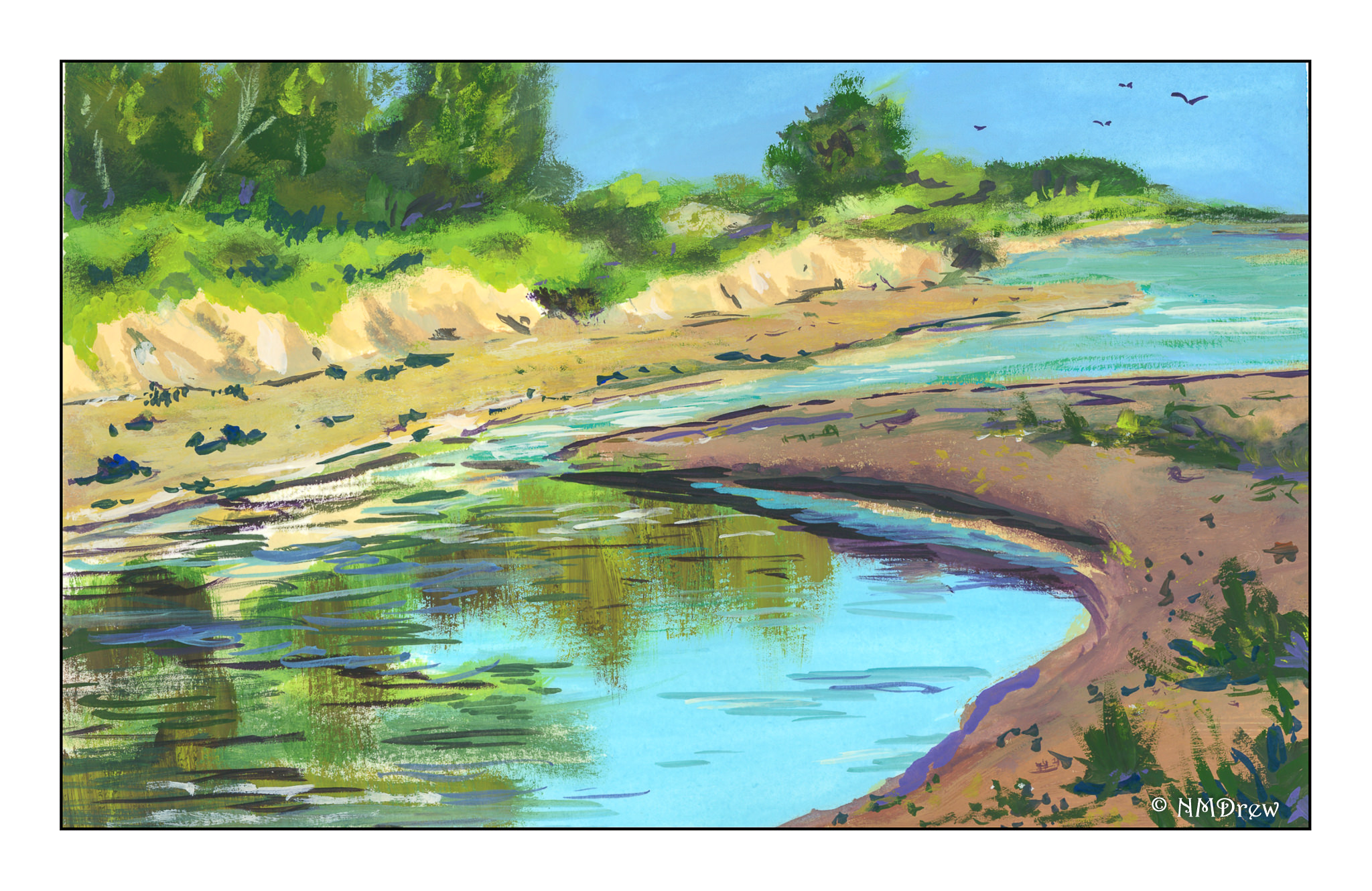
As you can see in the gouache, the perspective is totally off! I didn’t do much of an underdrawing, just a few quick lines, but I didn’t really check this point against that, as well as compare it to the photo. The result was an uphill beach, and a total lack of realistic perspective. I suppose it would look like htat if my head were on its side, lying in the sand or something! Anyway, it was a good lesson as I realized most of my perspective issues are simply the result of poor drawing techniques.
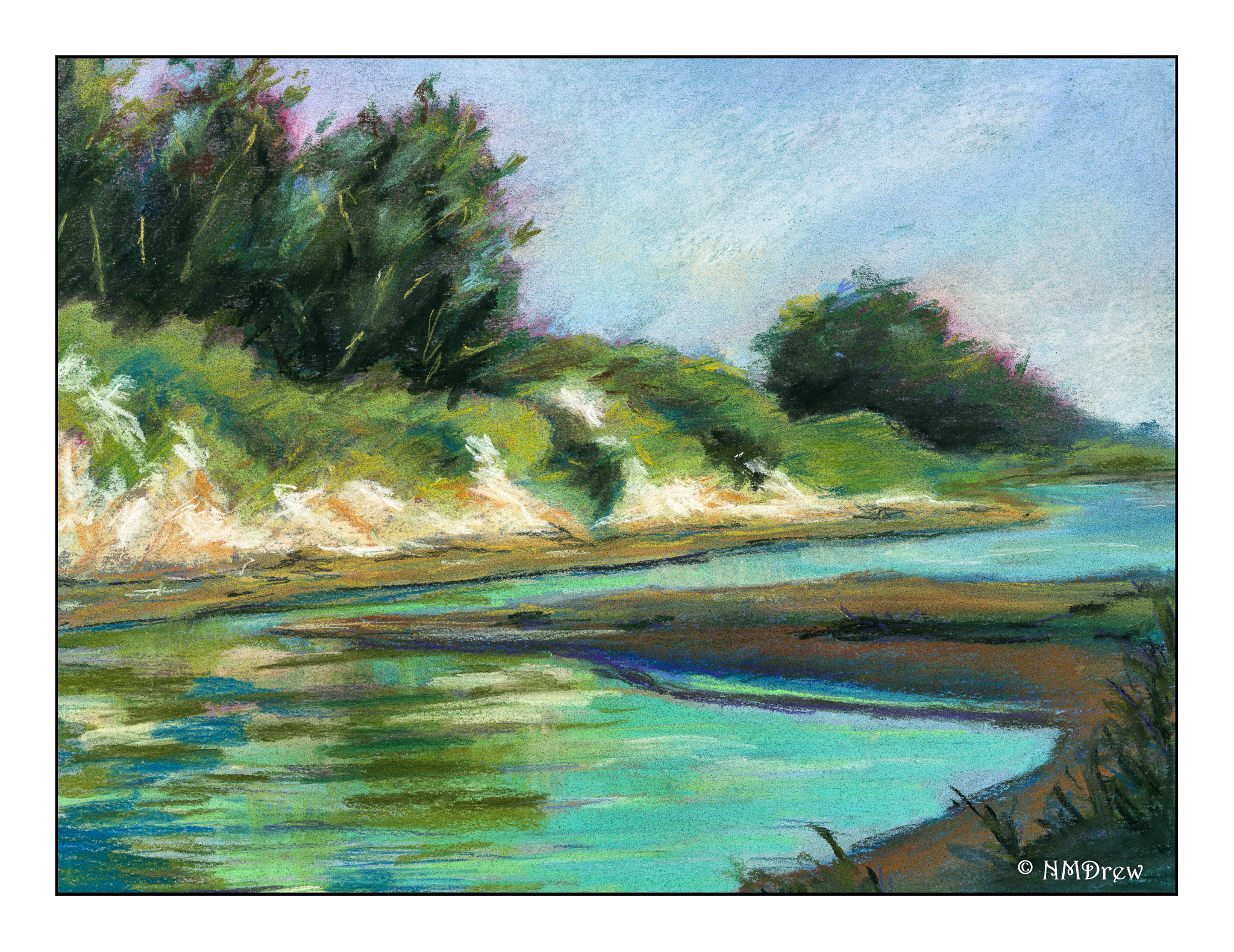
This next one is my favorite. Maybe it’s because I am just learning pastels and totally in love with them. Here, the perspective problem is solved. The cliffs look quite sandy in the picture, and in reality, they are. Along the coast where I live in California, cliffs tend to be friable, made of highly compacted but still fragile sand. They easily collapse, and it is really foolish to sit under them on the beach or to walk along there edges. After rains it can be especially dangerous, and one year a major landslide occurred and several people died. It was not good. So, I think these cliffs are pretty accurate representations of what our cliffs look like here.
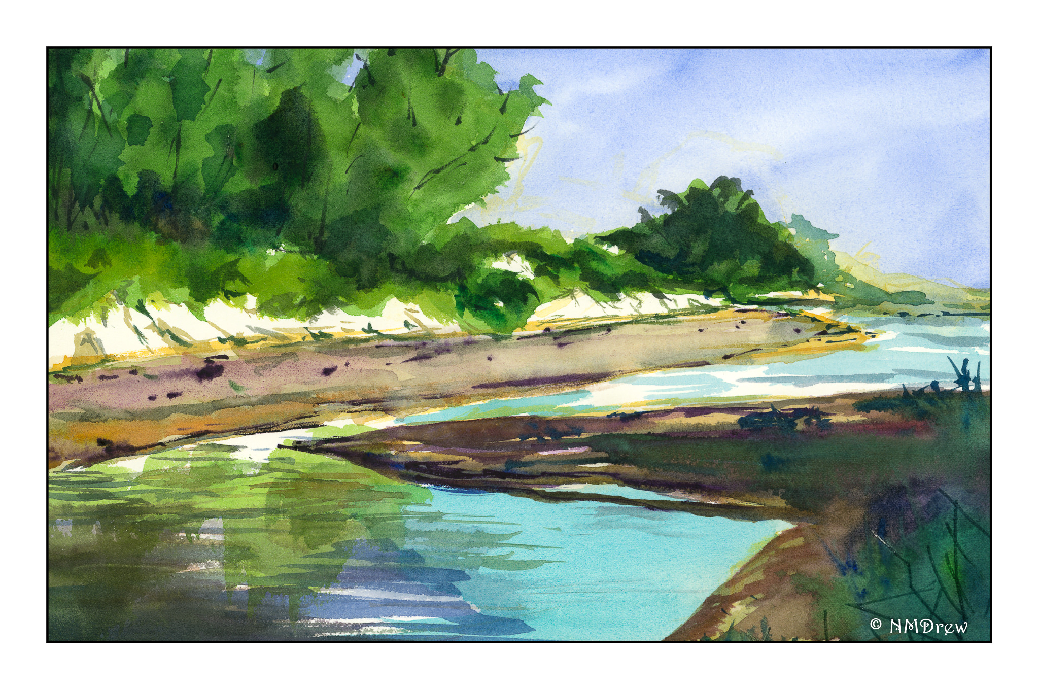
Finally, watercolor. Perspective issues remain resolved, but a sense of distance prevails along the strand of beach on the opposite shore. Rather than overwork it, I left it as it was, still pondering how I could make a sense of distance as the beach veered off to the left and background. More blue? Less detail? I’m still befuddled on that one.
Altogether, using three different mediums to paint the same image was rewarding. Problems occurred in all paintings, many of which could be applied to others. Perspective is always an issue for me, so I really need to focus on it probably more than anything in landscapes. I know the rules, but need to find methods to implement them. Gouache and pastels are more forgiving as you can paint over what is underneath to a reasonable degree; watercolors are pretty much a one-shot deal. I think I will continue the 3 painting studies in the future as I learned far more than if I had only done one study in a single medium.
