Color in Impressionism & Pointillism

For me, color is an excessively important part of my visual world.  I see colors before I see people or things.  I think in colors.  From there, reality intrudes and I can identify what is around me.  Because colors are my primary draw, when I paint, mud has often been the result.  Learning to separate colors and learn how one color works with another in painting has been, and continues to be, a difficult lesson for me.  My emotions want the color, but reality is that all colors do not create better ones.  Thus, “patience, grasshopper”!

According to Wikipedia:

Impressionism is a 19th-century art movement characterized by relatively small, thin, yet visible brush strokes, open composition, emphasis on accurate depiction of light in its changing qualities (often accentuating the effects of the passage of time), ordinary subject matter, inclusion of movement as a crucial element of human perception and experience, and unusual visual angles. Impressionism originated with a group of Paris-based artists whose independent exhibitions brought them to prominence during the 1870s and 1880s.

If you know your art history, Impressionism was ground-breaking and revolutionary.  Smooth blending and invisible brush strokes gave way to a different sense of light and its workings on the world seen by the artist.  As with all things, evolution occurred, and from this first rebellion against the “acceptable” art of Europe came other schools.  A direct off-shoot is Pointillism.  Color still is extraordinarily important, but instead of “impressions” being important, the usage of pure color became more distilled.  According to Wikipedia:

Pointillism (/ˈpɔɪntɪlɪzəm/) is a technique of painting in which small, distinct dots of color are applied in patterns to form an image.

Below is a short, clear video about Pointillism, its derivation and its influence.

What does this have to do with me? My need to work with color successfully requires a certain amount of intellectualization and rational thought about color – how color works, how colors interact, how Cobalt Teal reacts with Quinacridone Gold, and so on. I find breaking down colors into individuals before combining them helps. So, I decided to turn to the works of Monet and his studies of the ciffs at Etretat. I looked at several Monet studies, but I will use this one in particular:
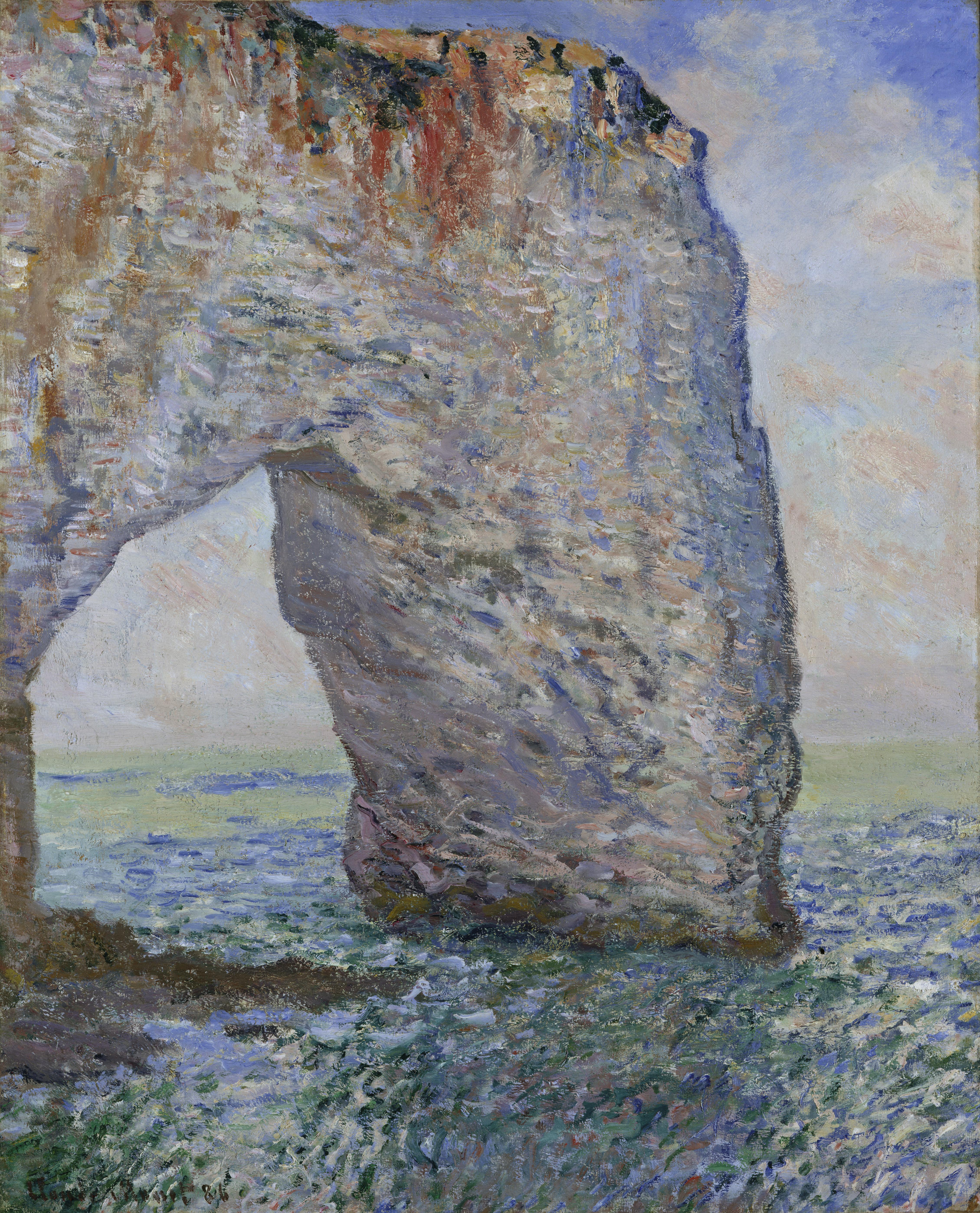
And here is my interpretation of it:
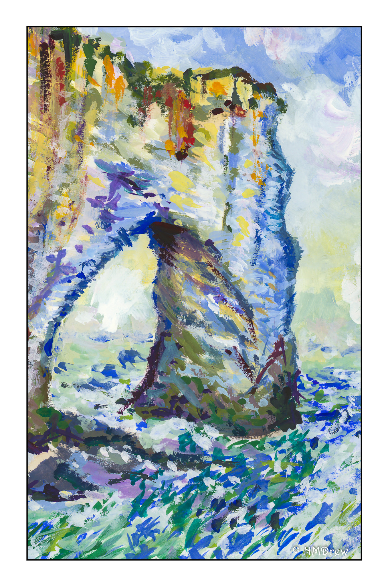
Obviously, my colors are more intense, but the impact of light on surfaces was the focus. After a few “Monet studies” I realized that this was not quite was what I was looking for. I knew of Georges Seurat but do not care much for the start graphic quality of his work. Exploring other Pointillists, I remembered Paul Signac, and it is here that I found my current muse.

Signac’s works vary from graphic and sharp to blurred and “painterly” (for want of a better term). His more purely Pointilistic works have an energy and vitality I prefer to Seurat’s – more modern, more attractive, and more elegant in composition. He also works with the precepts of Pointillism, but still in a more Impressionistic way. I did my first Pointillistic painting by painting a detail of this painting by Signac, Cassis, Cap Lombard:

I took a small section, enlarged it, and painted a detail of it without following the exact structure of Signac’s painting.  If you click on Signac’s painting above a couple of times, you can enlarge it, and find the blues and oranges together in the shadows, which I studied and used in my sample below.  Additionally, I studied both warm and cold blues and oranges to get a sense of the temperature of the painting, but I will admit at this point I am rather befuddled and cannot describe my observations
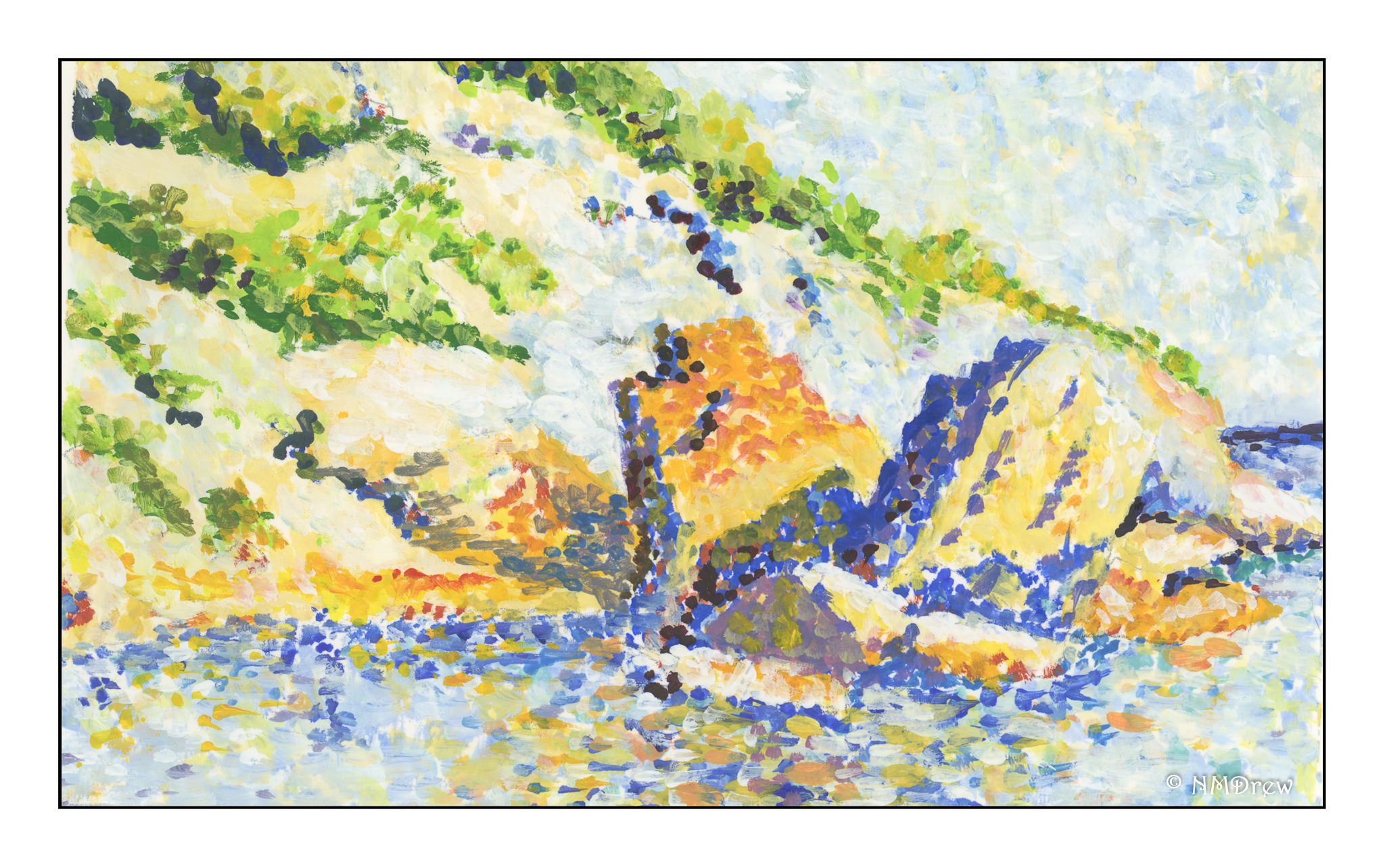
My goal was to look at the usage of color, in particular, the juxtapositioning of colors. In the stones along the shore, and in the reflections in the sea, you find blues and oranges, complements of each other, in play to create light, shadow, reflected light, and reflections seen in the lap of the waves.

Did I succeed? As far as color usage, yes, to a degree. In doing this study I also learned about making a Pointillistic painting. I began with just dots and soon learned it took forever! So, in further studies, I laid in the primary background colors in given areas and then applied the dots. I am working in gouache, and so I can blend colors into each other on the paper to create new ones since artists gouache is never permanently “dry” unless sealed. Gouache is the perfect medium for this, but I can also see the value of acrylics as each layer can dry and then be painted over without dissolving the layer beneath. The other beauty of gouache is that it is an opaque medium and so painting over other colors can be done, unlike watercolors.

More studies will follow using the principles of Pointillism, and I know that I will evolve into my own methods. Copying from the works of a master is a time-honored tradition and an important part of any student’s learning, no matter the field.  Such practice causes one to think, analyze, and apply; it is from this one learns.
 

Thoughts on Photographic Creativity

The day after we came back from our jaunt to Monterey I spent editing negatives I had processed while I was there. I scanned them and imported them into Lightroom. The film was Lomography’s Metropolis in 35mm, and I found it interesting to use, rather enjoying the colors it produces. Chances are I will order some more. For the most part, I did little editing in post as I liked what i saw, but a few had weird schmutz on them, probably bubbles that got trapped as the film was developed. Spot removal!

The process of editing images makes me look at them more closely. I worked hard to make some good pictures, and overall I was pleased with the roll. After a day of gardening and cleaning and just organizing life after the chaos of 4 days away, I sat down and just blobbed by watching various YouTube videos. They all seemed to be ones on photography. They included Ted Forbes’ channel and his “assignment” of a month using one lens length. I also watched Frederik Trovatten’s “Shoot Like . . .” series on Vivan Maier, Robert Frank, and Joel Meyerowitz. Totally by accident I came across a video about the Japanese photographer Miyako Ishiuchi.

Up front, I have never really “gotten” photography as an artform for myself. Watching Ishiuchi, I did. She explained her first three series and it made me think about photography as a theme to express emotions by focusing on one thing. That is about as easy a way to explain it. Watching Forbes’ video on one lens length helped me focus (sorry for the pun! Not!) on emotion – which one? – and one lens. Narrowing things down here. Trovatten’s vidoes provided interesting insights on how or why or what various photographers do and did.

Creativity is something that is difficult to find at times – that is, being creative and producing an artwork that is satisfying to me on many levels. These include emotional, intellectual, and proficiency of whatever medium I am using. In general, I can take a decent photo, but I have never been what I would consider to be a creative photographer. I don’t set up still lives or seek out a theme to explore. I like the technical things, such as exposure factors and what I want to see in an image, but I don’t “do” a series of anything. I love landscapes, but the heat limits my wanderings. The pandemic curtails too much travel or traveling with a chauffeur to do a safari.

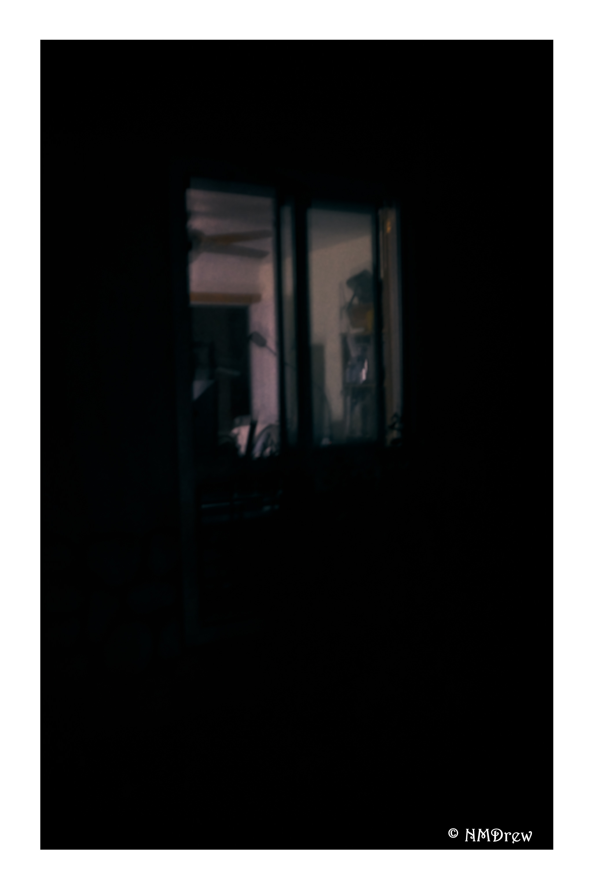
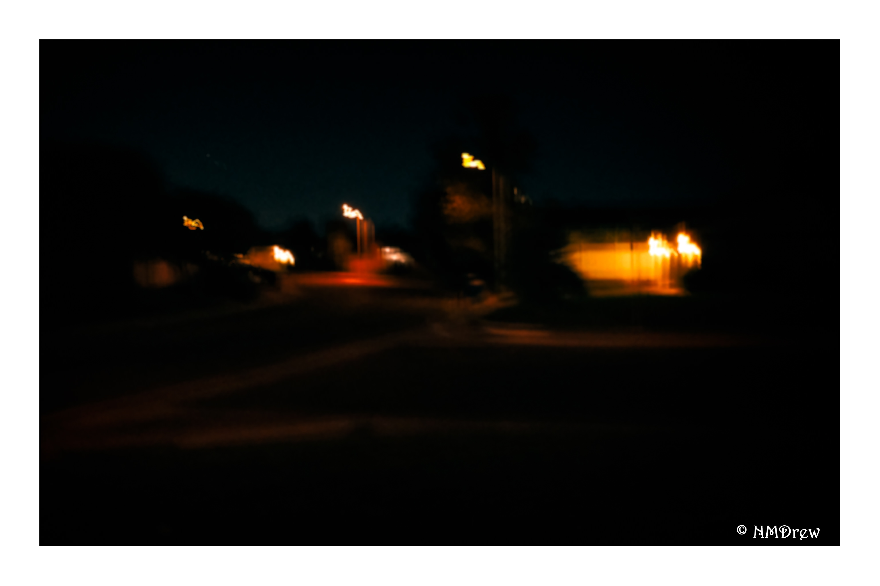
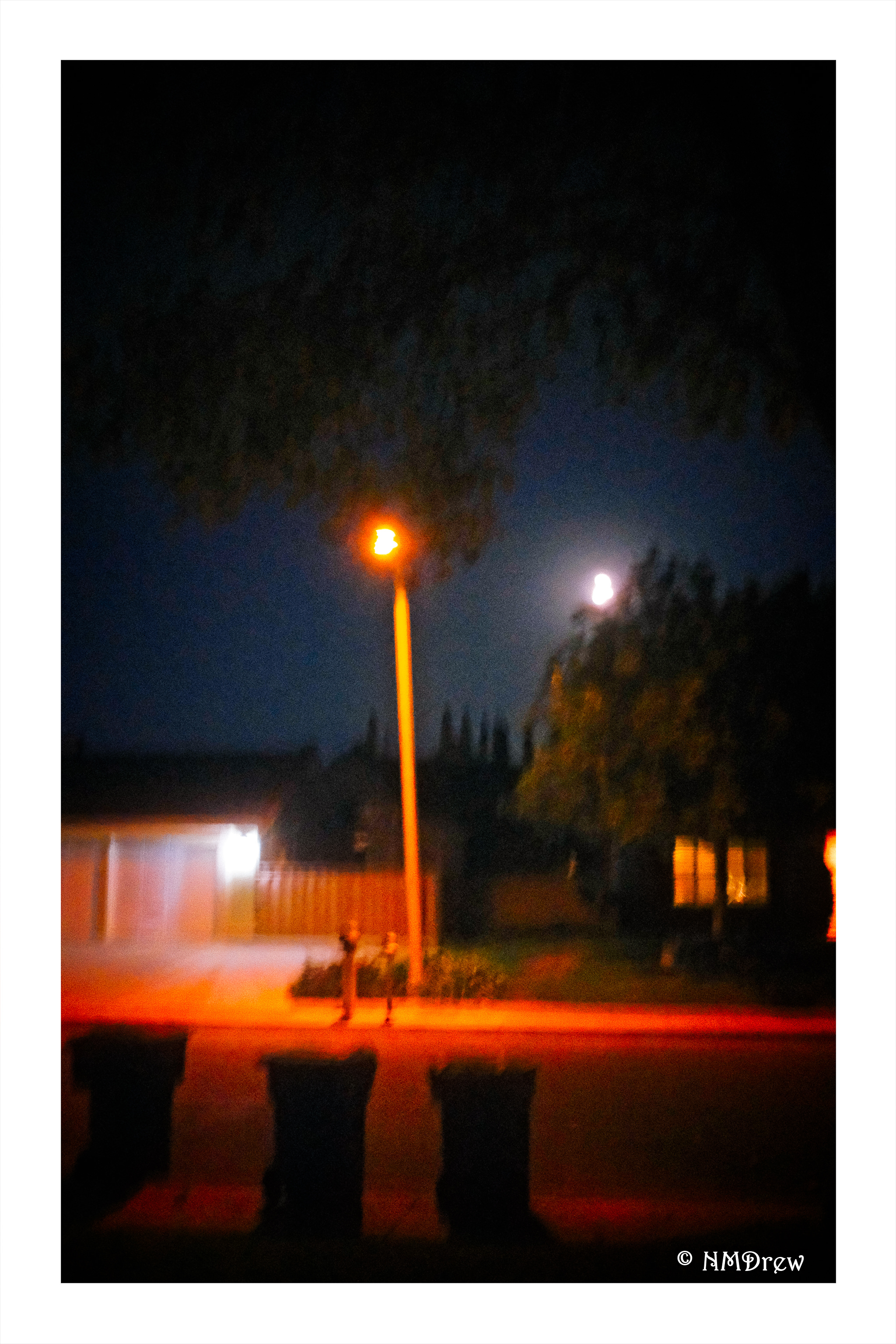
Yesterday’s video watching pulled a lot of things together for me in the area of making photos. Theme, single lens length, mastery. While I plan to continue to try my daily painting, I am also going to begin a month-long study of image making with a single lens length. The lens will be a 35mm. The Fuji X100V is a fixed lens length at 23mm and a 1.5 crop factor, equating 35mm. I have a 35mm series E lens for my Nikon film cameras. It will also work on my Nikon Df full frame. There is a lot of choice here with what I have. The theme that catches me the most is one that has intrigued me the most over the past several months: my neighborhood at night.

I live in the suburbs. It is a nice neighborhood with nice people, curving streets, greenery, a park with a creek. Nearby is a college. A small strip mall is within walking distance.  I consider all these to be within the parameters of My Neighborhood.

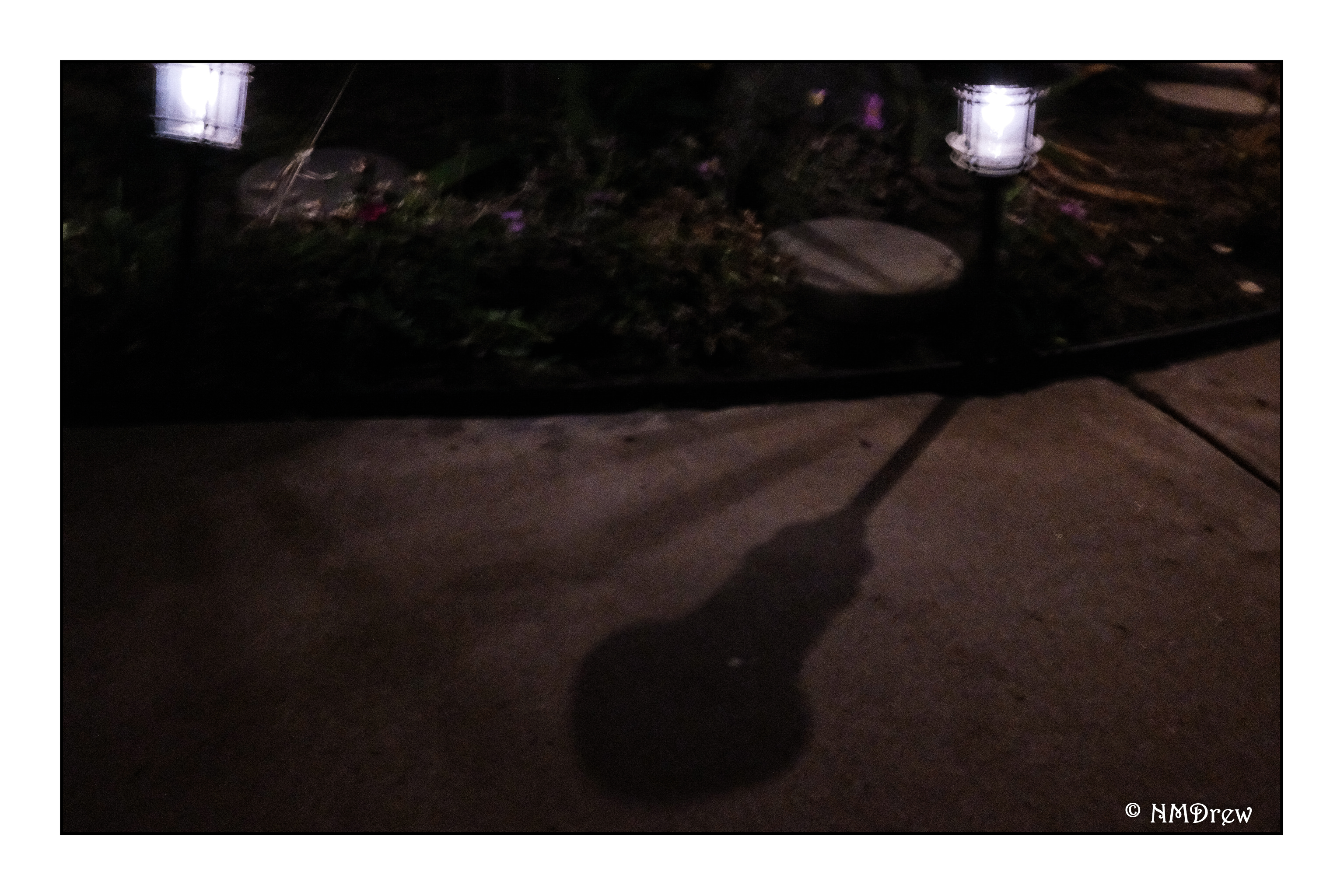
I went out last night with this thought in mind, using the X100V, iso set at its highest and the rest on automatic. Everything was done handheld. I will need a tripod. I will need to use flash at times. This will be a great way to dig into the menus of the X00V as well as learn how to use it on a deeper level. And I will need to dig out a tripod and a shutter release cable. These same things will need to be applied to my film cameras and other digital critters.

So begins The Neighborhood at Night.

En Plein Air

We spent  three days in Monterey, California, doing basically nothing but eating and walking miles along the boardwalk in Pacific Grove and the bike path in Monterey. We walked and then ate, and then sometimes walked some more. When we weren’t walking or eating, the activities included simply being blobs, like reading books or knitting or watching “Good Omens”. It was a really hellish vacation.

While walking in Pacific Grove, we admired trees and people and rocks and birds. Then I espied this gentleman, out in the full sun, painting a view behind me. I stopped and looked, and decided to chat him up a bit – it is very seldom I see someone painting directly from the real world. Where I live, you are likely to faint from dehydration these days.

Anyway, he was so friendly and nice! (And he let me take his picture, too.) His name is Ethan Walsh, and he has a lovely website, Ethan Walsh Paintings which I decided to visit. His paintings appear deceptively simple – they look so easy to have done, but you can see the skill and work behind them. His portraits are really amazing, especially in his ability to capture expression. I wish I could do as well. Add to that, he paints the Monterey area, and he catches the light and geography beautifully. Look him up!

This is the view Ethan was painting – Monterey pines on a rocky outcropping into the waters of the Monterey Bay. Here he is painting in oils and was using a fine brush to catch the details. This painting is very different than the ones I saw on his website, and to me this attests to an ability to move in many dimensions when wielding pigment.

Ethan – if you read this, thanks for spending a few minutes with me in the middle of your painting. I really enjoyed it!

And for those of you who are curious, these images were taken using a Nikon FM2n, 100mm Series E f2.8 lens and Lomography Metropolis film.