Christmas Day! Nothing like a snowfall and the cold and the quiet of the woods for remembering the magic of the season. New and old traditions overlap, memories and hopes for the future all seem to be rolled into the end of the year and depth of winter. The stillness of the winter woods gives pause to our crazy lives. Holidays of any sort at this time of the year make us look backward as well as forward.
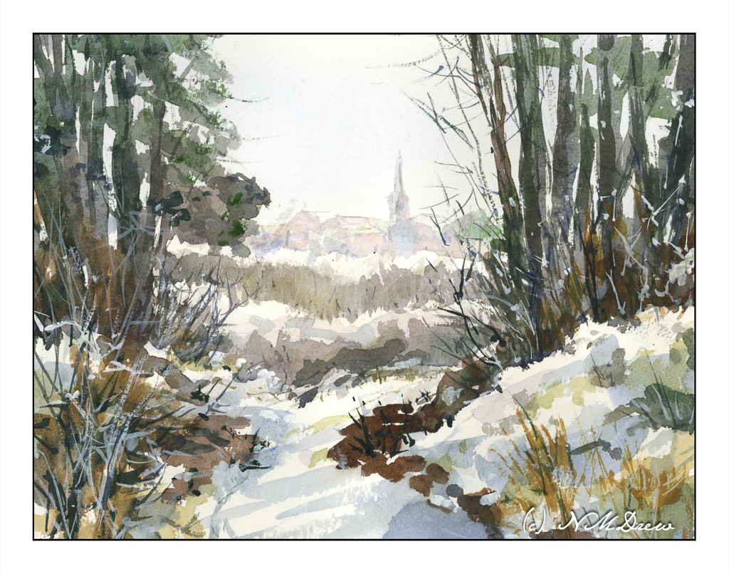
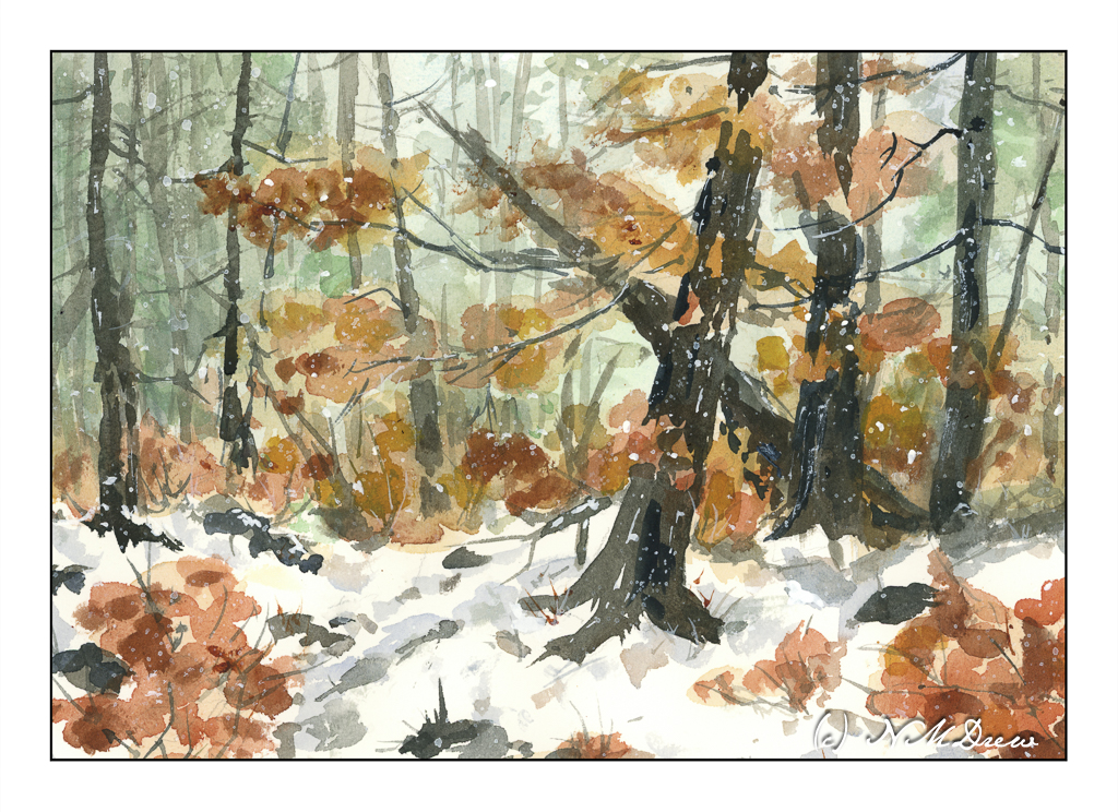
Here I worked from very light to dark. The colors I used for the greenish-blue sky were cobalt teal, a bit of ultramarine, and a touch of Hooker’s green, neutralized by a bit of alizarin. The leaves and autumnal foliage were various siennas and orange with a touch of Indian yellow. Trunks, from light to dark, were essentially ultramarine with burnt sienna and raw umber with a bit of Payne’s grey. Snow shadows were ultramarine and Payne’s grey. Finally, I watered down some titanium white gouache and tapped my brush across my forefinger to look like falling snow after applying a few lines and dots in white here and there.
This is another watercolor which pleases me. Perhaps I should stick to Arches Rough paper instead of my usual cold press . . . ?
Have a wonderful Christmas Day – or whatever it is you celebrate!
Watercolor, Arches Rough 140# paper, 10×14.