Transition

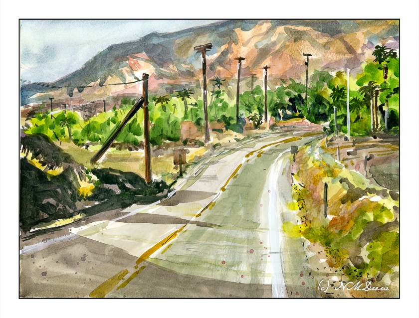
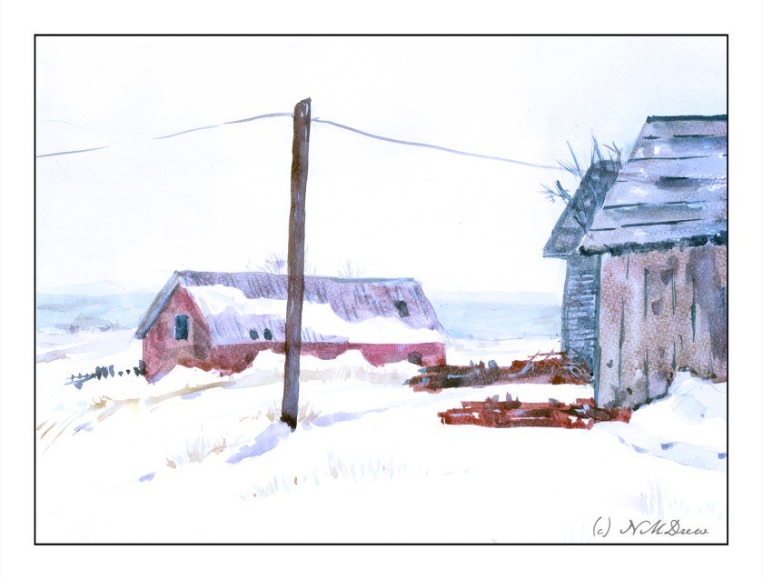
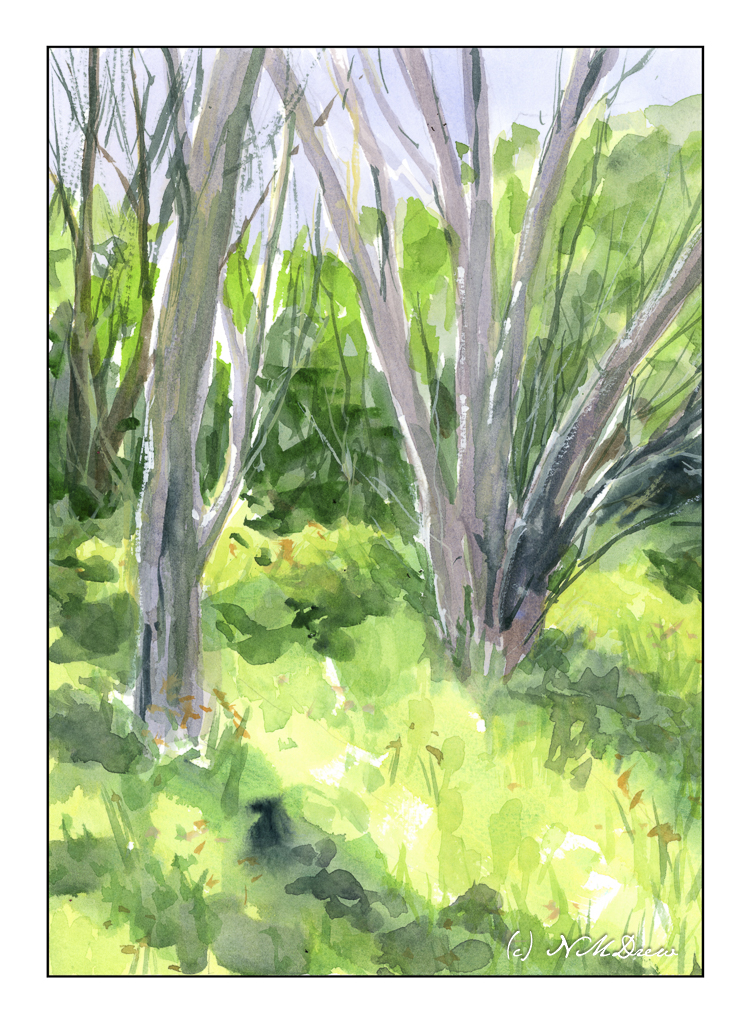
Even though seasonal changes in SoCal are subtle, elsewhere in the state, further north or at higher elevations, shifts in color and temperature are more apparent. The tilt of the earth changes the light, winter pushes trees to change colors and lose their leaves. Temperatures drop. While today is about 73F, two weeks ago it was in the 50s (no snow, yay!) and nights are chilly. So, let’s celebrate the shift of summer to fall, and now fall to winter.

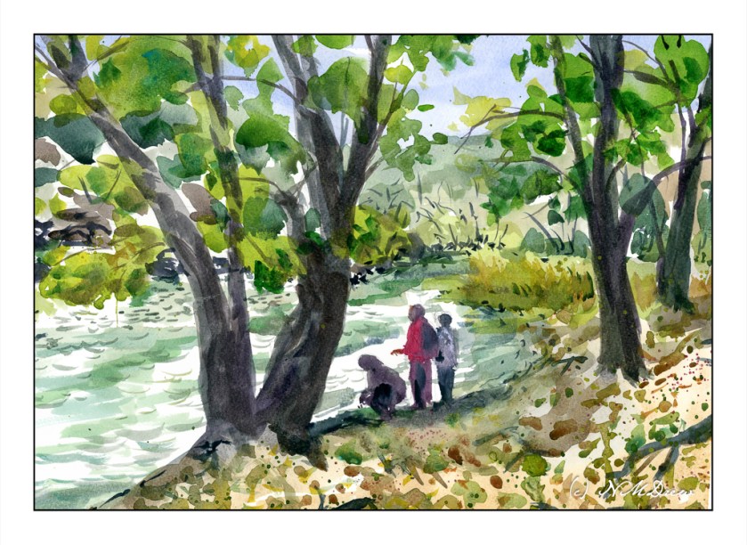
For me, this is a rather complex painting. Rocks and sandy shore, trees and brush, water, sky and reflections in the creek. Remembering the “rule” – simple big shapes, moderate shapes, details last, I worked by creating the most noticeable areas – or certainly the ones I felt could be the most challenging. This meant the creek in particular – keeping the water marked out. As well as that, the shoreline in the foreground coupled with bits of sandy shore on the right. After that, the rocks on the left and foliage of trees. I was all over the place working larger to smaller, light or dark, and then on to light or dark details.

Overall, I think this painting worked out. Analyzing its complexity and then breaking it into its larger components and areas of color helped. It is still not quite what I would have liked to produce, but much of it did succeed.

Watercolor, Hahnemuhle paper, about 10×12.

Above the Treeline – Mountain Peak & Snow

As always, I can never fail to but enthusiastically recommend the short watercolor courses by Shari Blaukopf! Her most recent one is called “Peaks and Valleys.” It is inspired by her trip into the Alps while teaching a class. Having lived near the Rocky Mountains in Colorado and driven through them many times, I found this course especially fun to do. Shari’s instruction is clear and to the point, but her lovely personality shows through to make the lessons personable and friendly.

I am not going to show you the subject matter I have done so far in the course. Instead, I am going to show you what I learned to put into my own painting. My reference for this watercolor was a mountain peak photo found on Pixabay – the best resource for public domain, royalty free photos (and other things, too!).

Mont Blanc was the first mountain top study in this course. At 14,000 feet, it is way above the timberline, covered in snow, and nothing else than barren rock and clouds. At this elevation, the view across the Alps must have been amazing with ridges of more and more mountains before and beyond Mont Blanc itself. To paint it, essentially blues and browns were used in the class – cobalt, ultramarine, burnt sienna – with the addition of Payne’s grey, some organic viridian, and yellow ochre to neutralize of brighten the colors. Myself, for this painting, I stayed pretty much with these colors, but threw in some dioxazine purple as well.

It seems that the one most important lesson I fail to really retain when I watercolor is to be patient and think ahead on what I want to do. Taking a class such as this make me remember to plan ahead.

On the other hand much of my color mixing is automatic because I am familiar with how my colors look and blend, but my natural impatience is sorely tested. This is where 99% of my mishaps occur – rushing. With this painting, not so much because I started playing a game with myself – how will I plot my next step? I didn’t do a value study, but I want to try to do that more often. Here, the strong contrasts of light and dark, warm and cold, made the values and contrast easy to perceive.

I am rather pleased with this painting. It is cold and starkly beautiful, and that was the whole point of this painting.

Watercolor, Arches 140# CP, 9 x 12.

Rio Chama

The Rio Chama is a branch of the Rio Grande River in New Mexico. It flows through the Chama River Canyon Wilderness and is managed by the Bureau of Land Management (BLM). Country like this is public land, subject to the rules and regulations to help preserve it, but also vulnerable to the whims and politics of the times. It is host to a variety of wild life and the beauty of the American Southwest.

Oil, 11×14, cotton canvas panel.

Afternoon Sketches

Late afternoon I met up with a friend at a nexus for a series of hiking trails to do some afternoon plein aire sketching. She brought a paper and pencil, I brought ink and watercolor. We walked about 30 yards down a flat trail and settled in what could appear to be an isolated area as the trail curved into an oak woodland at the lower edge of a hill. The later afternoon sun gave lovely shadows, areas of light and dark, and the oak trees were especially beautiful in that light.

This is my “warm up” sketch. I always like to play around with what I am working with to see how ink and watercolor and paper all interact. Most importantly is how the watercolor and paper work together. This sketchbook is designed for watercolor sketching, and it worked well. Here I started out with the ink and then worked with the paint. After all was dry, I went back in for some touch-up with the pen.

For this one, I painted the tree shapes with light washes. Then came the leaves. After that, some ink, back to paint, then finally ink.

The second painting is my “serious” one whereas the “play” painting was testing my tools. We spent two hours sitting in the woods, yakking and drawing, taking a few photos, chatting with passersby on bike and foot. At 5 pm the sun was going down, so pack it in, hike that long distance out, and say our good-byes.

Ink, watercolor, 5×7 on watercolor paper.

Lucious Loquats

I love loquats! They are an odd fruit to most Americans, but they have a mild taste, beautiful seeds, and are borne on bushes or trees with glossy leaves. Over time, I have taken many photos of them and painted or drawn them.

I don’t remember where or when I took this photo, but it really shows the loquat in its full beauty. The fruits are pale yellow to a more deeper orangish color.

This is my most recent rendition of loquats, done in oil on a 12×12 canvas panel.

Above is one done in pen, ink, and watercolors.

And the above is done in gouache.

The round shapes against pointy, glossy leaves is always a pleasure for the eye.

Gouache, oils, watercolor, pen and ink on various surfaces.