Me and My Cookie Scoop

I love cookies, but of late, dietary issues have forced me to stop eating certain foods after a lifetime of eating them.  Well, that is the way life is.  Luckily, there is the internet, there is imagination, and there is my love for cookies.  If I were to single out two favorite sweets, cookies and homemade fruit pie are the winners.  So, today, I decided I would look for cookies that didn’t use flour or starches, and I came across this recipe for thumbprint cookies by Danielle Walker.  They are designed to be paleo or specific carbohydrate diet (SCD).  They are a great start, but as I didn’t have coconut flour, I changed them a bit.  Here is my take on the recipe.

Thumbprint Cookies

1 egg
6 T. soft butter
1/3 c. honey
1/2 t. vanilla extract
1 egg
2 c. blanched almond flour (mine is from Trader Joe’s)
1/2 c. almond meal
1/2 c. unsweetened flaked coconut
1 tsp. cinnamon
Fruit preserves without sugar (I used some fruit spread sweetened with grape juice and natural pectin from Trader Joe’s)

Preheat oven to 350F. Beat together butter, honey, and egg, for about a minute at medium speed. Beat in at low speed the remaining ingredients until the mix together well.

I suggest you make one test cookie! This will help you adjust time and add ingredients if you need to.

Using a 2 T. cookie scoop, make balls, and place on parchment covered cookie sheet. Press your finger into the cookie to make a deep well. Fill well with just enough fruit spread to fill the indentation – don’t let it run over the sides or overfill. Bake for 15 minutes until lightly brown. Let cool completely on wire rack to allow the fruit spread to cool to a non-liquid state.  Yield:  17 – 18 cookies (I ate some of the dough!).

I think next time around I will add a bit of salt . . . I seldom cook with salt, but these cookies need just a tad.

Damned good cookies if you ask me!

Negative Painting & Glazing

This morning I decided to do a few things I haven’t been too fond of in the past.  One is negative painting.  The other is using glazes.  That’s what I did here.  The first layer was a warm yellowish wash, very thin.  From there, about 3 or 4 consecutive layers of blues and violets around the main trunks, and then over the ones to the sides, making them bluish.  I then used a rigger brush (for the first time) to create branches.

Overall, the picture works, but the areas I can say shouldn’t have happened are the branches in front of the central trunk.  The other thing I need to do is to create better contrast on the branches, in particular it seems on the right.  I would like to see more blue in there, in narrow strips using a flat brush.  I may do that later.

The idea behind this painting a sycamore tree in moonlight, with the above exercises to accomplish it.  I thought ahead more than I usually do, considering colors and such, as well as the approach to creating what I desired as an end product.

What is a “Personal Style”?

In painting, it is really possible to look at a picture and say, “Oh, that is by so-and-so.”  If you are familiar with a painter, you become familiar with his / her style.  You can tell by the light, by the brushwork, by the colors, by the subject.  It’s like your face in the mirror – you know it instinctively.  This knowledge of what someone’s style “looks like” makes me question myself:  What is my style?

The fact is, I don’t have a style, unless I were to call it messy and scribbly.  This occurs when I don’t think about a composition or what I want to do, but just do.  I cannot say this produces much which I like.  Once I am involved in working on a piece, I do seem to be able to deal with compositional elements, and can say when to finish, and say, oops!  shouldn’t have done that!

So, when does one’s own style emerge?  Is it a conscious choice?  Is it something which develops slowly?

This question came to me last night when I was putzing around, following another Peter Sheeler video and practicing his exercises.  There is an ethical question here:  is it acceptable to do this?  I think it is, as he is posting his videos online for people to learn from – and I have been learning, most certainly!  The lack of ethics would be to pass them off as my own.

The lesson from last night was using wet-in-wet to paint trees.  Mine are not as successful, mostly because my paper is not the same as he uses.  The lesson was good, though, as the focus was on the trees and the bloom of the colors on a wet surface.  The rest of the lesson was good as I watched him put in shadows which, left to my own imagination, would not have shown up.  The lesson there is to think about where the sun is coming from, imagine it, see it in the mind’s eye, and then paint it.  That’s a valuable lesson.

Thus:  Peter Sheeler’s video on wet-in-wet.

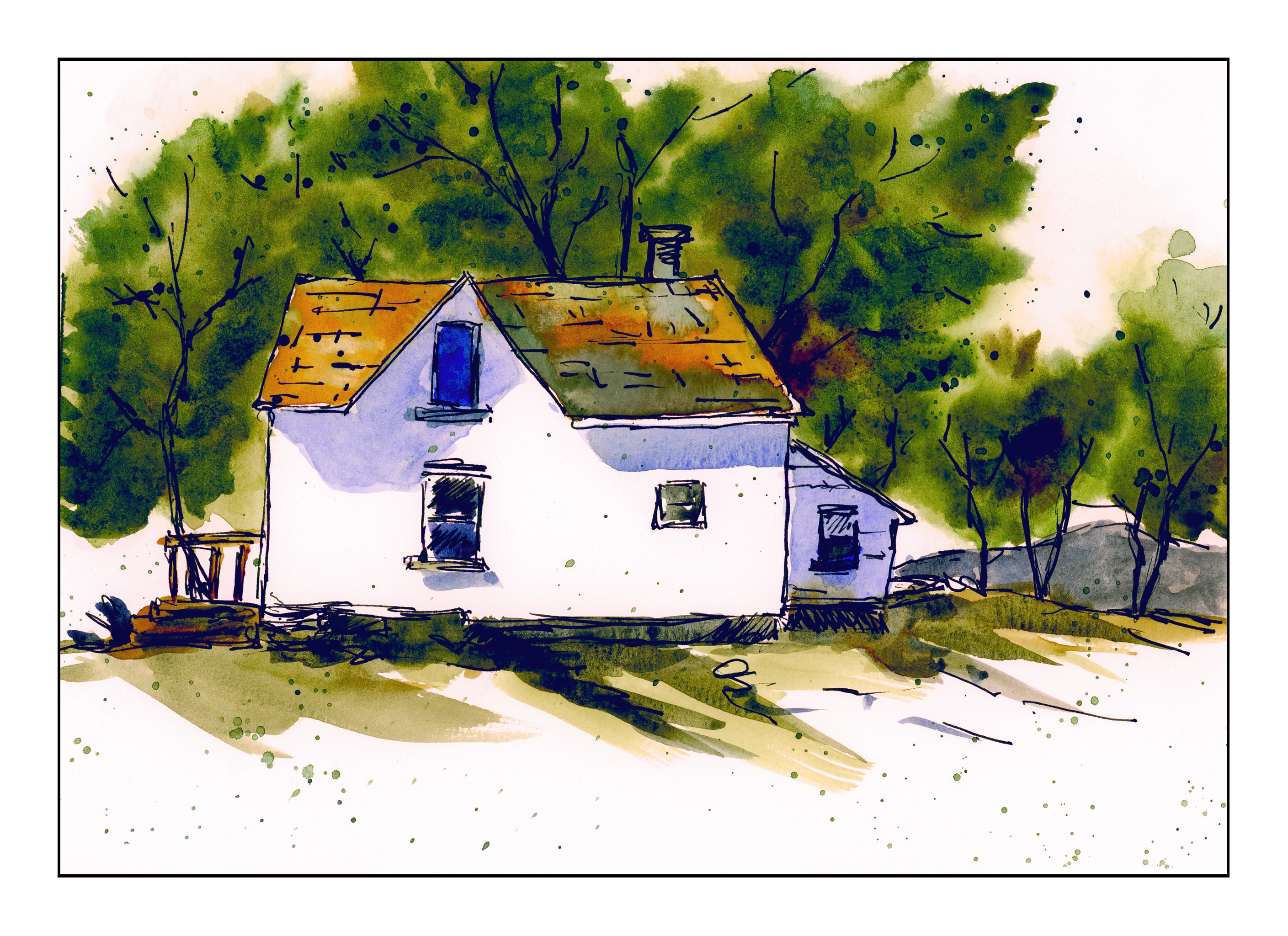
And my own painting.


I found it interesting to see myself adding the spatters and the shingles on the roof, which weren’t in Peter’s original drawing.  Is this the beginning of my own style?

Peaceful Morning


Today is Christmas morning.  It is easy to forget what truly lies behind Christmas – thoughts of peace and hope, the turning of the year as the solstice brings back the light of longer days, and the values that are at the core of most of us.  Community.  Family.  The world around us.

For me, much of what I truly love in this world is ephemeral.  My family, my friends – we all will vanish at some point.  How many of us will be remembered in 100 years?  There is one thing, though, that never ceases to amaze me, and that is the natural beauty of the world, its diversity of life (human, animal, plant), and the fact that it is even here at all.

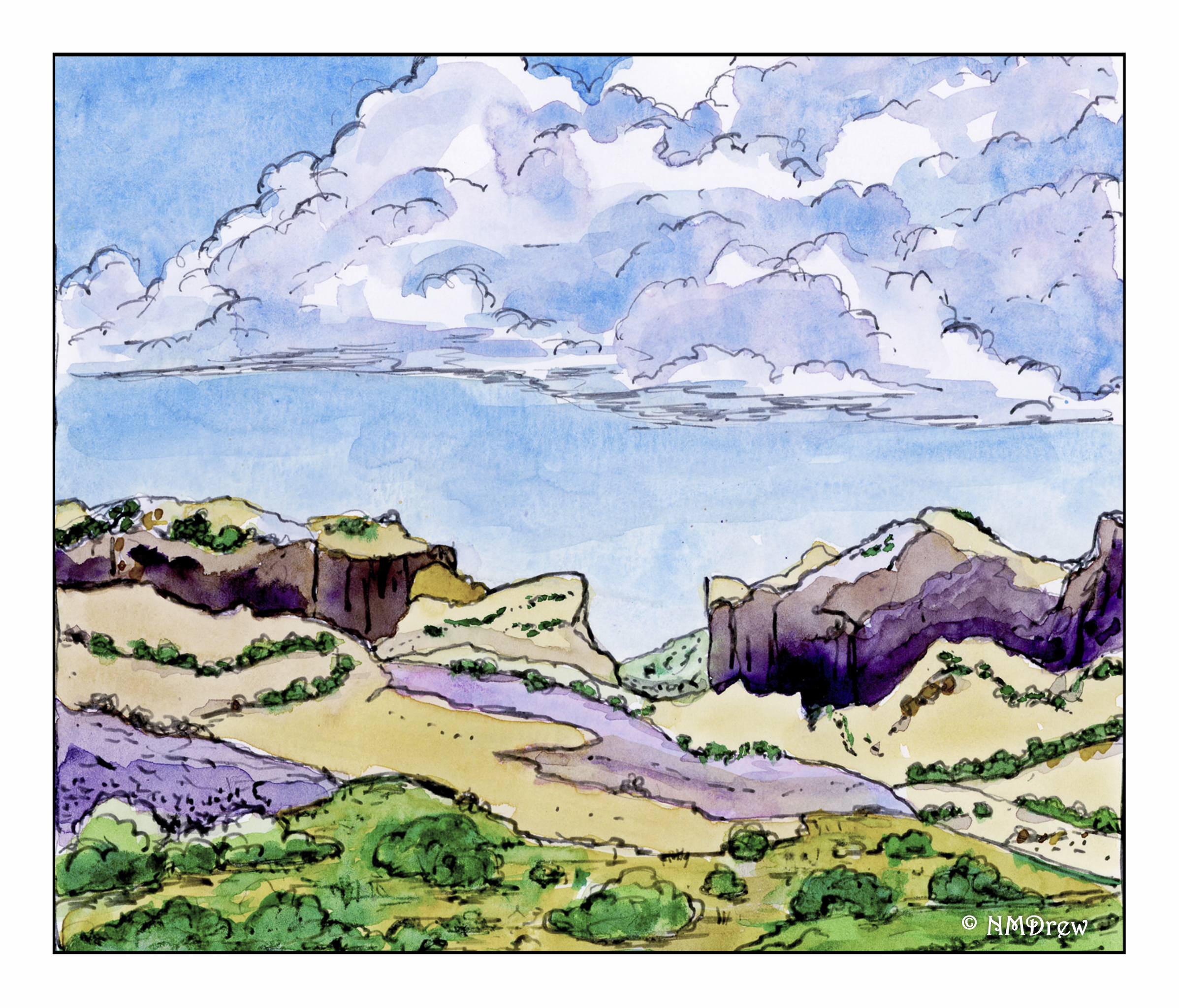
With this in mind, I wandered through some of the myriad photos I took on our trip last summer.  Here, a view out of the car window on the way from Mesa Verde, Colorado, to the state of Wyoming.  Here, the American West – sparse, grand, barren, and filled with life.  Merry Christmas!

Sky, Interrupted

This morning I sat down to practice skies.  If I were to do the ones in my neighborhood, they would be blue.  That’s all.  Just blue.  Clouds are not a common sight where I live!

Anyway, so I scooted around YouTube and found some videos that had some good ideas.  One showed how to do lifting with tissue, advising not to scrub too hard on lightweight paper.  Important to know – I scrubbed a bit of the paper off.  Others used some rather wild color combinations, or certainly ones I haven’t thought about using.  Add to that, I wasn’t trying to accomplish anything more than playing, so it was altogether a fun way to start the morning.

This first one is a combination of Sodalite Genuine, by Daniel Smith, Ultramarine Blue, and Quinacridone Gold.  The Sodalite is a color I picked up on a whim, put in my palette, but had never used until this morning.  It granulates wonderfully, and is a good charcoal grey.  I think I will be using it again.

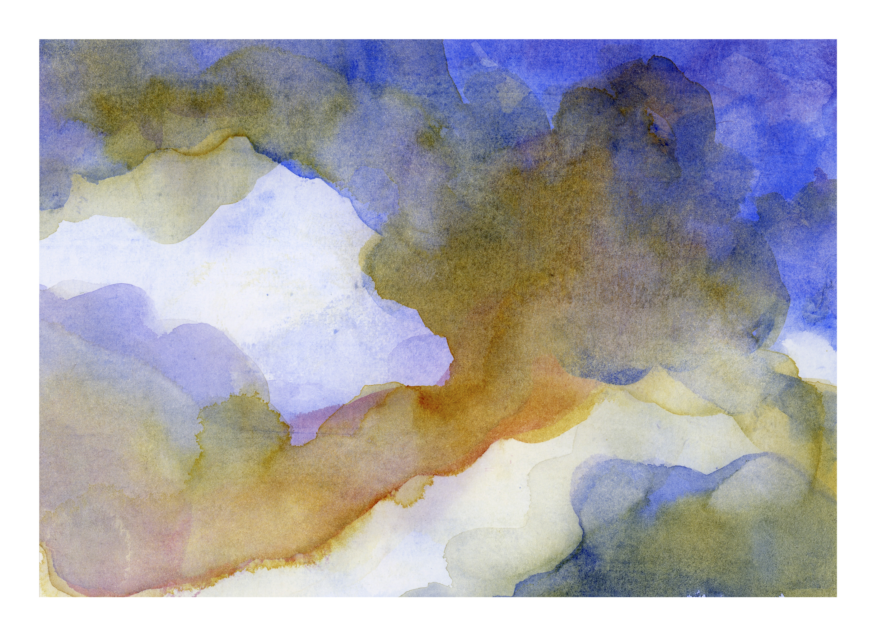
Then I started another one, wetting the paper once, letting it soak in a second time, and then wetting it again.  I am using Canson XL watercolor paper, which has a nice texture, is about 90#, and is a student grade paper.  I like it because it is working out really well for my needs.

After wetting the paper, I decided to start with a gradated wash, using the reverse side of another painting (to save paper, eh?).  The brush I used was a flat with rather stiff bristles, and the result was lines throughout the wash.  Oh, well.  Then I simply lifted the color off.  Then I began adding Carbazole Violet and Quinacridone Gold.

And then the phone rang!  My brother and his wife in Wisconsin calling, to wish us well for the holidays . . . . the painting was forgotten for the next several minutes, and this is the result.

Regardless as to whether or not this last looks like clouds, the colors have a lot of potential for a dramatic sky some day.  I really like the colors!  I like both, actually.

White space.  No mud.  I must be doing something right!