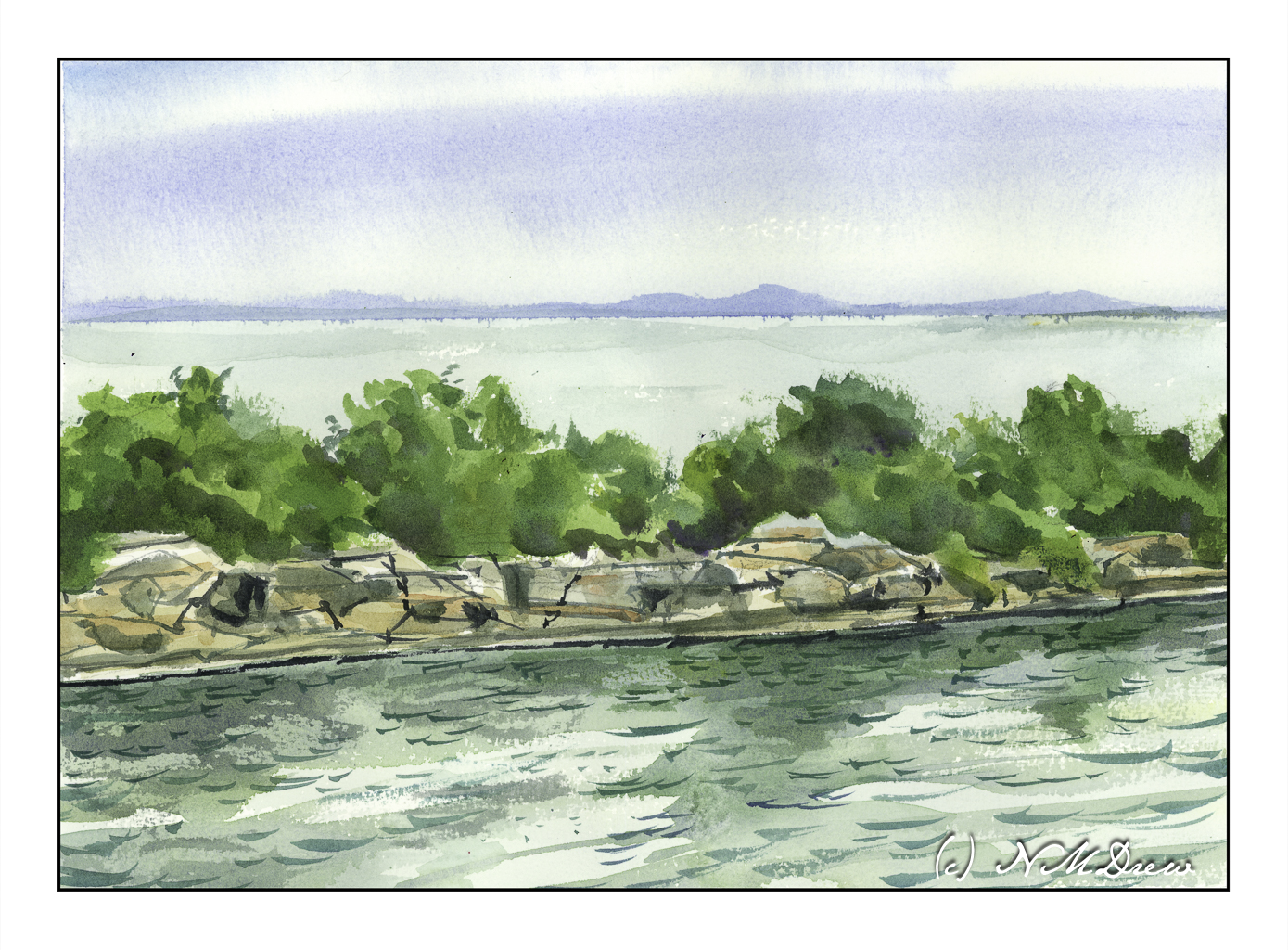
Halibut Point is a granite edge between the Atlantic Ocean and the mainland. On this rocky coast, people have quarried the robust stone, built military structures to defend the nation, and today the park supports a wide variety of wildlife.
On a clear day, visitors to Halibut Point State Park will be able to see Mount Agamenticus, located 40 miles away in Maine, and the Isles of Shoals off the coast of New Hampshire. You can explore the park’s trails and tide pools, picnic on the rocky ledges, and learn about the park’s World-War II history and the Cape Ann granite industry history.
What draws me to Halibut Point is the quarry, its cliffs, and the geometric properties of the stones themselves. Water is everywhere. All these present challenges as the weather changes or the view changes. The East Coast is definitely different than the West Coast!
My focus here is the graphic quality of sky, land, sea, trees, stone, more water. The scene is quite simple but the detail can be a bit overwhelming – I want to be specific and show every leaf and grain of stone and wave in the water. I needed to make it very simple for it to work, keeping the sky and distant land and sea simple before moving to the middle ground trees.
And, I think it does. I like the way my trees tuned out – masses of greens in different value to add depth and suggest the denseness of its growth. The rocks of the quarry walls are filled with straight lines which can be vertical, horizontal, or diagonal. The color of the stone is a rather warm white to ochre, but light, too, renders it warmer or cooler. Finally, the water itself in the foreground. A calm water, but a bit of wind. Reflections in the water and ripples on the surface. More detail, but hopefully not too much.
Watercolor is a challenge, but I seem to finally be able to think about what I want to focus on, and work to meet and succeed, in varying degrees, my goal. Here, it is wet-in-wet painting. In watercolor this means working with very wet paint – a lot of pigment and a lot of water. This is not easy to control because you sort of have to know your paper and your paint and how wet or damp or dry the whole thing is.
For the sky, I wet the paper first and let it settle into the paper for a few minutes. Then, using a mix of mostly ultramarine blue and burnt sienna, I created a grey by adding a lot of water to my colors. I dropped the paint onto the paper and let it bleed into the water. As the paper dried, I made a stronger mixture of the grey – meaning darker – and dropped that into the already painted surface. With a bit of toweling I blotted up some of the paint to lighten areas as well as to give a shape to the clouds.
After that, I did the middle and foregrounds. Everything was done with damp paper and watery paint. No dry brush at all, just working with different degrees of wetness and color intensity.
Goals accomplished, I don’t think of this as a good painting but a good exercise.
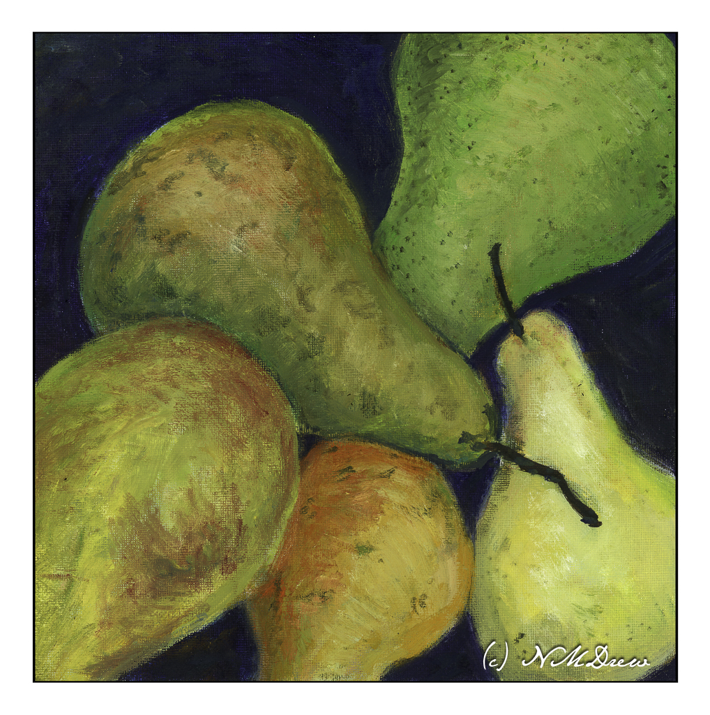
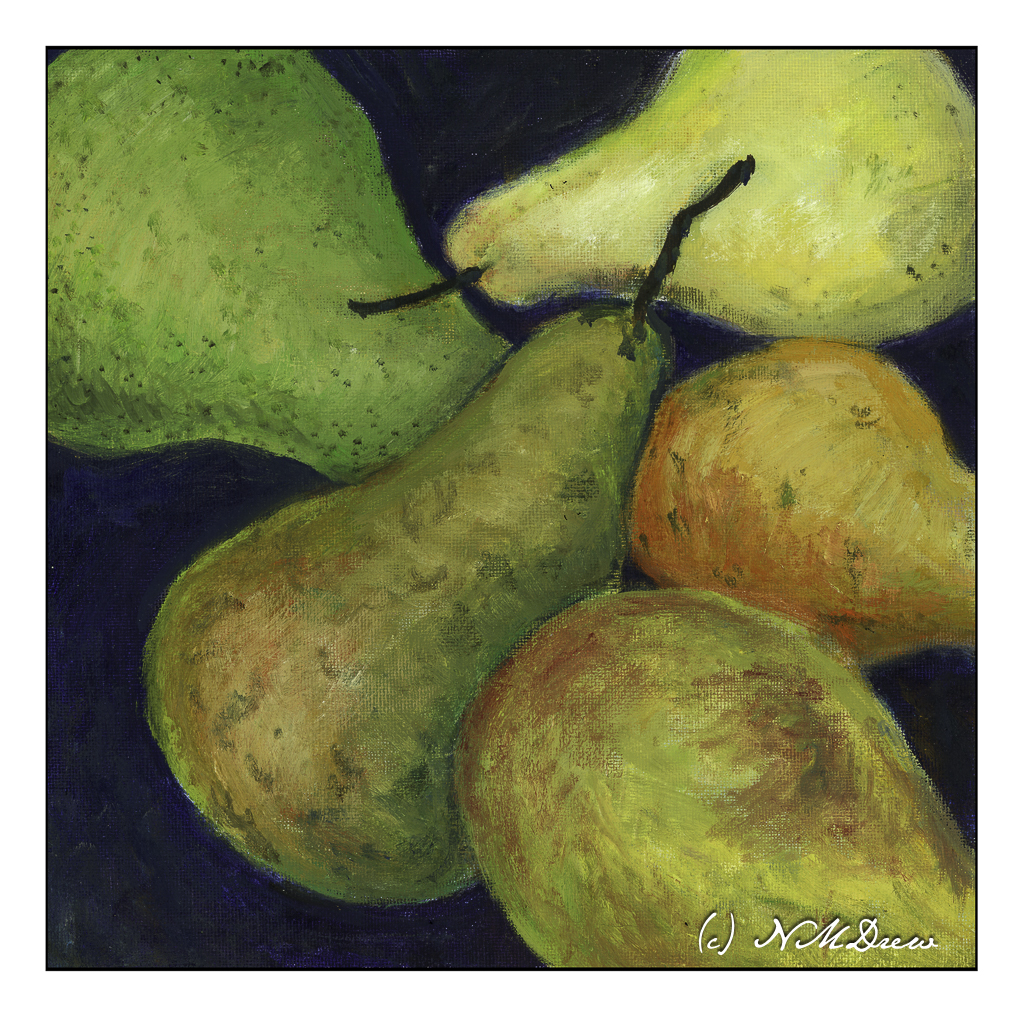
I don’t know if I have published this image before . . . . I have a feeling I did, but cannot find it. Of course, with all the stuff I have here on IY&B, it makes sense.
I painted this a few years ago. I worked really hard to get soft tones and paints. I had been working mostly in acrylics when I picked up the oils and was used to the hardness I seem to produce with acrylics. So, with the blendability of oils, that was my focus of the exercise.
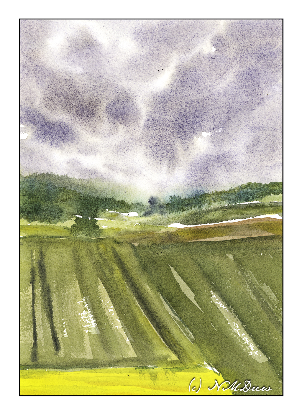
The results here have been sitting around for ages with the thought the painting could use a bit of work. Looking at it now, it seems finished enough. I am pleased with the moodiness and sense of a damp woodland as well as how you can tell it is a misty day by the colors of the sky through the trees.
Another oil painting. I am not sure if I am done with it or not. A part of me thinks some more alpine plants may be needed or something. Not quite sure. It’s one of those paintings that has been hanging around for several months while I think on such exciting things. Maybe I’ll take it into class for an opinion from my teacher – she always gives good advice.
This has been an exceedingly challenging painting. Depth and dimensionality are my usual problems. The rocks are also hard to depict. I don’t want too much detail but I don’t want too little. I do like the mountains and sky in the distance – it it the foreground and the middle ground which are bugging me, as well as the V-shape of the overall composition. This is why I am thinking of a need for some extra vegetation.
Work in progress, oils, 16 x 20, cotton canvas panel.