Lavender Field

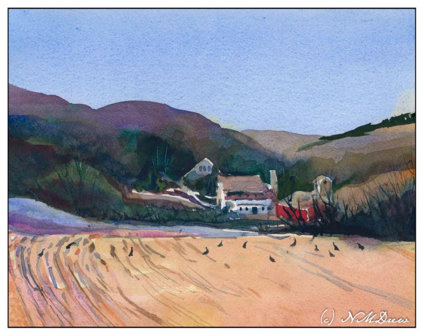
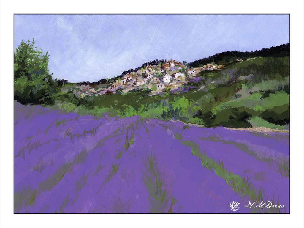
Pixabay provides such a wonderful range of photos for free! This is based on one, a lavender below a village in France, which I think may be Bonnieux.

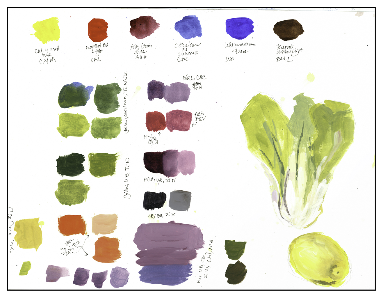
Yesterday I bought a number of fresh bottles of Golden Fluid Acrylic Paints. These are thinner than traditional heavy body acrylics, and unfortunately their color range is not equal to that of the tube paints. However, I have a number of small bottles, but my fresh ones are 4 oz. in size, and that will give me a lot of paint for some time. After playing a bit yesterday with the colors, mixing some, and then finding the ones I had did not meet my color needs, I ordered a few more from Amazon. This allowed me to get brighter spring greens and a good color for the lavender.

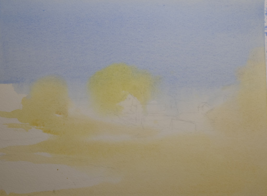
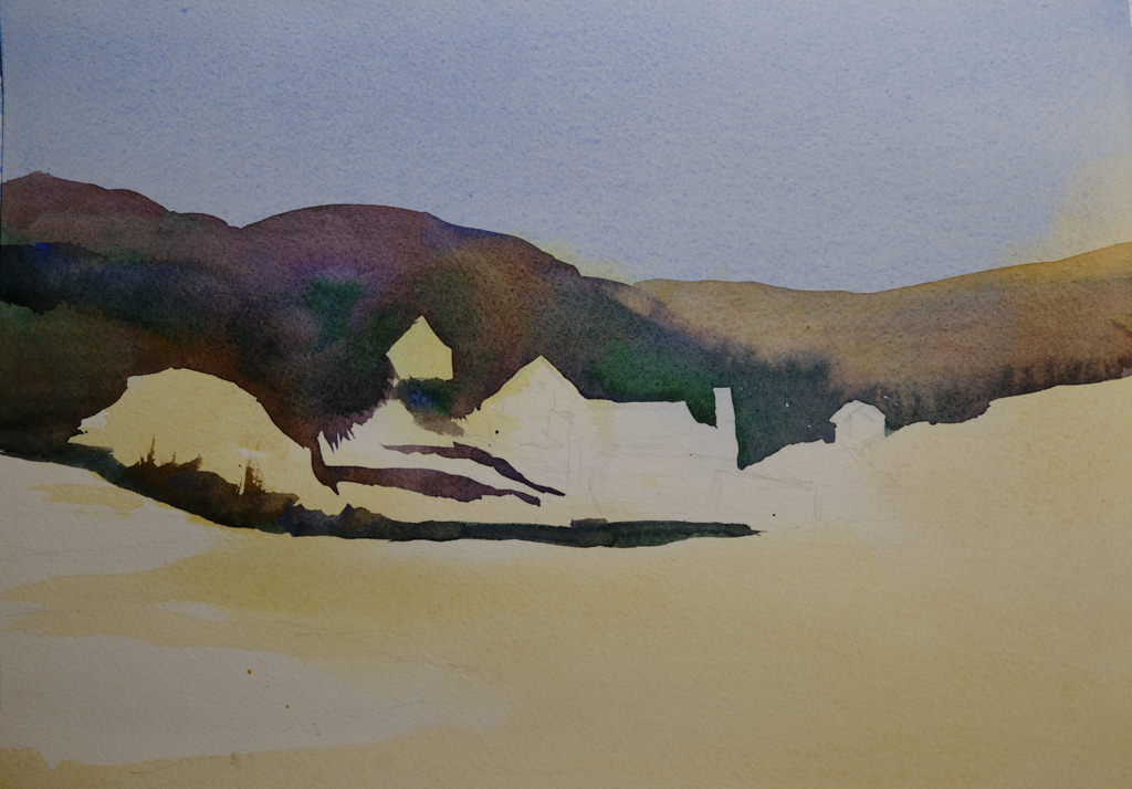
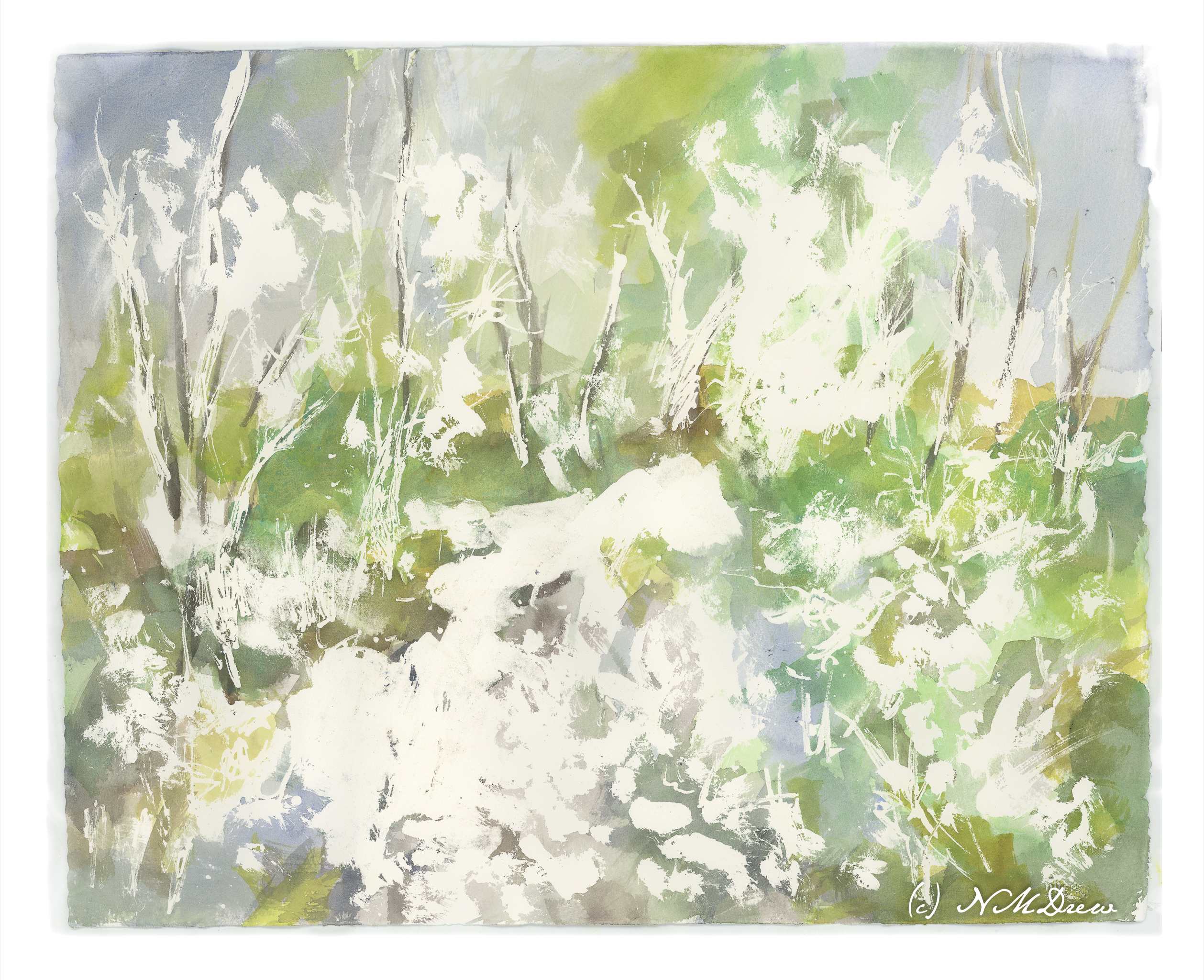
Yesterday I taped 1″ wide tape along the borders of a pieces of Canson XL watercolor paper in block format – 16×20 I believe. Then, I sketched in with pencil and laid down a foundation of values which gave me a sort of road map as to what I was going to do.

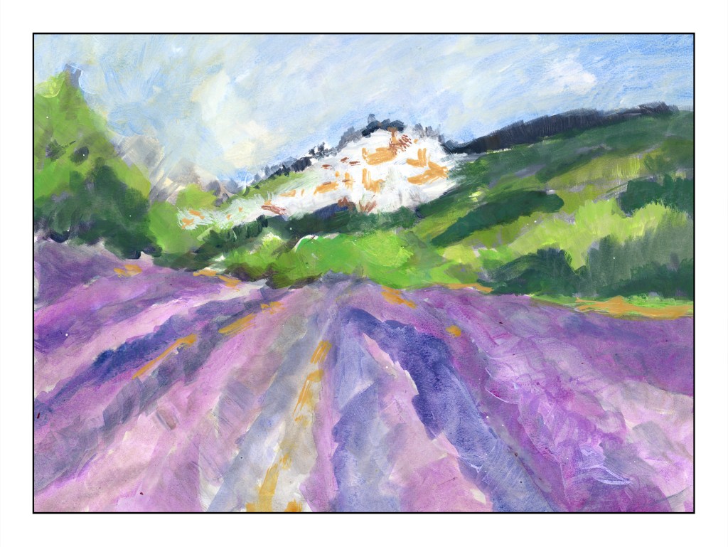
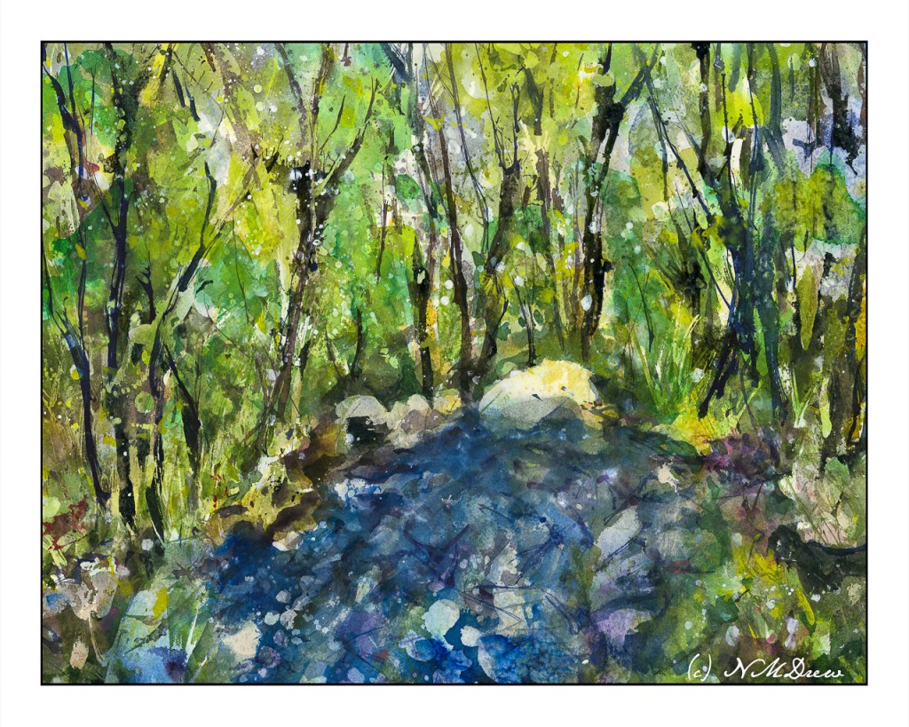
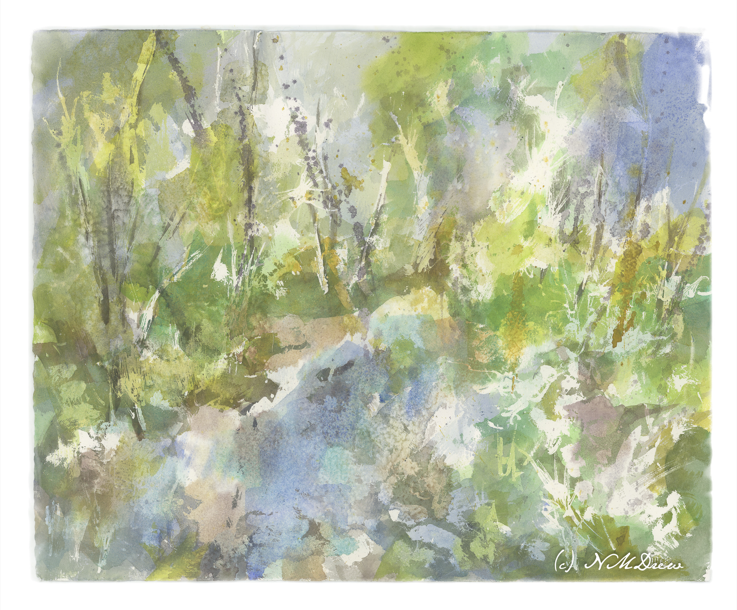
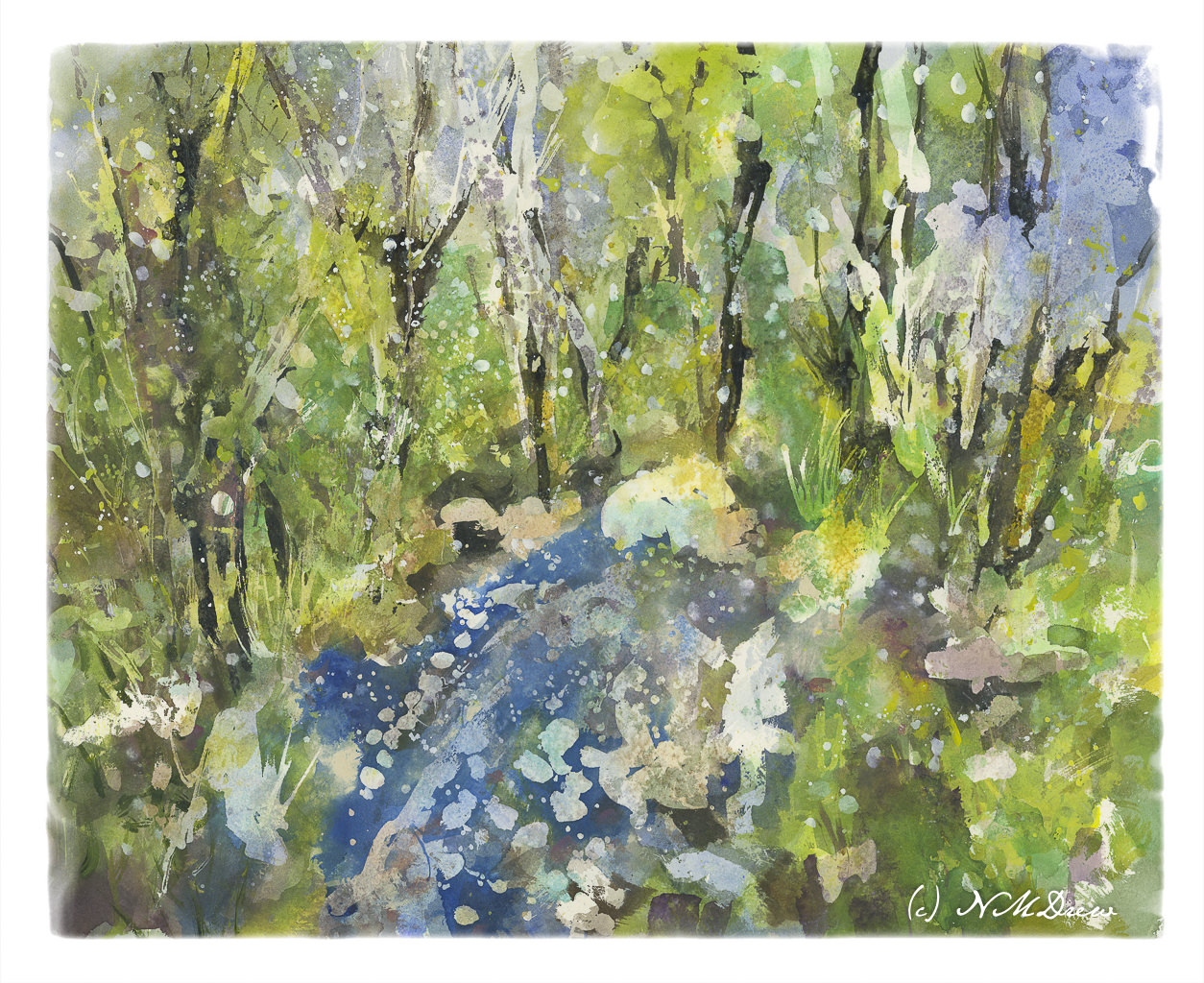
This is my second layer – colors this time with some values. The idea I had when I started out is I did not want to do a bunch of dabbing, which is my normal style, but instead make large swaths of flat color in the foreground lavender with some detail, and lead the eye to the village on the hill. To do this I used the lines of the lavender to lead the eye to the middle ground, but then chose brighter and warmer greens to sort of point to the village – lookie here!

I am not too sure how successful this is as a painting per se, but I am quite pleased with it. This is my first attempt at a big painting with the fluid acrylic paints, and as with all acrylics, I had to work with the quick drying time of the medium. The fluid acrylics were easier to use in a lot of ways than were the regular tube paints just because I didn’t need to work at diluting them. Straight out of the bottle, they work quite well. Shaking them a bit before use is a good idea, too. I will be ordering more titanium white as I have used a lot of it to just make this painting.

I hope you like this! More to come!

Playtime Is Fluid

Several years ago I bought some Golden Fluid Acrylics in 1 oz. containers. I really didn’t appreciate them as I wanted them to do something they couldn’t. However, I have pulled them out lately and played with them here and there. Many of them are dried up and old, worthless to use, so I decided to pick up some newer ones and in a limited color palette – one yellow, two reds, two blues, a brown, and two whites.

Obligatory color testing – and mixing – to see what could show up. I like the oranges and red violets, but the greens are not the bright ones I like. I think the blues are not quite what I would like for mixing, so I am getting some cobalt teal. The same with the lavenders – they are okay, but, again, not exactly the shades I want. So, some dioxazine (aka carbazole) violet, as well as a quinacridone magenta as the alizarin is not to my liking either. Oh, let’s add a raw umber to that mix – not sure about the burnt umber.

Anyway, some playtime with the paints, quick sketches to see how the fluid acrylics work. They are a lot smoother, but dry out quickly, too. I did a sad lemon and a decent bit of bok choi. I think the bok choi is worth a bigger glance.

I may actually begin to enjoy the acrylics – working on 140# Canson watercolor paper – 16×20 – gives me plenty of room to explore. I am working on a bit of a landscape to see how to use the paints, and will report on my progress later on. I laid down a value study on the paper, and will next consider colors and layers, probably moving dark to light, and my brushwork, too.

Turkeys in the Field

Turkeys in the Field

I feel like a school kid – classes are taking up so much of my life! It is keeping me off the streets, so I am sure a few people are glad to know that! The classes are a series with Ian Roberts (online), Andy Evansen (online), handsewing 18th stays with Burnley & Trowbridge (far behind!), and a local class in oils / acrylics with a good teacher. Housework is falling by the wayside!

The above is a watercolor exercise from Evansen’s class. It’s a year-long course in watercolor, and the content needs me, the student, to work hard at the lessons. We began with skies – I am pretty comfortable with those. This module works with values, and I think I did a pretty good job with it.

What I found especially interesting was the beginning of the value study. Unlike Roberts who puts in all values in a pencil sketch, Evansen puts the middle value only as the first step. The white areas are bright spots and the sky, but the middle values are all created as one big shape. That was quite interesting, and not the usual route one takes with value studies.

Pencil drawing with middle value only added as a shape.

I messed up a bit, but it did lay out a map that was more clear to me than also including the darks. Once I got the idea in my head, the next step was to lay in soft colors on paper that was wetted on both front and back with a natural sponge. I used 9×12 140# CP Kilimanjaro paper here.

After doing the middle value shape, both as a prelim and then on the final painting, you are supposed to go back and add the dark areas to the prelim. I didn’t get there – I was too involved in the final product!

Light areas filled in on dampened paper. Includes the sky, white areas for buildings, and field and trees.

Doing the light areas on dampened paper allows the colors to bleed a bit, and create soft edges.

Thicker paint added once the light areas have been worked.

The next step was to work left to right so that the shape created for middle values in the preliminary study could be made on the painting. The idea is to work in one movement – left to right since I am right handed, but right to left if you are left handed. The idea is to create a bead of color that varies as you paint in a continuous design.

To me, this was really a dark based on the reference photo, but that is life! As I did this, I worked around the buildings and structures, as well as roads. The thicker paint and dryer paper allowed this to happen to create hard edges. I was happy with how easy it was to do!

Almost done!

This was perhaps the 3rd stage in my painting. I added furrows to the field and details to the structures. I scraped in tree branches and such with my finger nail only to realize I keep them trimmed too short to be of any use there!

After all the layers were dried, I did the heavier dry brush as well as glazes over the field and hills to create areas of warmth or coolness. I also did it on some of the structures to keep them from dominating .

Some thoughts . . .

It is really a lot of work to do these classes. My whole purpose is to stop my old ways of approaching painting and create some kind of shift so that I can become a better painter in my opinion. Also, I need to stay busy. I have felt like I have been floundering a bit, so an area of focus was important, especially in an arena I wanted to learn. I am still adjusting to all this, but in the big picture, I am happy I made the commitments.

Water Thaw – 4 (Final Version?)

Water Thaw 4 – Final Version??

The end! Or is it?

Anyway, as I mentioned yesterday, more blue in the lower front, some other touches, and then let it sit overnight.

This morning I took another look at it, and the only way I can describe what I did was to refine it. I increased contrast in some areas to create harder edges. Other things were designed to lead the eye toward the center of the painting, toward the whitish rock at the top of the water. I also looked for areas that just didn’t look right, somehow too symmetrical or distracting. In the end, little bits here and there made it better to my eye. But – that was during morning coffee when I was trying to wake up!

I have never worked on a painting – a watercolor – for this long a time period. Total time is probably 8-10 hours. Time was spent laying down frisket, colors, letting things dry. Then frisket was rubbed off. Water was sprayed at different times and salt sprinkled. Rubbing alcohol was also sprayed on. I think the last round of frisket took about 30 minutes to rub off, along with salt. The result, though, are transparent layers of color which I could not have accomplished otherwise.

While the perspective seems a bit off – or maybe we are looking down into the water from above? – I like this painting. It’s a new adventure for me in watercolor, and while bright, I don’t think it is overly so. I deliberately did not use any orange!! New ideas are coming to mind for painting in a transparent medium. Mood and impression work here for me – not realism, but suggestion. So, spring thaw, melting ice, new leaves.

In this final version, I cropped it and changed the perspective a bit in Lightroom. Post-processing artwork is much like post-processing a photo, an din the printing industry it is done all the time. You can see the uncropped version in the gallery below.

Arches 16×20 140# CP, acrylic, gouache, watercolor.

Across the Dunes

I enjoy gouache a lot because you can rework places and easily blur edges to soften them. That is a lot harder in acrylics. I decided to give it a shot. It worked rather well for the sky, but like gouache, the whites in the clouds darkened more than I thought they would. On the other hand, I did work on the sand a bit, using very thin water glazes for the shadows. That worked out pretty well.

I realize the key to “getting” acrylic painting is to just keep doing it, experimenting, trying. Each painting, successful or not, is a lesson.

Acrylic paint on unprimed Arches 140# CP. 9×12.