A Man from the Mountains

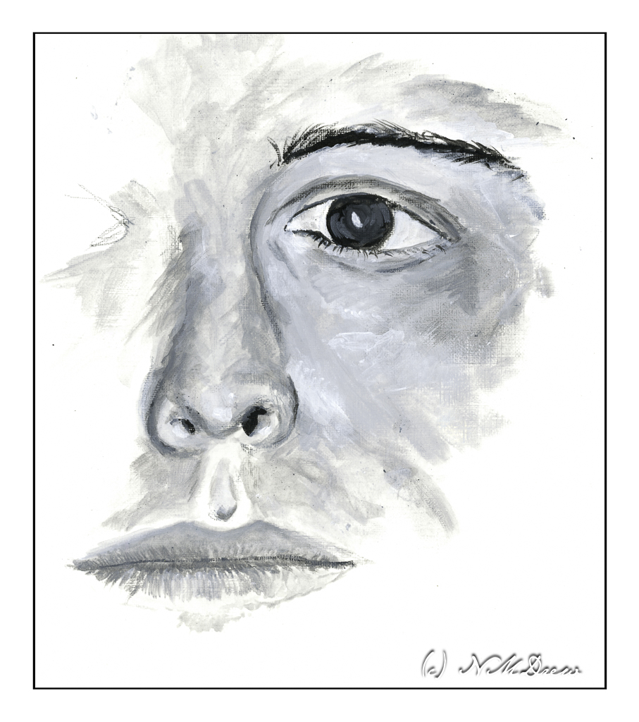
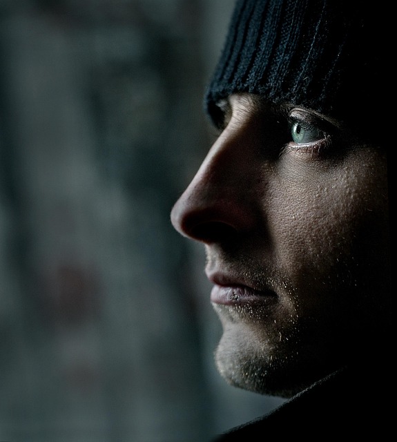
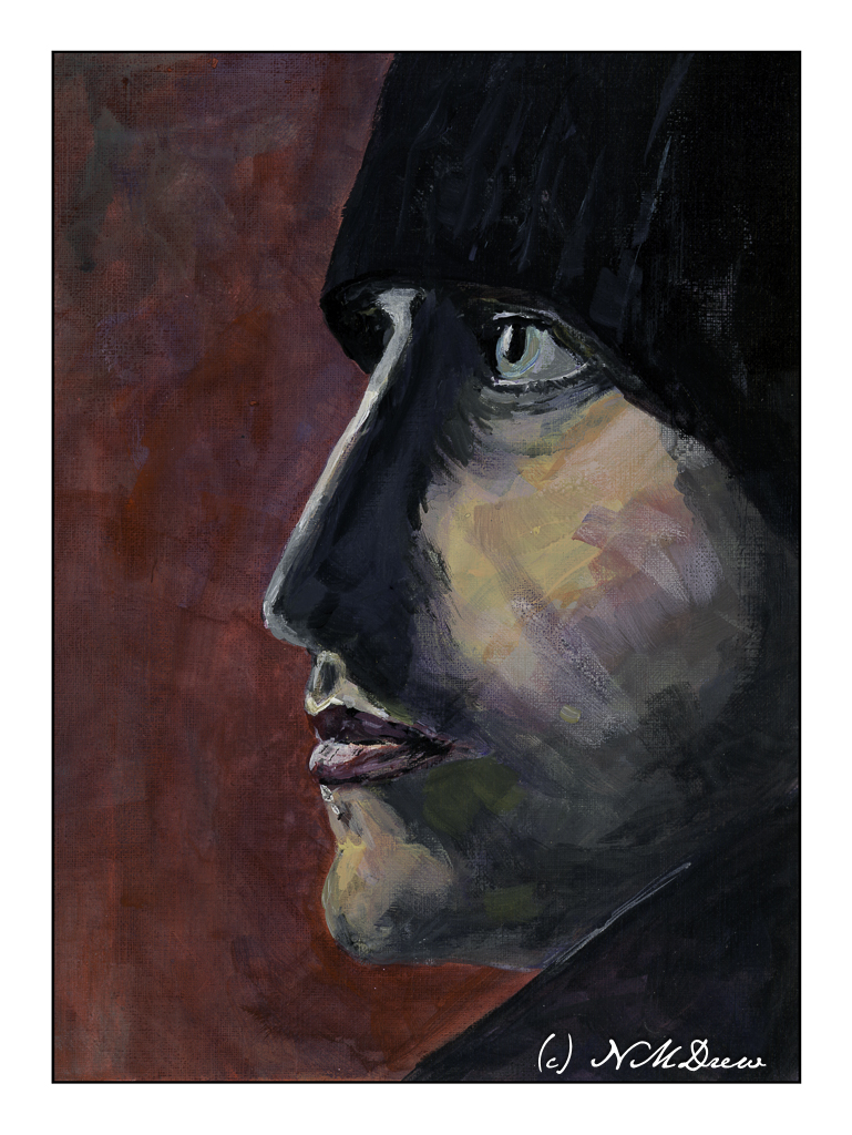
In between life and knitting disasters and housecleaning and purge-atory (I got rid of a lot of junk last week), I have been painting a portrait in acrylic over the last few sessions of my figure painting class. I used one of the many wonderful portraits available from Pixabay.

Painting this portrait was a challenge. I did not want to do a photographic reproduction. My idea was something moody and a bit sketchy, more so as I think such a style is more easily done in acrylics (which I swore to work on!) than a realistic rendition of the person himself. I painted using more transparent paint and scumbled a lot of the paint onto the canvas. Some areas don’t even have paint on the surface, or very little. Layers and glazes were built up. The quick drying quality of acrylics makes this easy to do in a classroom.

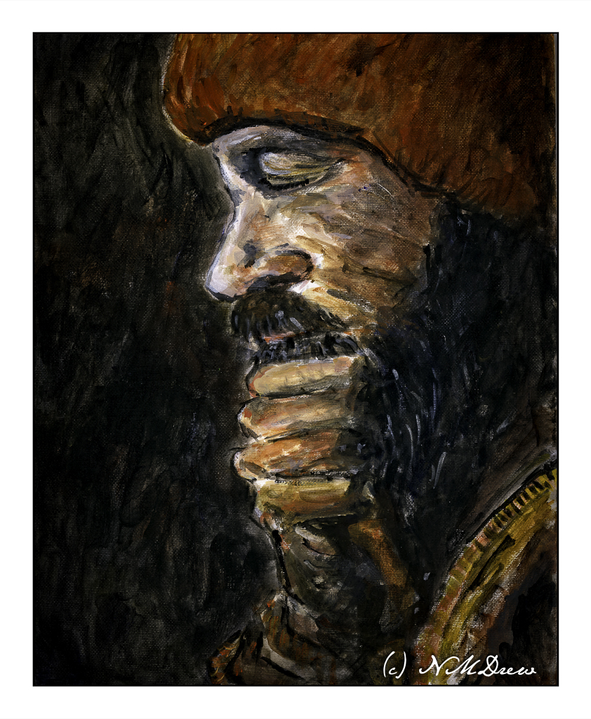
My palette was pretty limited, too. I used carbon black, ultramarine blue, raw umber, cadmium red light, titanium white, and yellow ochre. First step was to sketch in the man, working on proportions and then mixing general areas of color, slowly moving into details. I stepped back and forth to look at my painting.

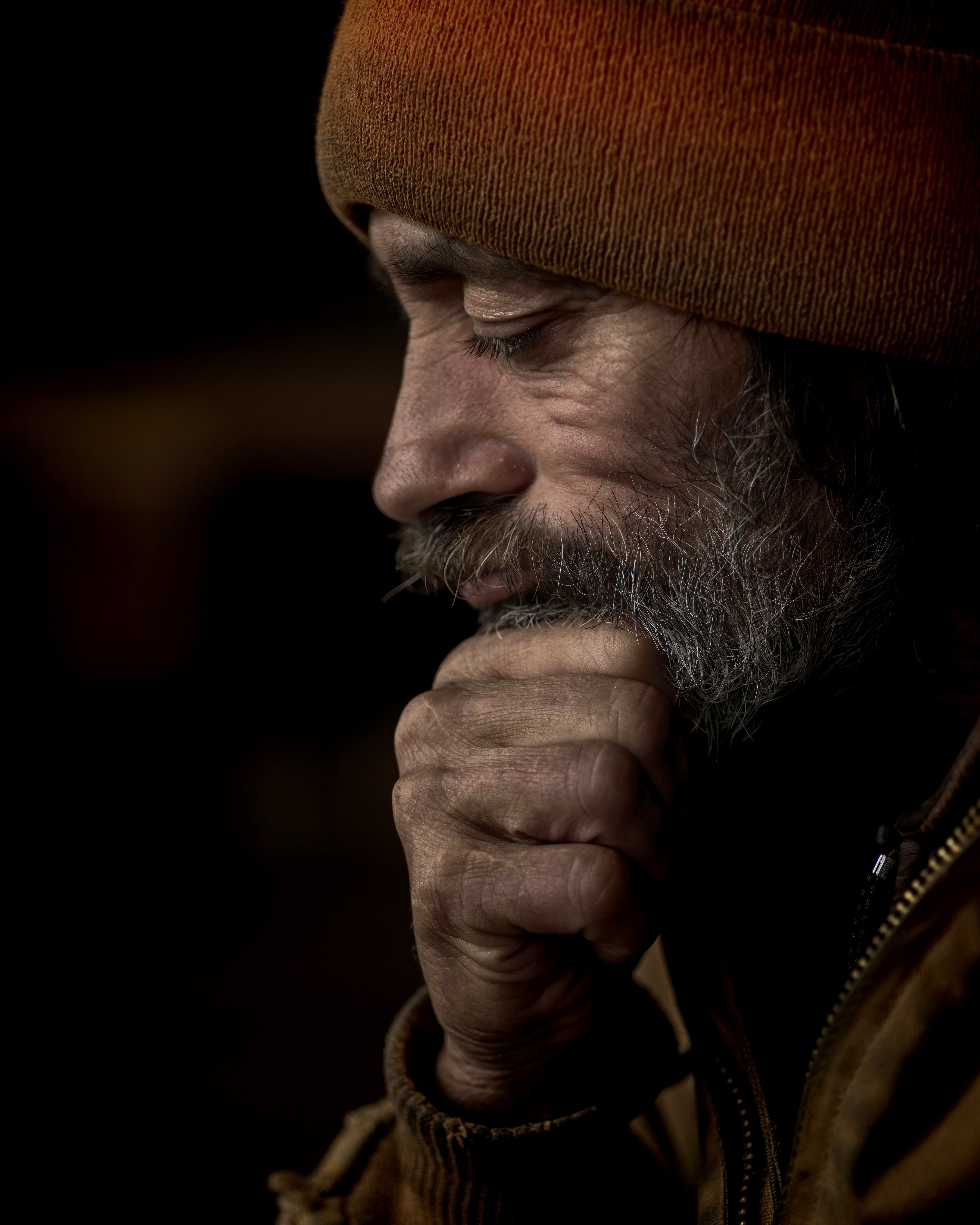
What really attracted me to this portrait was the lighting, the expressiveness and rather mysterious quality of the man – he could be from so many places. My first impressions is he is a man from a remote part of the world, a man who works hard and labors with his hands to provide for those he is responsible. I wanted to catch this quality – a rugged ability to endure.

I think I will hang this on my wall to enjoy. Yeah, pretty pleased! That is after I correct the mistake under the man’s mustache . . .

Heavy body acrylic paint, cotton canvas panel, 11×14.

Black + White = Grey

Yesterday was the beginning of new portrait class session with my favorite teacher. Having done 2 sessions with her, mostly with media within my comfort zone, I decided that I am going to conquer my general dislike for acrylic paints and portraits by painting them. So, armed with a black and white photo from Pixabay, I found an interesting man’s face as subject matter, zoomed into one eye, the nose, and the mouth.

For the surface, I am using Canson’s paper for acrylic and oil paints. It has a smooth, linen-like texture and responds well. The bit of tooth is pleasant under the brush. My colors are heavy-body acrylic paints from Golden and Liquitex and are simply ivory black and titanium white.

I consider this study to be a WIP – work in progress. The mouth is too small and needs to be re-worked. The guy’s nose looks like it was broken a few times in the photo and I have tried to capture its asymmetry. The paint under the eye of the skin is heavier and more opaque than a lot of the rest of the painting. It was applied first but then I realized that working in thinner washes of black and white might make for better shadow and light rendition. This is such a learning process! I am also using smaller brushes than I might otherwise – I want the details to be details, not big blobs of paint for this man’s face.

Overall, I am really pleased with how this is coming along. A couple of fellow students in my general painting class do such wonderful portraits and people that I decided to push myself. Acrylics will be my primary focus for awhile. I want to master them, learn how to work with them, and like them rather than cringe when faced with a tube of plastic paint.

Heavy-body acrylic paint by Liquitex and Golden, limited palette, Canson’s acrylic / oil painting paper, 9×12.

Profile of a Man

One of the painting classes I am taking is one on portraits. The teacher, Barbara, does beautiful work in oils. She is detailed, observant, laissez-faire, and is getting me into enjoying painting portraits of people. For me, I like people I don’t know. Personal portraits are too personal, and while I have done some decent pencil drawings, paint is another story altogether.

If you like free, public domain images of all sorts, check out Pixabay. It’s free and I use it over and over again. For portraits and figures, as well as anything else you might want including “adult” matter (i.e.nudes), you can find it. Many of my art teachers like my photos I use in painting class, and unless I have taken them, most come from this resource.

I am giving myself an exercise to paint portraits. How many, no idea. Different positions are certainly ones to study – profile, 3/4, frontal, looking up or down, etc. I also intend to do bodies, working on action and movement, but that is for another time. Today’s post is my painting of the model above.

What drew me to this portrait was its simplicity. Profiles are a good place to begin. The strong light and contrast in this portrait makes things not too subtle, which I think is a good place to begin for a portrait. Below is my painting.

My chosen medium is fluid acrylics, which are about the consistency of heavy cream. In the beginning, I laid in the background with thinned paint, and the same for the general features of the face. As I progressed, I increased the paint’s density by not thinning it, but as time progressed I varied its thickness depending on the opacity I wanted.

Besides rendering good values, I also wanted to focus on brushwork. I have said many times I tend to be a dabber, using a round pointed brush. I set that aside and worked in flats ranging in size from 1/4 inch to about an inch. One of these flats is also an angle brush. For tiny details I did use a fine round.

Altogether, this was painted over 3 days, using time to let the paint dry (or a hair dryer) and take time to step away from the painting. That way I could review what was done and think about changes. In the end, I am pleased with this painting quite a bit.

Fluid acrylic paint, Canson XL oil paint / acrylic paper, 9×12, finished size 8×11.

Master Study of Voilier au Petit-Gennevilliers by Claude Monet

The original painting by Claude Monet was painted in 1874 and measures approximately 22 x 29 inches. My painting measures 11 x 14 inches, so it is close to the same proportions. I left out a few things simply because I was not trying to replicate Monet’s painting but catch its sense of spontaneity. This spirit is what I found refreshing, and while Monet probably finished this painting alla prima, I spent about 6 hours in the studio. He used oils. I used fluid acrylics.

As I started to look more closely at Monet’s painting, I saw that his brushwork was very quick in many areas. The smudges of smoke in the left middle ground, the dark, wispy clouds used up a rather dry brush, one where paint was nearly gone. The white-blue swash across the sky seems like a quick thought. As well, it was interesting to see how the dark bits of clouds worked with the yellow and white areas to focus the viewer’s attention on the sailboat itself.

My own painting is more blue than Monet’s, but I saw a lot of blue in my reaction to his painting. Comparing the two is really interesting when I compare my scan to the Wikimedia online image presented here. It is hard work to get a good, warm grey and I did struggle with it. I also had to work on observing little things, such as the boats on the left middle edge – I couldn’t figure them out initially. The chimneys on the horizon also needed to be considered – what were they? The smoke on the left horizon gave it away. Once I had the boats on the left sorted, the vertical lines reflected in the water made a lot of sense.

What I really love about this painting is how it catches the light, which, of course, is the idea behind Impressionism. The moody sky with bits of cloud and fog and light as evening descends is what caught my attention. Even now, as I compare my master copy to Monet’s painting, I see even more subtleties which I could have caught. But, at some point, you just have to stop!

Fluid acrylics, Centurion OP DLX linen canvas pad, 11 x 14.

Bouquet

I am not a fan of what are called “heavy body” acrylic paints. They are thick when they come out of the tube and need to be thinned with water or medium. Even with a Masterson palette to help keep them moist, acrylic paints dry too fast for my liking. It always feels like a race against time when I use them.

Enter fluid acrylics. They are not “heavy body” but come in pourable containers. The paint is the consistency of thick cream. A drop or two may be all I need or want, and while they do dry quickly, they are very easy to mix together into the colors I want. Smooth blending a brushwork is far more easily accomplished with fluid acrylics.

I spent about 3 days painting this because I had to correct mistakes and change this and that. All this is done with the fluid acrylics (Golden makes them, and Liquitex has their own equivalent, as do other manufacturers), a bit of color at a time. While the time element before they dry is still there, I don’t feel the waste of using too much paint – I am pretty good at figuring out how much I need before they dry on the palette. An advantage of acrylic paint over oils is that they do dry quickly, and a painting can be worked on in multiple dry layers throughout the course of the day. Hair dryers help to speed up the drying, too!

Acrylic paints can dry within 5-10 minutes, or even sooner, which is what I find so frustrating about them when using the heavy body ones, and drove me to give up on them altogether. I switched to oils, which I really enjoy, but using these fluid acrylics is a lot of fun, and I can work more quickly.

So, a bouquet. I am not totally sure if this painting is a “success” or not. Parts of it seem a bit peculiar once I see the painting as a scan. I like the window and green that is beyond the glass, as well as the window frame itself. The flowers are decent, but perhaps need more contrast and drama. The glass bowl is also okay. However, the “shadow” area in the lower left seems to not quite belong.

Whatever! I will leave it as is, generally pleased with this attempt.

Fluid acrylic paint (Golden and Liquitex), 11×14 Fredrix canvas pad, unmounted.