Upward to the Beyond

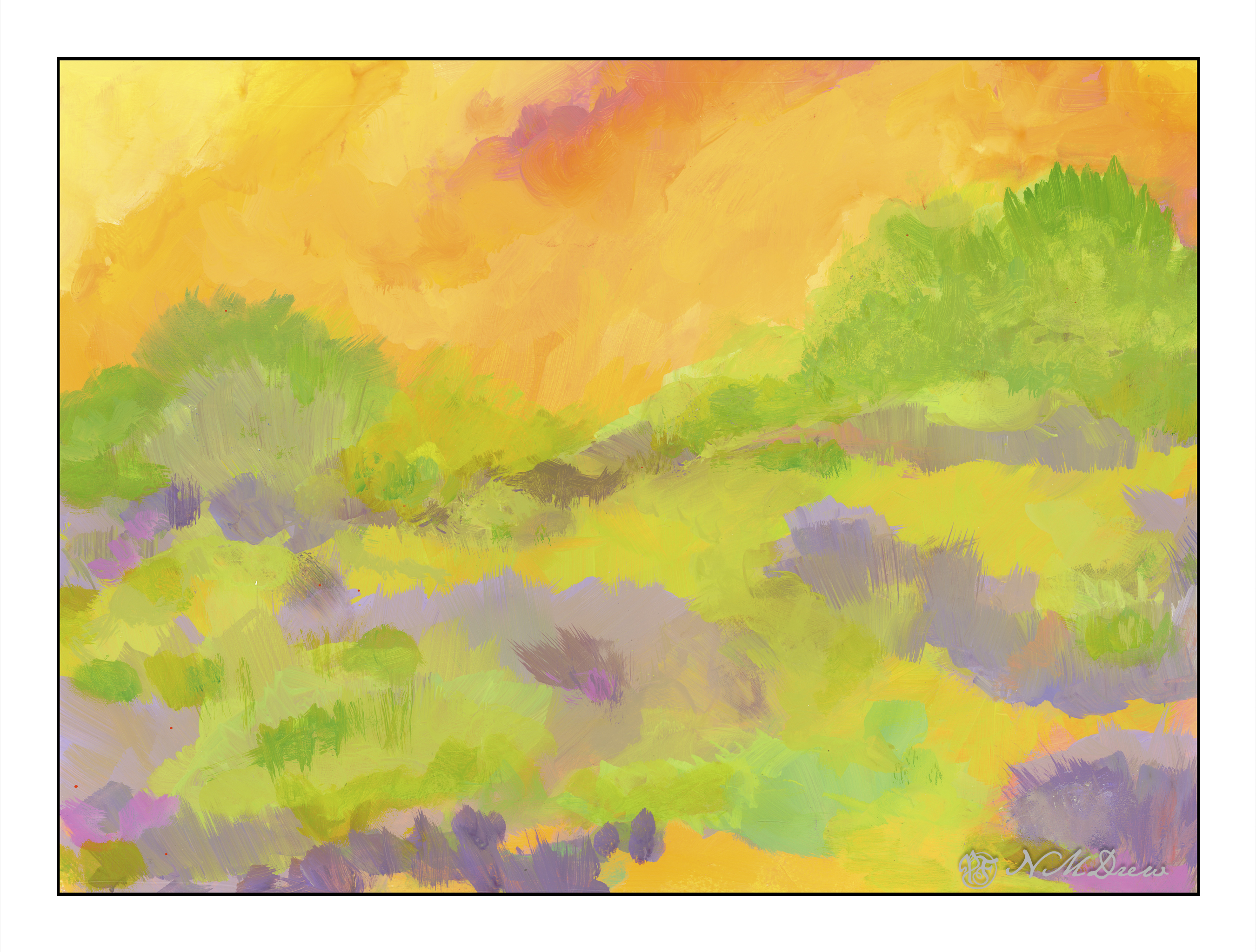
What is the “right” way to hang an abstract? Is it the artist’s choice – the viewer’s choice – the hanger’s choice? The painting “Into the Blazing Hills” is one thing – the title telling you what I see. Inverted, I see “Upward to the Beyond” – moving toward the other side. What is the other side?

Putting my digital signature on this one gives it a different sort of reality – the signature grounds the painting and says “this is the bottom so upward is the top.” What is the top? What is the bottom?

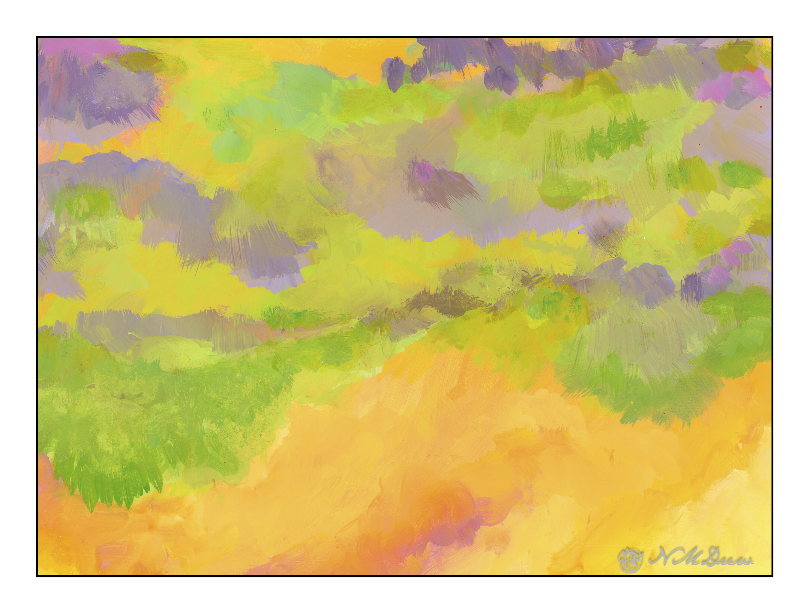
Sideways, the painting does nothing for me, with the yellows on the left or right, but yellows on the top or bottom create a totally different feeling, but somehow the feeling is right. I will say, the yellows on the bottoms are more disconcerting and unsettling to me than when it is on the top. So, upset or comfort?

If I were to critique this at all, I would find this painting bottom-heavy in yellow, and moving upward it seems as if there are trees silhouetted against the sky. However, there is all this stuff in between, and it lacks the harmony, I think, that “Into the Blazing Hills” has. Perhaps it is the ability for me to recognize my surroundings – the hills of California – with either a sky and brilliant, blazing sunset – or a wildfire encroaching a bit of paradise, destruction being moments away.

This is going to take time – maybe both are “right” – and perhaps the middle chaos in this painting is okay but needs a path of some kind to lead the eye upward.

Into the Blazing Hills

One thing I enjoy about a retrospective show of an artist’s work is to have a sequential progression of his / her development. As an erstwhile “artist” I find myself is bopping around. It is my erratic personality – my magpie personality – drawn to this and that. That is probably why I like Hawaiian print shirts – colorful and rather crazy. When I look at my own paintings over time, color is always the primary theme. Sometimes my color usage is quite bad – nay, awful! – and sometimes very much to my liking.

In this vein, I decided to just paint with the Golden fluid acrylics, spreading around colors and creating shapes. I figured it would make itself known to be whatever it is to be. As someone who likes landscapes, I figured it would become one. My thoughts were, as I progressed, a flower meadow, hills of flowers, trees, and then just putz. Using acrylics means putting paint down in a way which works with their quick drying qualities, but I did use matte medium. A lot of times I just dumped color on the palette paper, mixed, added white, and then mooshed it around on the paper. The matte medium creates a bit of transparency, and it makes a sort of glaze over underlying colors.

Painting was done with wide, flat brushes – 3″ and 1″ flats – later a large round – and my fingers encased in nitrile gloves. It took about 3 days and 6 hours to paint this on 15×20 watercolor paper. Golden Fluid acrylics, matte medium.

Colorism is something that truly appeals to me. Not Fauvism, which I find a bit too loud for my taste, but colors to create an emotion or feeling more than reality, with a bit of a suggestion of reality.

The Not Taken Vacation: Rock of Gibraltar

So . . . we continue at sea, bypassing A Coruna and visiting Lisbon and Porto (oops! I forgot my sketches of Lisbon!) before heading east into the Strait of Gibraltar and heading into the Mediterranean. If I recall my geography and geology, Africa and Europe were once connected here, which is why the famous monkeys of the Rock of Gibraltar exist today. And the Rock of Gibraltar, an English outpost on the tip of southern Spain, dominates the scenery as you sail through. Cruise ships land here, and while we did not, let us pretend we did (since this whole Not Taken Vacation is imaginary) to climb the rock and see the sites.

From the sea, the Rock of Gibraltar rises up, formidable, stately. At times it is shrouded in clouds, other times sharp and crisp against the sky, or softened by moist sea air. Beneath, at the water’s edge, is where people live. Apartments and houses are expensive. Spaniards cross the border daily to work for higher wages but not getting the social benefits such as pensions (my understanding) that they would pay into if working in Spain. English and Spanish are spoken here, and while English is the dominant language, Spanish is not a bad thing to know.

There is a lot of history and a lot to see in Gibraltar. I chose to climb upward to see what I could see. Africa to the south. Coastlines to the east, mountains to the north. And monkeys! Really, Barbary Macaques, which are protected and the unofficial national animal of Gibraltar. They are friendly – but they do bite!

I sat here awhile, visiting with and ignoring the macaques, watching the world below and above, basking in the sun, and thinking up a song of “basking with macaques” which will soon make it to the Top 10 list of rock-n-roll songs.

A Touch of the Fauve in Cinque Terre

Cinque Terre is located in Liguria, in northwest Italy, and comprises 5 villages built into the steep cliffs along the coastline. You can find all sorts of articles, videos, photos about it, and to my thoughts it sounds like an incredible place to see. However, it is not something I will get to do next week, so I thought it would make a good painting study. The idea of living in a house, built on a cliff at the edge of the ocean – I don’t know, but it seems quite a fascinating way to live!

I was more interested in playing with the paint and experiencing how to use the Golden fluid acrylics than I was in making a finished work of art. I am finding I like them when they have dried a bit and become rather sticky but still maintain the consistency of cream. Opacity seems to improve as the paints become more viscous. This stickiness makes for some rather nice ways of creating color combinations – one on another – and texture. This is all play, and play is the best way to learn how to use something, I think. The plan is to continue and come up with an opinion about if I like them – I think I do, sometimes more than other times – as well as just exploring painting with them.

This painting was inspired by a photo taken offshore and looking landward. The houses cling to the cliffs, and if you look closely at the photo, you can see pathways and stairs leading from one area of houses to another. There were more outcroppings of rock in the photo than I have here, and I think it would have been a better painting to have included them. It looks like I have two rock columns madly in love, and having a good smooch! Despite that, I had fun playing with not just the colors, but ways in which to apply the paint – like rubbing it in with a paper towel in addition to a paint brush. Soft and hard brushes also have and impact, as does using a filbert, flat, or round brush. So much to learn . . .

Golden fluid acrylics, a bit of a fauvist or colorist approach, 15×20 paper.