Winter Farm on Christmas Eve

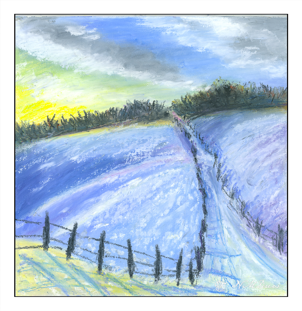
Now to the northern part of the continent . . . somewhere in North America for winter on the a prairie farm, snow covering field stubble, early evening or morning. Cold, desolate, and heartbreakingly beautiful.

I spent the morning painting this on rough 300# natural white Kilimanjaro. I did it in stages. The sketch was light, with suggestions of shapes. Then the sky was wet and yellow, quin gold, and permanent alizarin crimson used to create the rosy golds. Once down, cobalt blue and ultramarine were placed to simulate sky being careful not to merge into the rose gold of the central cloud. As the sky dried, purple and alizarin were mixed with ultramarine to create the darker clouds. 

After the clouds were laid in, I did the dark trees, blurring some green into the still damp sky, as well as waiting for the sky and soft trees to dry. This was done to create the hard edges needed for the buildings against the tree line. The buildings themselves were left white as the trees dried.

From there, the snowy field was laid in with cobalt and ultramarine in a very light wash and using a 2″ soft brush. Again, drying. At one point, the 2″ brush was dried and dipped into lightly damp burnt umber and applied to make the streaks of brown for field stubble near and far. Then the buildings were done, and once the snow dried, more thin washes as glazes applied to the foreground snow, culminating in a streak of quin gold and then permanent alizarin to the middle of the painting, hoping to show a sense of light reflected in the still dark snow from the breaking clouds above.

After that, details such as dried grasses, windows, tree trunks and whatever were added as deemed necessary.

I am pleased with this painting quite a bit! It achieves what I set out to do – a winter scene, snow, clouds, and patience to wait and think about a painting before just diving in with brush and color. The 300# rough Kilimanjaro is 11×14 and a wonderful paper to paint on. More is needed in the future for sure.

Winter Road in Hill Country

Today I decided to do some oil pastels. This is my second – no, third – painting in the medium. The cat and mandarin were on Strathmore 300 watercolor paper; this is on an 8×8 cotton canvas panel, the kind used for oils or acrylics. I read you could use oil pastels on nearly any kind of surface, so I grabbed this just to try it out.

To tell the truth, oil pastels are fun to use, but they are also tricky. Blending colors makes sense – layer this with that to make thus – but the blending itself is a rather creative experience. I used stumps (tortillons) for the most part, but toward the end I used my finger tips. Also, I found out that if I put on too many layers, eventually the newer layers pull off the underlying colors. While this could work for some desired effect, it was problematic in other ways. Live and learn, right?

I scanned this canvas on my Epson V600 (one of my best purchases!) as photographing paintings is time consuming, tedious, and usually worthless the way I do it. Two scans were needed, and in between I had to wipe of the glass platen to remove little oil pastel bits. Apparently oil pastels never really dry out, but you can apply a finishing spray to them. Sennelier makes one, which I bought along with my pastels, which I will try probably next week.

A Winter’s Creek

We have had rain – yay! – and thunderstorms, and threats of tornadoes (which never came) – and puddles of water, and a back yard lake. More to come, perhaps, but gentle and warmer, with a promise of a relatively sunny Christmas. I love the briskness this weather brings, but am also very happy not to have to shovel snow or drive in it. In fact, I was flying through water at intersections the other day, but luckily I am in an area without low lying ground which floods, unlike other areas of the county where people woke up to flooded bedrooms.

So, winter! Winter solstice is come and gone, and in many ways I wish we marked it more with bonfires and merriment, as in the olden days. I paint winter, partly from photos, partly from memory and imagination. 

Probably most of my memories come from upstate New York. No place that I have visited does winter quite like the mixed hardwood and pine forests. Bright green, dark green, barren branches, tall trees. Skies can be sunny and fierce, dull and overcast, and everything in between. Water, whether lake or stream, takes on its own life when frozen, thawed or in between. It still amazes me that fish swim under the ice and amphibians bury themselves in the mud until spring comes.

Happy Solstice!

Carrots

I watched a few videos by Jane Slivka, an acrylic painter out of Florida. She tones her canvas with a reddish orange color, paints in the major shapes in Hooker’s green, adds white for highlights, then proceeds to build her painting. Her paints are heavy body while I have been using fluid acrylics. I thought her process was quite interesting as it is seemingly spontaneous, but not without structure. Her steps give it structure, but she is not a slave to her subject – she sort of moves along with a game plan and no game plan, if that makes sense. 

What really fascinated me was how she actually creates values by working in the lights and darks before adding colors. Additionally, the red tone beneath the brushwork pops through, and adds a bit of sparkle to her paintings. Negative and positive space and shapes are worked back and forth. 

I tried to follow this approach, and found it really quite interesting. In many ways it simplified what I wanted – lights, darks, values, contrast. Carrots are not especially exciting things to paint, but they are quite cheery with their bright colors of orange and green.

Painting the carrots and their tops was really fun. I didn’t take this painting seriously, and sort of slapped around colors, working to see what might be successful, might not be. Never before have I toned a painting surface with cadmium red, but I think it could become a favorite thing to do. Yellow ochre is a wonderful color, but it is not especially dramatic. The little bits of red poking through the greenery is quite pleasing to my eye. I expect I will try more paintings like this.

Golden Fluid Acrylics, Strathmore 300 watercolor paper, 10×14.

Play with Oil Pastels

Ages ago when people thought the world was flat, I tried out oil pastels. I hated them. Messy, unresponsive, and just unpleasant to work with. I threw them away. 

Ignorance, though, and a lack of the internet, can make art materials mysterious and frustrating. Today, now that the world is round, YouTube and other media outlets show me what can potentially be done with oil pastels. Choices of paper, solvents, blending methods, brands and qualities of the oil pastels themselves has changed considerably. I bought some – Caran D’Ache, Sennelier, and Mungyo. I also bought some PastelMat paper and board, and I also have different papers here at home to try. And YouTube and oil pastel artists on Instagram.

‘Tis tangerine and mandarin season, so here we go with some locally grown. I used the Caran d’Ache as underpainting after outlining with a graphite pencil. The pencil blurred and created a bit of a fuss. To get the colors blended, I used tortillons and mineral oil, gentle touches and pressure. All play. I was rather pleased with them.

Then I decided to see how it would be to work with a very pale subject, namely a pale white and beige tiger cat. The green eyes are a combination of white, green, and blue, blurred together with a tortillon. The sharp edge of a black pastel crayon made the dark eye and nose lines, and even some colored pencil at the end to provide further sharpness in detail. Eye highlights were sort of a gamble with the white pastel – which one to use, softer, harder? And placement, too. The cat’s white whiskers wouldn’t show up no matter what I did, so I opted for a beige-y color and then some white over the lines.

Neither of these is spectacular – the poor cat is suffering a lopsided face – but the point was to play with the colors and work with blending. I did use some mineral oil on the tangerines, but everything dissolved into a gooey mess, so after the first scan, I scanned no more.

Now, on to my knitting! The acrylic painting is still vegging and that is fine for now.