After the Snow

There is a lot more “ink” these days than beer or yarn, but as far as those go, there is a lot going on in the background. I guess I will need to post some of my knitting projects or sewing projects (“yarn”). Cooking, too (the “beer” part). Paint (“ink”) takes up most of my time, though.

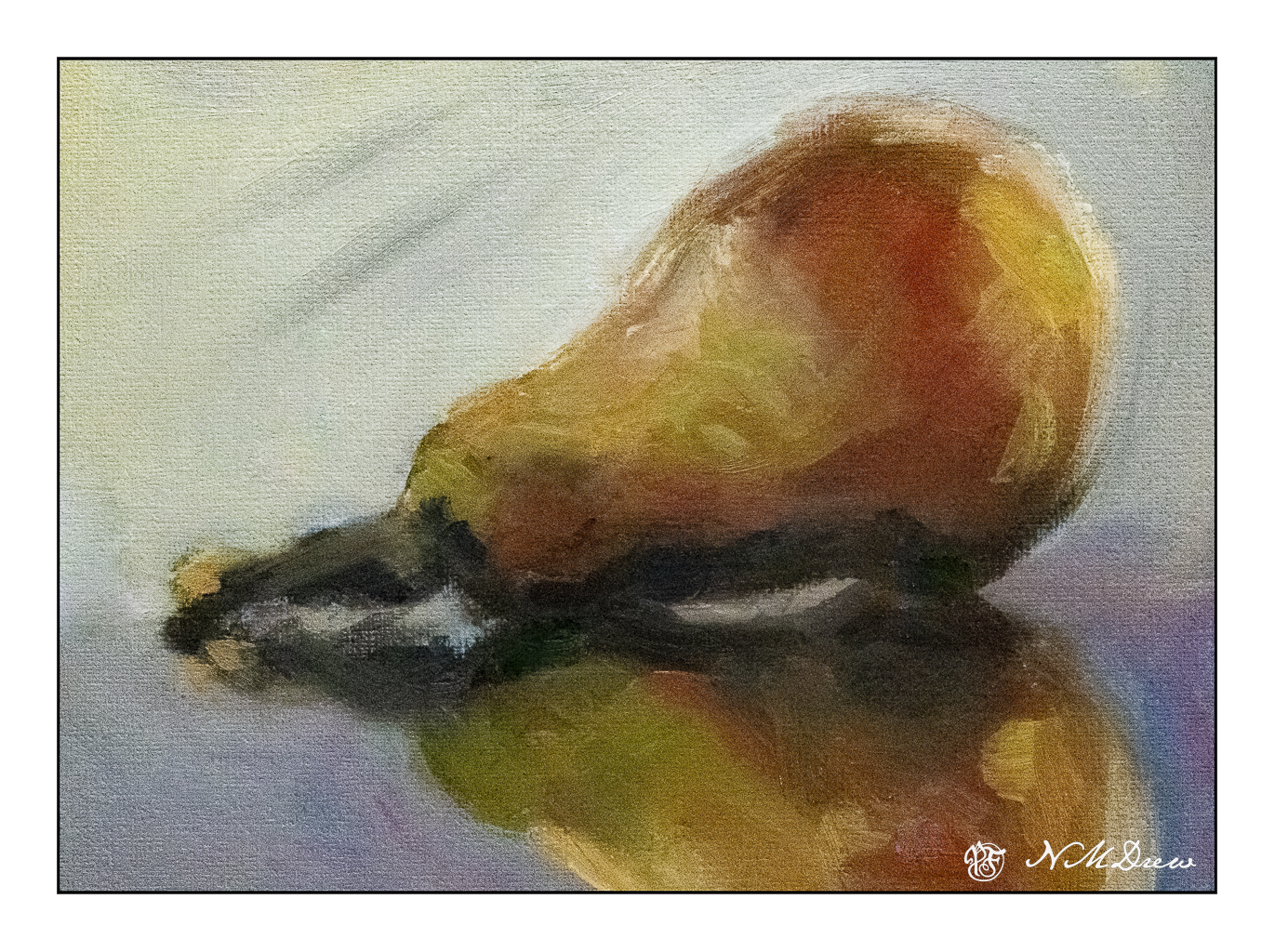
I am continuing with the oil paints and just love the sensuality of mooshing it around on a canvas! I also like being able to work on my sense of contrast – lights and darks – as I have done with a few pears.

When I am finished with a painting, even though I use low odor solvents, the smell lingers, more so when the house is closed up to keep it warm. Because of this smell, I have some drying shelves set up in the garage, which is pretty cold. It takes a long time for the paintings to dry unless I use Gamblin’s Galkyd Gel, and then they dry almost overnight.

Now that you know this, I painted this painting about 2 weeks ago using linseed oil as the vehicle as well as Gamblin’s solvent-free gel, but not the Galkyd. Drying time is very slow. I just got some walnut oil mixed with alkyd by M. Graham, which should speed up drying time and, I hope, give that lovely ooziness that makes oil paints a lot of fun. Maybe I will check that out later today.

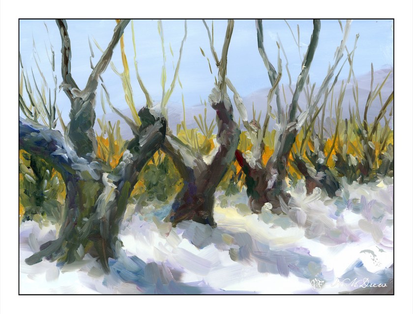
I chose this subject to work on a few things: values, color, distance, depth, contrast. Overall, I am pleased with this painting. I like the brighter yellow between the tree branches on the right as I think it leads the eye in. Someone on a forum said it was too bright and might need to be dulled down a bit. That is something to think about, but my magpie self likes that but does see what the person means. But how much should that yellow-orange be dulled, and so on. Maybe I will play with it in PS.

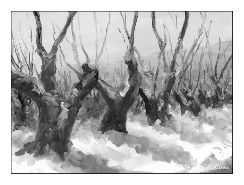
Above is the desaturated image. I do this to look at my values. Success! Isn’t it interesting to note that the bright yellow-orange becomes a middle grey when in black and white?

I have a couple of other paintings out in the garage drying. I’ll get those out in a few days. Scanning a painting is far nicer in result than photographing as there is minimal glare. The only problem with the scanner is that sometimes the software does not like to merge the sections – luckily I have a few different ones as back up and seem to work quite well.

11×14 oil painting on cotton canvas panel; scanned on Epson V600 at 600 dpi and 48 color bit depth.

Pear on a Reflective Surface

For the past 4 weeks I have been taking a short course in oil painting – we have not laid a bit of oil on canvas in this entire time period! Instead, we have learned so much about color – theory and real world (too complex for here) – contrast, tone, value, intensity, neutrality, and so on and so forth. Finally, in the last 30 minutes we finally got a painting demonstration of painting values on a pear. Some people painted along, but I just watched the instructor.

First thing, we mixed a dark value of burnt umber and ultramarine blue. Then we made a middle value grey by mixing in some white, and then the lightest value by adding even more white to the middle grey. After that, we used cad red light, cad yellow light, and yellow ochre, doing the same to each, but for the middle and darkest values, we added some of the middle and dark greys to darken and tone. I was really surprised to see the beautiful green the middle grey made when added to the yellow ochre, and I absolutely hated the cad yellow light’s greenish cast. Ugh. I rolled out cad yellow deep instead as it was much warmer and orange-ish.

The photo we used was blurred a bit, and then a notan (the rendering of an image into values of white through black, with shades of grey in between – in other words, a grey scale of the image) of the same was printed onto a piece of paper. We painted our values onto this paper, using the methods described above. Some people just kept their areas as values of color, but it made me a bit nuts, so I blurred mine together. The result was much more to my liking but more challenging, too. I made a lot of messes and lost my values quite often along the way.

Our teacher, Harvey, is really good. I have another 8 week session starting in a couple of weeks and I think it will be a good adjunct to a 4 week private class with him starting mid-March. Harvey is not just an artist, he is also an experienced art teacher as he has taught high school art for many years. Experience as a teacher is showing here – he is articulate, logical, and clear. No complaints, and I feel fortunate to have made his acquaintance – I like him, too, as a person, and that adds to the enjoyment of a class.

Oil on paper, about 5×7, value study of a pear. Colors used are titanium white, ultramarine blue, burnt umber, cad yellows and red, yellow ochre.

Storm Break

Heavy rains and foreboding skies give way to ragged clouds and brilliant blues as the storms recede. No snow here, but memories will do! I tried to express this sky in the distance, beneath the blue and white with the dark clouds moving away. Not so sure how it reads, but you can decide that. Could be trees, could be clouds, could be space ships. And there is a river behind the trees and the snow across the way.

Kilimanjaro Natural White Rough, 300#, Rough, 12×16.

Soggy & Boggy

Today the rains are pouring down. The backyard is flooded and the pump is working to keep the water levels acceptable by shunting it out to the the street and into the storm drains. This is the second of the two Pineapple Express atmospheric rivers causing concern and evacuations throughout the county and elsewhere in California. There is charm to living up a canyon until the rains erode it all – I live on a small hill in a tract with a creek in a park a ways down the hill. I’ll settle for that! Our clay soil and poor landscaping creates a boggy lake in the backyard, held in place with our clay soil, but we are lucky overall.

And on a rainy day, oil painting is not something I want to smell throughout the house even though I did think about it. Watercolors called – because of all the water around me? Who knows – but rain brings green growth and soggy ground, and that is a delight in our dry, dry land.

Hahnemuhle CP 140#, 9×12, watercolor. 

Quill & Coil

Sounds like the name of some pub . . . but in reality, this is a macro with my Nikon Z 50mm macro lens. 

Quill & Coil

Anyone who does post production with photo editing software knows about pre-sets. I have a lot I have made over time and it can be a lot of fun to manipulate a picture. The original of this was in color, so I converted it to black and white and then used a high-key preset I have made. I like the way it has softened the feather but retains enough detail to let you know what things are.

On an aside, I need to cut some new quills and brew some new ink. I am using fountain pens right now to write, but do like the tactility of a quill pen! However, my fountain pens are a lot of fun, too, and with different pens and inks, the variety is equally pleasant . . .