
Toys

Today and yesterday were really rather discombobulating. Does getting older mean you are more set in your ways and less able to adapt to changes in the daily routine? Either that or my allergies just make me a bit crazy – this morning I had one of my sneezing fits where I sneeze about 30 times in a row. That is exhausting to the point I need a nap.
And nap I did. But then I decided to do something creative, and back to watercolor (my real first love in painting) and work on something idyllic, wet and watery, full of rocks, and put it in my sketchbook so I won’t take myself too seriously.
Click on the image to enlarge!
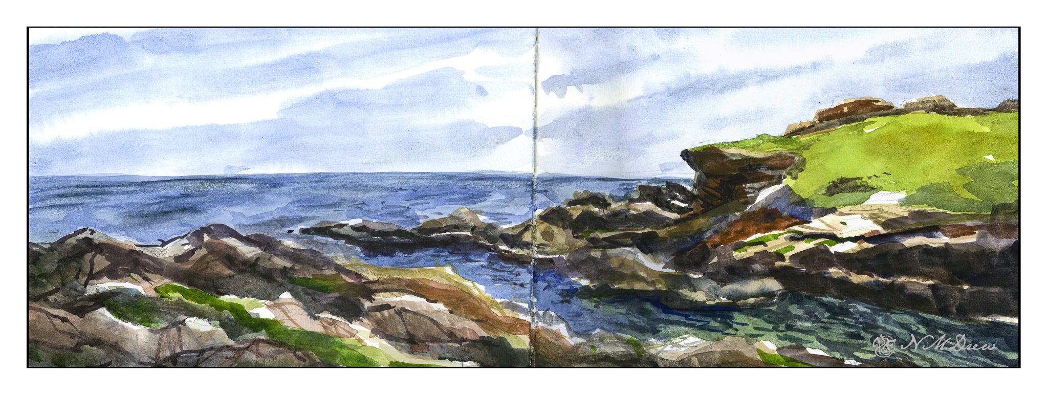
The Strathmore Vision paper works really well with little re-working of any part of the painting. I decided to see how the sketchbook would do with the same approach, as well as the more personal challenge of being more direct in color application.
With watercolor, many artists work with very wet paper, and while I like that, I prefer to have wet paper – as for the sky and the sea – but I also like to have layers. If you paint into wet color, your next incursion must be more pigment and less water than you are moving into, otherwise you get what are called blooms or cauliflowers. You can also paint onto dry paint and these won’t occur, and you can use thinner or thicker paint – less or more pigment combined with water. My sketchbook has good paper – far better than the Vision paper – so I could do all these things, and did.
First, wet the sky area, then drop in stripes of blues. Next, wet in the water, from horizon to the inlet area, all in about the same shades of blue, but darker than the sky. Let that dry. While that is going on, I painted in the greens on the right, blending colors into each other for gradations of green. The rocks, too, were painted with varying colors, working to leave bits of unpainted paper for a bit of pop and to indicate areas with more sun that shadow. Slowly I put in details, such as the waves or ripples in the lower right of the inlet, cracks in the rock, and so on. Large colors and masses first, finalized with contrast and detail.
I am pleased with this painting. I accomplished my task of direct painting with some modification – not a lot – later as I moved into detail. I drew in the general shapes with a pencil. The foreground rocks on the left and bottom were a challenge, but I think I have enough detail to make them interesting but not distracting. The same with the land mass on the right. Overall it took about 2 hours to do complete this watercolor.
Watercolor sketchbook, watercolor, about 7 x 18.
Today there is a bit of running around to do, so this morning I was in a blithery mood. Things to do – like the usual morning stuff – but I also know I won’t feel too focused on any one thing, so sketching with ink and watercolor seemed to be the best of all choices. (After all, life is not all about dishes and making the bed!)
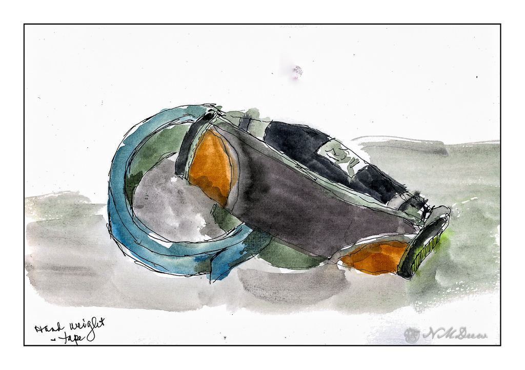
On my desk is a small hand weight and roll of painter’s tape. Warm-up. And now immortalized.
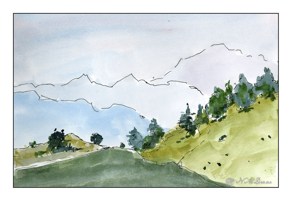
Next, the great outdoors. Mountains and trees. I would love to be walking around here, but sadly my ankle is keeping far more stationary that I want to be. I am getting better, but I have to just keep all to a minimum. I can go to the store and walk a bit, but I need my heel to get better more than anything.
So, the painting. Goal is to get a sense of distance with the gradations of the mountains as they recede into the distance. Accomplished!
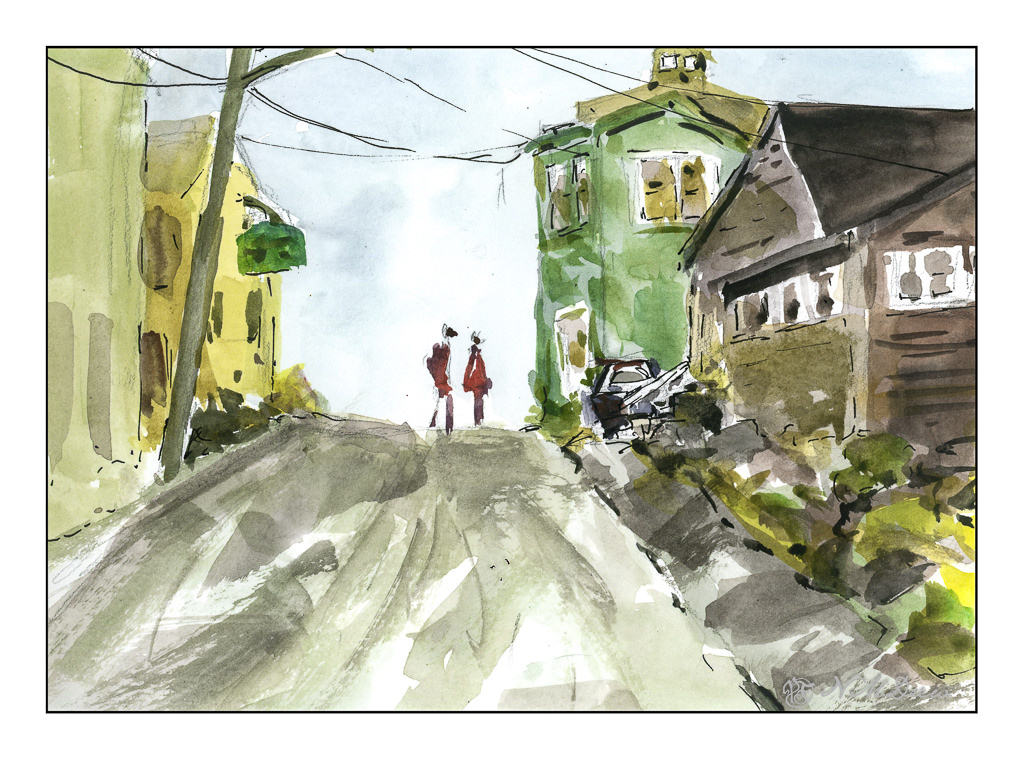
Finally, a scene with some complexity. I figured my warm up and splashing of paint were ready to meet my next challenge which is to paint buildings, people, perspective. Landscapes are comfy but I really want to push myself a bit more, as I did the other day, with direct painting and more patience and planning.
The first two sketches were done in very short order, but here I pulled out my pencil, limned in lines and worked on perspective and size. I think my people are a bit too tall, and I put them in before I did the painting of the buildings and the road. The buildings, too, are a bit wonky, but they work fairly well. I painted everything and then, once okay with the picture itself, I decided some black lines here and there would be good to help pull the painting together. Not perfect, but pleased with the results as I did meet my challenge.
Pentalic Aqua Journal, about 7×10, watercolor, Uniball micro pen.
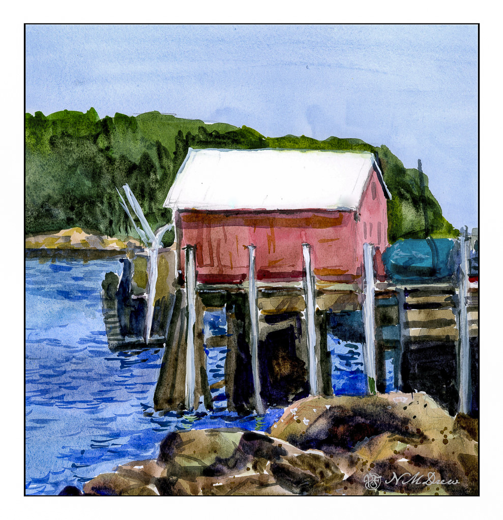
After playing around with the Strathmore Vision watercolor paper, I used it for today’s painting. Knowing its strength lies in painting directly on it with little to no lifting or scrubbing, I had to reset my thinking for this painting.
First, I did a pencil sketch on the paper, working to get proportions and placement of the bits and pieces in fairly good proportion to each other. From there, I worked as directly as possible to get values and colors the way I wanted them. I moved around the paper, too, laying in big washes and areas of color before adding detail.
First, the foreground rocks. The wash was laid down to get the ranges of tonality and vary the colors within them. Once dried I added the darker areas to create shadows. If you look, you will know the sun is coming from the upper right, and thus shadows will be toward the left.
Next, the sky. It is a very flat sky so I did a wash of a blue mix once I had dampened the paper, carefully working around various shapes. From there, the red of the building on the pier, working around the light uprights. Then, the green of the trees in the distance, being careful about the roof. Finally, the water.
Once all this was dried, the little things began, such as sorting out the supports and boards on the pier, some rock details, and the ripples of darker blue on the water.
This painting took me quite awhile as I tend to splish-splash and be quite impatient. This time around I worked hard to consider the colors and the paint before placing them on the paper. My mind is fried! Still, even though it is not by any means a great watercolor, I do like the way it looks – there is a bit more freshness to it than some of my other ones. I ordered some Sakura Gelly pens in white for better details for more delicate areas – I couldn’t find mine at all.
More watercolors to come, but I am going to use my 100% cotton Arches and try this same approach – more direct and thoughtful. I am curious as to how I will feel about Arches absorbency vs. the Vision. The Vision paper works rather well in this area – a good balance of absorbency without drying out. Surprisingly, even with a fair amount of water, Vision does not buckle as much as Canson XL does, and it seems quite capable of handling water when applied over the entire sheet without a problem.
Both Canson and Vision have problems with lifting color or scrubbing, and in many ways I think continuing the usage of Vision will force me to retrain my painting techniques a bit by requiring patience and forethought.

