I’ve said it before, and I’ll say it again: I am an impatient person, particularly when it comes to painting watercolor. The look of spontaneous painting requires forethought and planning, even for the simplest of pictures. I keep falling for that lie! Therefore, in an effort to tame my monkey mind, I decided to work on negative painting, which is not an easy thing to do. Looking through YouTube, I found a lovely example of negative painting by Krzysztof Kowalski, which you can view below.
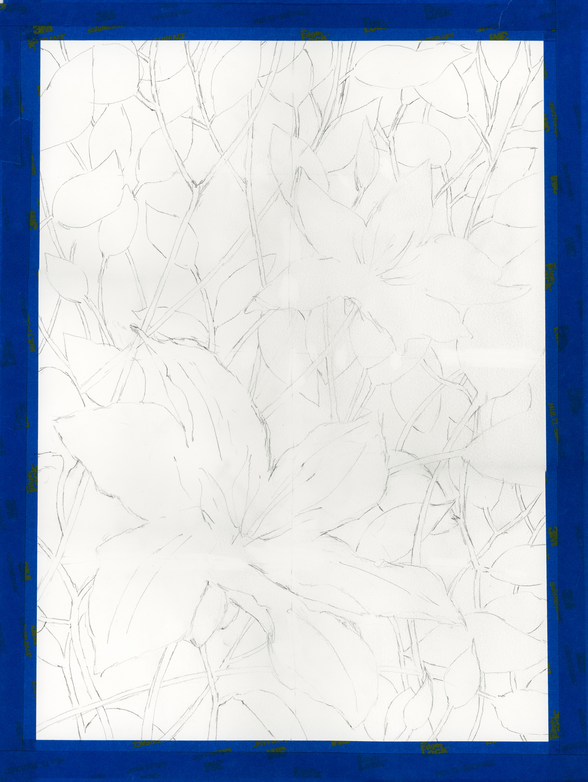
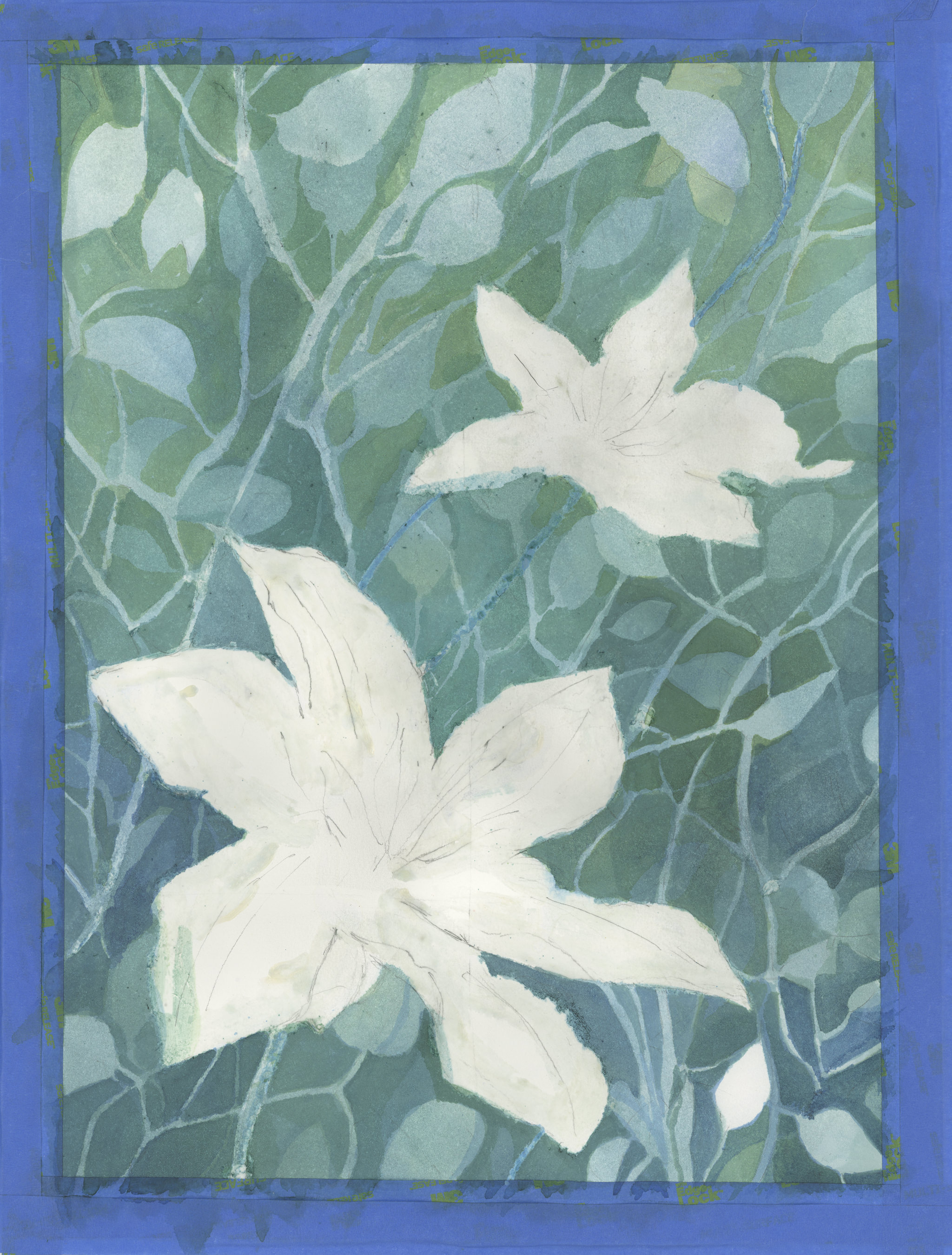
This painting study requires the usage of masking fluid in addition to working up layers of colors. My sketch came out fairly good, as you can see below, but the first layer of water over the masking fluid turned rather comical.
I didn’t dilute my dishwashing soap before dipping my brush in it, then the mask. The result, when I began to wet the paper, was soap suds! Okay, dilute it next time. I think the density of the dish soap also may not allow the masking fluid to adhere properly – I’ll find this out when I begin to remove it. I spent a few hours painting the layers; this is my afternoon’s work.
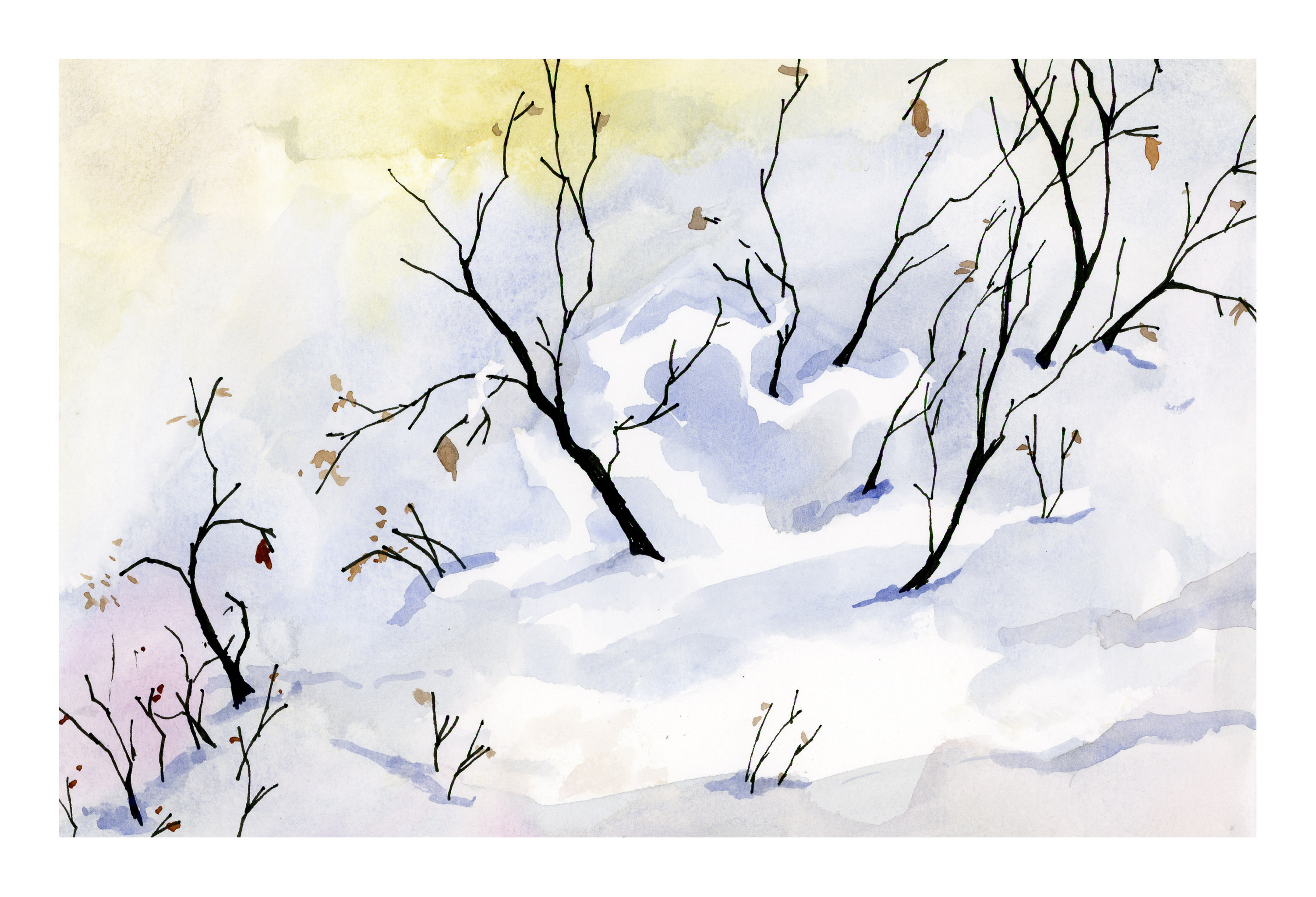
If you have been reading along, you know: I make mud, I need lines, and I cannot get white space at all. Well, in a moment of mad inspiration, I realized snow is white. Let’s paint snow! In my part of the world (California), we are in the midst of a hideous wildfire, which fortunately bypassed our neighborhood, but which could be visited by a fire any time. Crazy winds and no rain make for dry and dangerous conditions, and certainly the last place where you will expect to find snow.
Thus, snow. I went to my favorite place (YouTube) and searched for “watercolor snow” and there we were! Lot of them. In particular, I found Peter Sheeler, whose videos are simple to follow, and quite lovely. He uses a minimal palette, and just paints. Subtitles let you know the colors and the technique. Pleasant music moves you along. Here is my version of his painting.
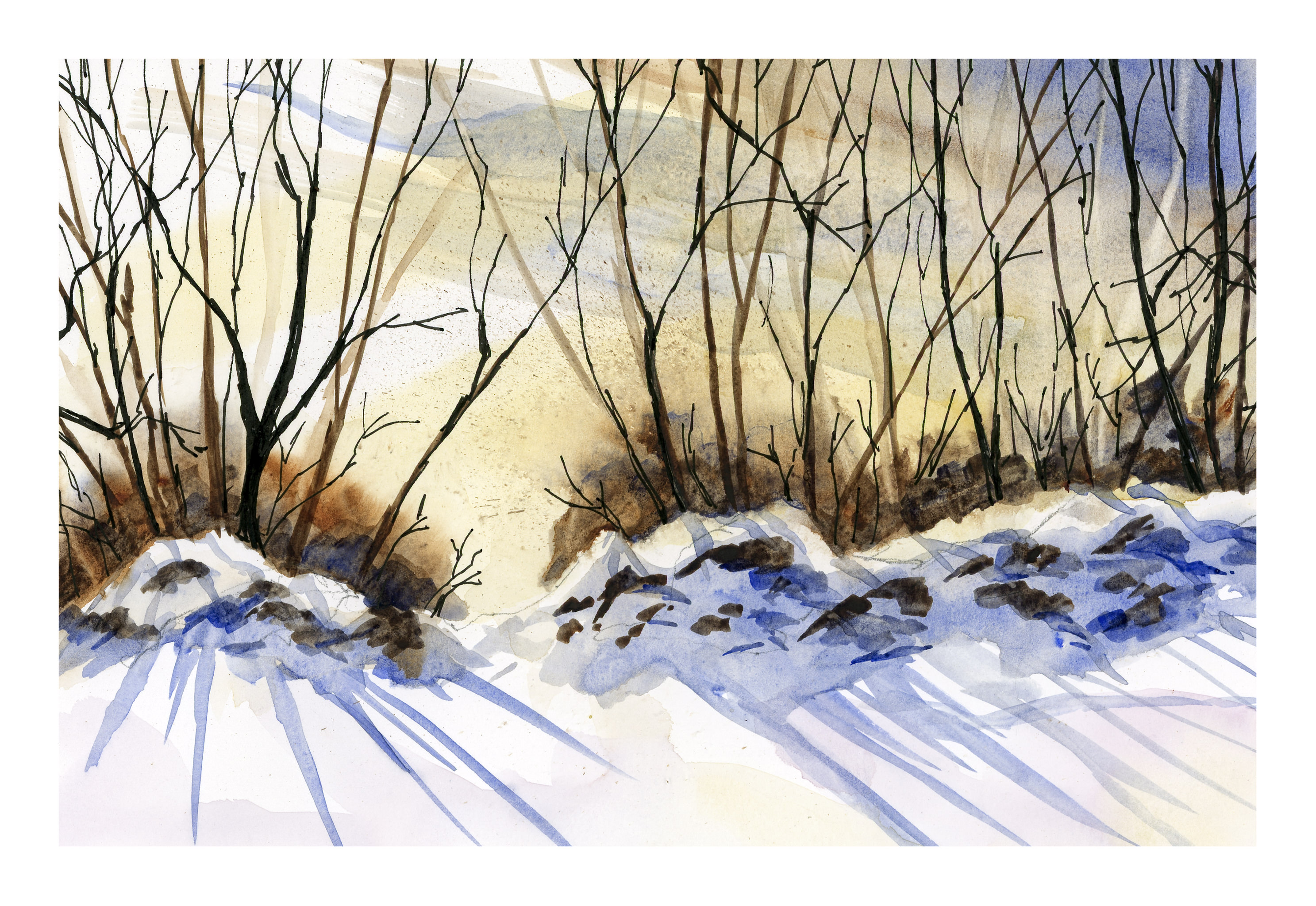
Peter Sheeler has another video that I used as well. It was a bit more complex, but not only was it great for shadows on snow, he has very strong light – dark colors, another problem I struggle with.
And here is my version of it. I was really intimidated by the dark trees and the rocks. Besides using only Ultramarine, Yellow Ochre, and Burnt Sienna (even though Sap Green is in his video’s palette), Peter uses a 1/2 inch flat brush. I have some flat brushes, and they scare the hell out of me. I think people who love flat brushes are nuts. No more: I bit the bullet and pulled out my flats and did the entire painting in a flat brush, varying sizes as necessary. And I used micron pens, too, as did Peter.
I am feeling a lot more confident now about colors, white space, limited palettes, and flat paint brushes. I think I will continue to follow along with Peter Sheeler’s videos – he is a really good painter, I like his style, and am confident I will get a lot out of his videos. And Peter, if you should come across this, let me tell you, “Thanks!”
I love YouTube – there is so much there! I’ve posted a few videos there on sumi-e, but making them is more work than I want to do. If you want to know about something, chances are you will find it there. As I really try to put forth effort in improving my abilities to watercolor like an artist, not a 2-year-old, I go there all the time. Today, when I was trying to paint white space, the notion hit me: do snow! And I found an artist whose videos and style I enjoy: Peter Sheeler. Catch him on YouTube here.
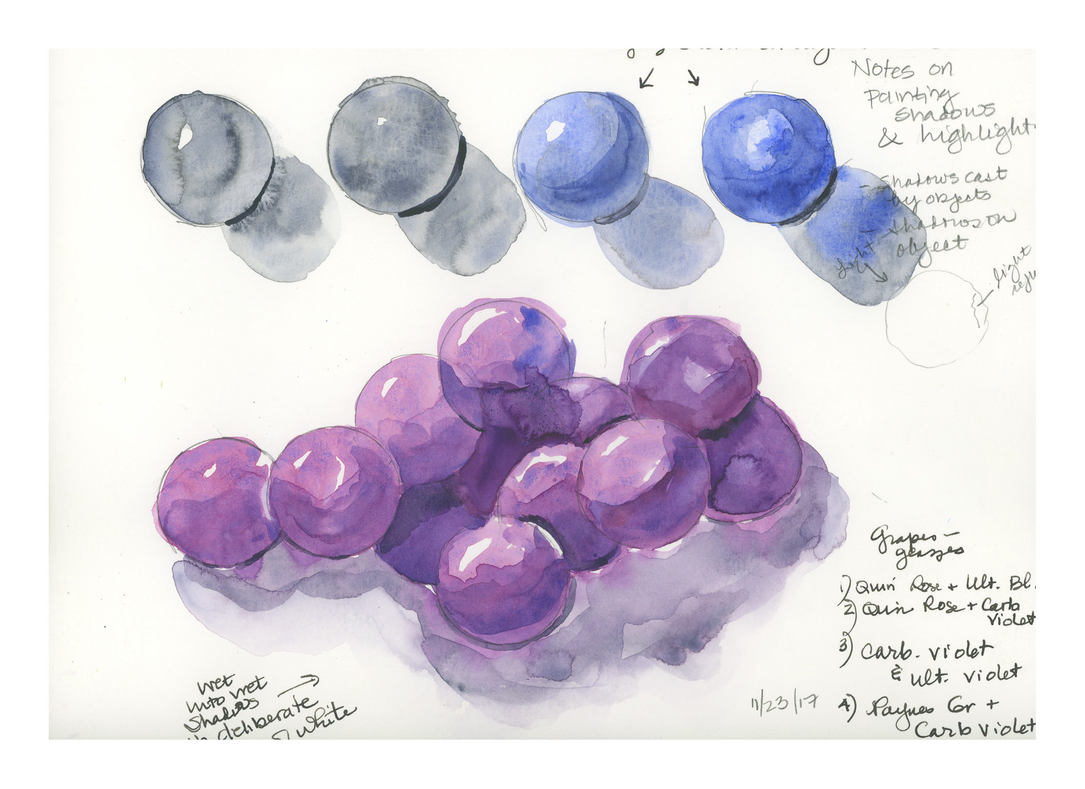
Painting light and dark – contrast – values – is a hard one for me in watercolor. I want to do it wet-in-wet, but maybe layering will work better. I just don’t know. So, when in doubt, look to YouTube!
Here is one video I found that I think does a very good job on both highlights and shadow, discussing reflected light and so on.
Another video which is also good, with a look at only the shadows on a spherical object, discusses the use of analogous colors to create the shadow on the surface opposite the light source. This video can be seen below.
Because I was having problems with making grapes believable (see here), I decided to research highlights, shadows, and round things. These two videos proved very helpful. Rather than describing them in detail, they are definitely worthwhile watching. The top one addresses shape and shadows on the object, as well as the cast shadow. The lower one uses analogous colors to deepen the shadow on the sphere itself, which keeps the color of the sphere rich, rather than neutralized by a complementary color or an added grey, such as Payne’s or Davy’s.
That said, I spent a bit of time on these old spheres today and yesterday. Here are some of the results of my practice.
The image above is based on the exercises in the first video. The ones with the red and blue spheres are the most believable, I think. The spheres and shadows are essentially wet-in-wet, with the final thin lines of darkest shadow done with a finely pointed brush on a dried image.
Here is another round of studies, trying slightly different techniques, such as wetting the paper first, then applying color. The techniques followed were the same as in the first video, with greater success.
Here, the spheres were made as in the first video, but then I went in to darken the shadows using analogous colors. The blue spheres were done in ultramarine blue, and the deeper shadows were a glaze of indanthrene blue. Below the 4 spheres is a bunch of spheres, sort of like grapes. The spheres were done with quinacridone rose and ultramarine blue, with analogous layers in the shadows to include carbazole violet and then Payne’s grey (see note on lower right of image). The shadows were done wet, and linked to the grapes to bleed color in. I deliberately left areas of white, even if they didn’t make sense, just to create areas of white between grape and grape, and grape and shadow.
Finally, the above image. I have a bunch of oranges I want to paint, so I thought it was now time to incorporate all my lessons into one little orange. The one on the left is the example, with, I think, the best orange colors. These were hansa yellow, pyrrol orange, and organic vermillion – all three are colors new to my palette. The ink is carbon ink from Sailor on the left, and just a fountain pen with regular black ink on the right, just if you are curious.
My orange is my favorite of all the exercises as it pleases me the most. The grapes are OK, but they are glazed, which I am not too excited about. It could be that I am just not adept at glazing. Anyway, there we have it: Thanksgiving morning exercises.
Online knitting resources have been around for years, but as internet technology and hardware improves, they have become better than ever.
One of the most valuable tools, for me, is the video. On youtube, there are all sorts of instructional videos. These really help get points across, and show the viewer something which is really difficult to describe in words, even with sequenced photographs. Just doing a search for “backward caston” results in numerous hits, and refining it with “knitting” breaks it down even more. If it hadn’t been for youtube, I’d never have been able to purl using the continental method – the Norwegian Purl video was more than a little bit of a help!
Other favorite sites for patterns include Ravelry, Twist Collective, Knitting Pattern Central, and KnitNet. On many of these, techniques can be found, groups, local yarn stores. In some ways, the internet is like an ongoing treasure hunt – click here, click there, and something new and interesting pops up!
Still, despite the potentials found online, there are also limitations, although as time and technology move forward, that will become less of an issue. The low-tech book and magazine provide a portability not found online, and yes, you can take them with you! I personally would rather look at these than spend hours online, sitting in a chair, at a desk, and be indoors. Much nicer to wander outdoors to peruse. Color illustrations still catch my eye, the smell of ink and paper, and the beauty of layout, design, type font as well.
And, in this high-tech world, isn’t it interesting that many of us still prefer to knit with fine knitting needlesin our hand, rather than at a knitting machine?