Camera Review: My New (to me) Beautiful Blue Agfa Silette


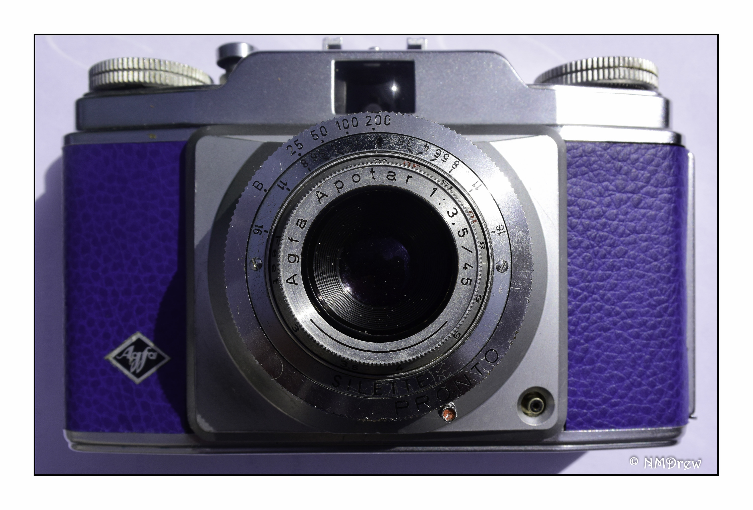
A couple of weeks ago I picked up an Agfa Silette Pronto camera for a very decent price.  It was CLA’d and re-upholstered in blue leather.  Altogether, it was a deal too good to pass up.  So, I didn’t, and I am glad I went ahead with the purchase.

First, what prompted me?  Price, in part; but also the seller is a great guy.  Another prompt was the pure simplicity of the Agfa Silette.  All you need is to do is figure out your exposure and distance, based on your film and your light.  The “Sunny 16” rule applies here, along with guestimating the distance between you and the subject being photographed.  A few adjustments, and you are ready to roll.  And, if you know the basic rules of photography, you almost cannot go wrong.

The Agfa Silette was produced over many years, with many models.  I believe mine is one of the first ones, as it is pretty simple.  Exposures are limited to bulb, 1/25, 1/50, 1/100, and 1/200.  All focusing is done in the zone system – you guess how far away your focal interest is, and turn the dial on the lens for distance.  F/stops are 3.5, 4.0, 5.6, 8.0, 11.0, and 16.00.  You also have to set the exposure counter manually each time you load the film.  The lens is an Agfar Apotar triplet, 45mm, f3.5.  There is a self-timer on the lens, and a PC socket for flash.  As a leaf shutter, it is supposed to work at all speeds, but I am not a flash person, so cannot vouch for that, but I expect it does.  The flash sits in the cold shoe on top of the camera.  That’s it.

In the U.S., this same camera was marketed as the Ansco Memar. The video above is full of good information.

Because there is a lot of information about the Agfa Silette on the internet, I am not going to write up all its specs. Instead, what I do want to say it is an absolutely easy camera to use if you are familiar with manual cameras at all. If you get one, and want to learn about it, the manual is available at butkus.org.

The Silette fits easily into your hands.  It’s not too big, too small, too heavy.  Probably the biggest drawback is the viewfinder – it rests above the lens, so you need to move down a bit lower than you think is necessary from the frame you see.  The knob on the film canister side of my camera is a bit tricky – I have to pinch the knob before I pull it up, but now that I am aware of this, it is easy to load.  Rewinding the film uses the same knob, not a crank, which is a bit awkward, but easy enough.  Loading film is simple, too; just make sure to engage the sprockets in the film and insert the lead into the take-up spool.  Give it a few exposures to make sure it is winding on correctly.  And, remember to set your film counter!

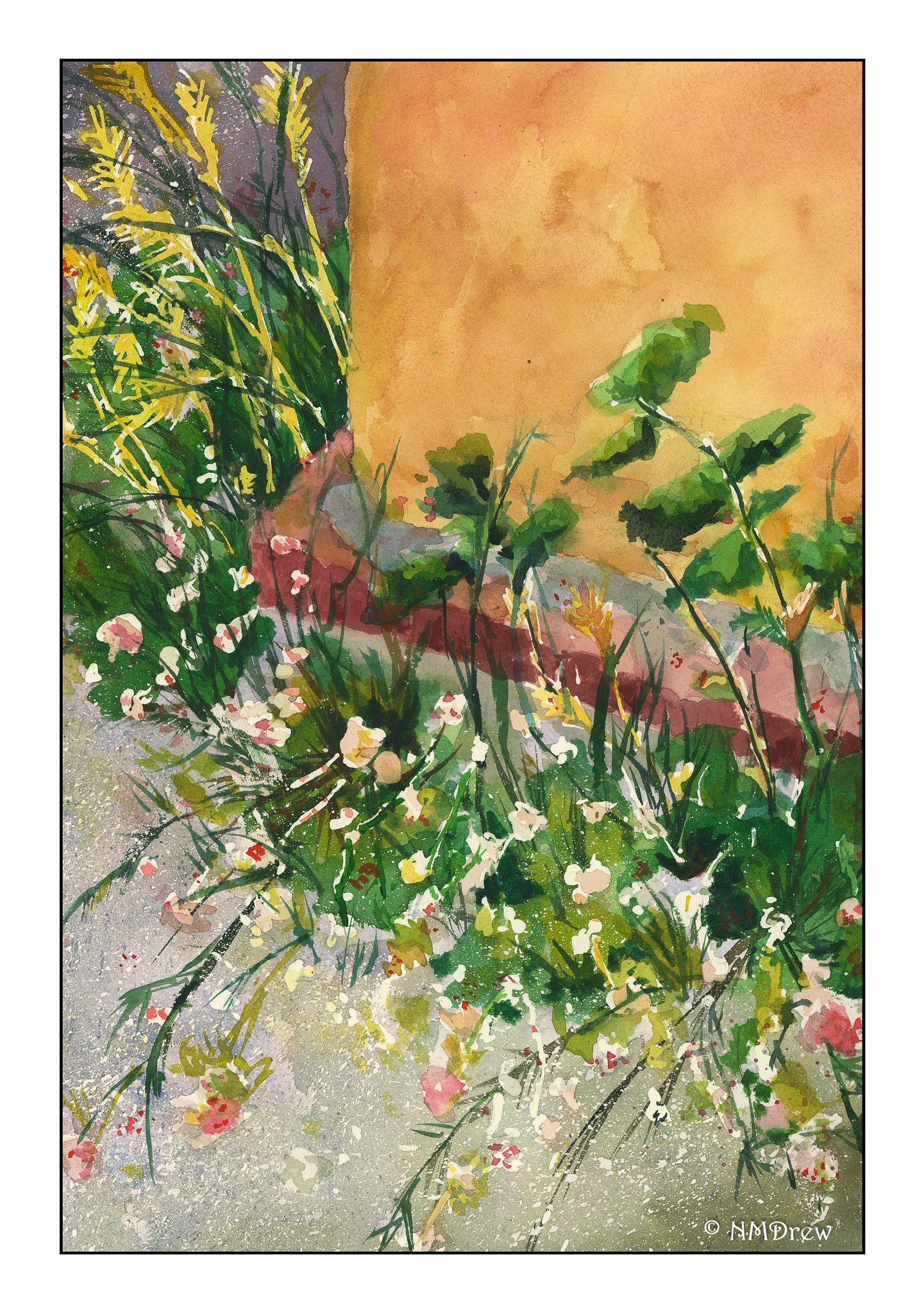
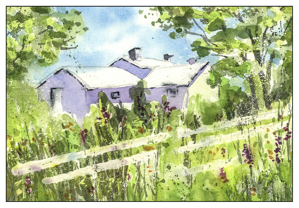
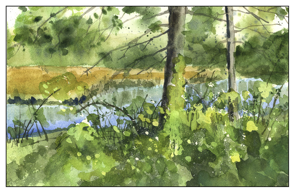
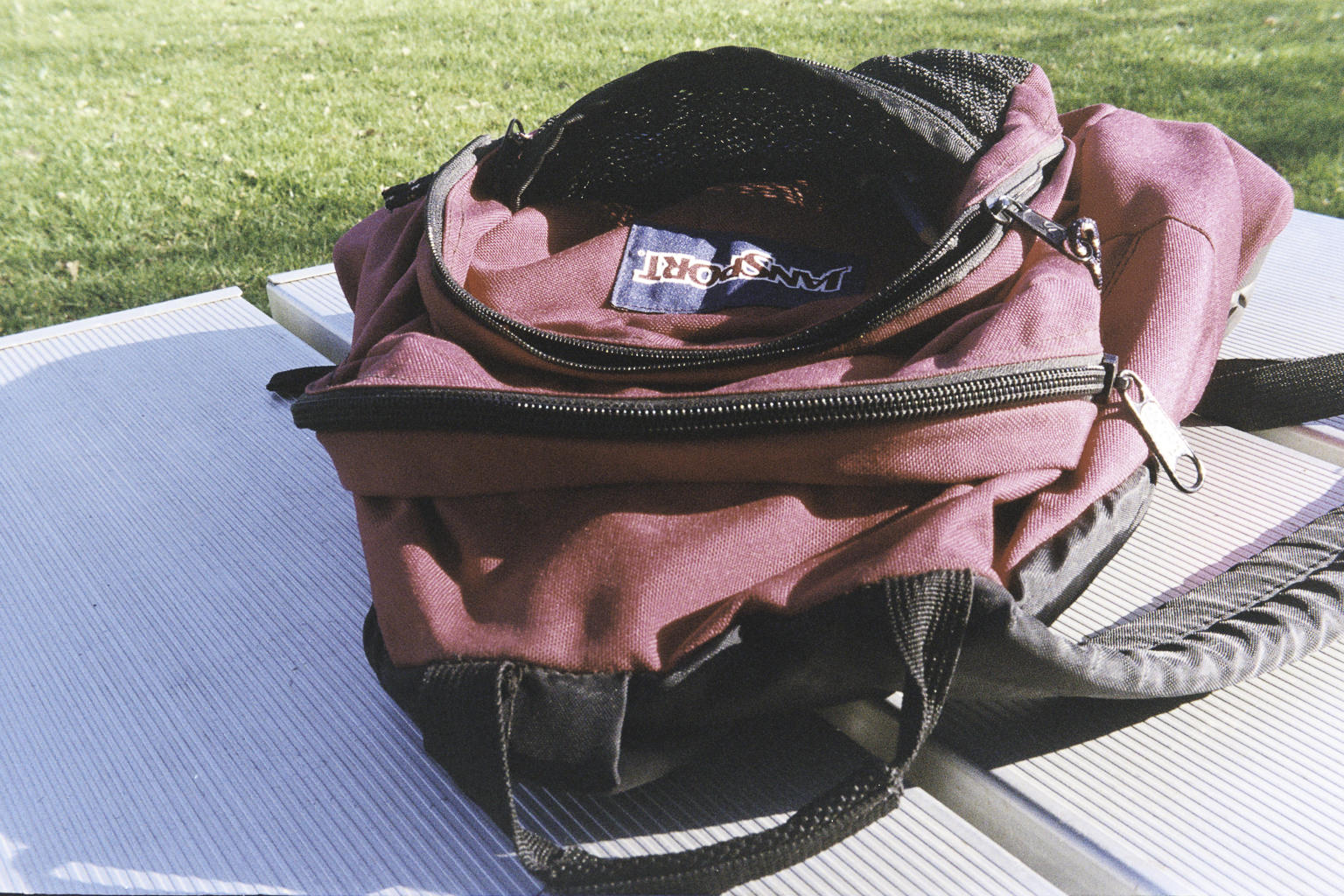
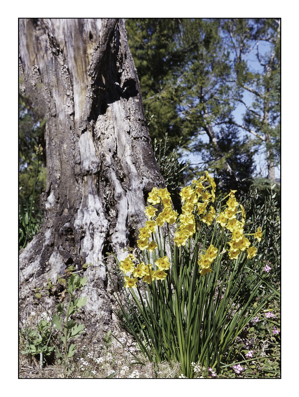
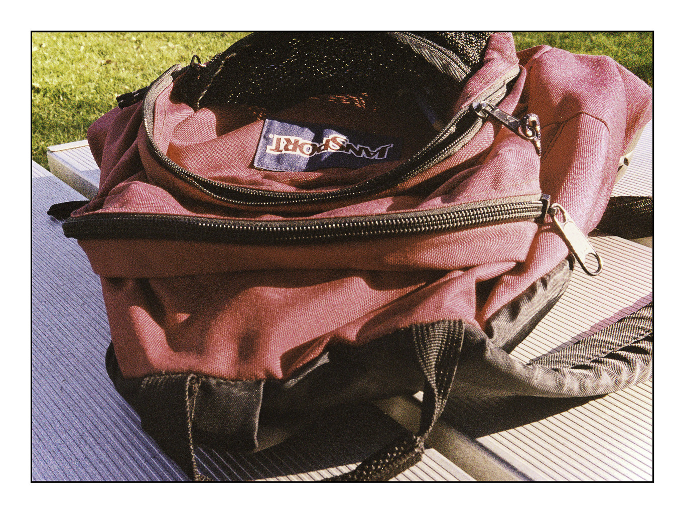
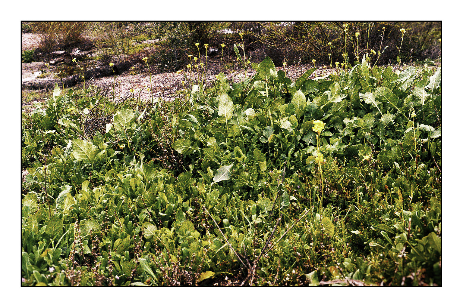
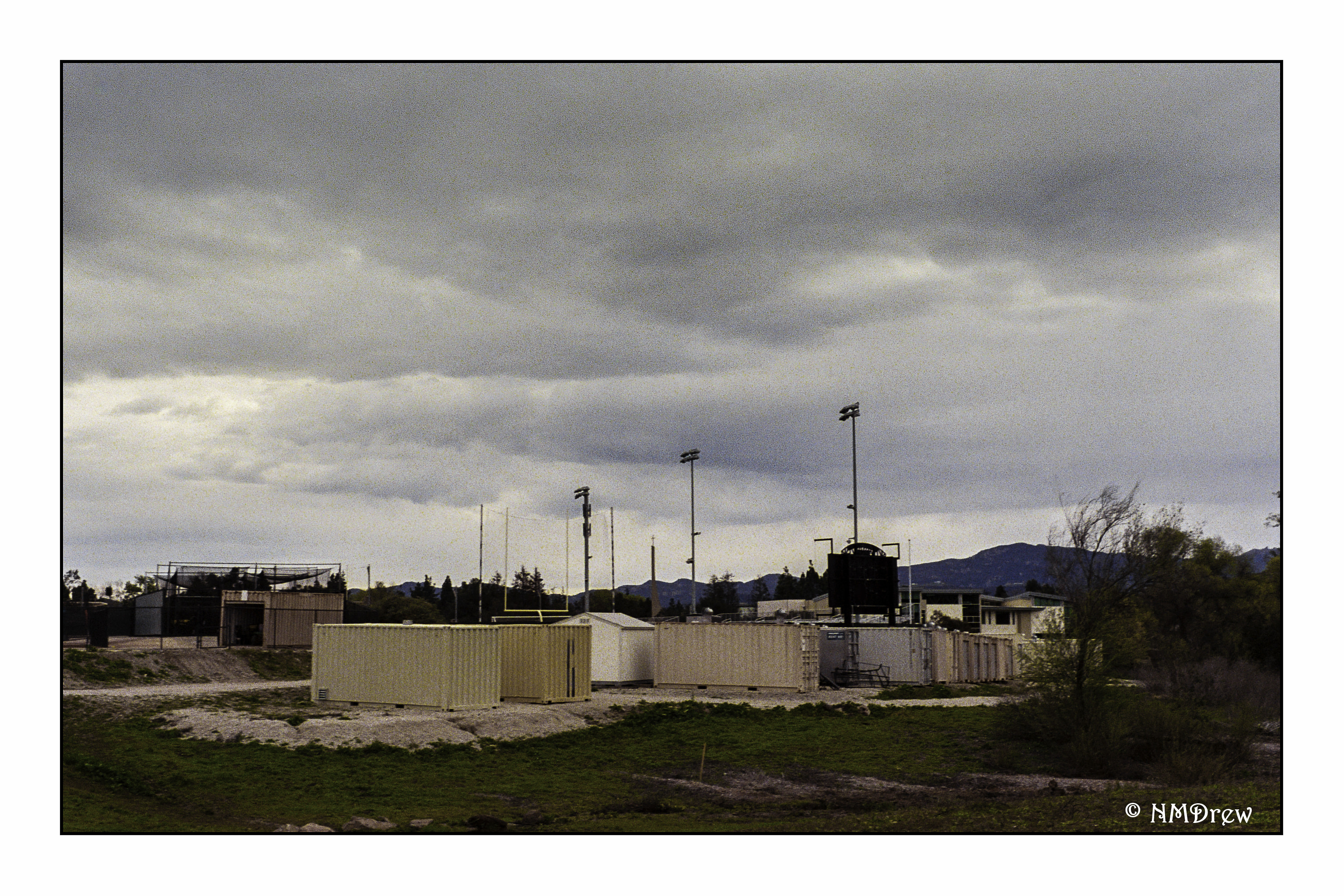
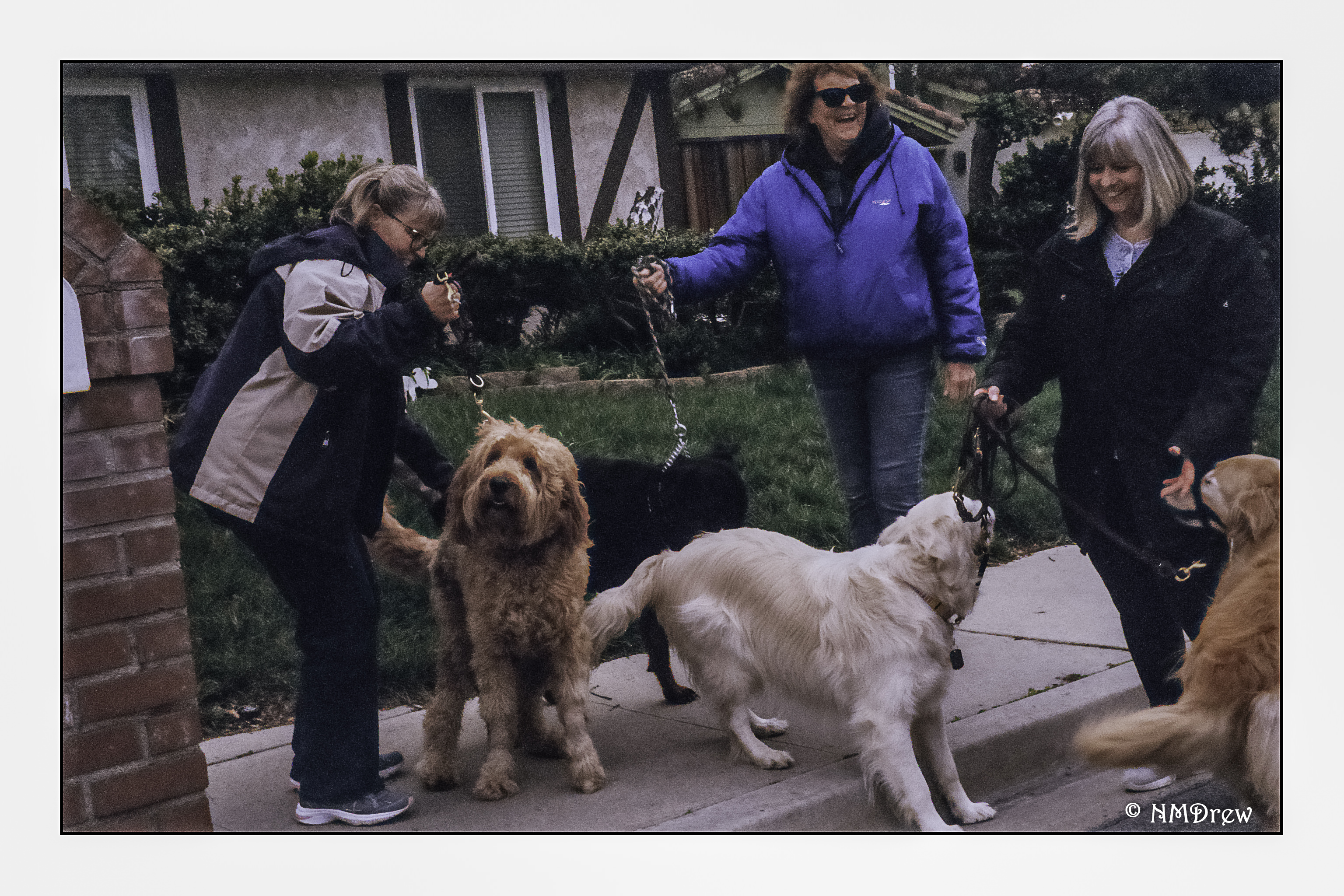
I used UltraMax 400 as the first roll through the camera.  Images were sharp and clear, whether I focused at 3 feet (day pack image) or at infinity.  My guestimations worked out – I used the Sunny 16 rule for 100 iso film.  The latitude of the Ultramax was just fine.  A few pictures straight out of the camera, first.


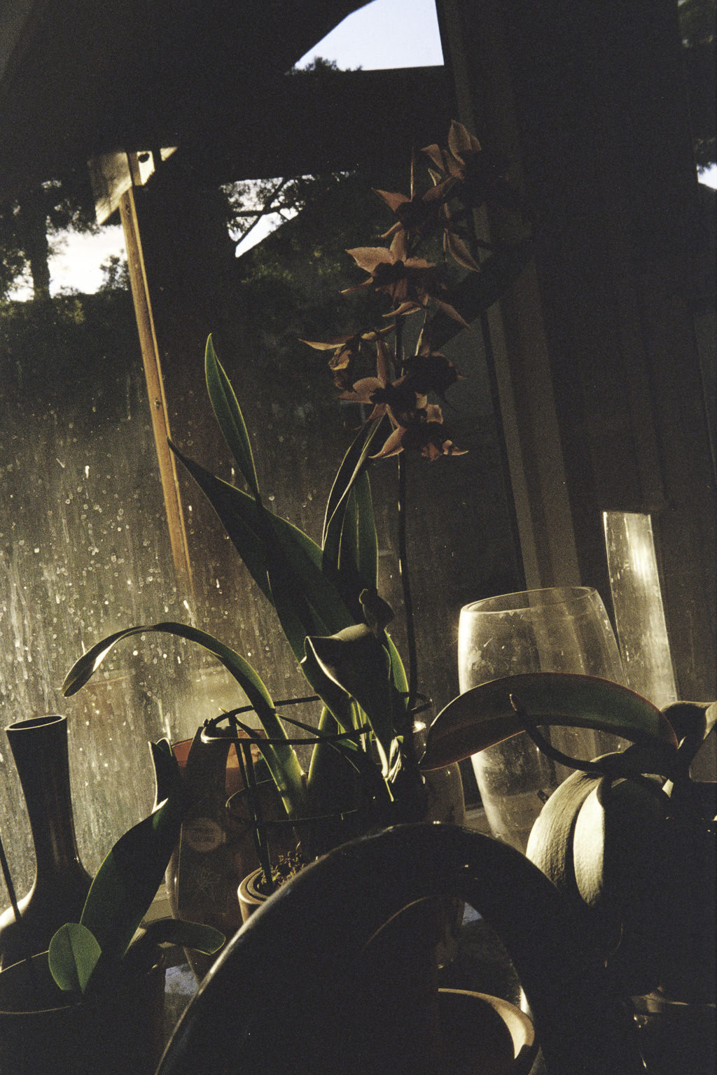
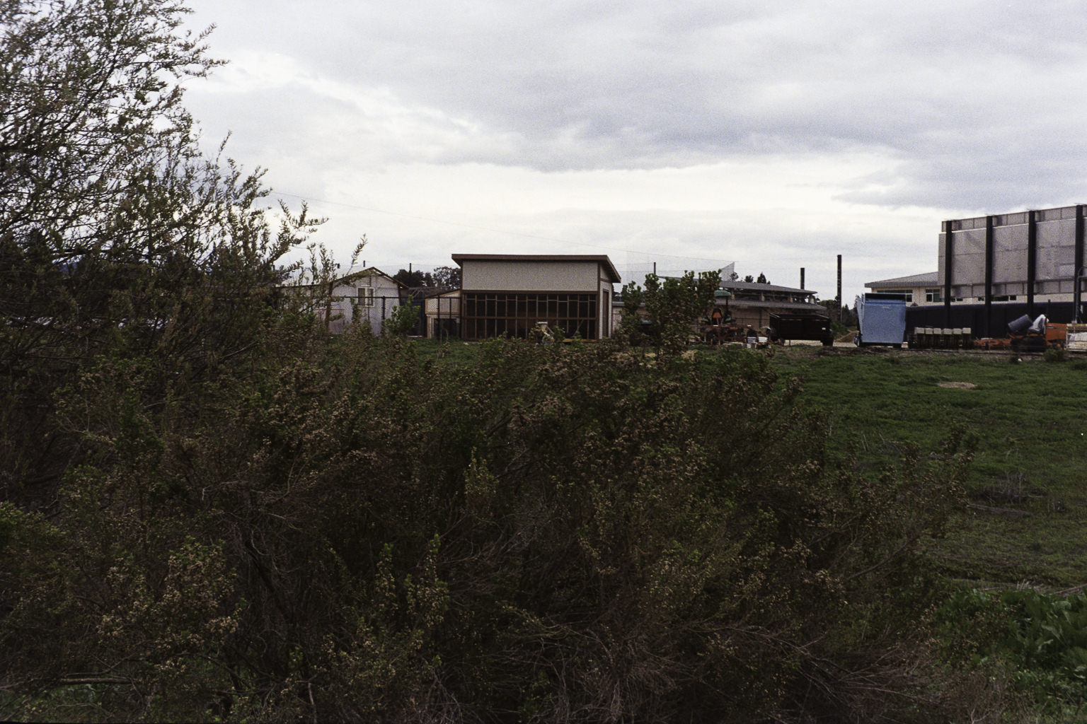
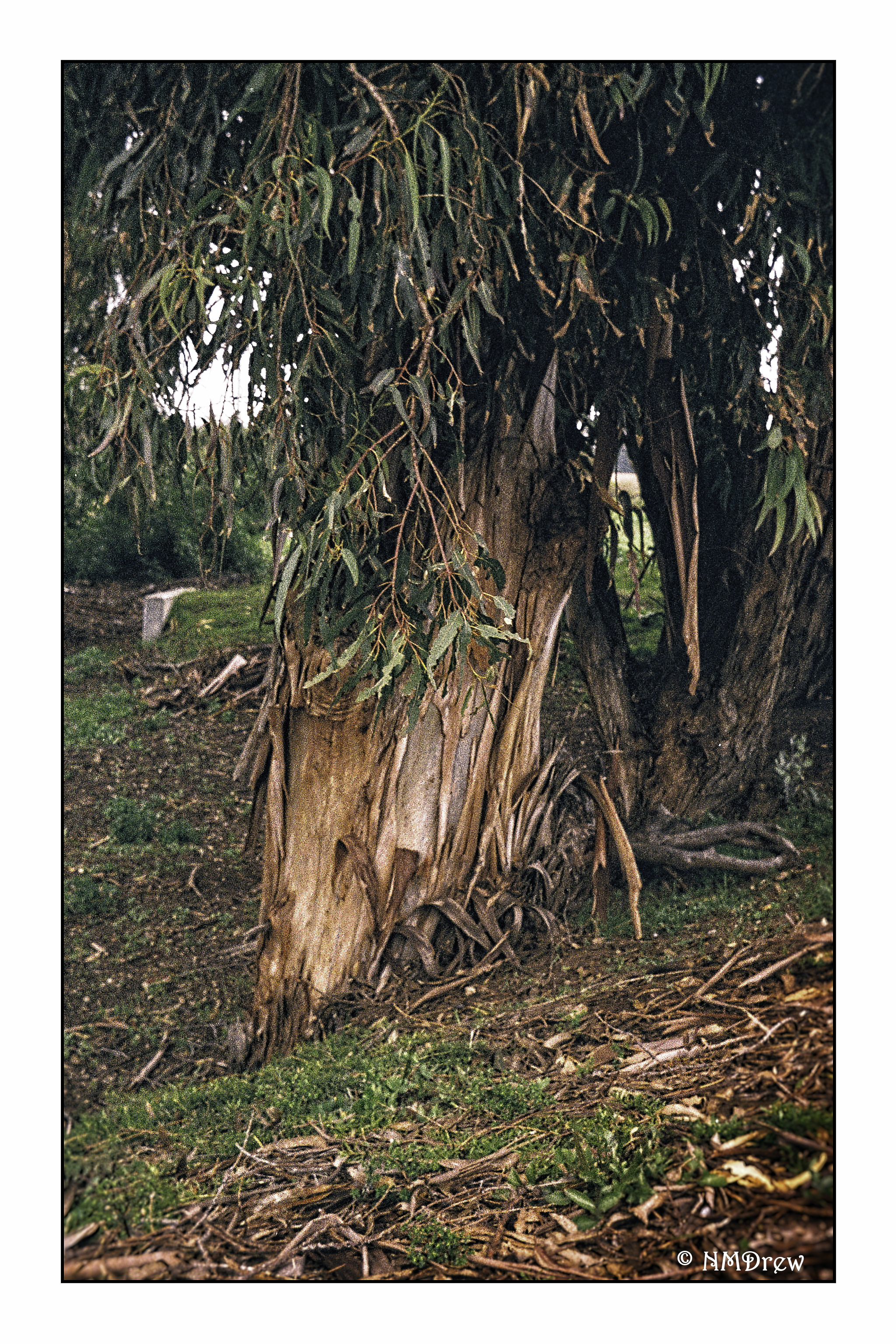
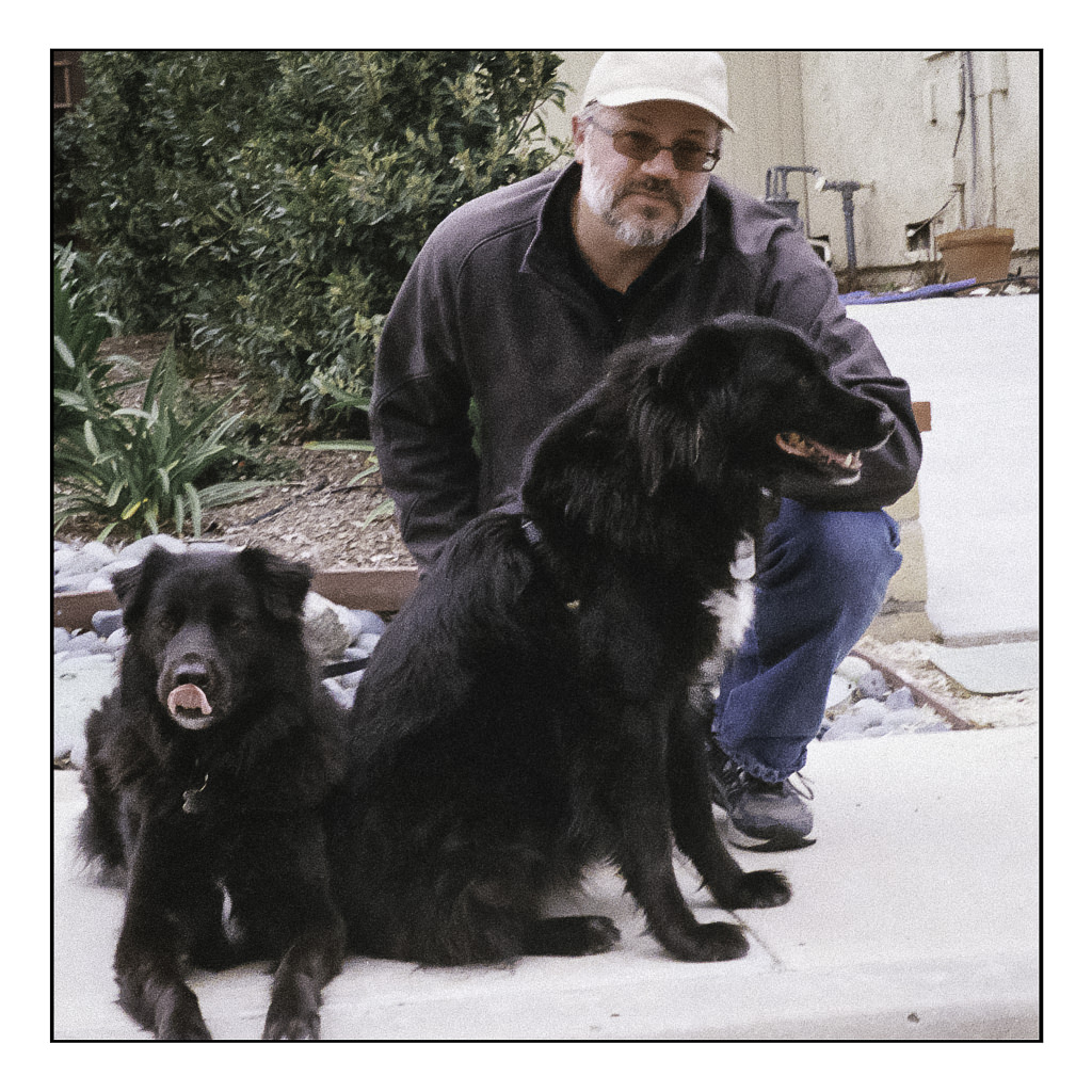
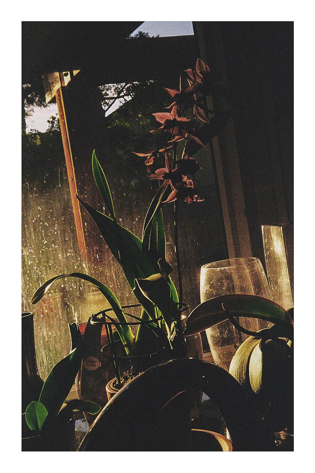
And now some with post-processing in LR and On1.  Detail is good, colors are rich with good lighting and exposure.  I even made a panorama out of a series of images for the first image, and cannot complain about the camera’s performance at all.

Altogether, if you find a working model, get it. It’s a really nice camera – better than a point and shoot in some ways, as you make choices. The Silette I purchased is a really lovely camera, and I know that I am going to totally enjoy its simplicity and functionality. Check out Flickr and the internet to see what this little gem can do!


A Dutch Landscape – After Edo Hannema

Today was a day of “firsts.”  I decided to paint a big painting for me – 16×20 inches.  I also chose to use a more professional paper than I have been; here, 140# cold press Arches.

I wanted to test out how Arches handles water – lots of water.  Hannema is the master of the wash and wet paper approach.  His current paper is Saunders Waterford, which is different, of course, from Arches.  I think the Arches handled the water really well.  I, on the other hand, still need to master my washes.  Blooms are visible here and there, and I need to learn how to control those or eliminate them if I find them later on.

The palette of colors I used was initially what Hannema used:  ultramarine blue, alizarin crimson, burnt sienna, and raw sienna.  Because I did not like greens I was getting, I threw in some sap green.  If I had used yellow ochre, perhaps my greens would have been more satisfactory – something to make a mental note of to try next time around.

I always learn from a video.  As I have mentioned, water is one thing I am working on, along with buildings.  Today, I wanted to just work with a new paper and a lot of water.  The study was successful altogether methinks.

Below is Edo Hannema’s painting tutorial:

Rick & Me

About a year ago I found the YouTube channel of Rick Surowicz, and artist of considerable talent, and a formidably talented teacher.  In the space of just over a year, he has garnered 25K followers, and I am one of them.  Check him out if you don’t know who he is!

Anyway, I did two of his videos, both of which make use of frisket.  In general, I like to “travel light” – meaning, I like the idea of spontaneity for success, not thoughtful pre-planning.  The result for me is usually disaster and disappointment.  Rick’s videos are clear.  He explains what he does and why.  The results speak for themselves.  I decided to get off my don’t-panic-I’m-organic high horse and follow along.  These next two paintings are from his lessons, which I followed.  I can honestly say I enjoyed doing them, even in the moments of terror – that frisket!  those colors!  

Each one of these paintings required the usage of liquid frisket. I applied it, let it dry, and got to work. The beauty of the liquid frisket is that it allows the application of broad washes across the paper without the loss of white paper, or having to do in painting or negative painting. This actually gives a bit more ability to be spontaneous and splashy than not using it! (Surprise lesson here.) I did each of these paintings over a two or three hour period, watching the steps in each video a number of times.

At some point, we all have to try our wings. I took a photo of a weed patch behind La Purisima Mission in Lompoc, California, last summer during a visit. There were white flowers – perfect for frisket – and yellowish grasses – also good for painted-over frisket after it was removed. This painting held a lot of terror, let me tell you! However, I am fairly pleased with the end result – simplification coupled with detail.

This morning, I did this painting, derived from a public-domain photo of an aspen grove. In the photo, light was shining from the right, and in looking at the picture carefully, the trunks of the aspens, which are a brilliant white, much as birch trunks are, were actually darker than the brilliant yellow-green foliage in the distance. I used frisket for the white areas on the right of the trees, and then, as I laid down layers of color, added more frisket here and there to protect areas of color. I did this for three or four layers until I finally removed it all, and then painted in areas needing more detail or contrast.

By following Rick Surowicz’s tutorials, I finally learned something. Frisket is not scary and can be an aid to a spontaneous or splashy wash as it helps preserve white paper. In the process of copying Rick’s process, I learned a bit about color, reworking areas, contrast, and whatever. I was also able to paint a representative of a bush or leaves rather than hankering to paint the details and losing the overall effect. I am thinking about redoing the last two paintings without frisket, just to work at white space without an aid. That will be more of a challenge I think than not using frisket!

The Inn at Brandywine – Another Study

This has been a busy weekend!  A lot of painting – certainly beats housework, I tell ya.

Here is another study from Rick Surowicz’s YouTube channel.  This is the “Inn at Brandywine” study.  Again, use of masking fluid, glazes, warm and cool greens.  If you like to paint and want to get better, you cannot go wrong with his videos.  They are detailed and informative – info on brushes, colors, techniques, thoughts on what he is doing.  All very helpful and insightful.

Using the masking fluid is becoming easier, as is thinking ahead.  Like painting in negative space, planning ahead is a different way of looking at a painting for me.  It’s hard to explain.  The thing is, while kind of frustrating to do, it is becoming more of a part of painting, if that makes any sense.

Below, Rick’s excellent video.

Covered in Paint

A workshop all day Saturday, playing with Yupo (a plastic paper) and masking fluid.  What did I accomplish?  A familiarity with two unknown – unfamiliar – items.  I produced not a thing worth talking about, and truth to tell, if a friend at the workshop hadn’t shown up, I would have been down in the dumps – I FORGOT TO BRING MY PALETTE OF PAINTS!

Oh, well.  But, it did get me rolling, and this has been a weekend spent immersed in watercolors and studying techniques by watching videos on YouTube, specifically, those by Rick Surowicz.  I followed two of his, one called “Creek’s Edge” and the other called “The Inn at Brandywine.”  His stuff is great.  The question is, will I carry his lessons into my own paintings, not copies?

So, here is what I did this weekend – the first is the “Creek’s Edge” and the second is my rendition of the “Inn at Brandywine.”