WWM #31: Favorite Colors

When I thought about this prompt, “favorite colors”, for #WorldWatercolorAMonth2019, I was rather overwhelmed.  There are just so many beautiful colors out there!  I also have added a dozen new colors to my palette, and I was of the mind I should put together a swatch of the colors to see them separately and pure, not mixed up with others on my messy palette.  This would answer “favorite colors” because I don’t think I have met a color I don’t like.

It seemed like a task too daunting for me today – I have spent the past two days putting my house back together as we have finished all the repairs from the slab leak of earlier this month.

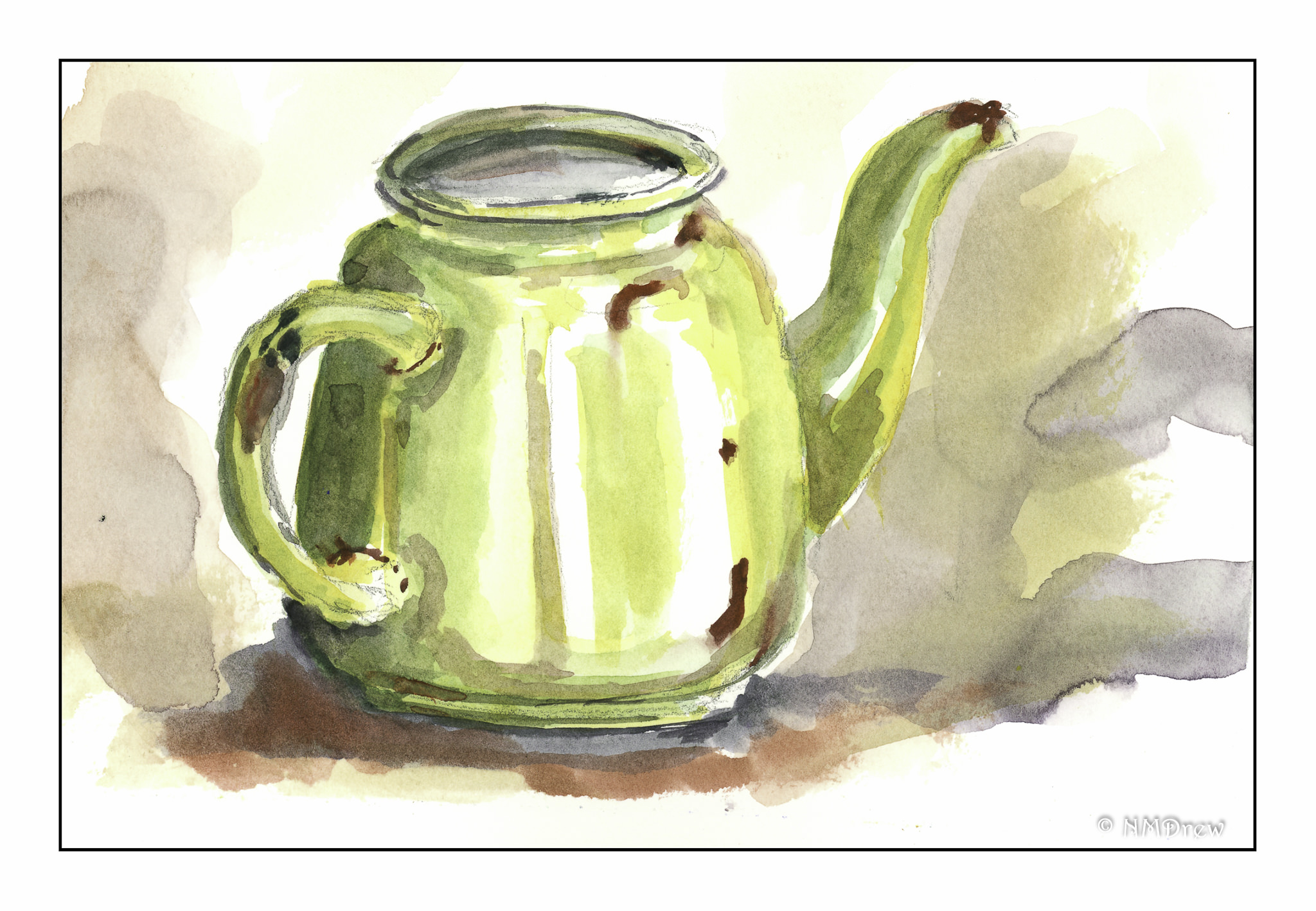
So, what are some of my favorite colors?  Truth be told, greens and magentas and turquoises.  These are the ones I like the best – light, dark, brilliant, quiet.  Sky, leaf, flower.  Bougainvillea against a bright, sunny sky hits the spot!


WWM #30: Wild Things

Today, when I was trying to figure out Wild Things for #WorldWatercolorMonth2019, I was really in a sourpuss mood.  I had to cancel a photo shoot with a friend and was not happy about it.  When you are tired and don’t feel well . . . you are absolutely crabby!  Hermity.  Crabby.  Hermit crab.  (How is that for subtle?)

I didn’t feel patient, and I didn’t feel capable of anything with a bit of subtlety.  I needed containment.  I wanted my shell.  I wanted limits and boundaries.  I wanted to feel safe.  Lines are perfect for that!  And as I have not done a line-and-wash watercolor for a month now, today I indulged.

And lets face it – hermit crabs are downright cute and fun with all their different colors and shells and homes.  Seeing them always makes me laugh – don’t know why, but they are such a delight.  And, as a result of this drawing, I, too, am in a much nicer mood!

WWM #29: Glorious Green

In spring, bright new greens fill the world. In summer, greens are darker, interspersed with flowering crops and wild flowers. Color is everywhere, but all dotting a verdant landscape. In brilliant sun, the greens shimmer, but under the electric sky of a thunderstorm, the sudden bursts of sunlight render greens into a strange intensity . . .

“Glorious Green” – prompt #29 – #WorldWatercolorMonth2019.

WWM #28: Metallic

A bit out of proportion – obviously put together by a madman or seriously abused in its lifetime – this green, enamel-over-metal teapot was my first flirtation with “metallic” for #WorldWatercolorMonth2019.  I think it is okay, but really more of a warm up study.  The ones that follow are a bit better.  As I was doing them, I became more confident in the brushwork.

This is rather obviously a teaspoon – but the handle is really too short!  Thus, it is now a sugar bowl spoon.

I need to practice drawing more, and working on relationships of size and such.  While my painting is improving, I can’t say my drawing is.

Nonetheless, I am pleased with this.  I used only Payne’s Grey and used it in varying strengths to create a (gasp!) monochromatic watercolor study.

Nest is an old brass skeleton key.  I used Burnt Umber, Quin Gold, Organic Vermilion, and Payne’s Grey.  I figured since I had done something with underlying metal and silver, a gold color was necessary.

Working my way through these paintings did not take a lot of time, but they did focus my attention.  The elements of contrast I am learning in gouache is really becoming apparent in my watercolors.

Bolder brushwork, too.  In gouache, I have been doing a lot of scumbling; here, I am working by holding the brush at its end, away from the ferrule, and holding it more loosely.  It works as far as freeing me from a sense of “I have to do this perfectly” – don’t know why, but it is interesting to see how a physical stance changes the mental, and perhaps the final artistic result.

WWM #27: Fruits

Summer is the time of year when we live on fruit salads. If we get ambitious, maybe a pie, tart, galette . . . you get the picture. The prompt of “fruits” is perfect for the middle of July, the month of #WorldWatercolorMonth2019.

This year looks like it will be a really good year for our fig tree, a Brown Turkey. We used to have a Kadota, which is a lovely green fruit, and a perfect foil for the Brown Turkey, which are a deep purply-brown color. Figs are something I look forward to every year, to just walk out to the tree and enjoy a sweet treat . . .

Besides anticipating figs, we have also enjoyed grapes and apricots this season.  Cherries, nectarines, melons, raspberries, strawberries, blackberries, blueberries.  Abundance!

The first painting is not quite where I want it to be.  I was focusing on contrast and shadows to separate one piece of fruit from another.  The same for the grapes and apricots, which is a bit more successful although I am not quite pleased with it because I think it is a bit overworked.  It’s interesting how I feel pretty good about some things – more confident – and less so with others.  I guess we all do.