Paper Skies

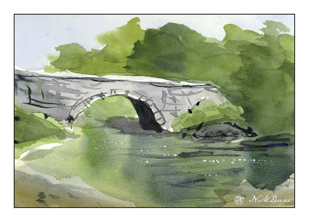
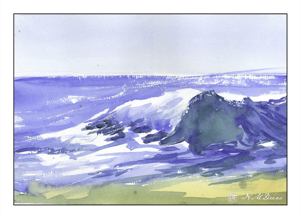
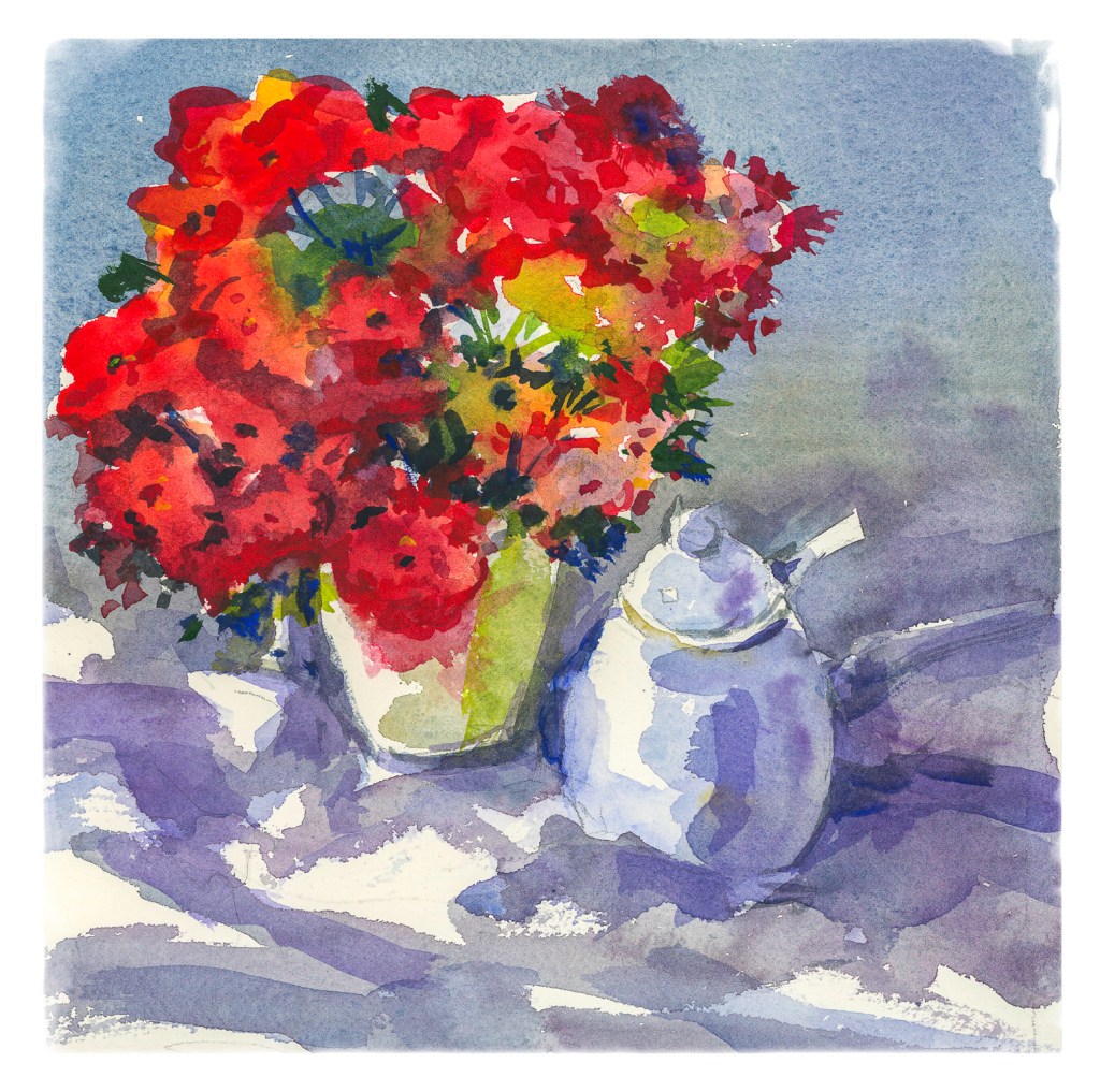
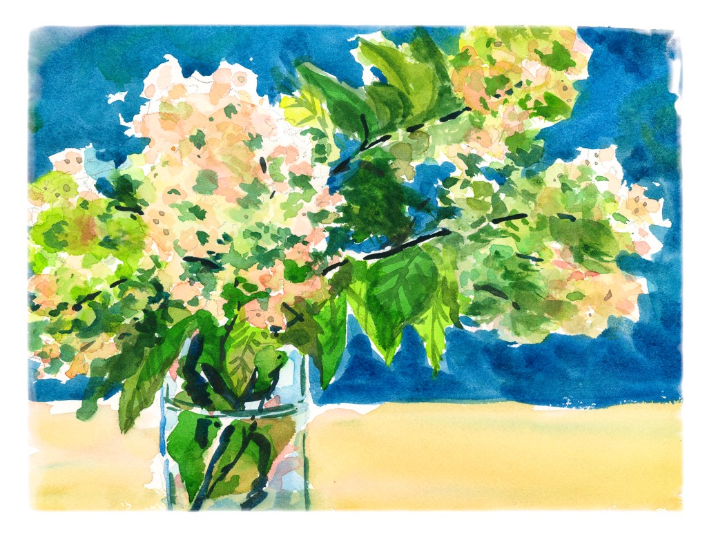
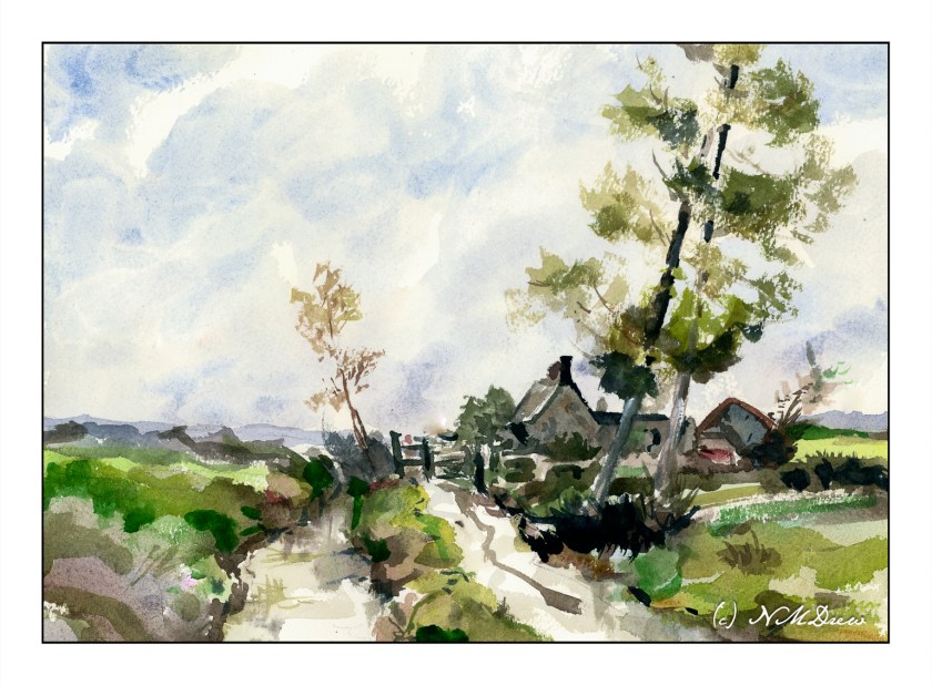
In a lot of ways we just take paper for granted. It’s everywhere. In the arts, though, paper can be more than important – it can be critical. Its qualities can determine how you work, what you do, and so on. In watercolor, paper sizing, texture, and fiber content all play a role. As well, how the paper is handled by the artist, meaning (in this post) how much water is used with the watercolor paints, and if the paper is dry or wet when paint is applied.

The other day, I was watching a YouTube video by an English artist whose work I enjoy: Andrew Pitt. In particular, I was watching how he handled skies with a limited palette of colors (Winsor Newton’s Light Red and Cobalt) and the paper he used. By chance, I have both of his choices – Arches Rough 140# and Bockingford CP (he has 200# and I have 140#). Arches is externally sized and Bockingford is internally sized. Arches external sizing creates a harder surface which does not absorb water as easily as does the internal sizing of Bockingford. You have to work more quickly with the Bockingford than with the Arches.

With this in mind, I decided it was time to tackle skies. I do them all the time, but it was fun to focus a bit more solidly on the subject of the sky itself as well as how wet-on-dry and wet-in-wet worked with the different papers. Watching Pitt’s video a did one thing in particular which he suggested: I kept my brush on the paper when I painted as long as I needed to create a specific area – the sky or a cloud.

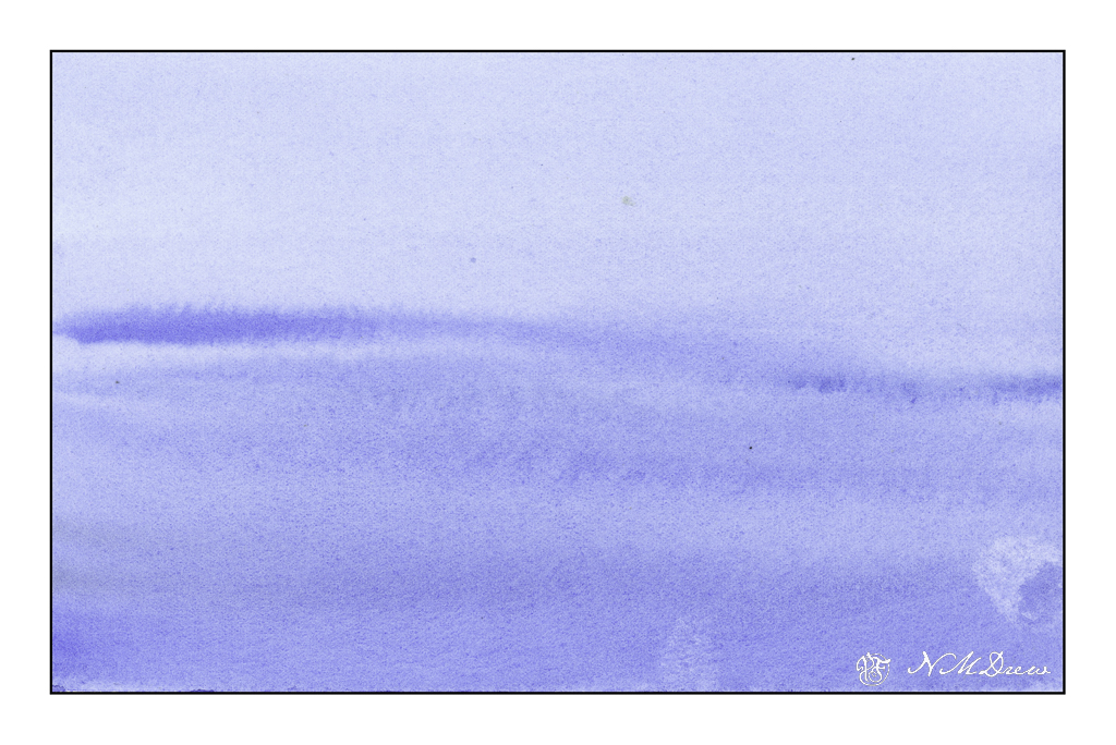
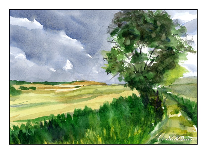
In the above painting, as with Pitt’s sky, I used only Cobalt and Light Red. Here, I used Arches Rough and used a wet brush on a dry surface. First I did the sky in blue. Rinsing the brush a bit, I mixed Cobalt and Light Red together, varying the amount of color and pigments. The lighter greys have more water, the darker greys have more pigment. The white is clean paper without any paint.

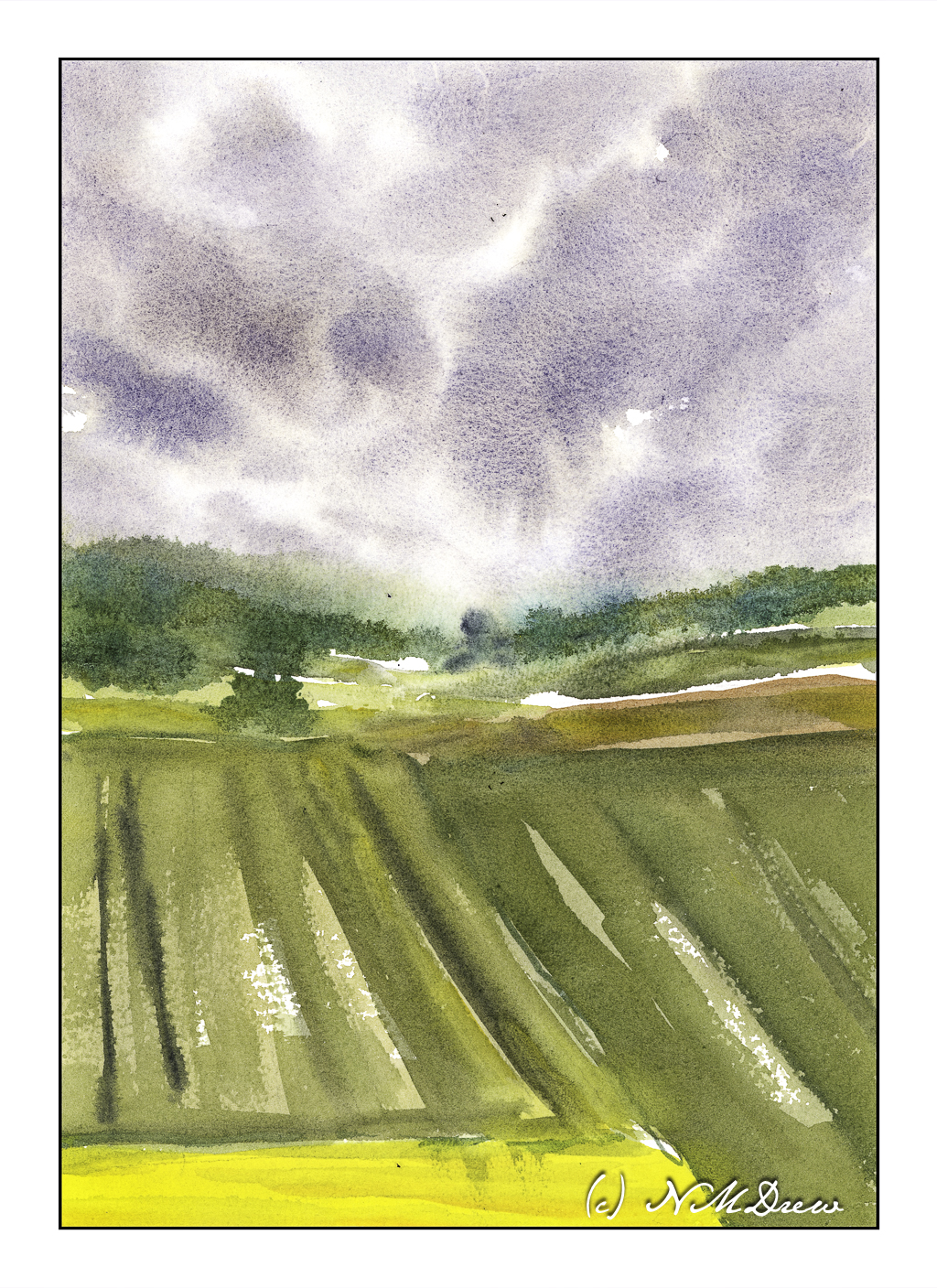
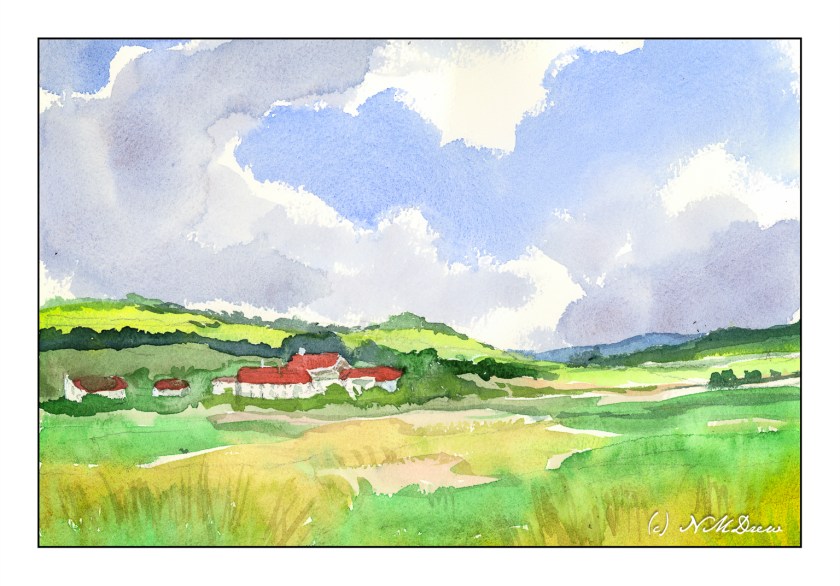
For some reason, Edward Seago wandered through my head as I was painting the first picture. I really like his paintings of the damp skies of the English coast. I figured a master(ish) copy of one of his paintings wouldn’t hurt. This is my copy of his “Farm Near Somerton – Norfolk” – not as simple as his, but the sky was the focus. Here, Arches rough paper, dampened, and then painted with dilute watercolors. As with the wet-on-dry painting, the Arches allowed more control than I have found on other papers, such as Bockingford.

Moving from Arches rough paper to Bockingford 140# CP paper is a different experience than with the Arches rough. The above painting is wet-on-dry, meaning the paper is dry. The Bockingford absorbed the water more quickly than the Arches, and this meant I had to work more quickly, moving the brush and colors more rapidly across the sky. It required a bit more forethought as to where I wanted to place colors. I could pause and think with the Arches. Not so here – I had to plot! Again, cobalt and light red in varying combinations, but a strong mixture to get the dark clouds.

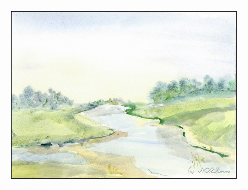
And finally, wet-in-wet on dampened Bockingford. I dampened the paper and let it sit a bit to absorb the water. As this was going on, I mixed very thin washes, mostly water and a bit of pigment. The initial wash was in the lower sky using raw sienna. The upper sky was cobalt or ultramarine, very thin as well. From there, everything else was painted with very thin paint onto damp paper. The dilute paint made for high key picture, so for a bit of contrast I added darker lines in Hooker’s green and Payne’s grey to paper in different degrees of dampness.

Overall, this exercise in paper and paint was a lot of fun. I learned a lot about the paper and its characteristics. Knowing your paper, just as you know your paints and brushes, makes the work of painting less work, if that makes any sense.

In conclusion, Arches rough allows more time to think and application of a lot more water than the Bockingford. Both are excellent papers with different qualities.

Now, go paint!

Rain Is Coming

Watercolor is a challenge, but I seem to finally be able to think about what I want to focus on, and work to meet and succeed, in varying degrees, my goal. Here, it is wet-in-wet painting. In watercolor this means working with very wet paint – a lot of pigment and a lot of water. This is not easy to control because you sort of have to know your paper and your paint and how wet or damp or dry the whole thing is.

For the sky, I wet the paper first and let it settle into the paper for a few minutes. Then, using a mix of mostly ultramarine blue and burnt sienna, I created a grey by adding a lot of water to my colors. I dropped the paint onto the paper and let it bleed into the water. As the paper dried, I made a stronger mixture of the grey – meaning darker – and dropped that into the already painted surface. With a bit of toweling I blotted up some of the paint to lighten areas as well as to give a shape to the clouds.

After that, I did the middle and foregrounds. Everything was done with damp paper and watery paint. No dry brush at all, just working with different degrees of wetness and color intensity.

Goals accomplished, I don’t think of this as a good painting but a good exercise.

Watercolor, Arches Rough 140# paper, 10×14.

A Frisket, A Frasket . . . .

I’ve been taking a basic watercolor course at the local adult school with one of my favorite teachers. I decided to do this as it never hurts to return to basics as it can be eye-opening. Here, one of our studies. This one made me rethink using frisket as a resist quite a bit, and while I may never really embrace this – using frisket to maintain white paper – I really learned a lot from this little study.

First, the teacher provided us with a template to use – namely the rose. We transferred it to our watercolor paper by using graphite on the reverse of the template. We were to outline the white areas and then, using the liquid frisket, paint out the white areas. This way we could apply very wet washes to the paper without losing our hard edges and white paper.

Once the frisket dried, we wet our paper around the rose. Colors were dropped in using viridian, quin rose, and phthalo blue. We kept our paper flat and worked relatively quickly. Once the outside colors dried, we moved into painting the rose. Wetting the rose, the colors were then applied using cad red light and quin rose. The violet was a mixture of blue and rose, but I also used carbazole violet as it is a very clean purple. Once more, paper kept flat as the colors dried.

From there, little details were added, such as leaves, extra contrast, and so on, all using various tricks common to watercolor. In the end, once all was dried, the frisket was removed and little bits of color added here and there over the white areas. Lines, bits of color.

And this is the result! It is an abstract and very watercolory and painterly rose. Techniques were wet-in-wet, masking with frisket, and some dry brush. I also splattered a bit of quin rose and carbazole violet onto the surface to make it a bit more interesting to my eye.

Watercolor, frisket, 10×10 Canson XL watercolor paper, wet-in-wet and splatters. Colors were limited to carbazole violet, viridian, phthalo blue, cad red light, quin rose, and a smidgen each of burnt sienna and cad yellow.

Water in Watercolor

Today I spent the morning running errands and doing chores, the afternoon playing with a friend and doing some photography. The day went by delightfully, but there is that need to pick up a brush and some paint. I wasn’t in the mood for trying to make a painting of anything, but the idea of waves and oceans has been going through my mind, and now it is time to get some ideas on paper. So, of course, YouTube comes to the rescue, and I found a nice, simple, easy video by Paul Clark.

Paul Clark’s videos are informative and easy to follow – as well, I like his presentation style and his paintings. In the above video, in 20 minutes, he shows how to paint water in increasingly more complex ways.

Above is just a simple, gradated wash, with the greatest density of value at the bottom of the page. From there, some paint is lifted, and while the paper is still a bit damp, more lines of color are painted into the blue, wider ones at bottom and more narrow at the top to suggest distance.

The next is reflections of trees on a lake. The trees and sky were painted first and allowed to dry. The water was then put in, using a gradated wash, darkest at the bottom. Time was given to put in suggestions of waves or reflections – this required waiting for the paint and paper to dry. The hair dryer is perfect for this. Watch how Clark does it in the video as it get a bit more complex than what I am describing.

The third one is done with one color of paint. I used a bit of what I had mixed on the palette – ultramarine and indanthrene blues. Clark’s painting is far better than mine, and we will leave it at that! I want to return to the video to watch it again as I know I worked really quickly – too quickly – to catch all the fine points.

From the ocean we now move inland, to an old bridge spanning a river. I think was my favorite one, and I was quite happy with my results. The white sparkles of light on the water is done by using a knife point to dig a bit into the paper. Techniques varied here; again, refer to the video.

Now, back to the beach. My painting is quite clumsy in a lot of areas. I rather like the sparkly water on the horizon, and the way my white gouache dry brush adds to sparkles. While my painting is definitely that of an amateur, I have a better sense of what to look for, to see, in a wave. The idea I had initially was to learn a bit about crashing waves, and this one is a good introduction to them.

Altogether, I spent about 30-40 minutes doing these studies. I watched and paused the video for each painting exercise, and then went to work. The goal is to do and practice, not create a beautiful work of art. The act of painting is what teaches me initially, and then I can analyze a bit more to hopefully create more successful whatevers – here, waves and water and reflections.

Practice is something a sketchbook gives room for – a playground to explore. Paul Clark’s videos are really nice and I do suggest them. Meanwhile, it is time to go to bed!

A Few Flower Studies

When you find an artist whose work you like, and who is also a good teacher, an online class can teach you a lot! The nice thing with videos is that you can watch them over and over, catching little things with each viewing.

Shari Blaukopf is a painter that I admire. Her watercolors are clean and fresh. She also has a really nice online personality, whether it is on her blog or in her recorded classes. I’ve made comments on her blog and she replies; I have uploaded a painting or two, and she is always gracious. One day it would be nice to take a class with her in person.

Anyway, I have / am taking two of her courses on flowers. One is painting wet-in-wet flowers, and the other is painting fresh cut flowers.

The above one is from the wet-in-wet flowers class. The paper is wet on both sides after the initial pencil sketch is done. The paper is then blotted. And from there, you go to town! It was really fun to see how the paper and paints all worked together. Not a great rendition, but the experience is the most important part as that is how you learn. My contrast issues are not too bad.

The hydrangeas are from Blaukopf’s course on fresh flowers. She does three different flowers – a blue salvia, then echinacea and black-eyed Susans, and finally the hydrangeas. I’ve done the salvia, but have yet to do the second one. I wanted to do the hydrangeas especially because of the delicacy of colors involved, as well as work on the contrast and negative painting, the latter which is just as much as a challenge for me as good contrast! Having been very frustrated with my colors always being too intense, this was also a good challenge for me with pigment and water control.

The past few days have been spent practicing free-motion quilting for a class this morning, so it was really a treat to wade back into painting. I love flowers, so painting them is the challenge, especially as I prefer a looser rather than more precise rendering of them. I think precision can be a lot easier than abstraction.