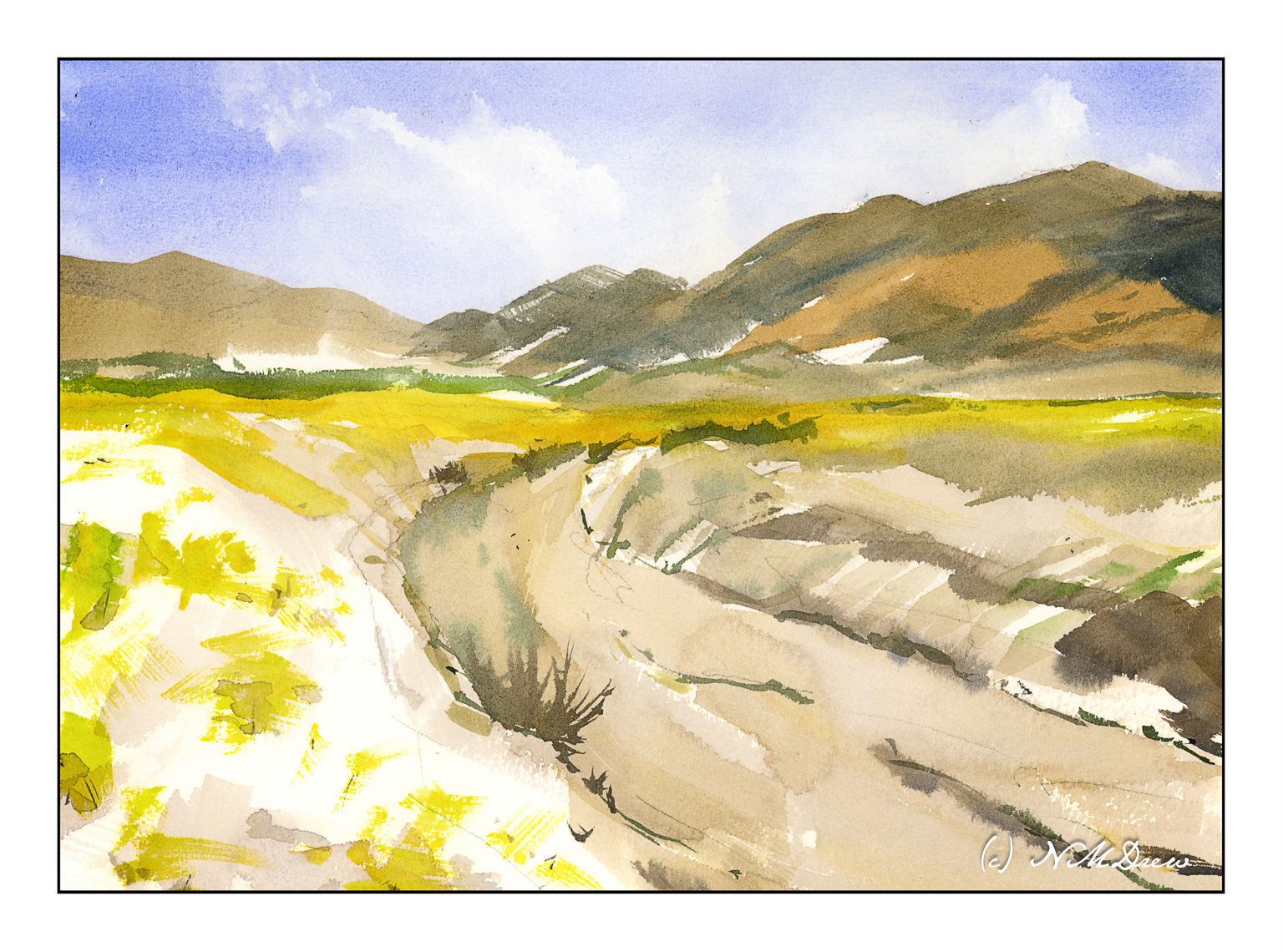
Another view of the desert in bloom. Rains bring out all sorts of wonderful things to see in Death Valley, from vanished lakes to tiny, colorful flowers which cover the sandy soil, before vanishing as the season changes and the heat returns.
I have been painting too much in oils – slow process, very satisfying, but it doesn’t come close to watercolors. I needed to take a break from it and return to my first love . . .
We have had a few good rains this year, and that can mean the desert blooms! The plain beige becomes green and flowers blossom. Sparse, harsh landscapes become far more gentle and welcoming. Death Valley was filled with life this year.
For most people, like me, who like to paint or draw but have little formal training, shapes can be challenging. I’ve taken art classes when I was in college, but the fact is, most American colleges fail terribly at providing practical knowledge to their art students. Too often the dictum is essentially “Go forth and create!” without any foundational information. In my adult school art classes, there is far more information to be had, and when I see fellow classmates from Asia and Europe with superb technical skills, I feel overwhelmed. How the heck do I get that?? But, on the other hand, they like my messy art and wonder how the heck to get that!
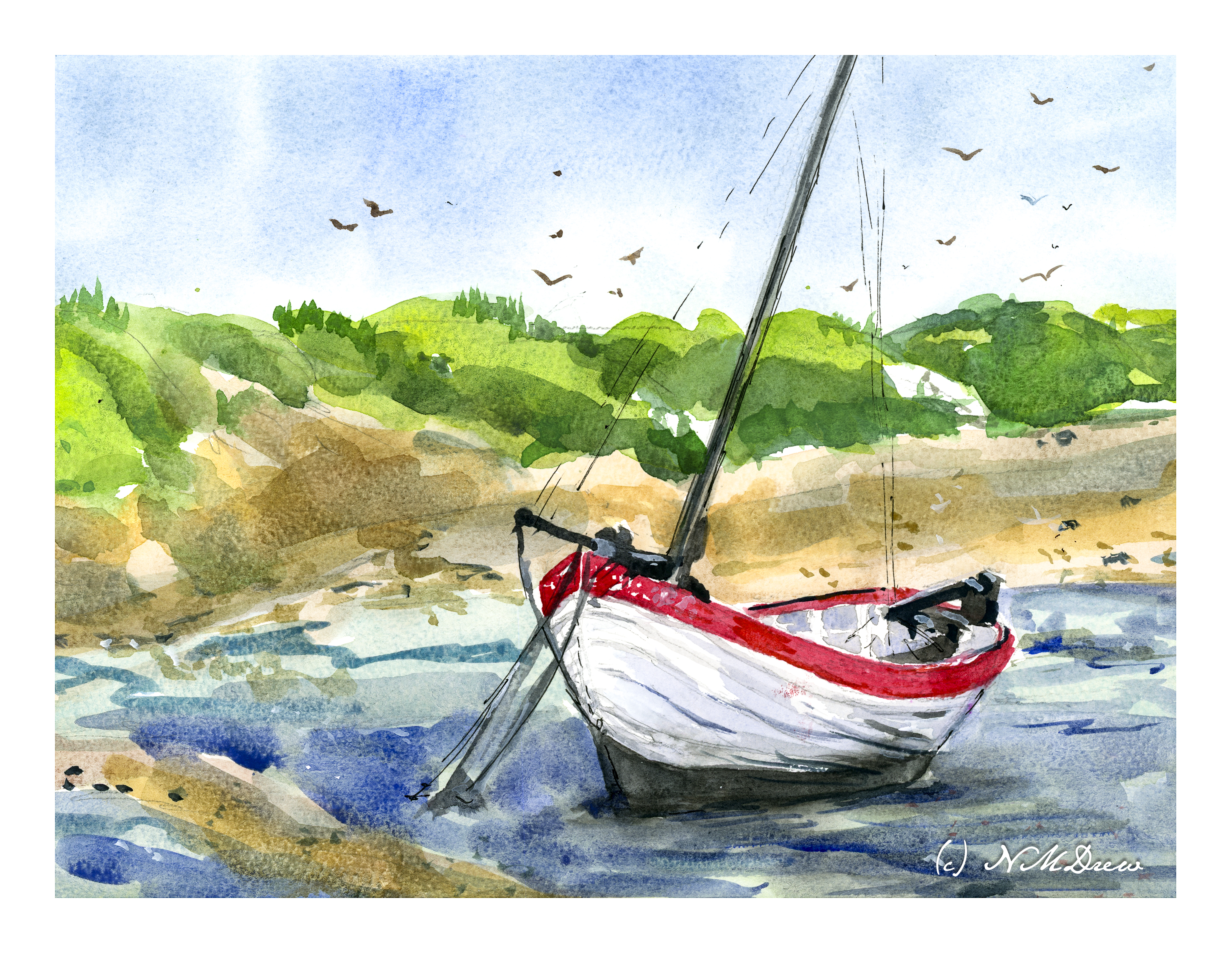
So, we are stuck. All of us. We all face challenges in how to do or express things with whatever medium we use. For me, shapes are most often the biggest challenge, and maybe that is because I prefer landscapes to people or buildings. I am working on meeting these challenges, and YouTube provides a lot of help in all areas confusing. My current challenge is to paint boats. I don’t have an easy way to get their correct shape.
So, enter YouTube and three methods to get a boat shape: figure 8, blocks, and a petal shape with lines and crosshairs. All work. The simplest is the figure 8 method, and that is what I applied here. I used a reference photo and then superimposed the figure 8 method to the boat. It took a bit, but below is the boat – a simple sailboat anchored at low tide.
I drew several figure 8 boats with pencil and paper, but painting one proved a bit of a challenge. It took awhile to get my mind wrapped around the image and then the figure 8. Going from figure 8 to boat with pencil and paper was easy, but looking at a real boat required more work. Still, not really displeased with the end result of the boat – she’ll float – and that is the point of this painting: a boat that looks real(ish)! As far as the rest of the painting? It’s just there for filler.
In a lot of ways we just take paper for granted. It’s everywhere. In the arts, though, paper can be more than important – it can be critical. Its qualities can determine how you work, what you do, and so on. In watercolor, paper sizing, texture, and fiber content all play a role. As well, how the paper is handled by the artist, meaning (in this post) how much water is used with the watercolor paints, and if the paper is dry or wet when paint is applied.
The other day, I was watching a YouTube video by an English artist whose work I enjoy: Andrew Pitt. In particular, I was watching how he handled skies with a limited palette of colors (Winsor Newton’s Light Red and Cobalt) and the paper he used. By chance, I have both of his choices – Arches Rough 140# and Bockingford CP (he has 200# and I have 140#). Arches is externally sized and Bockingford is internally sized. Arches external sizing creates a harder surface which does not absorb water as easily as does the internal sizing of Bockingford. You have to work more quickly with the Bockingford than with the Arches.
With this in mind, I decided it was time to tackle skies. I do them all the time, but it was fun to focus a bit more solidly on the subject of the sky itself as well as how wet-on-dry and wet-in-wet worked with the different papers. Watching Pitt’s video a did one thing in particular which he suggested: I kept my brush on the paper when I painted as long as I needed to create a specific area – the sky or a cloud.
In the above painting, as with Pitt’s sky, I used only Cobalt and Light Red. Here, I used Arches Rough and used a wet brush on a dry surface. First I did the sky in blue. Rinsing the brush a bit, I mixed Cobalt and Light Red together, varying the amount of color and pigments. The lighter greys have more water, the darker greys have more pigment. The white is clean paper without any paint.
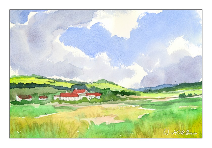
For some reason, Edward Seago wandered through my head as I was painting the first picture. I really like his paintings of the damp skies of the English coast. I figured a master(ish) copy of one of his paintings wouldn’t hurt. This is my copy of his “Farm Near Somerton – Norfolk” – not as simple as his, but the sky was the focus. Here, Arches rough paper, dampened, and then painted with dilute watercolors. As with the wet-on-dry painting, the Arches allowed more control than I have found on other papers, such as Bockingford.
Moving from Arches rough paper to Bockingford 140# CP paper is a different experience than with the Arches rough. The above painting is wet-on-dry, meaning the paper is dry. The Bockingford absorbed the water more quickly than the Arches, and this meant I had to work more quickly, moving the brush and colors more rapidly across the sky. It required a bit more forethought as to where I wanted to place colors. I could pause and think with the Arches. Not so here – I had to plot! Again, cobalt and light red in varying combinations, but a strong mixture to get the dark clouds.
And finally, wet-in-wet on dampened Bockingford. I dampened the paper and let it sit a bit to absorb the water. As this was going on, I mixed very thin washes, mostly water and a bit of pigment. The initial wash was in the lower sky using raw sienna. The upper sky was cobalt or ultramarine, very thin as well. From there, everything else was painted with very thin paint onto damp paper. The dilute paint made for high key picture, so for a bit of contrast I added darker lines in Hooker’s green and Payne’s grey to paper in different degrees of dampness.
Overall, this exercise in paper and paint was a lot of fun. I learned a lot about the paper and its characteristics. Knowing your paper, just as you know your paints and brushes, makes the work of painting less work, if that makes any sense.
In conclusion, Arches rough allows more time to think and application of a lot more water than the Bockingford. Both are excellent papers with different qualities.
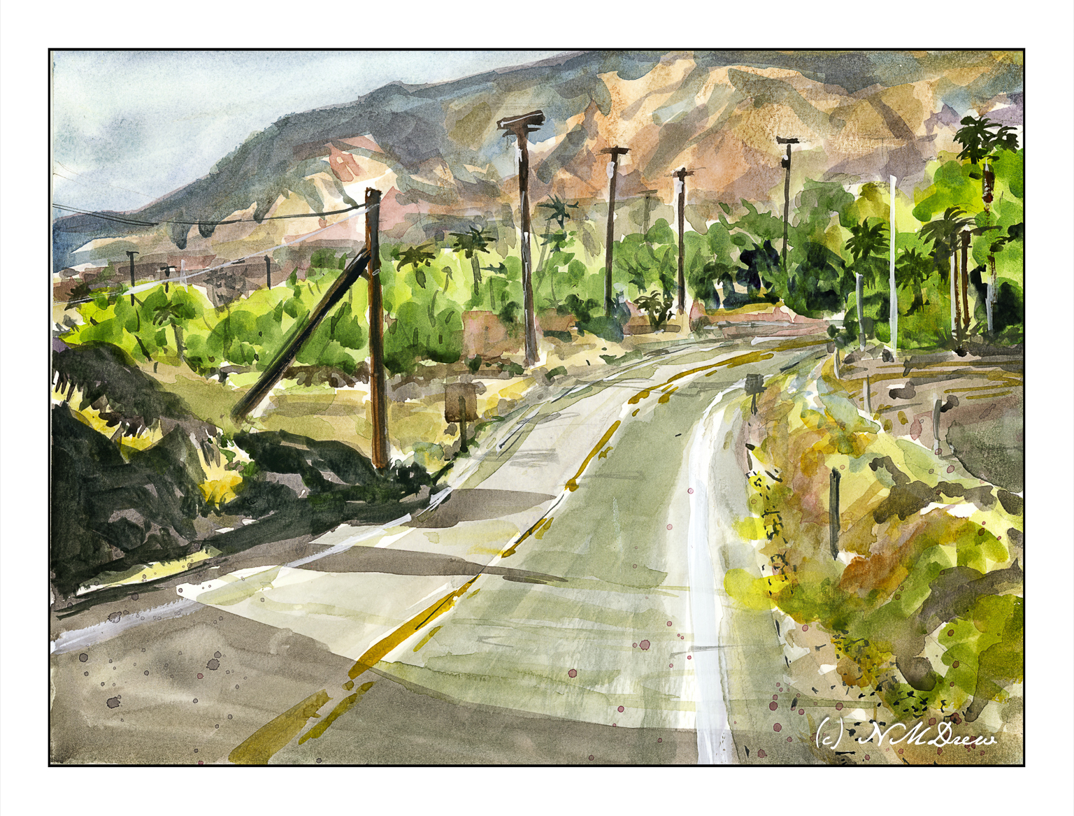
The southeastern corner of California is primarily desert. The land varies. There are hot springs, mountains, little rainfall, sparse vegetation. Days can be hot, nights can be cold. Within it are contained major parks and areas, which include Mojave National Preserve, Joshua Tree National Park, Death Valley and the Anza Borrego Desert State Park. Farming here is supported by irrigation from the Colorado River, but as times go by, the Colorado is not able to support farming as it once did. Despite its rather hostile environment – at least to people in some ways – this part of California is stunning. Its austere beauty is something perhaps not appreciated initially, but with time and observation, it becomes a magical landscape. There are towns, too, where you can stay to visit and learn a bit about the desert and its land and people.
This afternoon was a sort of what-do-I-want-to-do day. I really didn’t know. The winds are up right now, and anything done outdoors would require hanging onto everything. So, an indoor watercolor rather than an outdoor oil painting was my choice. And as far as any planning – well, let’s just say I did this on the proverbial wing and a prayer.
Overall, I blocked in the major color areas, using lighter colors. First came the sky, then the mountains of blue and orange brown. The road was limned in, along with the greens of the vegetation. Once dried, details were added. I used the hair dryer a lot! Finally, white gouache here and there, splatters of reddish and bluish paint, and here we are.
I am quite surprised that it turned out as well as it did – at least in my opinion!