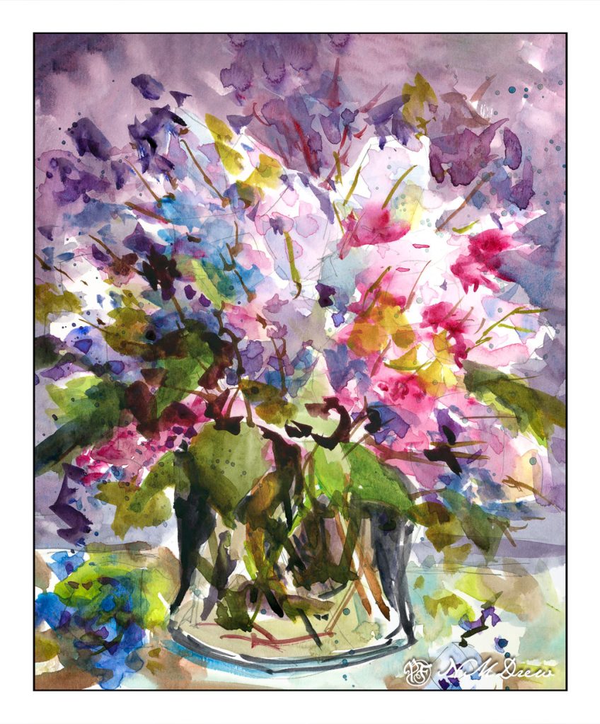
Masses of color to create suggestions of shapes? Check.
I am pleased with this painting – there are areas which could be better, but is any painting actually “perfect”? Certainly not in watercolor!
Lilacs are one of my favorite spring flowers. Their fragrance is heavenly and a welcome sight as winter fades away. Sadly, it seems hybridizing them for a coastal SoCal climate is not successful.
I drew the flower masses in pencil, creating general shapes. A few pointy leaf shapes. A glass vase. Dropped petals. From there, the rest happened with lighter washes of color, white areas left behind, and eventual deepening shades of lavender, purple, and pink. Some blue, too. It sort of happened all over rather than section by section.
And then my next painting was a complete disaster!!
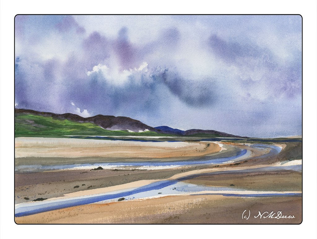
Yesterday’s painting got rather fussy when I looked at it this morning. So, determined to work on simplification, I decided to use a huge brush for the most part. Again, Kilimanjaro 300# 11×15 paper from Cheap Joe.
To keep myself in a “logical” sequence, I worked top to bottom after taping off the horizon line to keep it straight. (Yesterday’s painting needed to be straightened up when scanned – it was going uphill!) It worked with very little seepage into the other half. So, sky first, wet into wet, blotting as necessary, using a spray bottle to coax color and water, tilting the paper this way and that. Then the blow dryer.
One the sky was to my liking, I did the islands in the distance, again focusing on simplicity and distance. Not gonna get fussy! It worked. Then, the blow dryer.
I didn’t draw the water or sand. Instead, I used the big brush to delineate the sand and rivulets of water from the sea. To pull the painting together, I used glazes and washes, mixing in colors from sky and islands into the sand. I put a few details in with a very fine brush, using some tiny dots to represent sand, and larger blobs of brown / blue to make stones and pebbles and other bits of detritus.
While this is not my favorite painting of late, it is perhaps one of my more successful watercolors. It doesn’t feel overworked and the colors reflect the overcast, wet day. Wet, wet skies are always fun and a crap shoot, but a delight because watercolor is not predictable and has its own beauty. I think I would like to wander here a bit more . . . .
If you think that the SoCal coast can be foggy, Oregon is by far more foggy at times! It’s an incredibly beautiful coastline with wide, nearly empty beaches. Out to sea are the sea stacks, some large, some small. In clear weather they are stunning, in the fog, spooky and eerie.
Today, a limited palette and paying particular attention to laying down water and thin colors. Washes are the dominant technique used here. My little picky brush strokes had to give way to broad ones for the beach and damp sand. It actually worked fairly well. Water, water, everywhere!
More wet-in-wet work. This time, I paid a bit more attention to the details along with the wet paper and paint. I laid down washes, waited for them to dry, and then laid down wash upon wash. At times I lifted color out while still wet, too. It’s hard to describe what I did, but overall I was more deliberate in my approach to this painting, taking time rather than letting my impatient personality dominate. The result is a more successful painting.
Colors include burnt sienna, Hooker’s green, ultramarine blue, quinacridone gold, and perhaps a touch of sap green and cobalt blue. Limited palettes really help pull a painting together, as well as help you learn what colors, when mixed, produce what new color.
Brushes included a huge round for the main washes, and then a medium / small round, and a rigger brush for the grasses. I got the rigger as a Christmas present, and this is the first time I used it. I practiced on scrap paper, and can see why a lot of people like them! This one is a bit stiff and has a lot of snap to it.
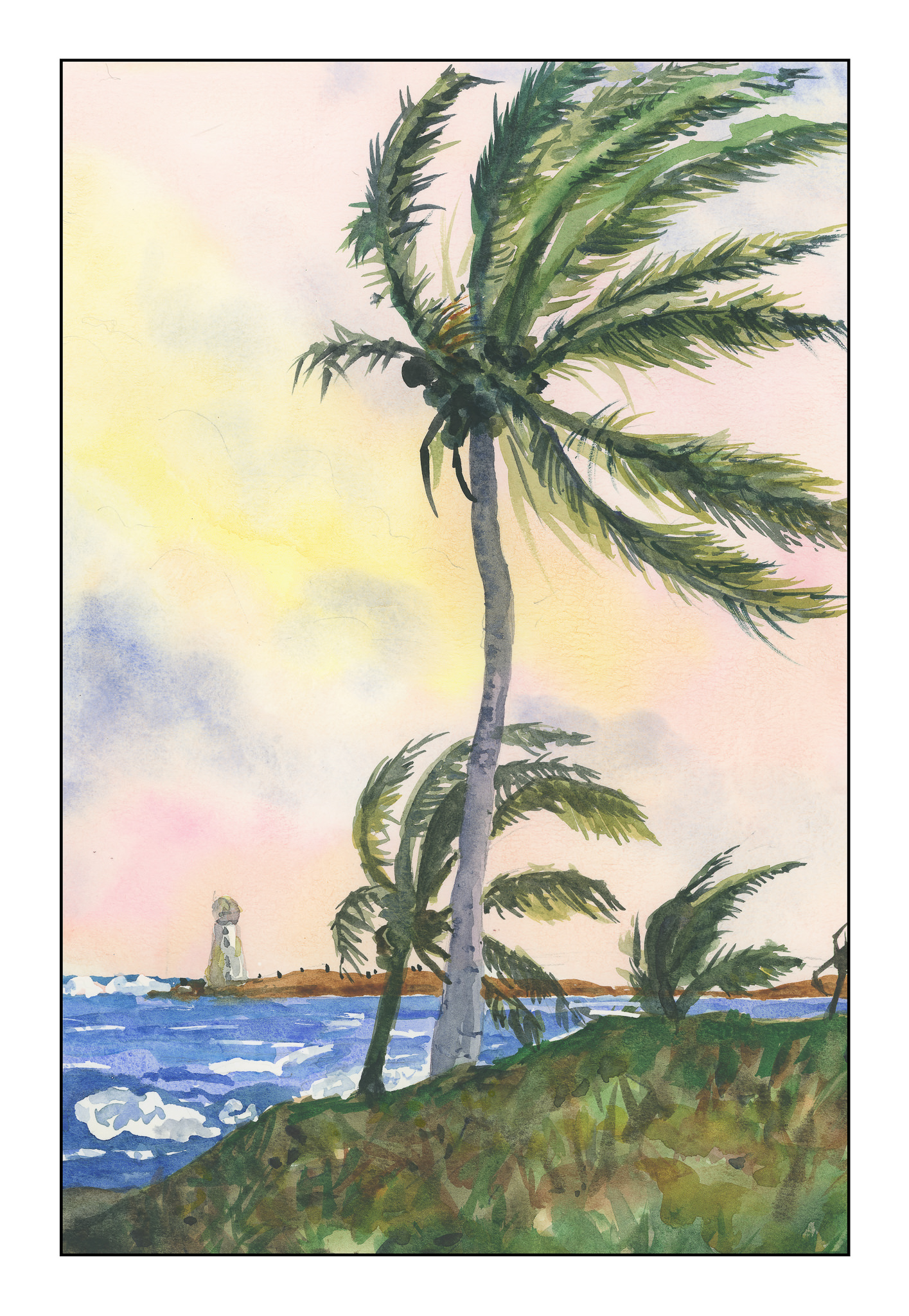
A couple of things here. First, I think that Winslow Homer is an amazing painter, especially in watercolor. Second, I think that copying the work of a master forces one to study what is in front of you – how was this done? what technique?
As Homer is a master of skies and atmosphere, I spent some time the other morning looking at different paintings he did. Especially delightful are his paintings done while in the Caribbean, spending time in the Bahamas and other islands. Homer’s skies are vast and expressive, subtle and strong. I decided that his painting, The Palm Tree, Nassau, would be a perfect study. What was most interesting was seeing how differently the same picture looks on different sites – some make it very murky, others make it very colorful. Below is Homer’s painting:
The Palm Tree, Nassau (by Winslow Homer)
I printed out a copy of this painting on my not-too-high-end color printer. In the end, I referred to it more for composition rather than colors or detail. This image shows the sky with blues in it, but other images on the web gave the sky reddish and yellowish undertones. In the end, I just did what I wanted.
The water could have been more turquoise, as is the water in the Caribbean; the foreground in Homer’s painting is some weird vegetation that I couldn’t figure out, but think it is typical for the scrub of the islands. If you look at Homer’s painting, there is a reddish blob by the lighthouse – what is it? Looking closely, you can see it is a flag. For me, it was a big distraction, so I left it out. Also, Homer’s rendition of the lighthouse is very simple – I decided to give it a bit more detail.
Copying this painting was a lot of fun. The sea was rather meh, but Homer’s is not especially spectacular. His palm trees, though, are divine. Since I live where there are palms, I really liked the idea of actually attempting to paint a tree – or trees – that are rather intimidating. Homer’s painting catches them snapping in the trade winds – you can just hear them clacking their fronds against each other. I hope that my fronds convey the same sense of sound and movement.
Techniques used in this painting were wet-in-wet for the sky, light washes moving into darker ones for the foreground, and layers of colors for the palm fronds and coconuts. I took some long looks at what was in the painting before me and felt confident enough to figure out what I think Homer did. For the white of the waves and lighthouse, I cheated and used frisket. Then, after it was dried, I laid in the sky, and then moved to other areas, working lighter to dark, some detail to final details, depending on what was going on. Altogether, I spent about 3 hours doing this study.