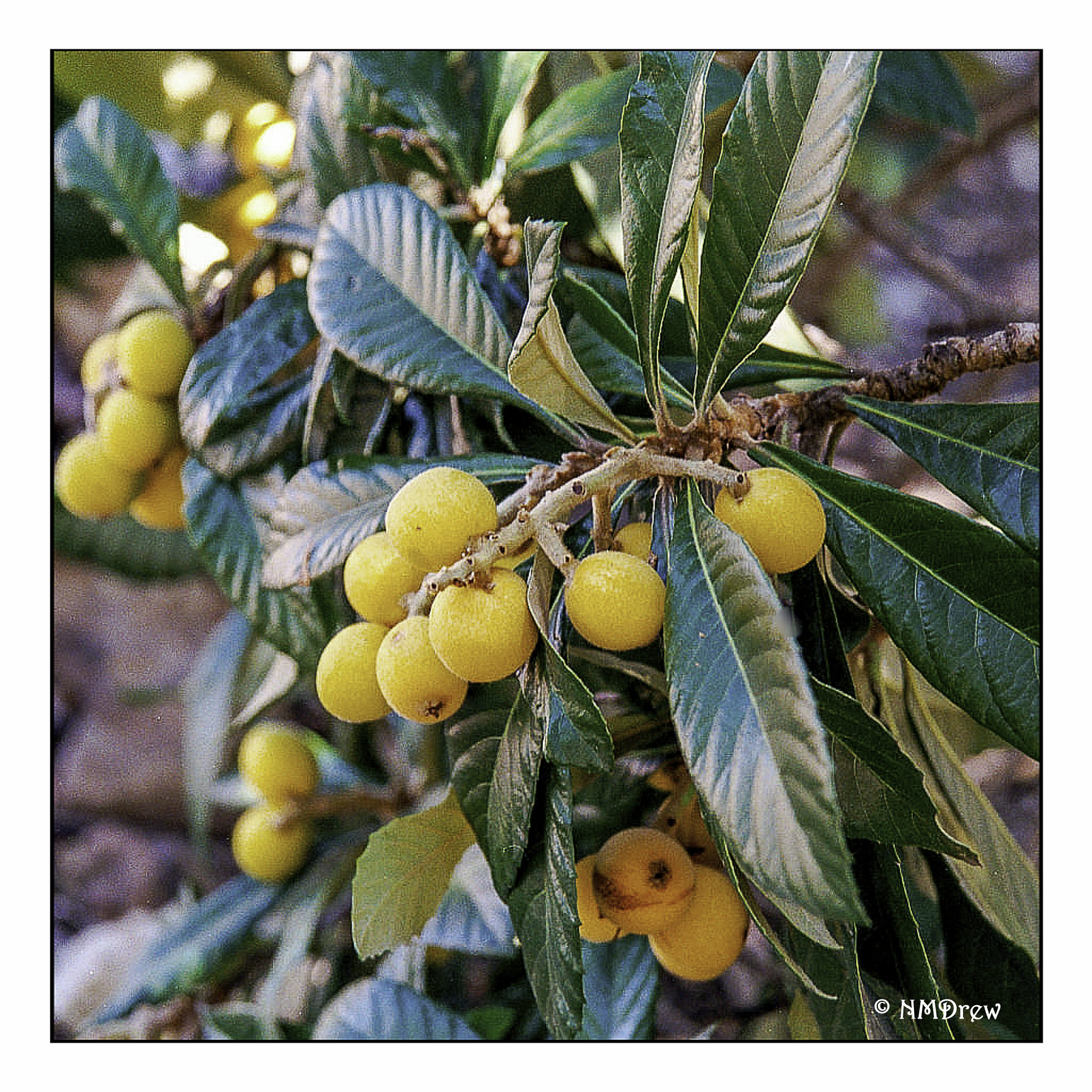
I love loquats! They are an odd fruit to most Americans, but they have a mild taste, beautiful seeds, and are borne on bushes or trees with glossy leaves. Over time, I have taken many photos of them and painted or drawn them.
I don’t remember where or when I took this photo, but it really shows the loquat in its full beauty. The fruits are pale yellow to a more deeper orangish color.
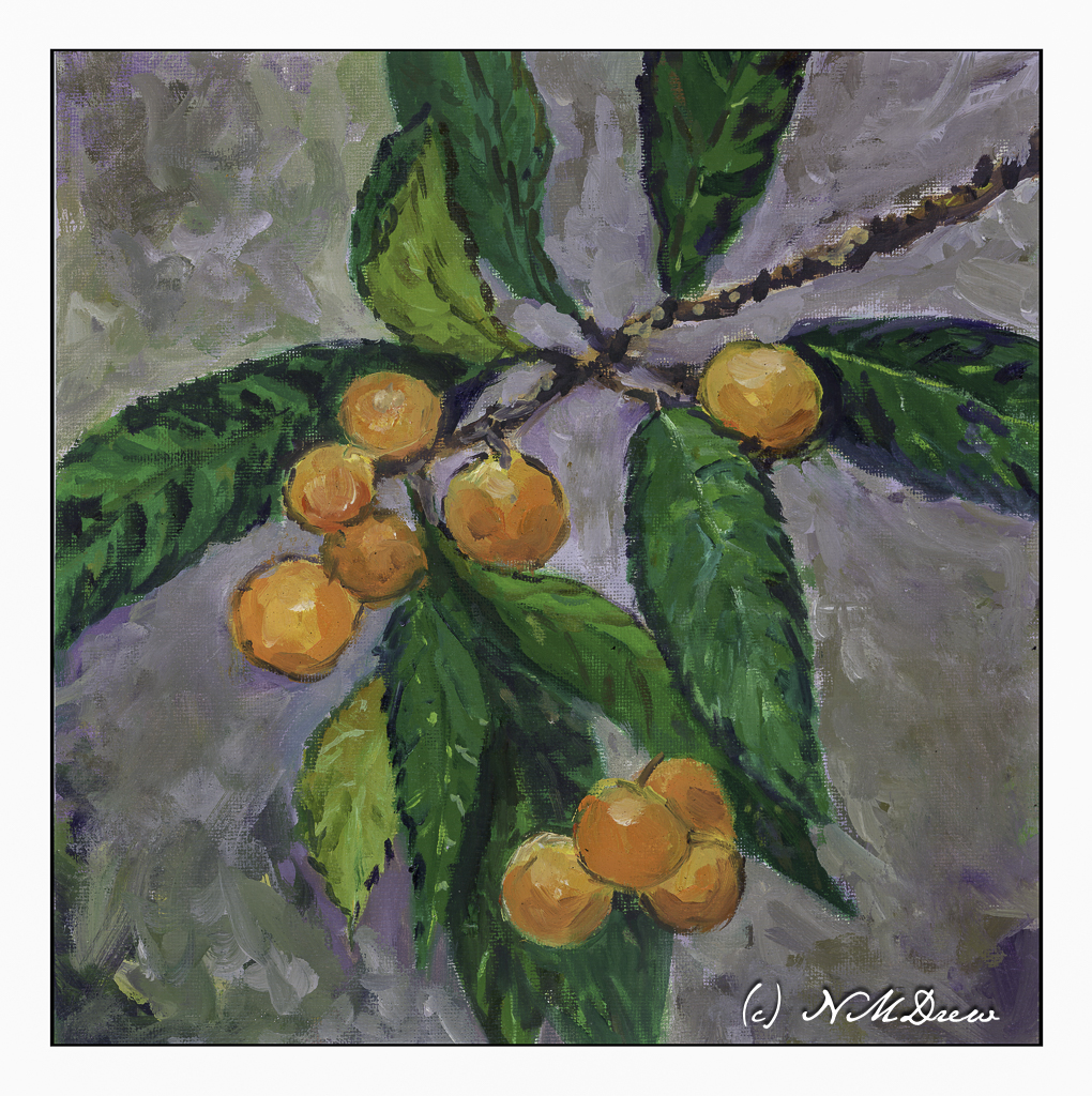
This is my most recent rendition of loquats, done in oil on a 12×12 canvas panel.
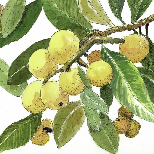
Above is one done in pen, ink, and watercolors.
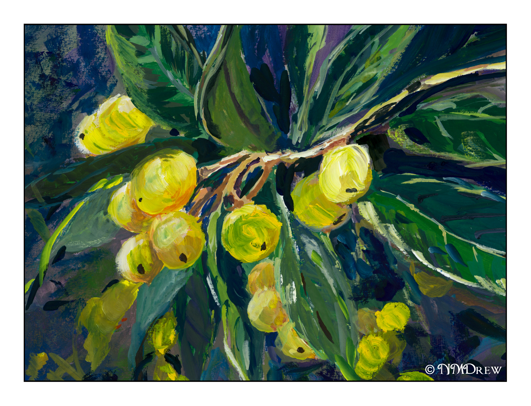
And the above is done in gouache.
The round shapes against pointy, glossy leaves is always a pleasure for the eye.
Gouache, oils, watercolor, pen and ink on various surfaces.
I just realized that if I want to do good – in my eyes, of course – or better ink and watercolor drawings, I need to work a bit more on my colors. For many years my colors were anemic and paintings ended up pale and wan. To compensate, I made my colors more intense – more pigment, less water. However, I think if I really want to do ink and wash, I need to learn to moderate the color intensity a lot. Next painting I do will have color swatches on another piece of paper before applying them to the paper.
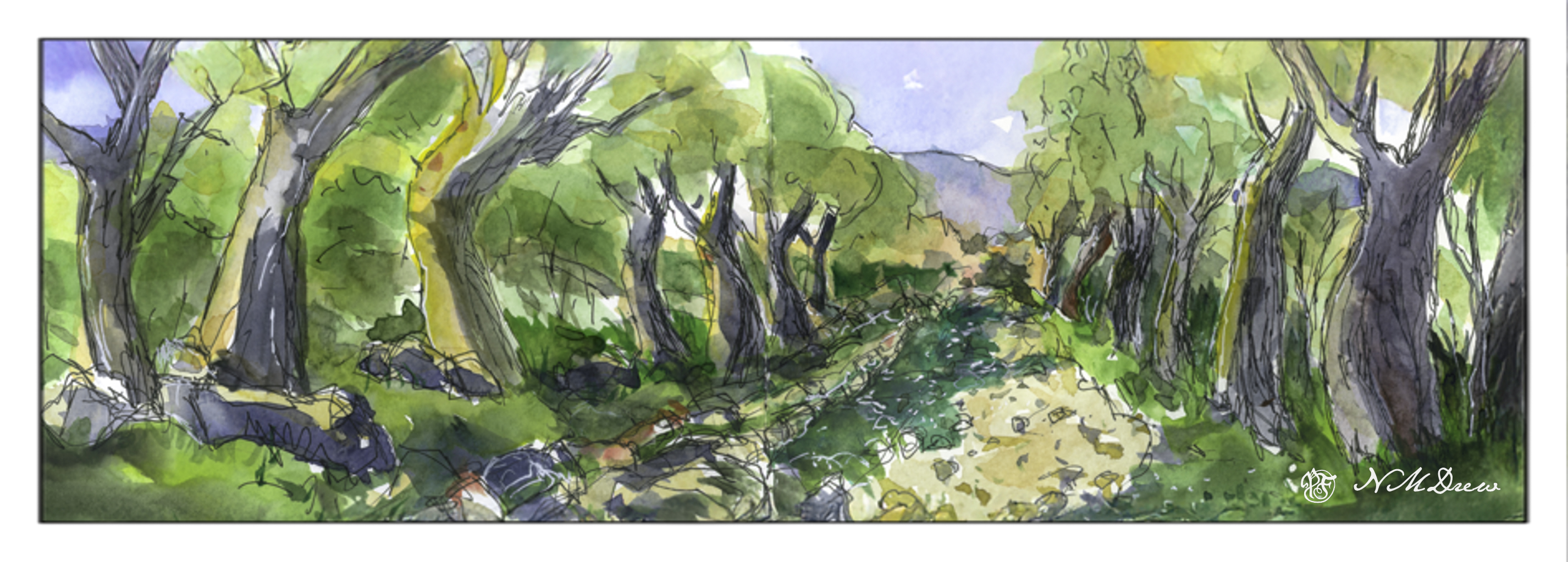
This is a very contrasty painting – and it doesn’t really play well with the eye. The shadow along the dirt road, on the left, is too green. The darks between the trees, from shadow and overgrowth, are not well done. I liked the ink drawing but think I could have made better color choices. Unfortunately, when you use a limited palette of only 10 basic colors, color mixing becomes a bit of a challenge. That is not to say these were not good quality paints – they are Schminke pan paints which are very intense – but I need to work more with moderating the colors.
Well, I didn’t paint anything yesterday, but I am beginning to work on cleaning up and getting rid of stuff. Yesterday I worked in the garden, straightening things up, getting rid of debris, and taking apart the drip system. With fewer plants it is unnecessary. This morning, sorting through clothes and mish mash in the in the garage.
However, painting continues!
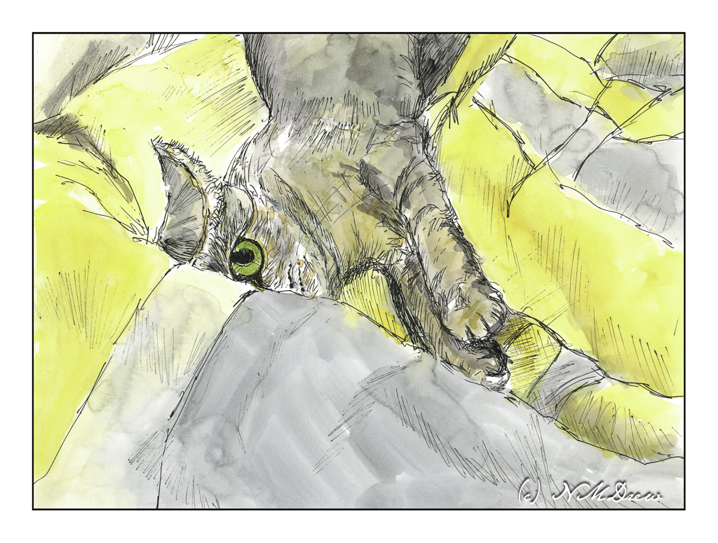
Sketchbook across 2 pages, about 6×16 inches; ink and watercolor.
Another pleasant break to be had yesterday afternoon! Tasks and chores shucked and done; dinner to be prepared. In between, back to Shari Blaukopf’s short course on ink and pen and drawing.
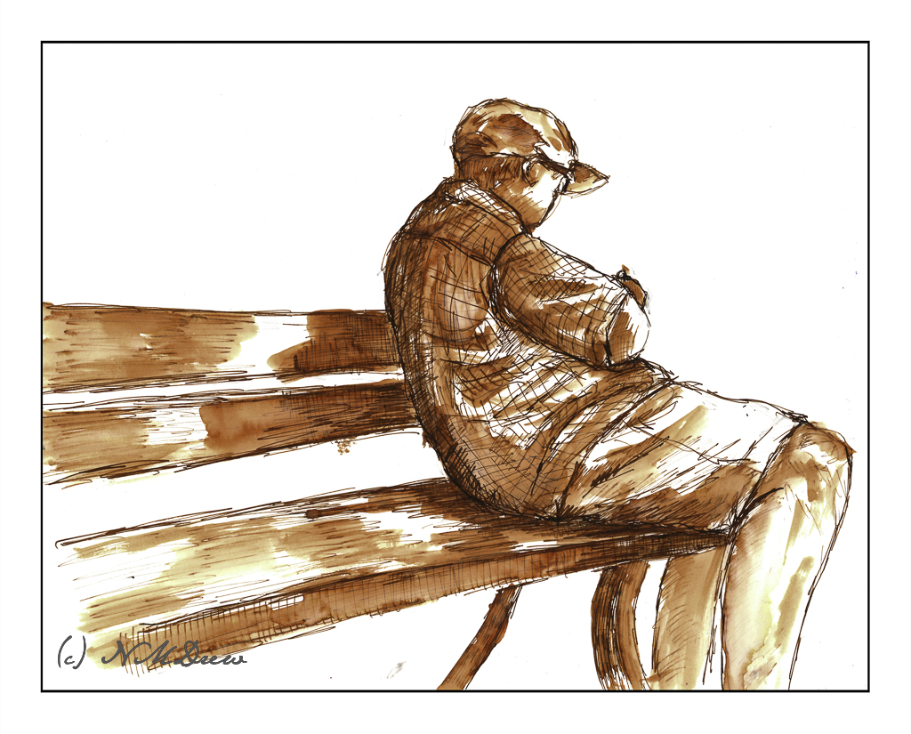
I tackled the section on drawing people, and I think I accomplished my task quite well. As always, a few good tips really helped move my sketches into more successful areas – in particular the one about getting the shape of the shoulders correct and then moving up and down the body as needed.
The hands in the above drawing are not at all good, but such is life. The basic drawing was done in pencil, which I did not erase after applying the ink. The line drawing was done using Sailor’s black pigmented ink, and the washes were done with India ink, diluted to make the washes.
From there, we moved on to water soluble ink in color. The color Shari used, and which I bought, is called Ancient Copper. The pen I used is my trusty Spencerian nib in my vintage Edwardian pen hold made of silver (yeah, posh!). The Spencerian nib is great as it provides a very fine line, but with pressure yields a good thick line.
Looking at my signed and scanned image, it looks like there is black ink used here, but there is none. It just shows how scans can mutate color, but also just how variable the ink itself is – from on the nib, to dissolved with a brush dipped in water and applied across the lines.
First a pencil drawing, then outlines and cross-hatching with the pen. Darker areas have more hatching. Then, let the ink dry and erase the lines with a kneaded rubber eraser. From there, a brush dipped in water to create the lights and darks by applying it over the lines. Areas with more lines = darker areas. Then, while the paper was damp or dry, I used my dip pen to apply more ink. In particular, I used it to outline the man, his clothes, and the edges of the bench. This helped emphasize contrast and to help separate different areas of the drawing from other areas.
Bristol paper, 11×14, India ink, Sailor pigmented black ink, Ancient Copper ink, Spencerian dip pen, brush.
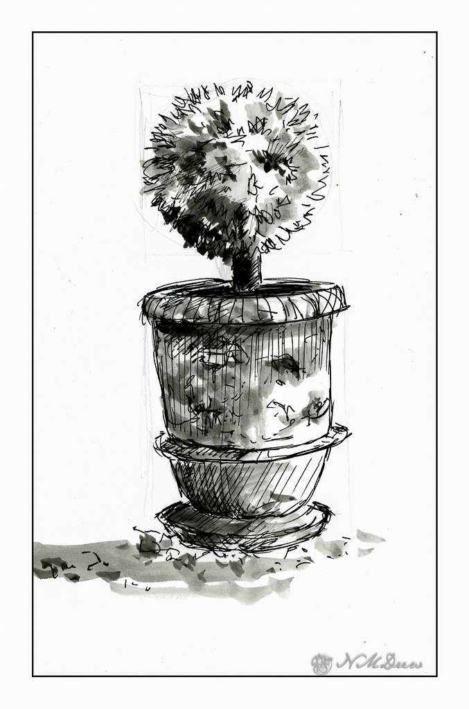
I think I have purchased every single course that Shari Blaukopf has online! She is such a good teacher, puts together short and affordable courses, and I always learn a few things – or oodles of things – from her! Her latest one is “Sketching Techniques with Pens and Inks” which you can check out here. I do a lot of pen and ink, but figured I would dip into this one just to see what I could learn. And, I did – such as a more clear way to view things from eye level. Ellipses become more round below and above eye level (duh!), and she explained it in a way that made me review my own way of drawing a bit, and perhaps will help me solve some perspective problems.
So, this first one is a potted plant in a planter somewhere in France. It’s a cool planter, too. Shari pointed out that it is good to begin with the big shapes and determine ratios. Top is a circle for the pruned tree or bush. Make a square, insert your circle. Below is the trunk, and beneath that is a large rectangular shape which you can divide into upper pot and lower pot, as well as the stand. Texture a bit for the gravel and stones upon which this planter stands. Shari put in light pencil lines, which she later erased in her video, but I left these in. You can see them very lightly in the painting. Contrast and shape coupled with expressive lines and here we are.
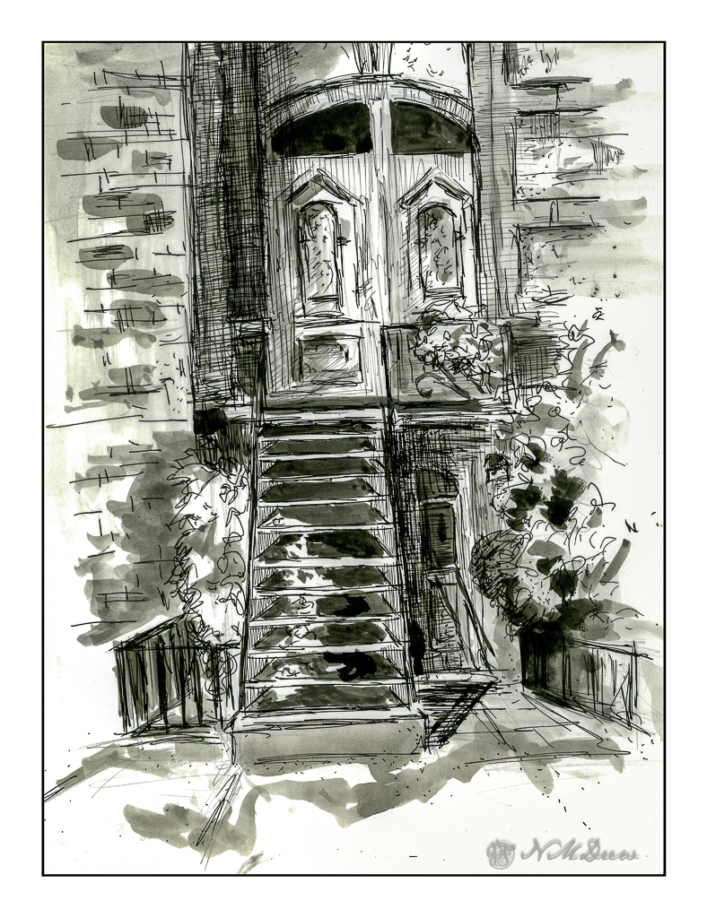
The Victorian door is considerably more complex than the planter, but once more Shari’s clear instructions helped me set up the proportions to make things work. Both the planter and this door came with reference photos, which is very helpful because things can become a bit confusing. This subject was definitely a challenge.
The detail in this subject matter makes for a desire to put it in – one of the good things about pen and ink – but I also needed to make sure I did not lose a sense of light and dark. I used waterproof ink, but to get the greys I put a bit on a plate and used it straight or diluted it as needed. I check the values to the side of the drawing before inking. Lines and dots also add to the texture and contrast of the drawing.
I like my potted plant as it works well with contrast, value, and textures. The Victorian door is more complex. Under the stairs is a second door, and I may go back in and fictionalize it a bit or darken it a bit to the right of the stairs. Something to look at and rethink.
Sailor black ink; fountain pen with Sailor ink; water and brush. Strathmore Bristol paper.