Tulips in a Glass Vase

Flower paintings are some of my favorite things, just because I like flowers.  Painting them is another story.  Tulips are such cheerful, seasonal flowers, appearing in the market for a short time; I always have to buy a bunch or two or three.

Determined to paint a vase and water with stems, to really look at them, I put the tulips in a rather coarse, rectangular glass vase.  The edges of the vase are wavy, and it is far from perfect, which gives it a rather pleasant charm.  It seems I rather avoided the stems – my picture got too big!  I’ll give it another try later.

Parts of this painting work, but overall it feels rather labored in appearance.  I’m not quite sure why – maybe too many glazes took away a sense of spontaneity as well as clumsy negative painting.

Just A Bouquet

Yesterday was one of those days filled with things to do, with more things to do added last minute.  Toward the end of the day, I really was not in the mood to do much more than veg out, be a blob, and sink into a stupor.  Nonetheless, I girded up my proverbial loins, and sat down with an imaginary bouquet in my head and a reference picture for light and shadow to use with the imaginary bouquet.

I didn’t set out to do too much – but in the end, it worked out pretty good.  I kept in mind light to dark.  I also kept in mind working over the whole painting, shifting back and forth from one area to another, and applying a hairdryer when things needed to dry out a bit more than my patience was willing to wait for.  All of a sudden, I swear, my mind said, “Hey, let’s paint around these flowers!”  There were not any flowers in that area, but I did negative painting without too much thought.  Wow!  That was a big shift for me – I’m still quite the newby in this area.

So, here we are.  Colors include sap and Hooker’s greens; Payne’s grey; ultramarine and cobalt blues; hansa yellow; quinacridone rose.  There may be a few others.  I used one brush, too.  The paper is Fabriano’s 100% cotton Artistico, and that alone helped a great deal – evident as the other side of the paper was already used for a wash-heavy exercise!

99. Carnations & Chamomile

The other day at the store I picked up small, individual bouquets of chamomile and red carnations (probably really dianthus, a member of the same flower group).  The leaves of each are vastly different, with the chamomile more “leafy” and the carnation’s longer and pointy.  I took my time with this painting this morning – took a photograph of the flowers – and studied things a bit before diving in.  I didn’t do a value study, but tried to determine value from the photo.

I began with an overall wash for most of the areas with color – greens, reds, and yellow dots.  From there, negative painting and deepening colors in an attempt to show depth.  Not quite there – a bit too tight for my tastes – but I do feel it was a moderately successful study.  Waiting between the washes was a bit trying on my patience!

Sunday Morning

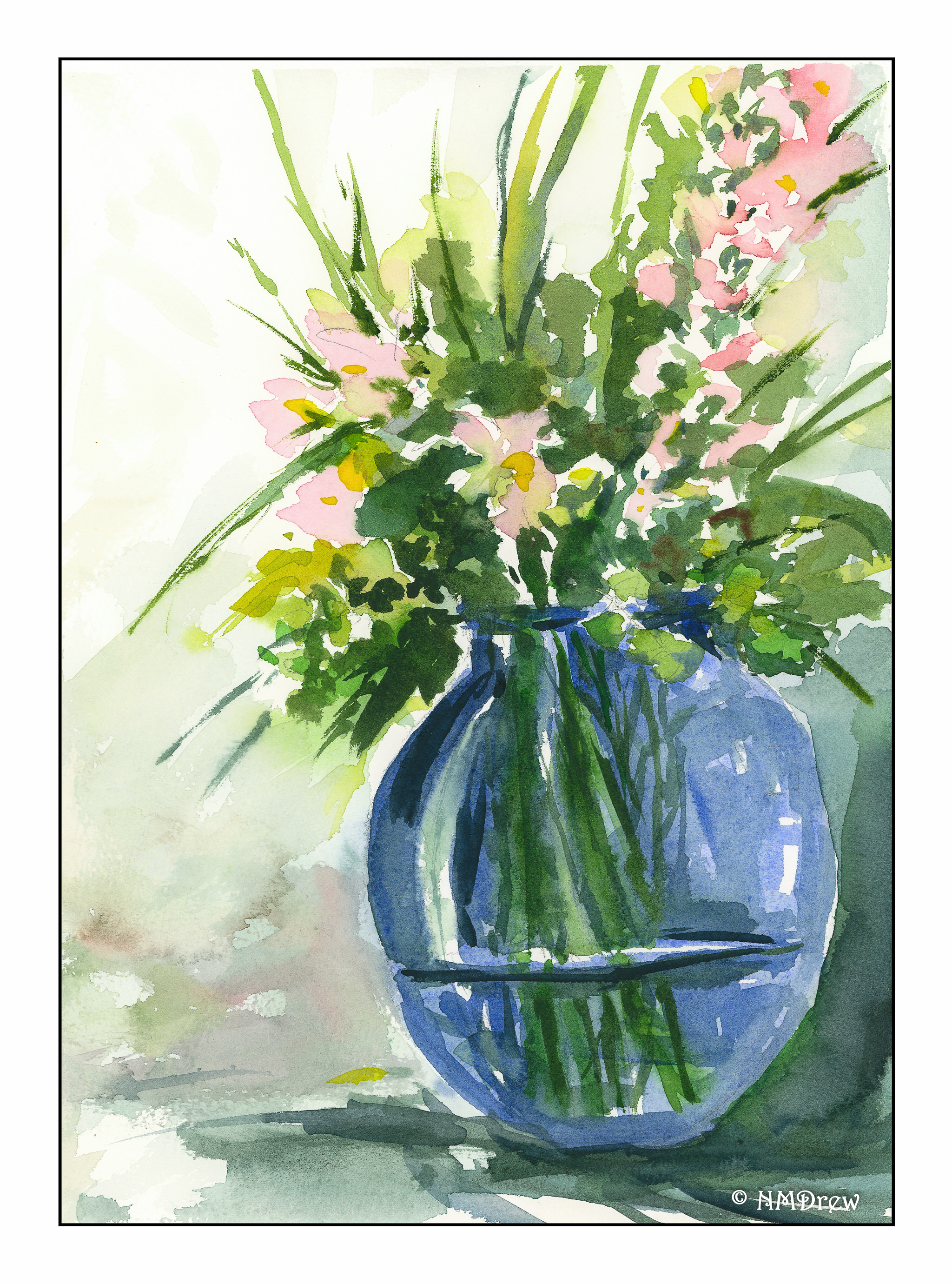
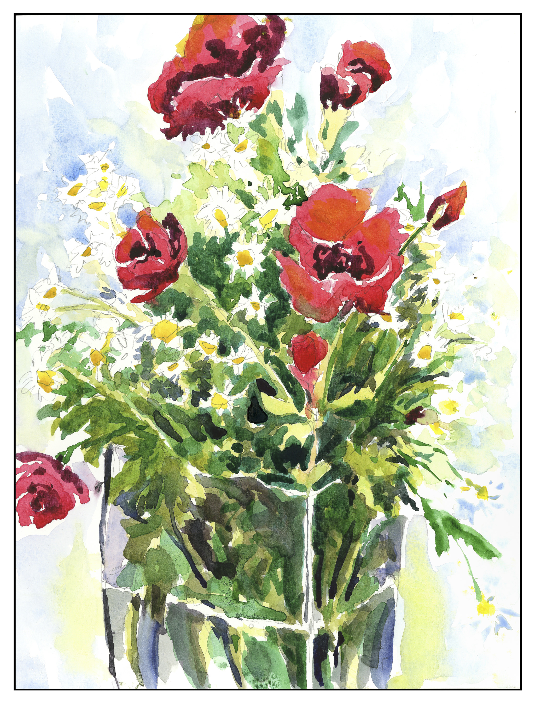
This morning I had one goal in mind:  paint.  With a gloomy sky here on the California coast, the damp and cold penetrate you to the bone.  Once it leaves, it’s a great big sunny day ahead!  So, while waiting for the fog to dissipate, I took a few pictures of a bouquet I put together of chamomile flowers and small, red carnations in a rectangular glass base.  I didn’t do a value study because I wanted to look at the colors – light, dark, and so on – to see what I could produce.

I penciled in the basic drawing, took some notes of the colors and mixed this and that, testing them on a scrap of paper.  Looking at the vase, I saw the different shades of color through the glass with water and without water, as well as the water line and edges of the vase.  Chamomile leaves are multi-lobed and floppy; carnation leaves are rather spiky.  Chamomile flowers are happy, daisy-like flowers, and quite small.  Carnations are upright.  Both are really lovely!

Process was like my last two flower paintings – start with the large areas of color and move into details.  Overall, it worked here, until I started getting into the hodge-podge of leaves.  I think I should have simplified their masses of color, but I didn’t.  I like the negative painting I accomplished for the chamomile flowers, as well as the edges along the bouquet where the white flowers have to merge into something.  The carnations were far more difficult than I thought, and once more, I made something more complicated and tight than I would like to see as “my” style.

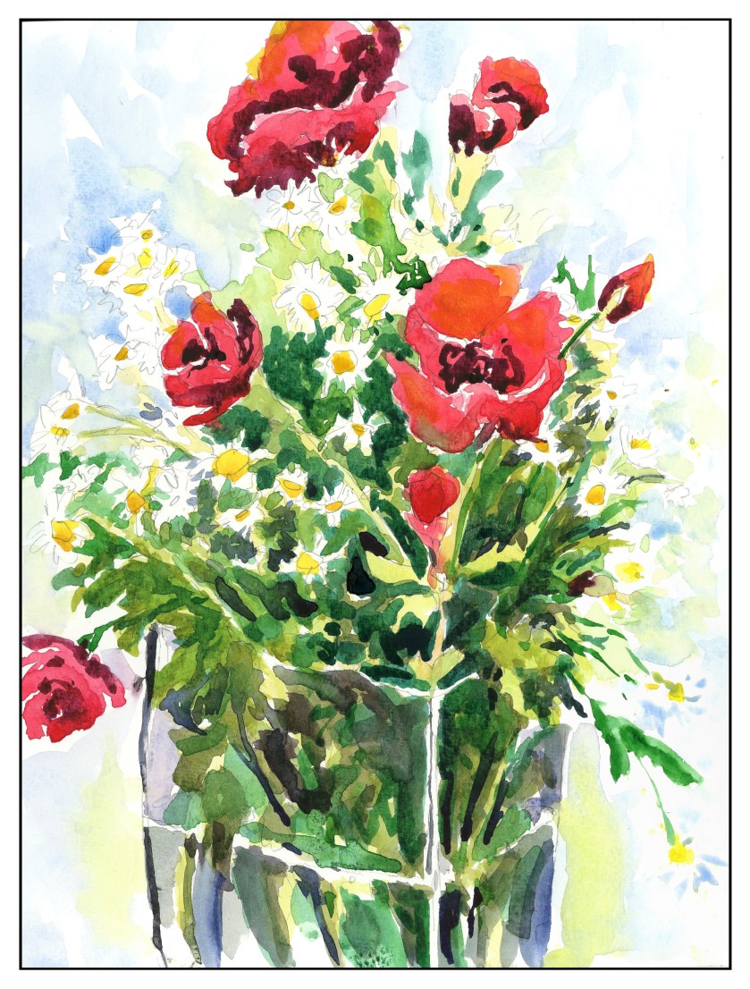
Nonetheless, I feel that this painting is a moderate success.  I was patient and let the washes dry, working from lighter to more dark, thinking about white space and negative painting.  And I still have a bouquet of flowers to enjoy!