Gladioli

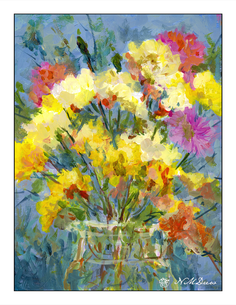
In seems to me that a “style” is not something I have. You can recognize many painters by how their work looks, but I am all over the place. This is not really by design, but more by learning by trying to figure out how they might do something. I started out here by trying to do an abstraction of a vase of gladioli, inspired by varied modern painters, but in the end I ended up doing most if it by shaping the flowers, background, and vase with vertical and horizontal strokes.

Using fluid acrylics, I painted with wet paint, and as time went by, used the brush to blend the drying paint. Some glazes were used, too. When I finished the vase, background, and bouquet, the background was pretty empty. So, simple geometric shapes – a bowl, a glass, a pitcher. I wanted them pale to blend into the background but still distinctive. The results seem to work.

11×14, cotton canvas on board, fluid acrylics.

Splotchness

Another floral study following a YouTube video. This one is by Lois Davidson, whose technique is much different than the “Bowl of Roses” video.

I rather liked this one. There were some little things in doing it that I hadn’t done before. I’ve sprinkled colors onto wet paint, but never dropped in sprinklings of water. That was fun. Also, the sheer joy in painting splotchy flowers is always a delight but I did have to think a lot more than it looks – working light to dark requires forethought and patience. To me, watercolor painting is like haiku – it takes a lot more work than it appears to need!

This is on Arches CP 140# – as always! – 9×12.

A Bowl of Roses

The above study was fun to do, but I had a lot of help in the form of (what else?) a YouTube video. Videos are such good ways to see what a person does, and how they paint. To me, watching the methods an artist goes about accomplishing something is one of the biggest ways to learn.

The video I used was one by a YouTuber called “Draw with Shiba.” There are a lot of good videos on his channel, and none of them are so difficult you cannot learn something. As my goal is flowers I found this video of his quite helpful.

Our images sort of match, sort of don’t. His paper seems to hold on to water more than mine does (Arches) so he can lift color from the sides of the roses. He also begins with a lot of wet-in-wet. In this video, he wets the paper entirely with a brush before he paints, and then drops in color so it blurs into all the major areas of the paintings. In other videos he simply drops water droplets onto his paper, thus controlling areas as he disperses the water with his brush. He paints, flat, too, from what I can see.

Overall, I enjoyed this video. The flowers are roses (thumbs up there!), the vase is simple, and the entire painting covers a lot of techniques. I liked the way in which he lifted the paint and painted the roses. I learned a bit and produced a painting that doesn’t make me cringe. I tried to apply a lot of the techniques here to my flower flop of yesterday, and some worked, some did not, but that is life. Live to paint another day!

WWM #19: Splashes of Color

I’ve been thinking about how I am developing a sort of painting style in gouache, as well as giving thought to the painters whose work I admire.  It definitely falls in the impressionistic and expressionistic varieties.  Gouache just seems to be made for exuberant color and enthusiastic brushwork.My colors are more subdued that I wanted – I wanted turquoise skies and pink flowers and a brilliant sunset.  Instead, I have a rather northern European type of town scene, with a garden or flowering park in the middle.  Summer’s abundance flourishes under the trees, but in the shade it seems.  In doing this painting, I didn’t do much planning.  I stuck to the prompt of “splashes of color” – and splash I did.  The result was a serious loosening up of my style, and a letting go of “this is what I want it to be.”  That is significant – I can be a real tight ass about painting, and in the end dislike the results.  When I let go – let things splash – I am usually much, much happier with the results.

Regardless, both paintings appear muddy to me.  I wonder if working with pure color – straight from the tube – would help.  Practice certainly will.  The flowers in the vase seem a bit overworked, too.  Again, practice and experience.

So, lots of splashes of color for #WorldWatercolorMonth 2019 is producing some rather pleasing results and, more than anything, a daily involvement with painting.