17-20 / 30

Somewhere, a corner turned. It is becoming easier to simplify a picture, throw out unnecessary things and perhaps adding something else to make it more interesting or work more than a photo can.

Day 17

I’ve been wanting to draw a cloudburst and finally did. After looking at lot of pictures, I realized that the drama comes from the soft rain blurring what is behind it. However, there is also contrast – light and dark. To achieve this, I drew everything in with graphite and then used a grey rubber eraser to create the streaks, lifting the graphite. From there, I smudged it in. Values remain but the messy nature of graphite sometimes defeats itself for value studies!

Day 18

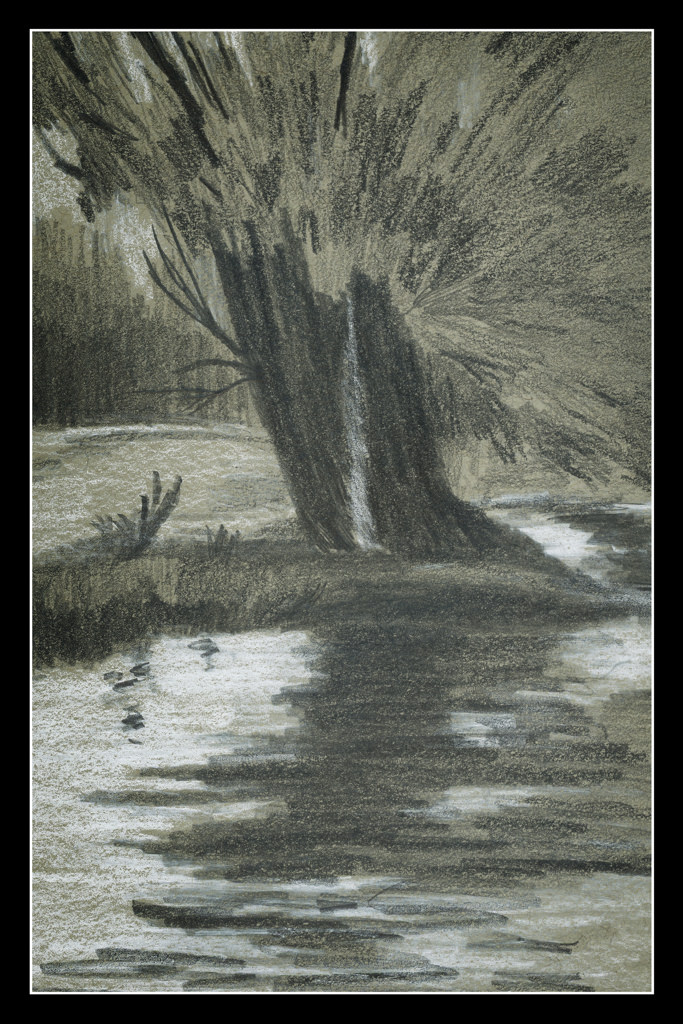
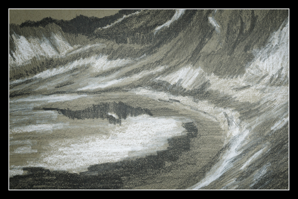
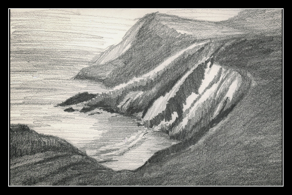
I am pretty pleased with this study. There are nice, subtle areas in a photo that was basically very high contrast in the tree and vegetation in the foreground. The ocean is in the middle right and extending into a misty sky.

Day 19

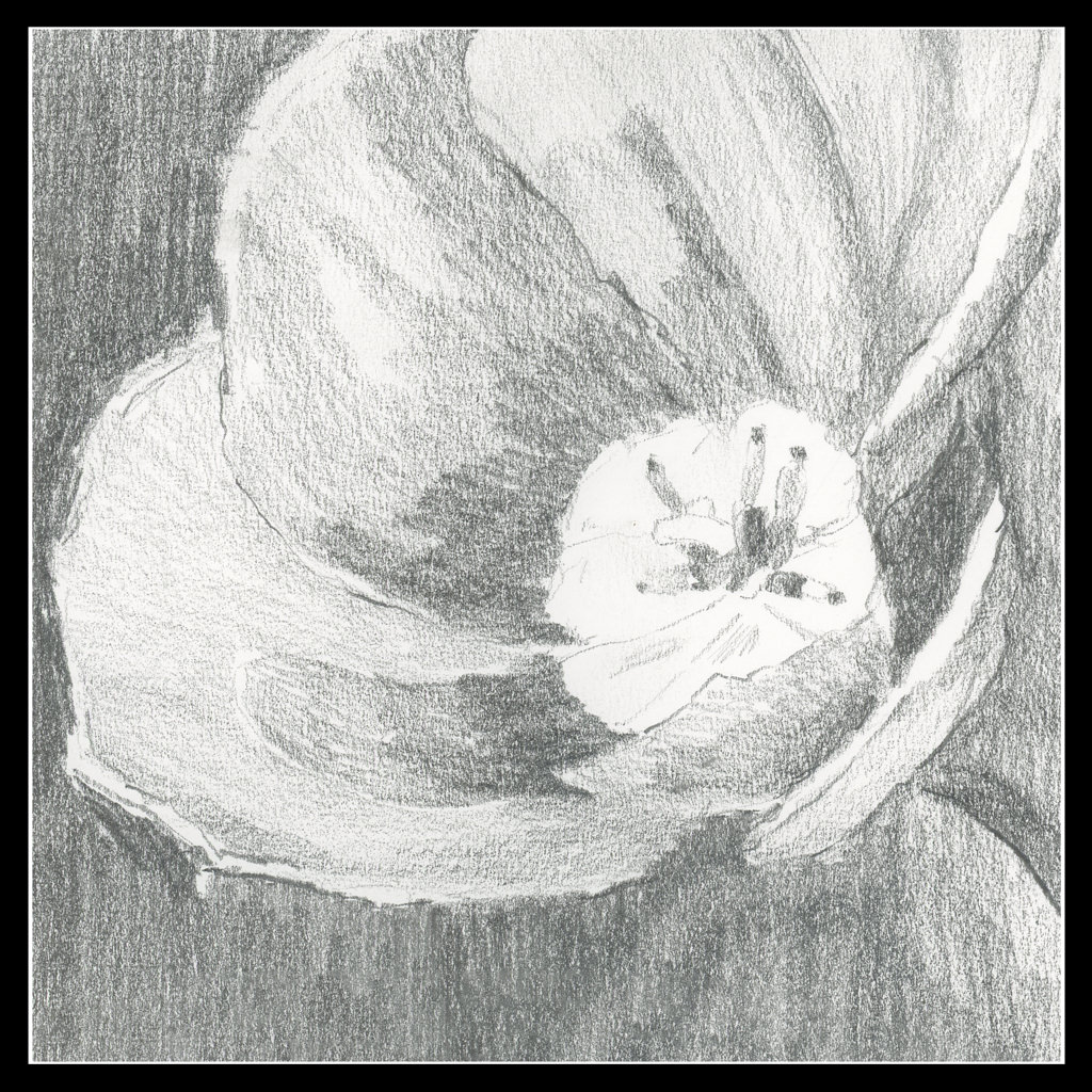
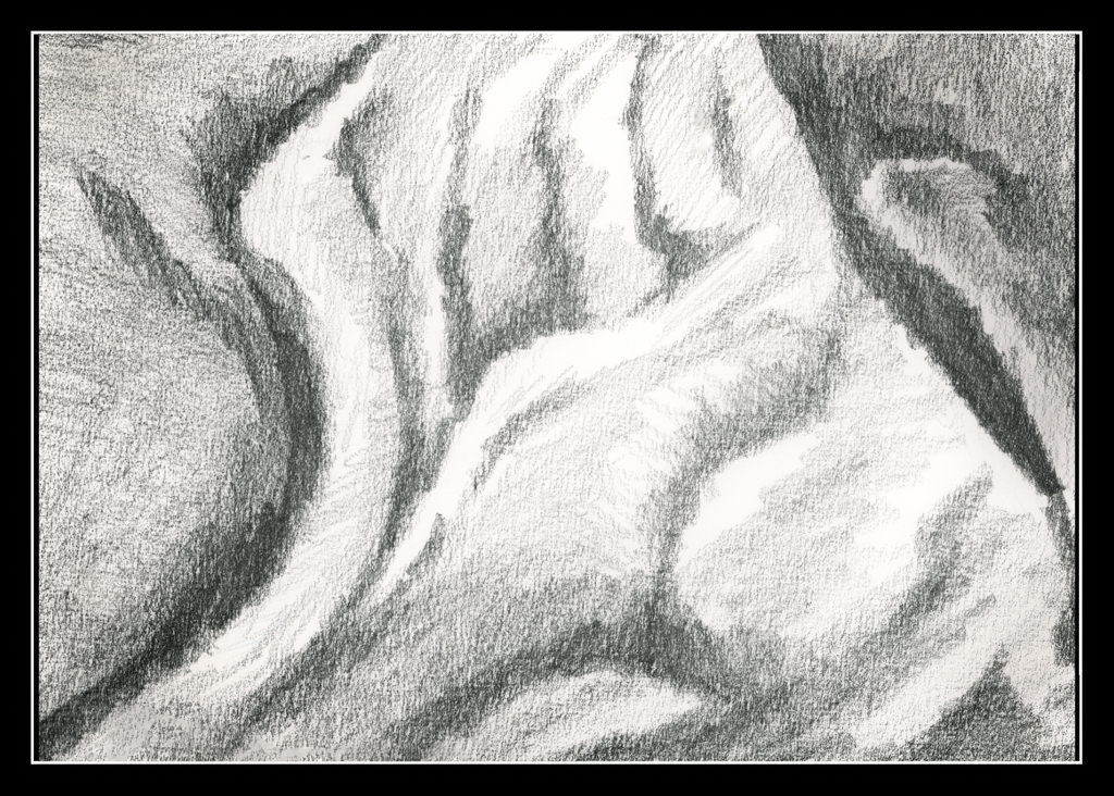
I took a picture of a tulip years ago – pale pink and backlit. The blurry quality of my drawing is just a value study, not a drawing to show what a tulip looks like. This idea is really challenging at times because I have done portraits in pencil and details abound then! It is important to remember this is to be a simple reference, not a finished work of art.

Day 20

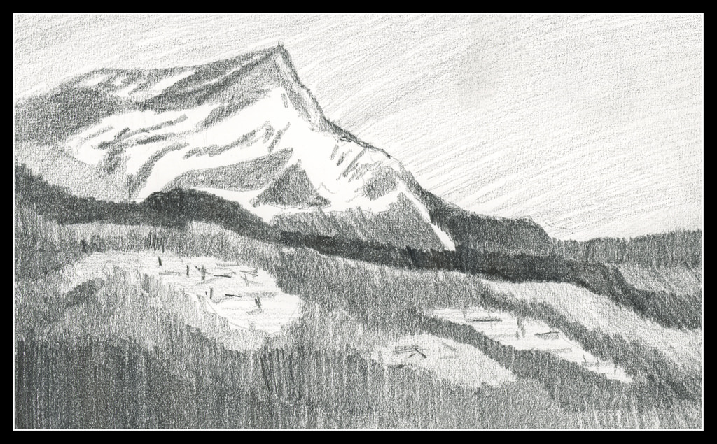
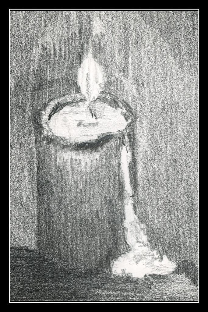
As I progress in this 30 day challenge, I find I am running out of subject matter! So, it is time to work with other things. The flower was one. This one is perspective.

I actually got out a ruler and for the sketch created a grid, and then worked hard to put things in both perspective and in proportion to each other. As well, I wanted to create a nocturne.

Commentary

So, the days are rolling by, little shifts are occurring, and as my confidence in value studies grows, so is, it seems, my patience for doing preliminary work before trying to execute a painting. Not easy for me at all!d

14-16 / 30

Day 14

I am beginning to lose track of the days since I began this project since some days I do nothing, and other days I do a few.

Above is Day 14. Continuing to simplify shapes and masses into values, the above should represent a mountain in the distance. From there, mid-ground is a dark ridge before the mountain, and another to the right of the mountain, behind the mountain itself. The white blobs in the foreground area with sticks is supposed to represent structures. To me, they look like felled timber. Ideally, I think the mountain itself should be lighter to represent atmospheric perspective.

Day 15

This is an attempt at a nocturne – a night time value study to see if I could catch the light of the full moon. The bush-like thing in the middle needs some lightening at the top. Overall, I like this as a start to something even though it is so vague – but that is how night is!

Day 16

This is a view upward to the hill at the center of the local botanical garden. The white swath in the right foreground is the sand trail which winds around downward (behind the viewer) into the riparian woodland below.

I am not quite sure if I like the values as I have them set up here – nor am I really sure about the focal point of the drawing. It seems the dark tree at the top is too dark, but it could be a leading line down the hill to the tree with the cast shadow. The trail leads the eye. In a painting, this could work out with warm and cool tones in addition to values. Maybe I’ll give it a shot!

Commentary

With Day 13 I tried to make my masses more simple and graphic. I am continuing this, and will for the rest of the 30 day challenge.

Some studies lend themselves to it more readily than others. Despite that, I tried to simplify in all three. Doing this makes Roberts’ admonition to “draw shapes, not things” easier to do. Distilling the more important – most important – into value masses seems to be happening (at long last!).

Again, it will be interesting to see where it works with painting.

7 – 11 / 30

I got behind! So here we go – the 30-day challenge.

Day 7

I found some grey stock when rummaging around. Graphite and white chalk pencil on grey paper.

Day 8

More of the same media as Day 7. This is a glacial lake with snow. Does it look like it or not?

Day 9

I like this one the best out of this series. It looks like it is supposed to be – a chicken!

Day 10

A candle, and back to graphite on white paper, just like Day 9.

Day 11

The soft melted wax dripping down the side of the candle for Day 10 made me think that perhaps some fabric would be another good exercise in soft surfaces in pencil. Again, graphite on paper.

And there we are – caught up. I couldn’t get to anything until this afternoon, so a daily drawing was not possible. The 30-day challenge is to do as many images, up to 30, in 30 days, but without the caveat that it has to be one a day at the most. In a way this really made for a sort of evolution in the drawings. Day 7 and Day 8 had the same idea – grey paper, graphite, and white chalk. It had its good points, but I think I prefer the graphite on white paper. The midtones are more easy to think about. I think these two studies helped make Day 9 as good as it is. From there, two subjects I never have considered – the candle and the fabric. Both work and don’t.

Again – how will I translate these value studies into color??!!

A Class with Rick Surowicz: “Abandoned” (Day 1)

I’ve long wanted to try one of Rick Surowicz‘s online watercolor classes, but haven’t felt focused enough to take the time to do so.  Yesterday I decided I was ready.  His classes are not expensive compared to other artists’ classes – $39.00.  I think that is a worthwhile investment.  And a bargain.  Surowicz has a number of videos on YouTube which I find so informative and educational that I thought a class with greater depth of what he does, how he thinks, would be a great benefit.

The class I decided on is called “Abandoned.”  I can do okay with water and trees, but buildings and perspective are a problem.  This was the primary reason for this choice.  Additionally, there are structural elements, such as planes and angles and deciding proportions.  I am not good at this at all!

So, today I sat down, downloaded and printed out the PDF files.  I got out my sketchbook and did the preliminary work – sketches of four different compositions and value studies of two of them. (Click on one to see the gallery.)

I am full of good intentions, but very bad at executing them!  I keep telling myself to do value studies, but don’t.

Making all these sketches -12 in total – came with an amazing “ah ha!” moment:  drawing the same thing multiple times gets you familiar with it.  I started learning where the chimneys were, the slants of the roof, the arches.  The house became like a friend who you haven’t seen for awhile – but the features are so familiar.

Here, on the one with 3 values (white, medium, dark), Rick had us consider light from the left and light from the right.  There are similarities and differences, and if you look, you will see them.  This was fascinating as I have never done anything like this – I’ve done value studies, but not with a changing direction of light.

So far I am really pleased with the course content.  Rick has an even pace when he speaks, and his reasons are clear.  As someone who taught for many years, I tend to be highly critical of online courses.  So far, I am very happy.  Content is clear, and progresses logically.  I am looking forward to continuing more tomorrow!  Thank you, Rick!